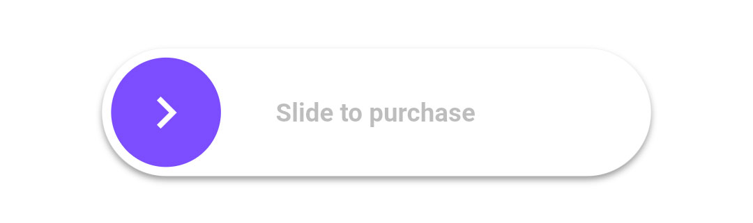
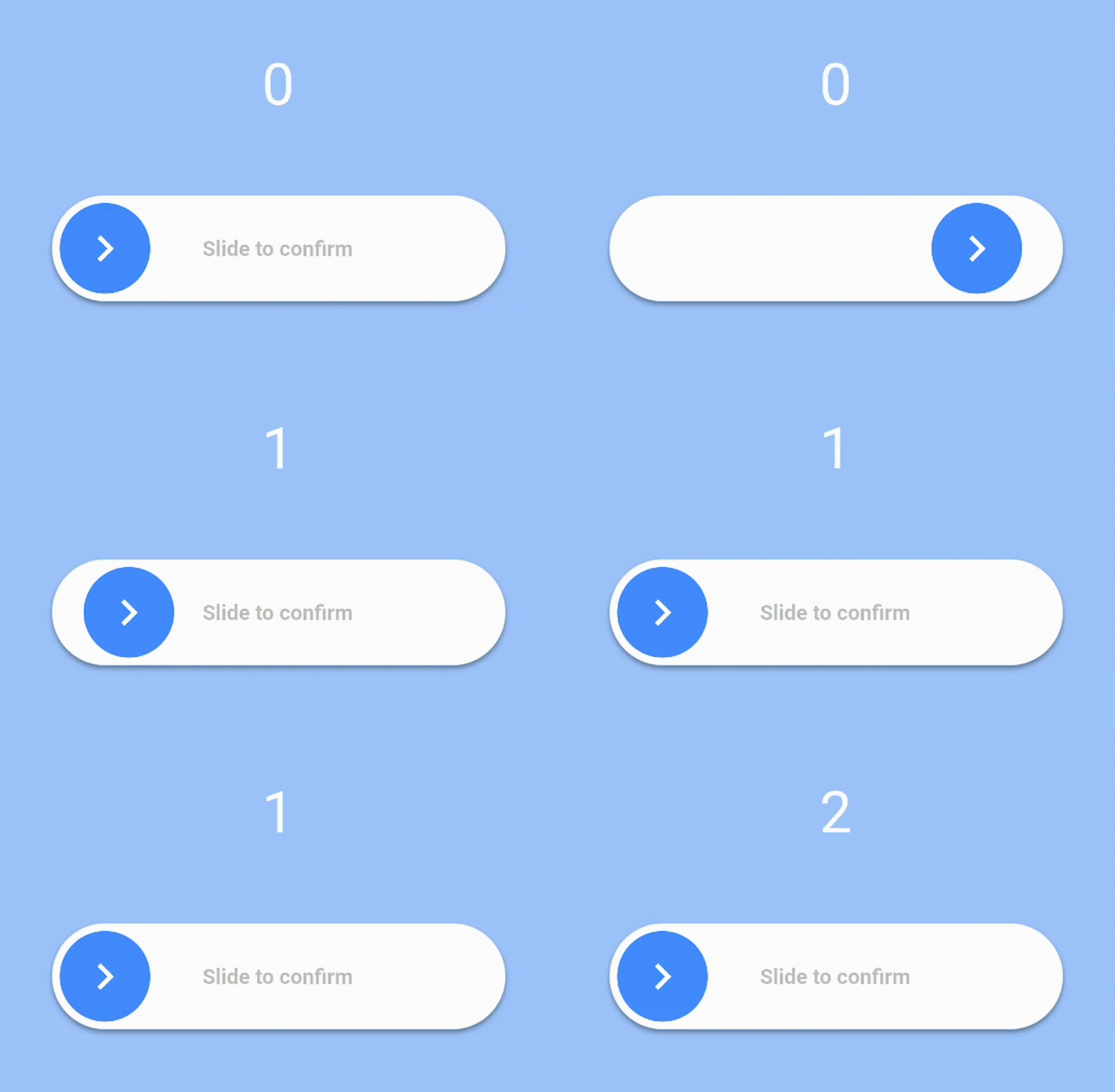
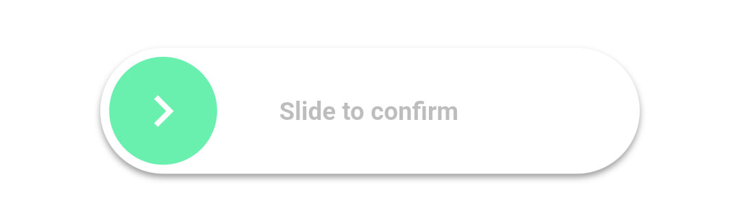
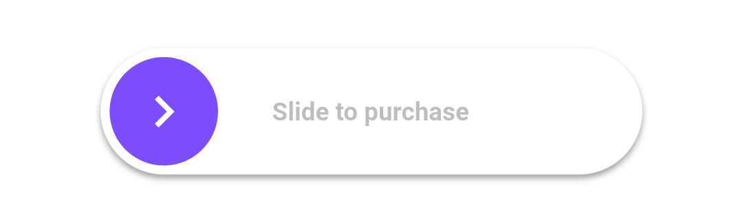
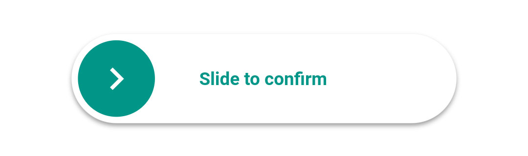
heightdouble: Height of the slider. Defaults to 70.
widthdouble: Width of the slider. Defaults to 300.
backgroundColorColor: The color of the background of the slider. Defaults to Colors.white.
backgroundColorEndColor: The color of the background of the slider when it has been slide to the end. By giving a value here, the background color will gradually change from backgroundColor to backgroundColorEnd when the user slides. Is not used by default.
foregroundColorColor: The color of the moving element of the slider. Defaults to Colors.blueAccent.
iconColorColor: The color of the icon on the moving element if icon is IconData. Defaults to Colors.white.
sliderButtonContentWidget or : The icon widget used on the moving element of the slider. Defaults to Icon(Icons.chevron_right).
shadowBoxShadow: The shadow below the slider. Defaults to BoxShadow(color: Colors.black38, offset: Offset(0, 2),blurRadius: 2,spreadRadius: 0,).
textString: The text showed below the foreground. Used to specify the functionality to the user. Defaults to "Slide to confirm".
textStyleTextStyle: The style of the text. Defaults to TextStyle(color: Colors.black26, fontWeight: FontWeight.bold,).
onConfirmationVoidCallback: The callback when slider is completed. This is the only required field.
onTapDownVoidCallback: The callback when slider is pressed.
onTapUpVoidCallback: The callback when slider is release.
foregroundShapeBorderRadius: The shape of the foreground (the moving element of the slider). Defaults to a circular border radius.
backgroundShapeBorderRadius: The shape of the background of the slider. Defaults to a circular border radius.
stickToEndbool: Bool that indicates if stick or not the cursor at end of slide
Example
View the Flutter app in the example directory to see a working example of how to use and implement the slider.