搜索插件、代码仓与 APP 分类

插件详情v0.0.5

slider_controller

一个提供滑块控制器和自定义小部件的包。此小部件用于轻松自定义滑块小部件。

AndroidiOSWebmacOSWindowsLinux
近 30 天下载
36
喜欢数
40
Pub 分数
160

安装插件

flutter pub add slider_controller

插件介绍

基于插件公开信息、社区数据与项目使用情况整理的选型参考。

slider_controller 包为 Flutter 应用程序提供了一个可自定义的滑块控制器和小部件。它简化了滑块的创建和管理,增强了对外观和行为的控制。开发者可以轻松地根据特定的设计需求调整滑块的外观和功能。该包支持所有主要平台,包括 Android、iOS、Web、macOS、Windows 和 Linux,确保在各种设备上性能一致。通过直观的 API,它可以轻松集成到现有项目中。

适合场景

  • 自定义滑块设计
  • 交互式 UI 元素
  • 带范围选择的表单输入
  • 跨平台滑块组件
  • 动态值调整

主要特点

  • 易于自定义
  • 跨平台支持
  • 内置控制器逻辑
  • 响应式设计集成
  • 可扩展的部件结构

适合对象

  • UI 开发人员
  • Flutter 初学者
  • 注重设计的应用
  • 交互式表单
  • 多平台项目

使用建议

  • 需要基本的 Flutter 知识
  • 仅限滑块特定用例
  • 复杂布局可能需要额外的样式
  • 依赖外部依赖项以实现高级功能
  • 不适用于非滑块控件

原始 README

以下为关联源码仓库的 README 原文快照,最新内容请访问源码仓库。

slider_controller

Flutter Website Dart Website MIT License

A package that gives us a slider controller a custom widget. This widget is used for easy customization for the slider widget.

Key Features

  • Ready to use custom slider widget.
  • Easy customization for the slider widget.

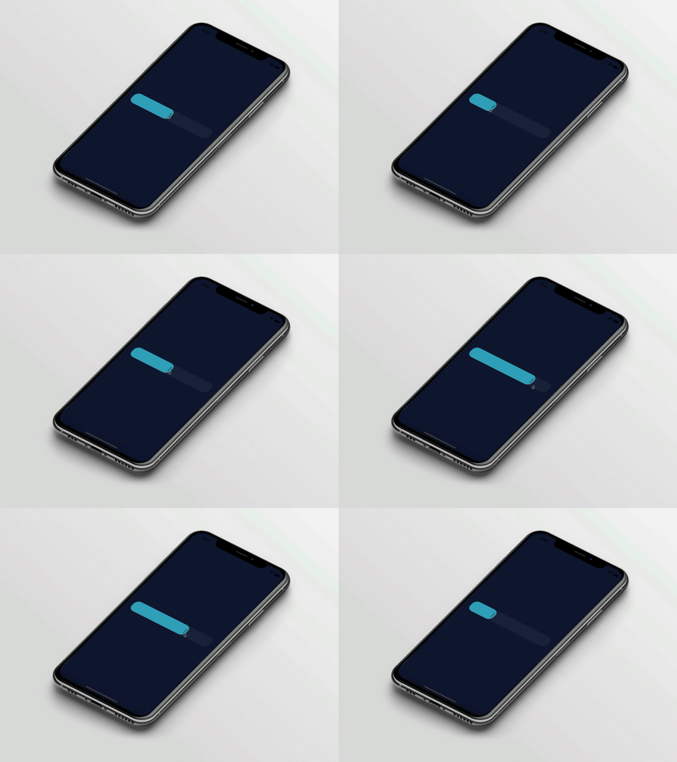
Preview

slider_controller

Basic Usage

Import it to your project file

import 'package:slider_controller/slider_controller.dart';

And add it in its most basic form like it:

SliderController(
  value: 50.0,
  onChanged: (value) {
    print('slider value : $value');
  },
);
Required parameters of SliderController

Parameter Description
double value Indicates the default slider thumb value between the 0.0 to 100.0
ValueChanged onChanged Called during a drag when the user is selecting a new value for the slider by dragging
Optional parameters of SliderController

Parameter Default Description
ValueChanged? onChangeEnd - Called when the user is done selecting a new value for the slider
ValueChanged? onChangeStart - Called when the user starts selecting a new value for the slider
double min 0.0 Indicates the Minimum value for the slider
double max 100.0 Indicates the Maximum value for the slider
SliderDecoration sliderDecoration -- Used to Decorate the Slider Widget
bool isDraggable true Used to Enable or Disable Drag Gesture of Slider
Optional parameters of SliderDecoration

Parameter Default Description
Color inactiveColor Colors.blueGrey Defines the background color of the inactive part of the slider
Color activeColor Colors.blue Defines the background color of the active part of the slider
Color thumbColor Colors.white Defines the thumb color of the slider
double borderRadius 20.0 Indicates the rounded border radius for the slider
double height 50.0 Indicates the height of the slider
bool isThumbVisible true Indicates that slider thumb is visible or not
double thumbHeight 25.0 Indicates the height of the slider thumb
double thumbWidth 5.0 Indicates the width of the slider thumb
Guideline for contributors

  • Contribution towards our repository is always welcome, we request contributors to create a pull request for development.
Guideline to report an issue/feature request

It would be great for us if the reporter can share the below things to understand the root cause of the issue.

  • Library version
  • Code snippet
  • Logs if applicable
  • Device specification like (Manufacturer, OS version, etc)
  • Screenshot/video with steps to reproduce the issue
  • Library used

LICENSE!

slider_controller is MIT-licensed.

Let us know!

We’d be really happy if you send us links to your projects where you use our component. Just send an email to sales@mindinventory.com And do let us know if you have any questions or suggestion regarding our work.

所属分类

源码仓库

使用此插件的项目

暂无相关数据。