搜索插件、代码仓与 APP 分类

sliding_clipped_nav_bar 封面
插件详情v3.1.1

sliding_clipped_nav_bar

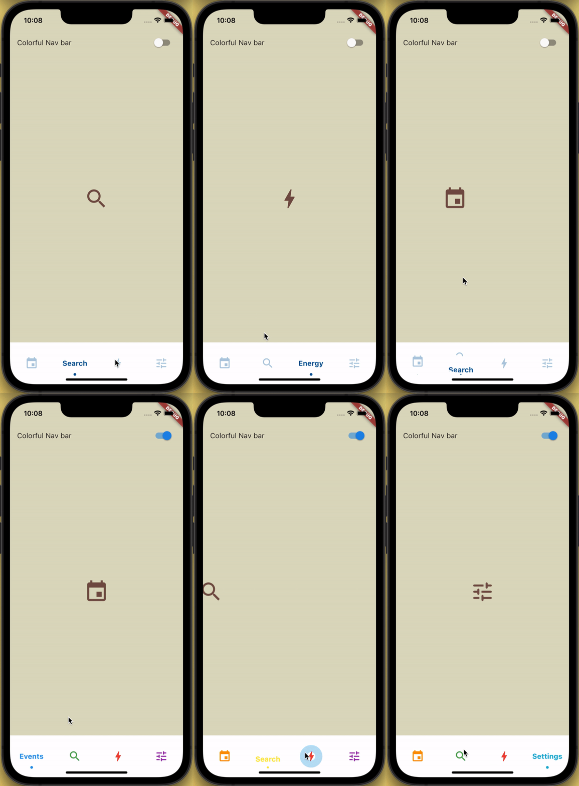
带有滑动菜单图标和文本剪裁效果的底部导航栏,点击时还具有涟漪效果。

AndroidiOSWebmacOSWindowsLinux
近 30 天下载
233
喜欢数
339
Pub 分数
150

安装插件

flutter pub add sliding_clipped_nav_bar

插件介绍

基于插件公开信息、社区数据与项目使用情况整理的选型参考。

一个可自定义的底部导航栏,图标和标签具有滑动动画效果,通过裁剪效果和点击时的涟漪反馈进行增强。专为现代交互式UI设计,支持Android、iOS、Web、macOS、Windows和Linux等多个平台。该包提供流畅的过渡效果和视觉精致度,非常适合需要直观导航和动态反馈的应用程序。可通过pub.dev无缝集成到Flutter项目中。

适合场景

  • 移动应用导航
  • Web 应用程序接口
  • 跨平台UI设计
  • 交互式底部栏
  • 现代应用程序美学

主要特点

  • 滑动图标和文字动画
  • 剪裁效果以实现视觉深度
  • 点击时的涟漪效应
  • 跨平台兼容性
  • 可自定义外观
  • 平滑过渡动画

适合对象

  • 寻求动画底部导航栏的Flutter开发者
  • 注重设计的应用程序
  • 用户互动高的应用
  • 面向多个平台的开发者
  • UI/UX增强项目

使用建议

  • 可能需要在旧设备上进行性能调优
  • 超出核心功能的定制化有限
  • 复杂控件中的潜在布局冲突
  • 未针对非常大的导航集进行优化
  • 依赖于 Flutter 的渲染管道

原始 README

以下为关联源码仓库的 README 原文快照,最新内容请访问源码仓库。

Loading Animation Widget

YouTube Badge Twitter Badge Patreon Badge BMC Badge pub package WateryDesert


How to use?

Add sliding_clipped_nav_bar: to your pubspec.yaml dependencies then run flutter pub get

Add from git [Latest and experimental version]

 dependencies:
  sliding_clipped_nav_bar:
    git:
      url: https://github.com/watery-desert/sliding_clipped_nav_bar  

Add from pub [Stable]

 dependencies:
  sliding_clipped_nav_bar:

Then import the package to use

import 'package:sliding_clipped_nav_bar/sliding_clipped_nav_bar.dart';

Add SlidingClippedNavBar() to bottomNavigationBar property of Scaffold() and add PageView() to body with NeverScrollableScrollPhysics() don't try to upate the seleted index from onPageChanged or will see some weird behaviour. You can use Stack() or AnimatedSwitcher() for custom page transition animation.

API reference

barItems → List<BarItem>

  • List of bar items that shows horizontally, Minimum 2 and maximum 4 items.
    required

selectedIndex → int

  • Selected index of the bar items.
    required

iconSize → double

  • Size of all icons (inactive items), don't make it too big or will be clipped.
    optional [30]

fontSize → double

  • FontSize of the text.
    optional [16]

fontWeight → FontWeight

  • FontWeight of the text.
    optional [FontWeight.bold]

fontStyle → FontStyle

  • FontStyle of the text.
    optional [null]

activeColor → Color

  • Color of the selected item which indicate selected.
    required

inactiveColor → Color?

  • Inactive color of item, which actually color icons.
    nullable

onButtonPressed → OnButtonPressCallback

  • Callback when item is pressed.
    required

backgroundColor → Color

  • background color of the bar.
    optional [Colors.white]

Design Credit & screen recording

Toolbar icons animation by Cuberto

Do and don't
  • Don't make icon size too big.

    • FontAwesomeIcons: 24
    • MaterialIcons: 30
  • Using SlidingClippedNavBar() when you want global active and inactive color.

 return Scaffold(
     
      body: PageView(
      physics: NeverScrollableScrollPhysics(),       
      controller: controller,
...
      ),
      bottomNavigationBar: SlidingClippedNavBar(
        backgroundColor: Colors.white,
        onButtonPressed: (index) {
          setState(() {
            selectedIndex = index;
          });
          controller.animateToPage(selectedIndex,
              duration: const Duration(milliseconds: 400),
              curve: Curves.easeOutQuad);
        },
        iconSize: 30,
        activeColor: Color(0xFF01579B),
        selectedIndex: selectedIndex,
        barItems: [
          BarItem(
            icon: Icons.event,
            title: 'Events',
          ),
          BarItem(
            icon: Icons.search_rounded,
            title: 'Search',
          ),
           /// Add more BarItem if you want
        ],
      ),
    );
  • Using SlidingClippedNavBar.colorful() when you want to set individual item active & inactive color.
return Scaffold(
    
     body: PageView(
     physics: NeverScrollableScrollPhysics(),
     controller: controller,
...
     ),
     bottomNavigationBar: SlidingClippedNavBar.colorful(
       backgroundColor: Colors.white,
       onButtonPressed: (index) {
         setState(() {
           selectedIndex = index;
         });
         controller.animateToPage(selectedIndex,
             duration: const Duration(milliseconds: 400),
             curve: Curves.easeOutQuad);
       },
       iconSize: 30,
       selectedIndex: selectedIndex,
       barItems: [
         BarItem(
           icon: Icons.event,
           title: 'Events',
           activeColor: Colors.amber,
           inactiveColor: Colors.red,
         ),
         BarItem(
           icon: Icons.search_rounded,
           title: 'Search',
           activeColor: Colors.red,
           inactiveColor: Colors.green,
         ),
        /// Add more BarItem if you want

       ],
     ),
   );
FAQ
  • How do I change the height?

The height must be constant because the animation is in vertical direction. According to me 60 is perfect. But if you think needs to be reduced then please create an issue with a screenshot. I will see if I can do something.

  • How do I add drop shadow?

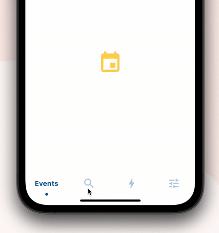
Wrap SlidingClippedNavBar with DecoratedBox or Container and pass BoxDecoration to decoration property. BoxDecoration takes list of boxShadow there you can pass your drop shadow.

DecoratedBox(
    decoration: BoxDecoration(
      boxShadow: [
        BoxShadow(
            color: Colors.black.withOpacity(0.2),
            offset: Offset(0, 4),
            blurRadius: 8.0)
      ],
    ),
    child: SlidingClippedNavBar()
)
  • How do I change the corner radius of the navigation bar?

Wrap SlidingClippedNavBar with ClipRRect and pass BorderRadius to borderRadius property.

  ClipRRect(
      borderRadius: const BorderRadius.vertical(
        top: Radius.circular(16),
      ),
      child: SlidingClippedNavBar(
    )                

All flutter packages

➜ Sliding Clipped Nav Bar
● Water Drop Nav Bar
● Swipeable Tile
● Loading Animation Widget


所属分类

源码仓库

使用此插件的项目

暂无相关数据。