搜索插件、代码仓与 APP 分类

smooth_corner 封面
插件详情v1.1.1

smooth_corner

一种模仿 Figma 的矩形边框,具有可变的平滑度。

AndroidiOSWebmacOSWindowsLinux
近 30 天下载
2.4万
喜欢数
64
Pub 分数
160

安装插件

flutter pub add smooth_corner

插件介绍

基于插件公开信息、社区数据与项目使用情况整理的选型参考。

Smooth Corner 是一个 Flutter 包,允许开发者创建可调节平滑度的矩形边框,紧密模仿 Figma 中的设计美学。它提供了一种灵活且高效的方法,通过自定义裁剪器逻辑为小部件应用圆角或平滑曲线边缘。非常适合需要现代、精致外观的 UI 元素,而无需依赖复杂的图像资源。该包支持所有主要平台,确保在不同设备上的一致渲染。

适合场景

  • 使用柔和边缘创建现代UI组件
  • 设计具有可变圆角半径的按钮和卡片
  • 实现类似 Figma 的边框样式
  • 增强应用程序界面的视觉质感
  • 构建可重复使用的装饰性容器
  • 匹配设计系统要求

主要特点

  • 角落的可变平滑度控制
  • Figma 风格的边框近似
  • 跨平台兼容性
  • 轻量且高效的剪裁实现
  • 通过 pub add 轻松集成
  • 支持所有 Flutter 平台

适合对象

  • UI设计师实施Figma设计
  • 寻求简洁现代边框的开发者
  • 对视觉保真度要求较高的应用
  • 使用设计令牌保持一致性的项目
  • 团队正在致力于像素级的UI复刻

使用建议

  • 性能影响可能随着复杂形状而增加
  • 限制为带有圆角的矩形边框
  • 可能需要在所有目标平台上进行测试
  • 不适合高度不规则或自由形状
  • 依赖于基于路径的裁剪的准确渲染

原始 README

以下为关联源码仓库的 README 原文快照,最新内容请访问源码仓库。

Language: English | 中文简体

smooth_corner

Pub

Implement smooth iOS-style rounded corners in Flutter, mimicking Figma's "corner smoothing" feature. The algorithm is also inspired by Figma's blog post "Desperately seeking squircles".

The principle involves combining two Bezier curves and an arc to create smooth corners. Similar to Figma, the smoothness is adjustable. When the smoothness parameter is 0, it represents a normal rounded rectangle, and when the parameter is 1, the rounded corners are composed of only two Bezier curves, approaching a superellipse.

You can view the debug rounded corner components and image examples I wrote in the example project, adjusting their smoothness and corner size to observe the changes in the corner curves.

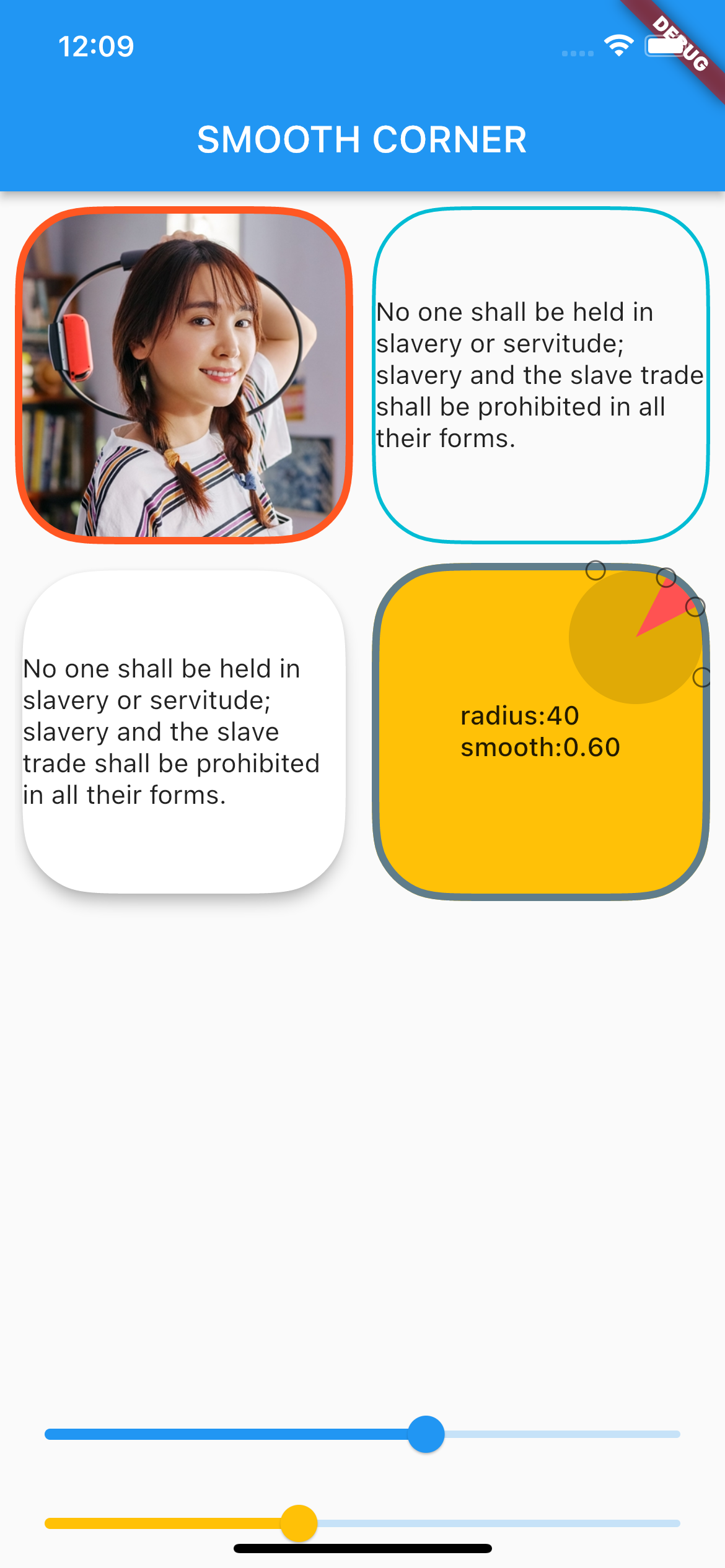
Example screen shot

Usage

Add dependency
dependencies:
  smooth_corner: ^1.1.1
Built-in Widgets

This library provides several commonly used widgets that allow you to adjust smooth rounded corners.

All widgets provide three parameters: smoothness, side, and borderRadius, to control smooth corners and borders.

  • smoothness: Represents the smoothness, ranging from [0, 1.0]. According to Figma's standards, 0.6 is the closest to iOS's rounded corner curve.

  • side: Type is BorderSide, used to set borders.

  • borderRadius: Used to set the corner radius. Note that if the x and y values of the radius are not equal, the smaller one will be chosen.

SmoothContainer

SmoothContainer includes all the parameters of Container.

SmoothContainer(
  width: 200,
  height: 200,
  smoothness: 0.6,
  side: BorderSide(color: Colors.cyan, width: 2),
  borderRadius: BorderRadius.circular(40),
  child: child,
  alignment: Alignment.center,
),
SmoothClipRRect

To enable images to have borders, SmoothClipRRect is provided.

SmoothClipRRect(
  smoothness: 0.6,
  side: BorderSide(color: Colors.deepOrange, width: 4),
  borderRadius: BorderRadius.circular(40),
  child: Image.network(
    url,
    fit: BoxFit.cover,
  ),
SmoothCard

SmoothCard includes all parameters of Card.

SmoothCard(
  smoothness: 0.6,
  borderRadius: BorderRadius.circular(40),
  elevation: 6,
  child: child,
),
Custom widget

The smooth corner capabilities of the above widgets are implemented by SmoothRectangleBorder. You can use this ShapeBorder to freely customize your smooth corner components.

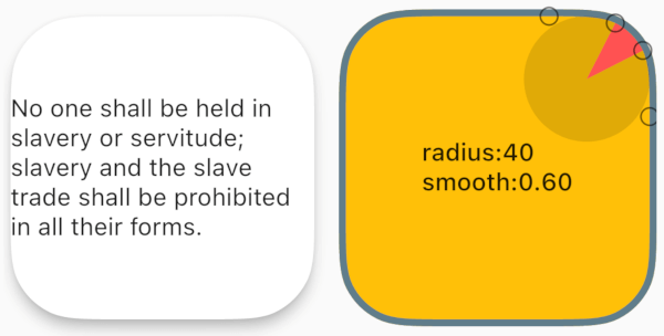
ShapeDecoration
Container(
  width: 200,
  height: 200,
  alignment: Alignment.center,
  decoration: ShapeDecoration(
    shape: SmoothRectangleBorder(
      borderRadius: BorderRadius.circular(40),
      smoothness: 0.6,
    ),
    color: Colors.amber,
  ),
  child: Text(''),
),
ShapeBorderClipper
Container(
  width: 200,
  height: 200,
  child: ClipPath(
    clipper: ShapeBorderClipper(
      shape: SmoothRectangleBorder(
        smoothness: 0.6,
        borderRadius:
            BorderRadius.circular(40),
      ),
    ),
    child: Image.network(url),
  ),
),

所属分类

源码仓库

使用此插件的项目

暂无相关数据。