搜索插件、代码仓与 APP 分类

square_progress_indicator 封面
插件详情v0.0.8

square_progress_indicator

您可以创建可自定义的方形进度指示器,类似于原生 Flutter 的 CircularProgressIndicator 小部件。

AndroidiOSWebmacOSWindowsLinux
近 30 天下载
5280
喜欢数
30
Pub 分数
160

安装插件

flutter pub add square_progress_indicator

插件介绍

基于插件公开信息、社区数据与项目使用情况整理的选型参考。

一个可自定义的方形进度指示器小部件,灵感来自原生的 CircularProgressIndicator。它提供了一种现代、紧凑的圆形进度指示器替代方案,支持自定义颜色、线条宽度和动画。非常适合在 UI 设计中更适合方形布局的应用程序加载状态中使用。该包轻量且兼容所有主要平台,包括 Android、iOS、Web、macOS、Windows 和 Linux。

适合场景

  • 表单中的加载指示器
  • 在仪表板中显示进度
  • 移动应用中的自定义加载动画
  • 用方形进度条替换圆形进度条
  • 增强材料设计应用中的UI一致性

主要特点

  • 方形设计
  • 可自定义的颜色和笔画宽度
  • 平滑动画
  • 跨平台兼容性
  • 与 Flutter 的简单集成
  • 可扩展的样式选项

适合对象

  • 寻求替代进度指示器的开发者
  • 专注于方形主题界面的UI设计师
  • 需要一致加载视觉效果的应用程序
  • Flutter 项目针对多个平台
  • 使用现代美学的 Material Design 项目

使用建议

  • 限制为方形几何
  • 可能需要额外的样式来实现复杂的动画
  • 不适用于圆形进度需求
  • 依赖于 Flutter 的渲染性能
  • 最适合在方形形状与设计语言一致的上下文中使用

原始 README

以下为关联源码仓库的 README 原文快照,最新内容请访问源码仓库。

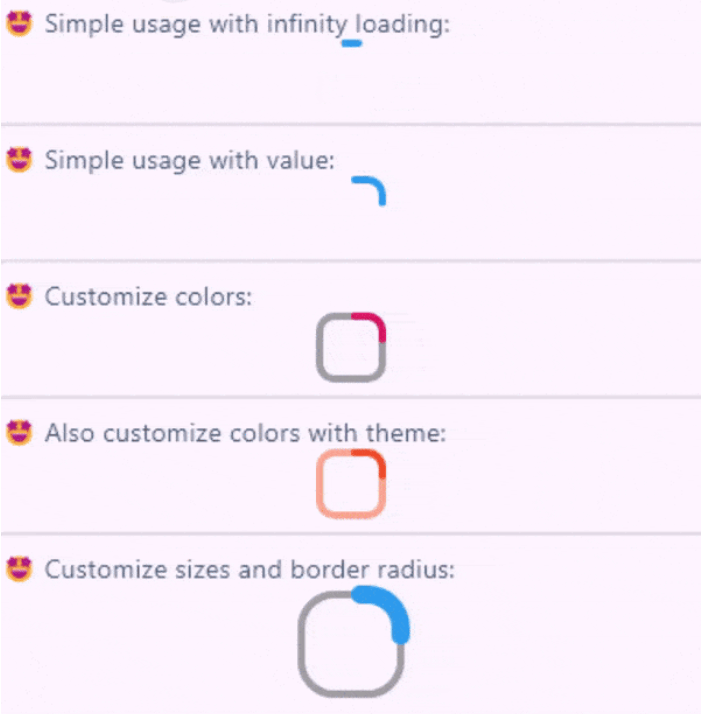
Create fully customizable square or rectangle progress indicators like native flutter CircularProgressIndicator widget!

Features

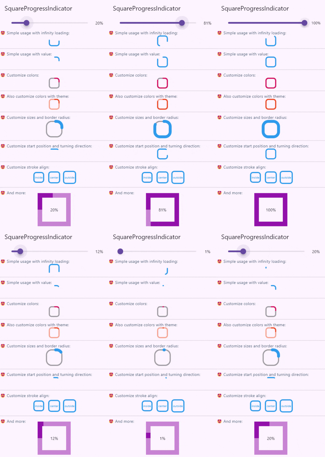
Full example of SquareProgressIndicator

Live demo

You can check the example project web export on this link: https://amir14a.github.io/square_progress_indicator/ Thanks to Github!❤️

Usage

Simple usage:

const SquareProgressIndicator(),

Customize usage:

SquareProgressIndicator(
    value: _value,
    width: 100,
    height: 100,
    borderRadius: 0,
    startPosition: StartPosition.leftCenter,
    strokeCap: StrokeCap.square,
    clockwise: true,
    color: Colors.purple,
    emptyStrokeColor: Colors.purple.withOpacity(.5),
    strokeWidth: 16,
    emptyStrokeWidth: 16,
    strokeAlign: SquareStrokeAlign.center,
    child: Text("${(_value * 100).toStringAsFixed(0)}%"),
),

Additional information

Parameter Type Default Info
value double? null The value of the progress, it should be between 0 and 1. don't pass it to use Indeterminate mode
width double 38 The width of rectangle that the progress line is drawn around it.
height double 38 The height of rectangle that the progress line is drawn around it.
borderRadius double 8 The border radius of the rectangle, it is applied to all four corners.
color Color? progressIndicatorTheme.color The color of the progress line.
emptyStrokeColor Color? progressIndicatorTheme.circularTrackColor The color of the line behind the progress line which show for reminding progress.
strokeWidth double 4 The width of the progress line.
emptyStrokeWidth double 4 The width of the line behind the progress line which show for reminding progress.
clockwise boolean true The direction of turn of progress line, if you pass false, the progress line will be reversed, default value is true.
startPosition double 0 (StartPosition.topCenter) Start position of progress line relative to the topCenter, you can pass a value from [StartPosition] class or custom double value you need.
strokeAlign SquareStrokeAlign SquareStrokeAlign.inside The stroke align of the progress line, pass a value from [SquareStrokeAlign] and read it's documents. see: https://api.flutter.dev/flutter/painting/BorderSide/strokeAlign.html
strokeCap StrokeCap? StrokeCap.round The stroke cap of the progress line and empty line, see: https://api.flutter.dev/flutter/dart-ui/StrokeCap.html
child Widget? null The child widget, it can be a text or everything you need.

Feel free to create issue or pull requests in github repository!

所属分类

源码仓库

使用此插件的项目