搜索插件、代码仓与 APP 分类

themed 封面
插件详情v8.4.0

themed

theme 包允许您使用 const 值定义主题,然后通过一些黑暗的 Dart 魔术,无论如何都可以动态地更改它们。

AndroidiOSWebmacOSWindowsLinux
近 30 天下载
2630
喜欢数
67
Pub 分数
150

安装插件

flutter pub add themed

插件介绍

基于插件公开信息、社区数据与项目使用情况整理的选型参考。

该主题包使开发者能够使用 const 值定义主题,提供了一种灵活的方式来管理跨应用的 UI 外观。尽管使用了不可变常量,它仍利用 Dart 的功能,允许在运行时动态更改主题。这使其非常适合需要在浅色和深色模式之间实现平滑过渡或自定义主题变化的应用程序,同时不会牺牲性能或类型安全性。该包轻量且可无缝集成到 Flutter 项目中。

适合场景

  • 动态主题切换
  • 深色和浅色模式支持
  • 自定义主题变体
  • 运行时主题更新
  • 跨平台的UI一致性
  • 大型应用中的主题管理

主要特点

  • 基于常量的主题定义
  • 运行时主题修改
  • 最小的样板代码
  • 跨平台兼容性
  • 类型安全的主题处理
  • 高效的重新渲染

适合对象

  • 带有主题的 Flutter 应用
  • 寻求简单主题管理的开发者
  • 支持深色模式的应用程序
  • 优先考虑性能的项目
  • 希望实现一致主题的团队
  • 针对多个平台的应用程序

使用建议

  • 仅限基本主题属性
  • 需要理解 Dart 的 const 语义
  • 无内置主题持久化
  • 不适合复杂的主题层次结构
  • 手动处理主题状态
  • 依赖外部状态管理

原始 README

以下为关联源码仓库的 README 原文快照,最新内容请访问源码仓库。

Pub popularity Pub Version GitHub stars Code Climate issues GitHub closed issues GitHub contributors GitHub repo size GitHub forks PRs Welcome Developed by Marcelo Glasberg Glasberg.dev on pub.dev Platforms

Sponsor

themed

The Themed package:

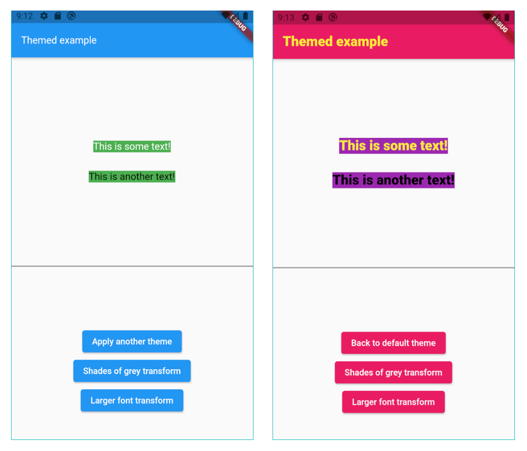
  • Lets you define a theme with const values, but change them dynamically anyway.
  • ChangeColors widget to change the brightness, saturation and hue of widgets or images.
  • Color extension methods like decolorize, addOpacity, removeOpacity, darker, lighter, average and more.
  • Static methods ColorUtil.rgbaToArgb and ColorUtil.abgrToArgb.
  • TextStyle extension methods: var myStyle = TextStyle(fontSize: 15) + Colors.blue and more.

Const values that you can change

As we all know, using const variables is the easiest way to create and use themes:

static const myColor = Colors.white;
static const myStyle = TextStyle(fontSize: 16);

Container(
  color: myColor,
  child: const Text('Hi', style: myStyle)))

However, if you do it like that you can't later change the theme dynamically. By using the Themed package you can:

static const myColor = ColorRef(Colors.white); 
static const myStyle = TextStyleRef(TextStyle(fontSize: 16)); 

Container(
   color: myColor,
   child: const Text('Hello', style: myStyle)))
   
// Later, change the theme dynamically.
Themed.currentTheme = {
   myColor: Colors.blue,
   myStyle: TextStyle(fontSize: 20);
}      

There is no need to use Theme.of(context) anymore:

// So old-fashioned. 
Container(
   color: Theme.of(context).primary,
   child: Text('Hello', style: TextStyle(color: Theme.of(context).secondary)))

Also, since Theme.of needs the context and is not constant, you can't use it in constructors. However, the Themed package has no such limitations:

// The const color is the default value of an optional parameter.
MyWidget({
    this.color = myColor,
  });

Setup

Wrap your widget tree with the Themed widget, above the MaterialApp:

@override
Widget build(BuildContext context) {
   return Themed(
      child: MaterialApp(
        ...      

Compatibility

The Themed package is a competitor to writing Theme.of(context).xxx in your build methods, but it’s NOT a competitor to Flutter’s native theme system and the Theme widget. It’s there to solve a different problem, and it’s usually used together with the Theme widget. For example, if you want to set a global default color for all buttons, you’ll use the Theme widget. You may use it together with the Themed package however, meaning that Themed colors and styles may be used inside a ThemeData widget:

static const myColor1 = ColorRef(Colors.red);
static const myColor2 = ColorRef(Colors.blue);
...

child: MaterialApp(
   theme: ThemeData(
      primaryColor: MyTheme.color2,
      elevatedButtonTheme: 
         ElevatedButtonThemeData(
            style: ElevatedButton.styleFrom(primary: MyTheme.color2),
      ),
   ),

How to define a theme map

Each theme should be a Map<ThemeRef, Object>, where the keys are your ColorRef and TextStyleRef const values, and the values are the colors and styles you want to use on that theme. For example:

Map<ThemeRef, Object> theme1 = {
  MyTheme.color1: Colors.yellow,
  MyTheme.color2: Colors.pink,
  MyTheme.color3: Colors.purple,
  MyTheme.mainStyle: const TextStyle(fontSize: 22, fontWeight: FontWeight.w900, color: MyTheme.color1),
};

At any point in your app you can just change the current theme by doing:

// Setting a theme:
Themed.currentTheme = theme1;

// Setting another theme:
Themed.currentTheme = theme2;

// Removing the current theme (and falling back to the default theme):
Themed.clearCurrentTheme();

// This would also remove the current theme:
Themed.currentTheme = null;
Resetting

Calling the static method Themed.reset() will remove the entire widget tree inside the Themed widget for one frame, and then restore it, rebuilding everything. This can be helpful when some widgets are not responding to theme changes. Usage of this method is not usually necessary. A side effect is that the all stateful widgets below Themed will be recreated, and you'll need to have mechanisms to recover their state, like for example having the state come from above Themed widget, or using a proper state management solution.

Organization

You can also organize your theme in a class:

class MyTheme {
   static const myColor = ColorRef(Colors.white); 
   static const myStyle = TextStyleRef(TextStyle(fontSize: 16, color: Colors.red)); 
}

Container(
   color: MyTheme.myColor,
   child: const Text('Hello', style: MyTheme.myStyle)))    

Color transform

Instead of changing the current theme you can create a color transformation. For example, this will turn your theme into shades of grey:

static Color shadesOfGreyTransform(Color color) {
  int average = (color.red + color.green + color.blue) ~/ 3;
  return Color.fromARGB(color.alpha, average, average, average);
}

Note you can create your own function to process colors, but shadesOfGreyTransform is already provided:

// Turn it on:
Themed.transformColor = ColorRef.shadesOfGreyTransform;

// Then, later, turn it off:
Themed.clearTransformColor();

Changing brightness, saturation and hue of widgets or images.

Use the provided ChangeColors widget to change the brightness, saturation and hue of any widget, including images. Example:

ChangeColors(
   hue: 0.55,
   brightness: 0.2,
   saturation: 0.1,
   child: Image.asset('myImage.png'),
);

To achieve a greyscale effect, you may also use the ChangeColors.greyscale constructor.

Note: This widget is based upon this code (from BananaNeil's), which is in turn based upon this code (by Richard Lalancette).

Color extension

The lighter method makes the color lighter (more white). Example:

// 20% more white.
Colors.blue.lighter(0.2); 

The darker method makes the color darker (more black). Example:

// 20% more black.
Colors.blue.darker(0.2); 

The average method makes the current color more similar to the given color. Example:

// 50% blue and 50% red.
Colors.blue.average(Colors.red); 

// 20% blue and 80% red.
Colors.blue.average(Colors.red, 0.8);

The decolorize method makes the current color more grey. Example:

// Grey, with luminance similar to the original blue.
Colors.blue.decolorize(); 

// Blue with 20% less color.
Colors.blue.decolorize(0.2);

The addOpacity method makes the current color more transparent than it already is, by the given amount. The removeOpacity method makes the current color less transparent than it already is, by the given amount. This is different from the withOpacity method, as you can see below.

// 50% transparent blue.
Colors.blue.addOpacity(0.5); 

// 80% transparent black.
Colors.transparent.removeOpacity(0.2); 

// Also 50% transparent blue.
Colors.withOpacity(0.5); 

// 75% transparent blue, because we add 50% and then more 50%.
Colors.blue.addOpacity(0.5).addOpacity(0.5);

// This is 50% transparent blue, because the opacity is replaced, not added.
Colors.withOpacity(0.5).withOpacity(0.5);

There are also two static methods for advanced color representation conversion: The ColorUtil.rgbaToArgb method converts the RGBA color representation to ARGB. The ColorUtil.abgrToArgb method converts the ABGR color representation to ARGB.

TextStyle transform

You can also create a style transformation. For example, this will make your fonts larger:

static TextStyle largerText(TextStyle textStyle) =>
      textStyle.copyWith(fontSize: textStyle.fontSize! * 1.5);

// Turn it on:
Themed.transformTextStyle = largerText;

// Then, later, turn it off:
Themed.clearTransformTextStyle();

TextStyle extension

With the provided extension, you can make your code more clean-code by creating new text styles by adding colors and other values to a TextStyle. For example:

const myStyle = TextStyle(...);

// Using some style:
Text('Hello', style: myStyle);

// Making text black:
Text('Hello', style: myStyle + Colors.black);

// Changing some other stuff:
Text('Hello', style: myStyle + FontWeight.w900 + FontSize(20.0) + TextHeight(1.2));

Beware not to define the same constant

Please remember Dart constants point to the same memory space. In this example, colorA, colorB and colorC represent the same variable:

class MyTheme {
  static const colorA = ColorRef(Colors.white);
  static const colorB = ColorRef(Colors.white);
  static const colorC = colorA;    
}

If you later change the color of colorA, you are also automatically changing the color of colorB and colorB.

If you want to create 3 independent colors, and be able to change them independently, you have to create different constants. You can provide an id string, just to differentiate them. For example:

class MyTheme {
  static const colorA = ColorRef(Colors.white, id:'A');
  static const colorB = ColorRef(Colors.white, id:'B');
  static const colorB = ColorRef(colorA, id:'C');
}

Avoid circular dependencies

The following will lead to a StackOverflowError error:

Map<ThemeRef, Object> anotherTheme = {
   MyTheme.color1: MyTheme.color2,
   MyTheme.color2: MyTheme.color1,
};

You can have references which depend on other references, no problem. But both direct and indirect circular references must be avoided.

Other ways to use it

If you want, you may also define a default theme, and a current theme for your app:

@override
Widget build(BuildContext context) {
   return Themed(
      defaultTheme: { ... },
      currentTheme: { ... },
      child: MaterialApp(
        ...      

The defaultTheme and currentTheme are both optional. They are simply theme maps, as explained below.

When a color/style is used, it will first search it inside the currentTheme.

If it's not found there, it searches inside of defaultTheme.

If it's still not found there, it uses the default color/style which was defined in the constructor. For example, here the default color is white: ColorRef(Colors.white).

Please note: If you define all your colors in the defaultTheme, then you don't need to provide default values in the constructor. You can then use the fromId constructor:

class MyTheme {
  static const color1 = ColorRef.fromId('c1');
  static const color2 = ColorRef.fromId('c2');
  static const color3 = ColorRef.fromId('c3');
  static const mainStyle = TextStyleRef.fromId('mainStyle');  
}

Saving and setting Themes by key

You can save themes with keys, and then later use the keys to set the theme. The keys can be anything (Strings, enums etc.):

// Save some themes using keys.
enum Keys {light, dark};
Themed.save(key: Keys.light, theme: { ... })
Themed.save(key: Keys.dark, theme: { ... })

// Then set the theme.
Themed.setThemeByKey(Keys.light);

It also works the other way around: If you use the key first, and only save a theme with that key later:

// Set the theme with a key, even before saving the theme.
Themed.setThemeByKey(Keys.light);

// The theme will change as soon as you save a theme with that key.
Themed.save(key: Keys.light, theme: { ... })

Note: You can also use the methods saveAll to save many themes by key at the same time, and clearSavedThemeByKey to remove saved themes.

Important: When I say "save" above, I mean it's saved in memory, not in the device disk.


Copyright

This package is copyrighted and brought to you by Parkside Technologies, a company which is simplifying global access to US stocks.

This package is published here with permission.

Please, see the license page for more information.


By Marcelo Glasberg

glasberg.dev
github.com/marcglasberg
linkedin.com/in/marcglasberg/
twitter.com/glasbergmarcelo
stackoverflow.com/users/3411681/marcg
medium.com/@marcglasberg

My article in the official Flutter documentation:

The Flutter packages I've authored:

My Medium Articles:

所属分类

源码仓库

使用此插件的项目

暂无相关数据。