Flutter Timeline Widget


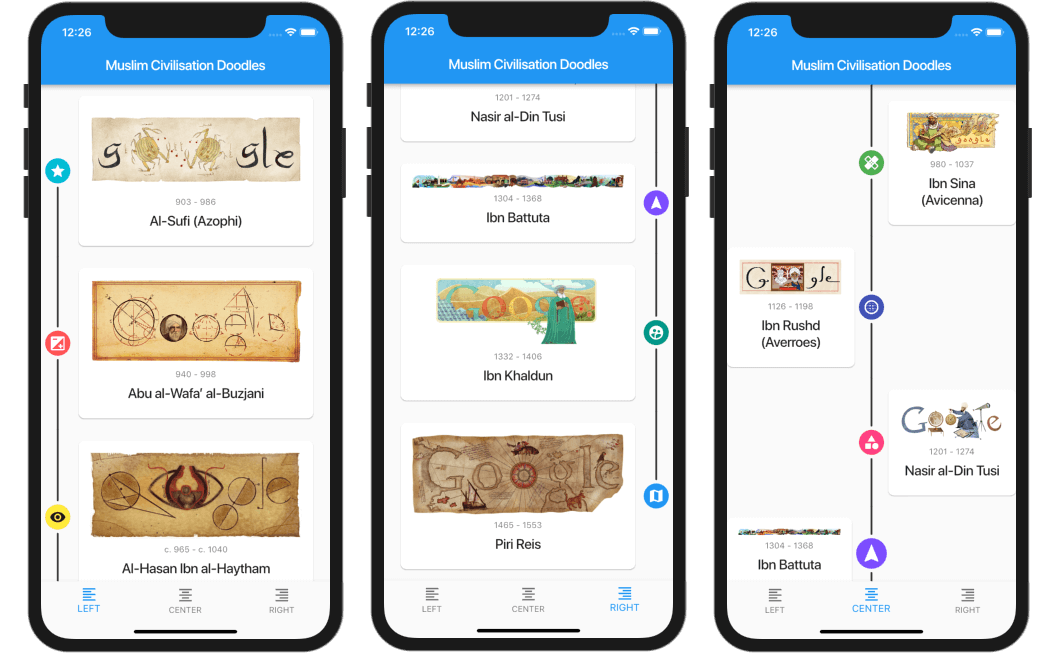
A highly customizable Flutter widget for displaying vertical timelines with custom markers, icons, and flexible positioning options.

[!WARNING]
🦚 The documentation was created using LLMs. If you notice any errors or typos, please submit a Pull Request or create an issue.
Features
- 🎯 Three timeline positions:
start (left), center, or end (right)
- 🎨 Fully customizable markers with any widget as content or icon
- 📍 Flexible icon alignment:
top, center, or bottom of markers
- 🎯 Individual marker positioning for centered timelines
- 🔄 Support for reversed timeline order
- 📱 Custom scroll physics and controller support
Installation
Add this to your package's pubspec.yaml file:
dependencies:
  timeline_list: ^0.1.0
Usage
Simple Timeline

import 'package:timeline_list/timeline_list.dart';

Timeline(
  children: [
    Marker(child: Text("Step 1")),
    Marker(child: Text("Step 2")),
    Marker(child: Text("Step 3"))
  ],
)
Onboarding Example
Here's a more advanced example showing an onboarding timeline with custom icons:

var checkIcon = Container(
    width: 16,
    height: 16,
    decoration: BoxDecoration(shape: BoxShape.circle, color: Colors.green),
    child: Icon(Icons.check, color: Colors.white, size: 12));
var emptyIcon = Container(
    width: 16,
    height: 16,
    decoration: BoxDecoration(shape: BoxShape.circle, color: Colors.grey));
return Scaffold(
    appBar: AppBar(title: const Text("Onboarding example")),
    body: Column(children: [
      Timeline.builder(
        context: context,
        markerCount: 10,
        properties: TimelineProperties(
            iconAlignment: MarkerIconAlignment.center,
            iconSize: 16,
            timelinePosition: TimelinePosition.start),
        markerBuilder: (context, index) => Marker(
          child: Padding(
            padding: const EdgeInsets.all(8.0),
            child: Text("Step ${index + 1}"),
          ),
          icon: index >= 8 ? emptyIcon : checkIcon,
          position: MarkerPosition.left,
        ),
      ),
    ]));
Customization
Timeline Properties
timelinePosition: Controls the overall timeline position (start, center, end)iconAlignment: Sets icon alignment relative to marker contenticonSize: Defines the size of marker iconslineWidth: Sets the width of connecting lineslineColor: Customizes the color of connecting linesitemGap: Controls spacing between markersiconGap: Sets gap between icon and marker content
Marker Properties
child: The main content widget of the markericon: Optional custom icon widgetposition: Marker position for centered timelines (left, right)onTap: Optional callback for marker tap eventsmaxWidth: Maximum width constraint for marker content
Examples
Check out the example/ folder for complete sample applications, including:
- Fully featured timeline with custom icons and widgets
- Simple onboarding flow
Contributing
This repo is looking for maintainers. Contributions are welcome! Please feel free to submit a Pull Request.
Thank you for all the contributors!
Sponsored by: