Toggle Switch
A simple toggle switch widget. It can be fully customized with desired icons, width, colors, text, corner radius, animation etc. It also maintains selection state.
Getting Started
In the pubspec.yaml of your flutter project, add the following dependency:
dependencies:
  ...
  toggle_switch: ^2.3.0
Import it:
import 'package:toggle_switch/toggle_switch.dart' ;
Usage Examples
Basic toggle switch
ToggleSwitch (
initialLabelIndex: 0 ,
totalSwitches: 3 ,
labels: ['America' , 'Canada' , 'Mexico' ],
onToggle: (index) {
print ('switched to: $index ' );
},
),
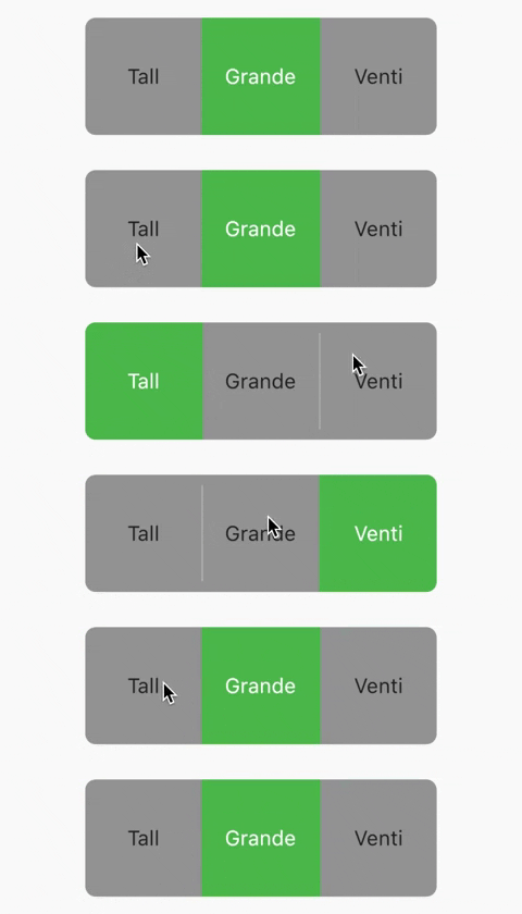
Basic toggle switch with custom height and font size
ToggleSwitch (
minWidth: 90.0 ,
minHeight: 90.0 ,
fontSize: 16.0 ,
initialLabelIndex: 1 ,
activeBgColor: [Colors .green],
activeFgColor: Colors .white,
inactiveBgColor: Colors .grey,
inactiveFgColor: Colors .grey[900 ],
totalSwitches: 3 ,
labels: ['Tall' , 'Grande' , 'Venti' ],
onToggle: (index) {
print ('switched to: $index ' );
},
),
With text or icon and custom widths
ToggleSwitch (
customWidths: [90.0 , 50.0 ],
cornerRadius: 20.0 ,
activeBgColors: [[Colors .cyan], [Colors .redAccent]],
activeFgColor: Colors .white,
inactiveBgColor: Colors .grey,
inactiveFgColor: Colors .white,
totalSwitches: 2 ,
labels: ['YES' , '' ],
icons: [null , FontAwesomeIcons .times],
onToggle: (index) {
print ('switched to: $index ' );
},
),
With icons, text and different active background colors
ToggleSwitch (
minWidth: 90.0 ,
initialLabelIndex: 1 ,
cornerRadius: 20.0 ,
activeFgColor: Colors .white,
inactiveBgColor: Colors .grey,
inactiveFgColor: Colors .white,
totalSwitches: 2 ,
labels: ['Male' , 'Female' ],
icons: [FontAwesomeIcons .mars, FontAwesomeIcons .venus],
activeBgColors: [[Colors .blue],[Colors .pink]],
onToggle: (index) {
print ('switched to: $index ' );
},
),
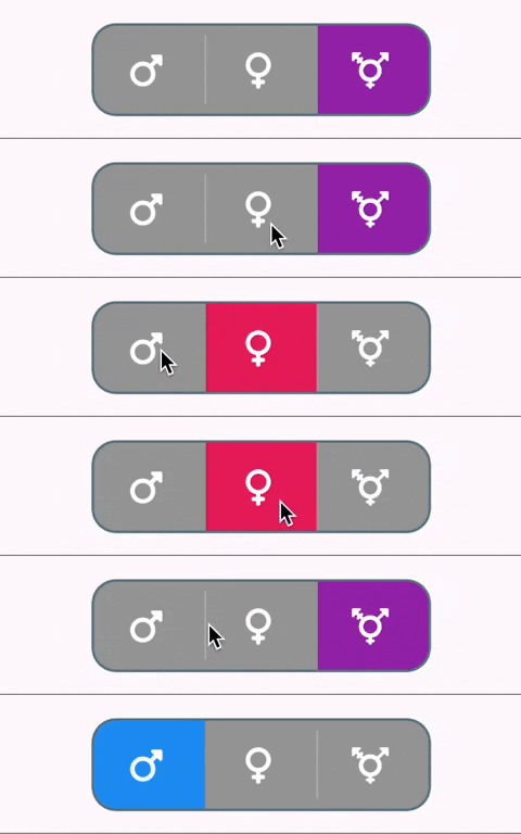
With border color, border width, icons, custom height and different active background colors
ToggleSwitch (
minWidth: 90.0 ,
minHeight: 70.0 ,
initialLabelIndex: 2 ,
cornerRadius: 20.0 ,
activeFgColor: Colors .white,
inactiveBgColor: Colors .grey,
inactiveFgColor: Colors .white,
totalSwitches: 3 ,
icons: [
FontAwesomeIcons .mars,
FontAwesomeIcons .venus,
FontAwesomeIcons .transgender
],
iconSize: 30.0 ,
borderWidth: 2.0 ,
borderColor: [Colors .blueGrey],
activeBgColors: [[Colors .blue], [Colors .pink], [Colors .purple]],
onToggle: (index) {
print ('switched to: $index ' );
},
),
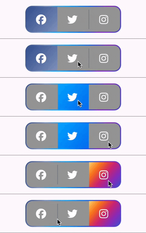
With gradient border color, divider color and gradient active background colors
ToggleSwitch (
minWidth: 90.0 ,
minHeight: 70.0 ,
initialLabelIndex: 0 ,
cornerRadius: 20.0 ,
activeFgColor: Colors .white,
inactiveBgColor: Colors .grey,
inactiveFgColor: Colors .white,
totalSwitches: 3 ,
icons: [
FontAwesomeIcons .facebook,
FontAwesomeIcons .twitter,
FontAwesomeIcons .instagram
],
iconSize: 30.0 ,
borderColor: [Color (0xff3b5998 ), Color (0xff8b9dc3 ), Color (0xff00aeff ), Color (0xff0077f2 ), Color (0xff962fbf ), Color (0xff4f5bd5 )],
dividerColor: Colors .blueGrey,
activeBgColors: [[Color (0xff3b5998 ), Color (0xff8b9dc3 )], [Color (0xff00aeff ), Color (0xff0077f2 )], [Color (0xfffeda75 ), Color (0xfffa7e1e ), Color (0xffd62976 ), Color (0xff962fbf ), Color (0xff4f5bd5 )]],
onToggle: (index) {
print ('switched to: $index ' );
},
),
With bounceInOut animation
ToggleSwitch (
minWidth: 90.0 ,
minHeight: 70.0 ,
initialLabelIndex: 0 ,
cornerRadius: 20.0 ,
activeFgColor: Colors .white,
inactiveBgColor: Colors .grey,
inactiveFgColor: Colors .white,
totalSwitches: 2 ,
icons: [
FontAwesomeIcons .lightbulb,
FontAwesomeIcons .solidLightbulb,
],
iconSize: 30.0 ,
activeBgColors: [[Colors .black45, Colors .black26], [Colors .yellow, Colors .orange]],
animate: true ,
curve: Curves .bounceInOut,
onToggle: (index) {
print ('switched to: $index ' );
},
),
With radius style
ToggleSwitch (
minWidth: 90.0 ,
cornerRadius: 20.0 ,
activeBgColors: [[Colors .green[800 ]!], [Colors .red[800 ]!]],
activeFgColor: Colors .white,
inactiveBgColor: Colors .grey,
inactiveFgColor: Colors .white,
initialLabelIndex: 1 ,
totalSwitches: 2 ,
labels: ['True' , 'False' ],
radiusStyle: true ,
onToggle: (index) {
print ('switched to: $index ' );
},
),
With custom text styles, null initial label, double tap to de-activate
ToggleSwitch (
minWidth: 90.0 ,
cornerRadius: 20.0 ,
inactiveFgColor: Colors .white,
initialLabelIndex: null ,
doubleTapDisable: true ,
totalSwitches: 3 ,
labels: ['Normal' , 'Bold' , 'Italic' ],
customTextStyles: [
null ,
TextStyle (
color: Colors .brown,
fontSize: 18.0 ,
fontWeight: FontWeight .w900),
TextStyle (
color: Colors .black,
fontSize: 16.0 ,
fontStyle: FontStyle .italic)
],
onToggle: (index) {
print ('switched to: $index ' );
},
),
With custom icons
ToggleSwitch (
minWidth: 90.0 ,
minHeight: 90.0 ,
cornerRadius: 20.0 ,
activeBgColors: [
[Color (0xfffdbb0a )],
[Colors .black54],
[Colors .white54]
],
inactiveFgColor: Colors .white,
initialLabelIndex: 2 ,
totalSwitches: 3 ,
customIcons: [
Icon (
FontAwesomeIcons .ccVisa,
color: Color (0xff1a1f71 ),
size: 55.0 ,
),
Icon (
FontAwesomeIcons .ccMastercard,
color: Color (0xffF79E1B ),
size: 55.0 ,
),
Icon (
FontAwesomeIcons .ccAmex,
color: Color (0xff27AEE3 ),
size: 55.0 ,
)
],
onToggle: (index) {
print ('switched to: $index ' );
},
),
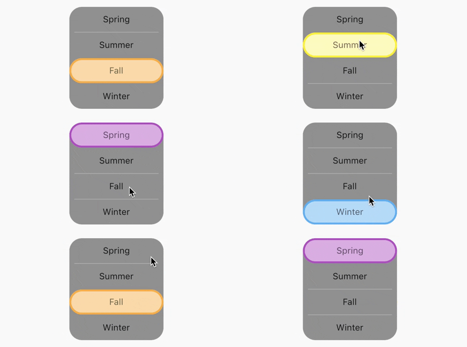
Vertical toggle switch with active border
ToggleSwitch (
activeBorders: [
Border .all (
color: Colors .purple,
width: 3.0 ,
),
Border .all (
color: Colors .yellow.shade700,
width: 3.0 ,
),
Border .all (
color: Colors .deepOrangeAccent,
width: 3.0 ,
),
Border .all (
color: Colors .blue.shade500,
width: 3.0 ,
),
],
activeFgColor: Colors .black54,
isVertical: true ,
minWidth: 150.0 ,
radiusStyle: true ,
cornerRadius: 20.0 ,
initialLabelIndex: 2 ,
activeBgColors: [
[Colors .purpleAccent],
[Colors .yellow],
[Colors .orange],
[Colors .lightBlueAccent]
],
labels: ['Spring' , 'Summer' , 'Fall' , 'Winter' ],
onToggle: (index) {
print ('switched to: $index ' );
},
),
Custom widths greater than device width
SingleChildScrollView (
scrollDirection: Axis .horizontal,
child: Scrollbar (
child: Padding (
padding: const EdgeInsets .symmetric (horizontal: 10.0 ),
child: ToggleSwitch (
customWidths: [300.0 , 100.0 , 100.0 ],
cornerRadius: 20.0 ,
activeBgColors: [
[Colors .green],
[Colors .redAccent],
[Colors .blue]
],
activeFgColor: Colors .white,
inactiveBgColor: Colors .grey,
inactiveFgColor: Colors .white,
labels: ['Yes, the statement above is true' , 'False' , 'Other' ],
onToggle: (index) {
print ('switched to: $index ' );
},
),
),
),
),
Multi-line text with custom text style inheriting activeFgColor and inactiveFgColor
ToggleSwitch (
initialLabelIndex: 0 ,
minHeight: 100.0 ,
minWidth: 100.0 ,
activeBgColor: [Colors .blueAccent.shade200],
activeFgColor: Colors .yellow,
customTextStyles: [
TextStyle (
fontSize: 15.0
)
],
multiLineText: true ,
centerText: true ,
totalSwitches: 2 ,
labels: ['This is multi-line text.' , 'One line' ],
onToggle: (index) {
print ('switched to: $index ' );
},
),
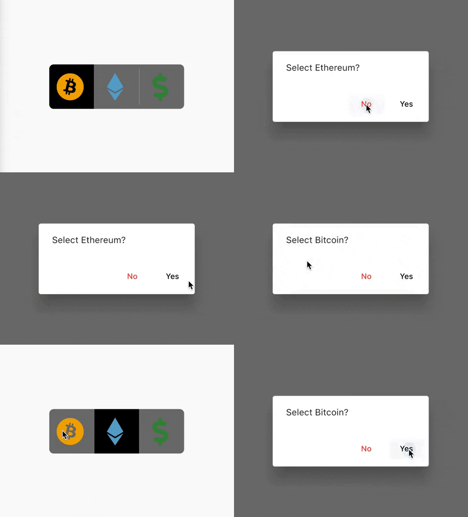
Cancel toggle
ToggleSwitch (
initialLabelIndex: 0 ,
inactiveBgColor: Colors .black54,
activeBgColor: [Colors .black],
totalSwitches: 3 ,
minHeight: 80.0 ,
minWidth: 80.0 ,
customIcons: [
Icon (
FontAwesomeIcons .bitcoin,
color: Color (0xFFF2A900 ),
size: 50.0 ,
),
Icon (
FontAwesomeIcons .ethereum,
color: Color (0xFF5ca6ce ),
size: 50.0 ,
),
Icon (
FontAwesomeIcons .dollarSign,
color: Colors .green.shade700,
size: 50.0 ,
)
],
onToggle: (index) {
print ('switched to: $index ' );
},
cancelToggle: (index) async {
String selection = index == 0
? 'Bitcoin'
: index == 1
? 'Ethereum'
: 'Fiat' ;
return await showDialog (
context: context,
builder: (dialogContext) => AlertDialog (
content: Text ("Select $selection ?" ),
actions: [
TextButton (
child: Text ("No" ,
style: TextStyle (color: Colors .red)),
onPressed: () {
Navigator .pop (dialogContext, true );
}),
TextButton (
child: Text ("Yes" ,
style: TextStyle (color: Colors .black)),
onPressed: () {
Navigator .pop (dialogContext, false );
})
],
),
);
},
),
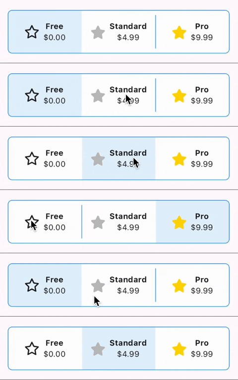
Custom widgets
ToggleSwitch (
initialLabelIndex: 0 ,
minHeight: 75.0 ,
minWidth: double .maxFinite,
activeBgColor: [Colors .blue.shade50],
inactiveBgColor: Colors .white,
dividerColor: Colors .blue,
borderColor: [Colors .blue],
borderWidth: 1.0 ,
customWidgets: [
Row (
mainAxisAlignment: MainAxisAlignment .center,
children: [
Icon (
FontAwesomeIcons .star,
),
const SizedBox (width: 10.0 ),
Column (
mainAxisAlignment: MainAxisAlignment .center,
children: [
Text (
'Free' ,
style: TextStyle (
fontWeight: FontWeight .bold,
),
maxLines: 1 ,
overflow: TextOverflow .ellipsis,
),
Text (
'\$0.00' ,
maxLines: 1 ,
overflow: TextOverflow .ellipsis,
),
],
),
],
),
Row (
mainAxisAlignment: MainAxisAlignment .center,
children: [
Icon (
FontAwesomeIcons .solidStar,
color: Color (0xffC0C0C0 ),
),
const SizedBox (width: 10.0 ),
Column (
mainAxisAlignment: MainAxisAlignment .center,
children: [
Text (
'Standard' ,
style: TextStyle (
fontWeight: FontWeight .bold,
),
maxLines: 1 ,
overflow: TextOverflow .ellipsis,
),
Text (
'\$4.99' ,
maxLines: 1 ,
overflow: TextOverflow .ellipsis,
),
],
),
],
),
Row (
mainAxisAlignment: MainAxisAlignment .center,
children: [
Icon (
FontAwesomeIcons .solidStar,
color: Color (0xffFFD700 ),
),
const SizedBox (width: 10.0 ),
Column (
mainAxisAlignment: MainAxisAlignment .center,
children: [
Text (
'Pro' ,
style: TextStyle (
fontWeight: FontWeight .bold,
),
maxLines: 1 ,
overflow: TextOverflow .ellipsis,
),
Text (
'\$9.99' ,
maxLines: 1 ,
overflow: TextOverflow .ellipsis,
),
],
),
],
),
],
onToggle: (index) {
print ('switched to: $index ' );
},
),
TextDirection.rtl and corner radius
Directionality (
textDirection: TextDirection .rtl,
child: ToggleSwitch (
initialLabelIndex: 0 ,
cornerRadius: 12.0 ,
textDirectionRTL: true ,
activeFgColor: Colors .white,
totalSwitches: 2 ,
labels: ['left' , 'right' ],
onToggle: (index) {
print ('switched to: $index ' );
},
),
),
setState() inside onToggle
Example code with explanation
Code Contributors