搜索插件、代码仓与 APP 分类

custom_image_crop 封面
插件详情v0.1.1

custom_image_crop

一个可自定义的图像裁剪器。您可以通过手势或控制器进行旋转、缩放和移动。

AndroidiOSWebmacOSWindowsLinux
近 30 天下载
1.2万
喜欢数
89
Pub 分数
150

安装插件

flutter pub add custom_image_crop

插件介绍

基于插件公开信息、社区数据与项目使用情况整理的选型参考。

一个高度可定制的 Flutter 图像裁剪工具,支持用户通过直观的手势或控制器旋转、缩放和移动图像。专为跨多个平台的无缝集成而设计,提供对裁剪体验的精细控制。适用于需要高级图像处理功能且具有响应式和交互式界面的应用程序。该包支持 Android、iOS、Web、macOS、Windows 和 Linux,确保广泛的兼容性。

适合场景

  • 在照片应用中自定义图像编辑
  • 用户个人资料图片裁剪
  • 交互式图像选择工具
  • 设计应用程序中的动态图像调整大小
  • 机器学习工作流中的图像预处理

主要特点

  • 基于手势的旋转、缩放和平移
  • 控制器驱动的图像操作
  • 跨平台支持
  • 高度可定制的 UI 组件
  • 裁剪时的实时预览
  • 适用于所有屏幕尺寸的响应式设计

适合对象

  • 开发图像编辑功能的开发者
  • 需要精确图像裁剪的应用程序
  • 跨平台图像编辑工具
  • 带有图像处理的交互式用户界面
  • 原型设计高级图像编辑工作流程

使用建议

  • 需要仔细处理大图像以避免性能问题
  • 可能需要额外的状态管理来处理复杂用例
  • 初始设置需要了解手势检测器和控制器
  • 未针对无需下采样的高分辨率图像进行优化
  • 内置预设有限;需要自定义特定的作物比例

原始 README

以下为关联源码仓库的 README 原文快照,最新内容请访问源码仓库。

custom_image_crop

An Image cropper that is customizable

pub package Build Status Coverage Status MIT license

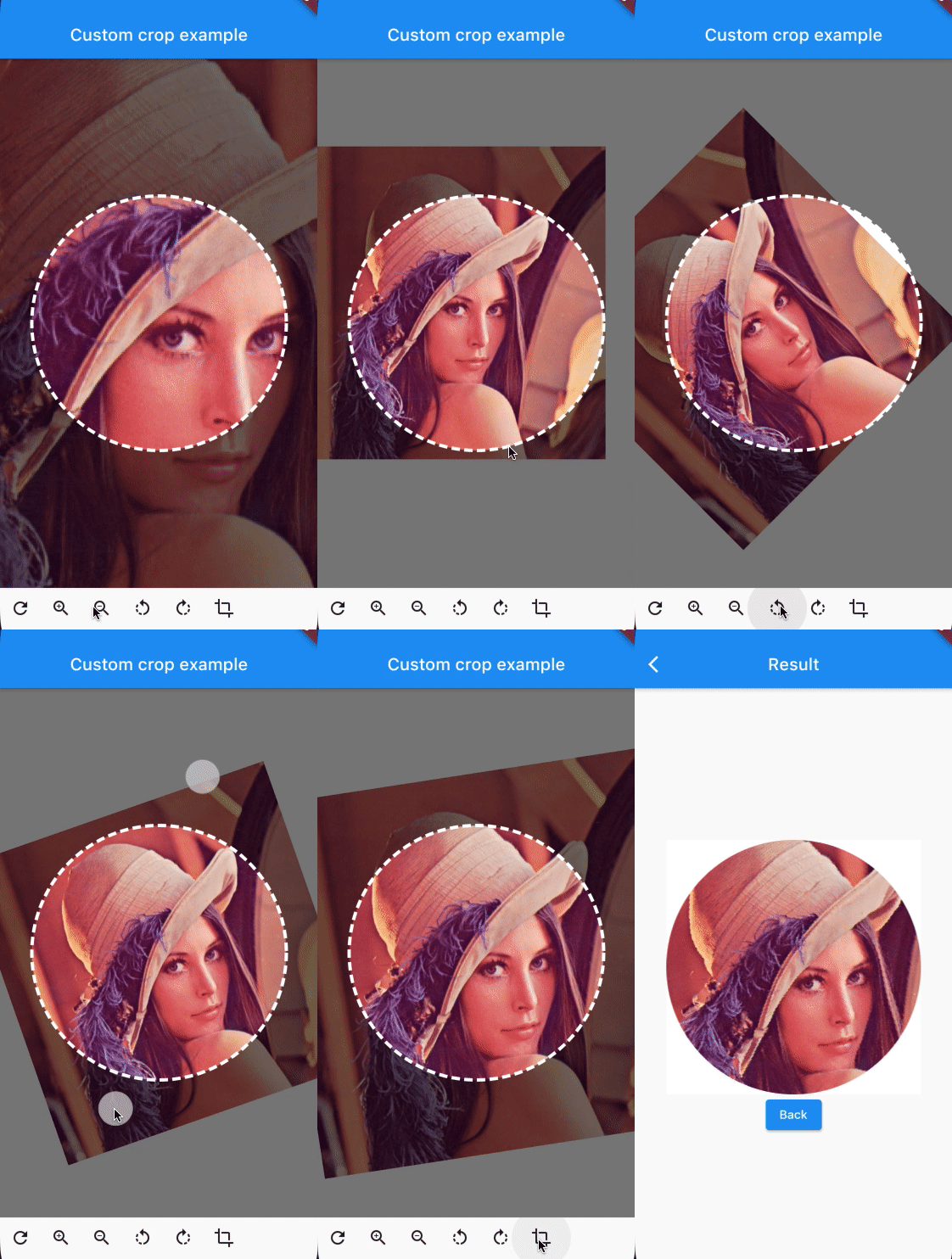
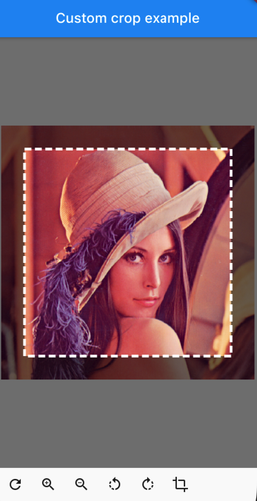
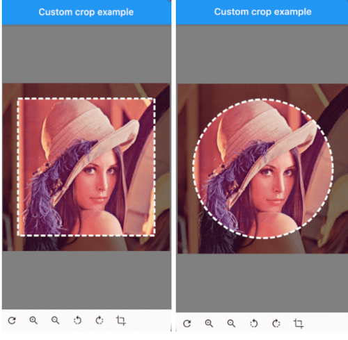
customcropcircle customcropsquare customcropcircle

CustomImageCrop

CustomImageCrop(
  cropController: controller,
  image: const AssetImage('assets/test.png'),
),

You can provide the image using any Imageprovider.

Parameters

required image

The image that needs to be cropped

cropController

The controller used to adjust the image and crop it.

overlayColor

The color above the image that will be cropped

backgroundColor

The color behind the image. This color will also be used when there are gaps/empty space after the cropping

shape

The shape of the cropping path.

maskShape

The shape of the UI masking.

cropPercentage

How big the crop should be in regards to the width and height available to the cropping widget.

drawPath

How the border of the crop should be painted. default DottedCropPathPainter.drawPath and SolidCropPathPainter.drawPath are provided, but you can create/provide any CustomPaint.

pathPaint

Custom painting for the crop area border style.

canRotate

Whether to allow the image to be rotated.

customProgressIndicator

Custom widget for progress indicator.

ratio

Ratio of the cropping area. If shape`` is set to CustomCropShape.Ratio, this property is required. For example, to create a square crop area, use [Ratio(width: 1, height: 1). To create a rectangular crop area with a 16:9 aspect ratio, use [Ratio(width: 16, height: 9)`.

borderRadius

The radius for rounded corners of the cropping area.

forceInsideCropArea

Whether image area must cover clip path.

Controller Methods

addTransition

void addTransition(CropImageData transition)

Add the position, angle and scale to the current state. This can be used to adjust the image with sliders, buttons, etc.

setData

void setData(CropImageData data)

Set the position, angle and scale to the specified values. This can be used to center the image by pressing a button for example.

reset

void reset()

Reset the image to its default state

onCropImage

Future<MemoryImage> onCropImage()

Crops the image in its current state, this will return a MemoryImage that contains the cropped image

Example

See example/lib

class MyHomePage extends StatefulWidget {
  final String title;

  MyHomePage({
    required this.title,
    Key? key,
  }) : super(key: key);

  @override
  _MyHomePageState createState() => _MyHomePageState();
}

class _MyHomePageState extends State<MyHomePage> {
  late CustomImageCropController controller;

  @override
  void initState() {
    super.initState();
    controller = CustomImageCropController();
  }

  @override
  void dispose() {
    controller.dispose();
    super.dispose();
  }

  @override
  Widget build(BuildContext context) {
    return Scaffold(
      appBar: AppBar(
        title: Text(widget.title),
        brightness: Brightness.dark,
      ),
      body: Column(
        children: [
          Expanded(
            child: CustomImageCrop(
              cropController: controller,
              image: const AssetImage('assets/test.png'), // Any Imageprovider will work, try with a NetworkImage for example...
            ),
          ),
          Row(
            children: [
              IconButton(icon: const Icon(Icons.refresh), onPressed: controller.reset),
              IconButton(icon: const Icon(Icons.zoom_in), onPressed: () => controller.addTransition(CropImageData(scale: 1.33))),
              IconButton(icon: const Icon(Icons.zoom_out), onPressed: () => controller.addTransition(CropImageData(scale: 0.75))),
              IconButton(icon: const Icon(Icons.rotate_left), onPressed: () => controller.addTransition(CropImageData(angle: -pi / 4))),
              IconButton(icon: const Icon(Icons.rotate_right), onPressed: () => controller.addTransition(CropImageData(angle: pi / 4))),
              IconButton(
                icon: const Icon(Icons.crop),
                onPressed: () async {
                  final image = await controller.onCropImage();
                  if (image != null) {
                    Navigator.of(context).push(MaterialPageRoute(builder: (BuildContext context) => ResultScreen(image: image)));
                  }
                },
              ),
            ],
          ),
          SizedBox(height: MediaQuery.of(context).padding.bottom),
        ],
      ),
    );
  }
}

所属分类

依赖

依赖清单 2 项

源码仓库

使用此插件的项目

暂无相关数据。