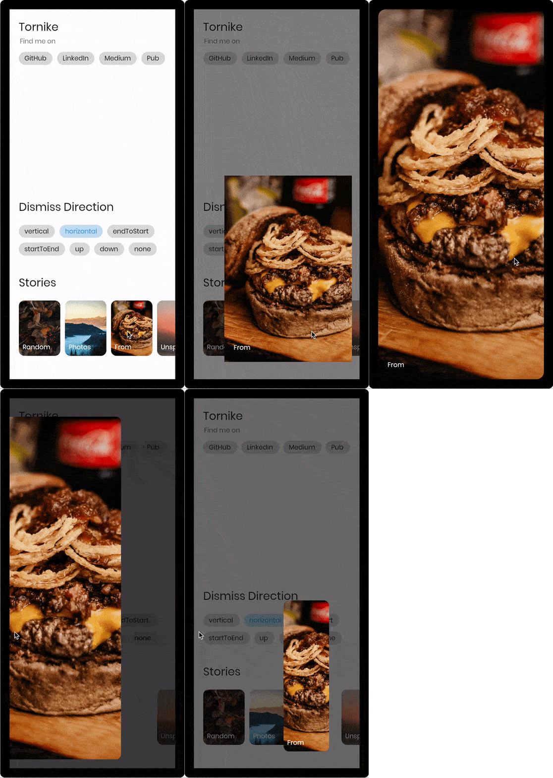
const imageUrl =
'https://user-images.githubusercontent.com/26390946/155666045-aa93bf48-f8e7-407c-bb19-bc247d9e12bd.png';
classFirstPageextendsStatelessWidget{
@overrideWidgetbuild(BuildContext context) {
returnScaffold(
backgroundColor: Color.fromRGBO(228, 217, 236, 1),
body: GestureDetector(
onTap: () {
// Use extension method to use [TransparentRoute]// This will push page without route background
context.pushTransparentRoute(SecondPage());
},
child: Center(
child: SizedBox(
width: 200,
// Hero widget is needed to animate page transition
child: Hero(
tag: 'Unique tag',
child: Image.network(
imageUrl,
fit: BoxFit.cover,
),
),
),
),
),
);
}
}
classSecondPageextendsStatelessWidget{
@overrideWidgetbuild(BuildContext context) {
returnDismissiblePage(
onDismissed: () {
Navigator.of(context).pop();
},
// Note that scrollable widget inside DismissiblePage might limit the functionality// If scroll direction matches DismissiblePage direction
direction: DismissiblePageDismissDirection.multi,
isFullScreen: false,
child: Hero(
tag: 'Unique tag',
child: Image.network(
imageUrl,
fit: BoxFit.cover,
),
),
);
}
}
Properties
constDismissiblePage({
requiredthis.child,
requiredthis.onDismissed,
this.onDragStart,
this.onDragEnd,
this.onDragUpdate,
this.isFullScreen = true,
this.disabled = false,
this.backgroundColor = Colors.black,
this.direction = DismissiblePageDismissDirection.vertical,
this.dismissThresholds = const <DismissiblePageDismissDirection, double>{},
this.dragStartBehavior = DragStartBehavior.down,
this.dragSensitivity = 0.7,
this.minRadius = 7,
this.minScale = .85,
this.maxRadius = 30,
this.maxTransformValue = .4,
this.startingOpacity = 1,
this.hitTestBehavior = HitTestBehavior.opaque,
this.reverseDuration = constDuration(milliseconds: 200),
Key? key,
}) : super(key: key);
/// Called when the widget has been dismissed.finalVoidCallback onDismissed;
/// Called when the user starts dragging the widget.finalVoidCallback? onDragStart;
/// Called when the user ends dragging the widget.finalVoidCallback? onDragEnd;
/// Called when the widget has been dragged. (0.0 - 1.0)finalValueChanged<DismissiblePageDragUpdateDetails>? onDragUpdate;
/// If true widget will ignore device padding/// [MediaQuery.of(context).padding]finalbool isFullScreen;
/// The minimum amount of scale widget can have while dragging/// Note that scale decreases as user dragsfinaldouble minScale;
/// The minimum amount fo border radius widget can havefinaldouble minRadius;
/// The maximum amount of border radius widget can have while dragging/// Note that radius increases as user dragsfinaldouble maxRadius;
/// The amount of distance widget is able to drag. value (0.0 - 1.0)finaldouble maxTransformValue;
/// If true the widget will ignore gesturesfinalbool disabled;
/// Widget that should be dismissedfinalWidget child;
/// Background color of [DismissiblePage]finalColor backgroundColor;
/// The amount of opacity [backgroundColor] will have when start dragging the widget.finaldouble startingOpacity;
/// The direction in which the widget can be dismissed.finalDismissiblePageDismissDirection direction;
/// The offset threshold the item has to be dragged in order to be considered/// dismissed. default is [_kDismissThreshold], value (0.0 - 1.0)finalMap<DismissiblePageDismissDirection, double> dismissThresholds;
/// Represents how much responsive dragging the widget will be/// Doesn't work on [DismissiblePageDismissDirection.multi]finaldouble dragSensitivity;
/// Determines the way that drag start behavior is handled.finalDragStartBehavior dragStartBehavior;
/// The amount of time the widget will spend returning to initial position if widget is not dismissed after dragfinalDuration reverseDuration;
/// How to behave during hit tests.////// This defaults to [HitTestBehavior.opaque].finalHitTestBehavior hitTestBehavior;