搜索插件、代码仓与 APP 分类

dotted_decoration 封面
插件详情v3.0.0

dotted_decoration

虚线装饰是一个方便的包,用于绘制虚线分隔线、矩形、圆形或圆角矩形的虚线边框。

AndroidiOSWebmacOSWindowsLinux
近 30 天下载
10.5万
喜欢数
156
Pub 分数
150

安装插件

flutter pub add dotted_decoration

插件介绍

基于插件公开信息、社区数据与项目使用情况整理的选型参考。

dotted_decoration 包为 Flutter 应用程序提供了一种简单且灵活的方式来创建虚线和边框。它允许开发者绘制虚线分隔符,以及在矩形、圆形或圆角矩形周围绘制边框,支持自定义点的大小、间距和颜色。非常适合用于分隔线、轮廓或装饰性点缀等 UI 元素,无需复杂的自定义绘图即可增强视觉设计。该包轻量级,并兼容所有主要平台,包括 Android、iOS、Web、macOS、Windows 和 Linux。

适合场景

  • 在列表中创建虚线分隔符
  • 向卡片或容器添加虚线边框
  • 设计圆形或圆点轮廓
  • 增强表单字段样式
  • 构建自定义 UI 分隔符
  • 添加装饰性线条图案

主要特点

  • 易于使用的虚线装饰类
  • 支持矩形、圆形和圆角矩形
  • 可自定义的点大小和间距
  • 可配置的颜色和笔画宽度
  • 跨平台兼容性
  • 轻量且依赖极少

适合对象

  • 寻求装饰性元素的UI设计师
  • 开发表单或列表的开发者
  • 需要视觉区分或强调的应用
  • 具有统一设计系统的项目
  • Flutter 初学者探索自定义装饰

使用建议

  • 仅限基本的点状图案
  • 不支持虚线或自定义描边样式
  • 可能需要手动对齐以实现精确布局
  • 不适合高性能动画
  • 最适合静态或低频渲染

原始 README

以下为关联源码仓库的 README 原文快照,最新内容请访问源码仓库。

dotted_decoration

Dotted line decoration is custom decoration as simple as BoxDocoration can be used in Container widget to draw dotted divider, dotted border for rectangle, oval or circle.

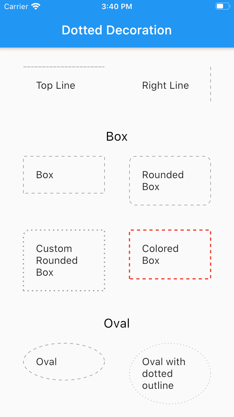
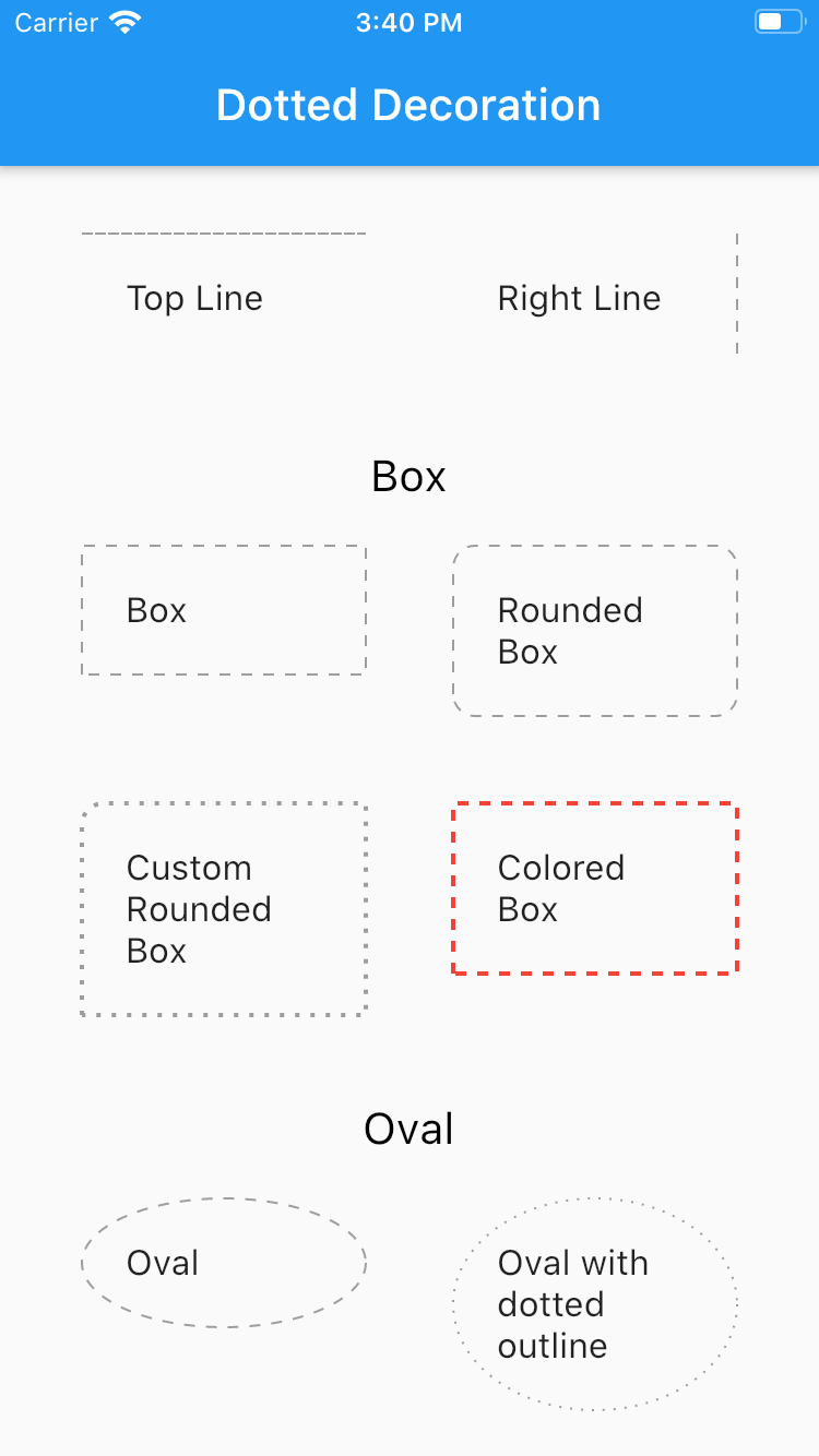
Preview

Flutter Dotted Decoration screenshot

Installing

To use this package, add dotted_decoration as a dependency in your pubspec.yaml file.

Usage

Create a container widget and assign DottedDecoration as decoration

Container(
    decoration: DottedDecoration()
    child: Text('Dotted Decoration')
)
Container(
    decoration: DottedDecoration()
    child: Text('Dotted Decoration')
)

To draw line

DottedDecoration(
  shape: Shape.line, linePosition: LinePosition.bottom),

To add rounded rection

DottedDecoration(
  shape: Shape.box,
  borderRadius: BorderRadius.circular(10), //remove this to get plane rectange
),

To add circle

//make sure width & height of container is same to get perfect circle or else it will end up in oval
DottedDecoration(shape: Shape.circle, dash: <int>[1, 4]);

Parameters

Shape

Kind of outline shape, default shape is Shape.line.

shape: Shape.line shape: Shape.box shape: Shape.oval

linePosition

Where line is located, default shape is LinePosition.bottom.

linePosition: LinePosition.bottom linePosition: LinePosition.left linePosition: LinePosition.right linePosition: LinePosition.top

dash

Border line order, first in dash and second is space.

dash: <int>[2, 5]

strokeWidth

Line width.

strokeWidth: 2

color

Color of line, default shape is Colors.grey.

color: Colors.red

所属分类

源码仓库

使用此插件的项目