搜索插件、代码仓与 APP 分类

dropdown_textfield 封面
插件详情v1.2.0

dropdown_textfield

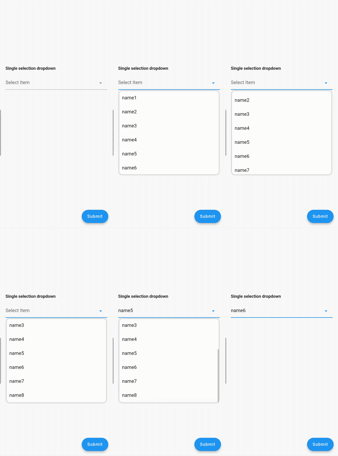
下拉文本框是一种材料设计文本框。下拉按钮是一个我们可以用来从一组值中选择一个唯一值或多值的组件。

AndroidiOSWebmacOSWindowsLinux
近 30 天下载
5950
喜欢数
181
Pub 分数
140

安装插件

flutter pub add dropdown_textfield

插件介绍

基于插件公开信息、社区数据与项目使用情况整理的选型参考。

DropdownTextfield 是一个 Flutter 包,将 TextField 与 DropdownButton 结合,使用户能够在 Material Design 界面中从列表中选择一个或多个值。它通过在文本输入字段内提供直观的下拉选择体验来增强表单输入。该控件支持单值和多值选择,适用于动态数据输入场景。它在所有主要平台(包括 Android、iOS、Web、macOS、Windows 和 Linux)上均兼容。

适合场景

  • 具有可选选项的表单输入
  • 表单中的多选下拉菜单
  • 符合材料设计规范的选项字段
  • 动态数据过滤
  • 用户友好的值选择界面

主要特点

  • 单值和多值选择
  • 材料设计集成
  • 跨平台兼容性
  • 可自定义的下拉项
  • 与现有表单的轻松集成

适合对象

  • 开发表单密集型应用的开发者
  • 寻求符合材料设计规范的组件的设计人员
  • 需要灵活选择输入的应用
  • 跨平台 Flutter 项目
  • 需要下拉功能的UI组件

使用建议

  • 需要适当的状态管理来支持多选
  • 可能需要针对自定义主题进行样式调整
  • 限于预定义的值集
  • 不适合非常大的数据集
  • 依赖于父级组件的布局约束

原始 README

以下为关联源码仓库的 README 原文快照,最新内容请访问源码仓库。

Flutter DropdownTextfield

A DropdownTextfield is a Material Design TextField. The DropDownButton is a widget that can be used to select one unique value or multiple values from a set of options.

Key Features

  1. Searchable dropdown
  2. Single & multi-selection
  3. Material dropdown
  4. Easily customizable UI
  5. Easy implementation into StatelessWidget
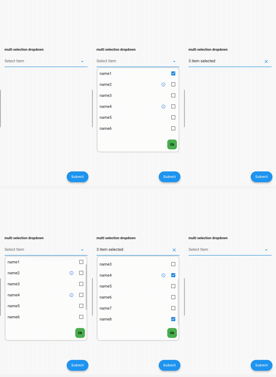
  6. ToolTip dialogue for multi-selection dropdown items

Examples

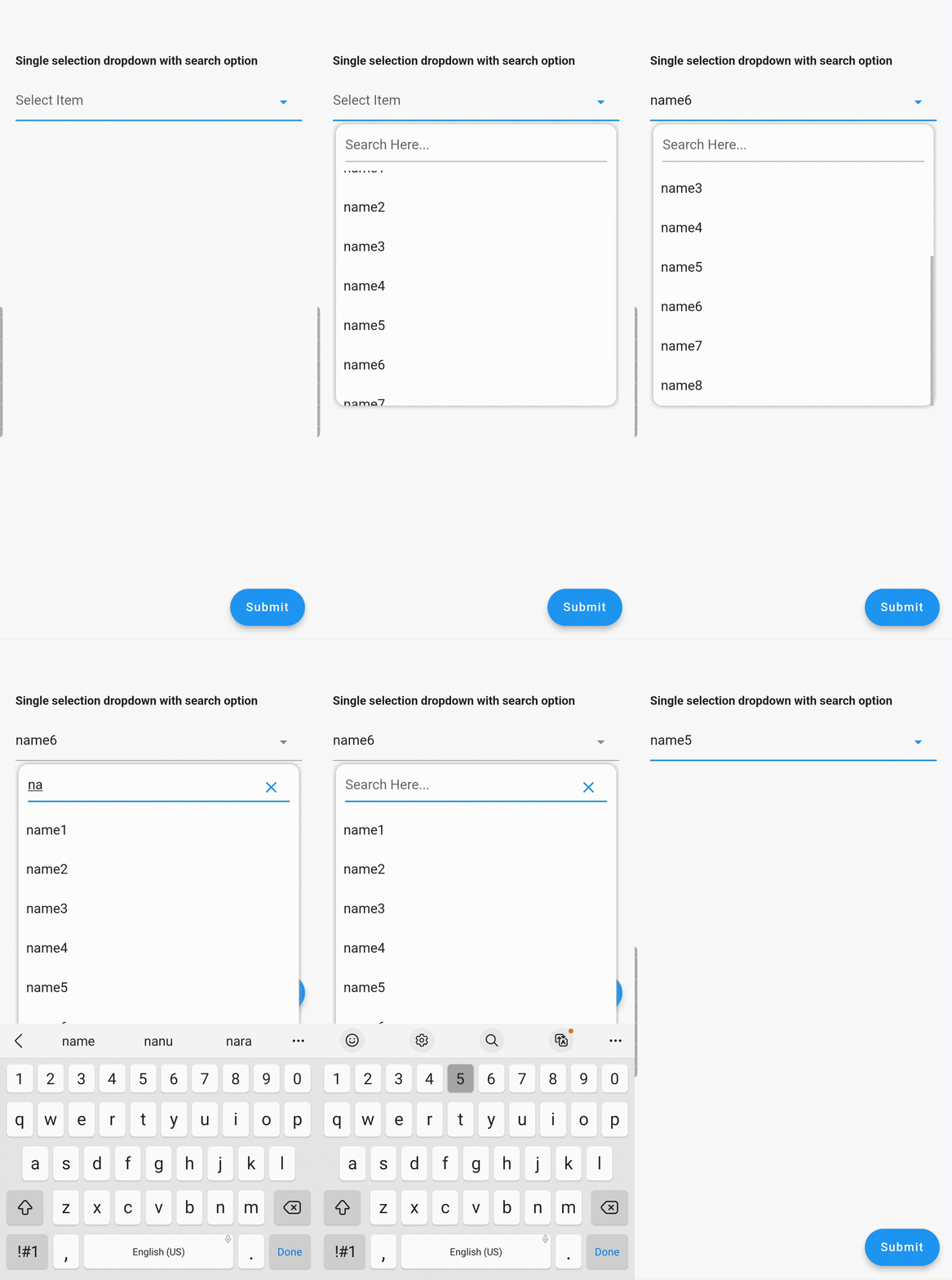
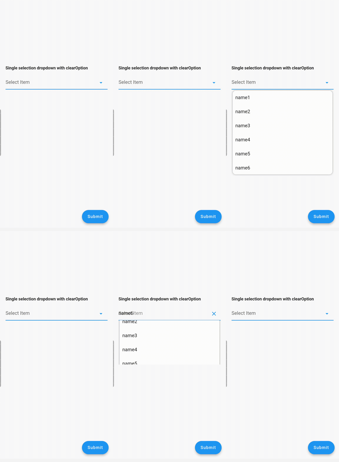
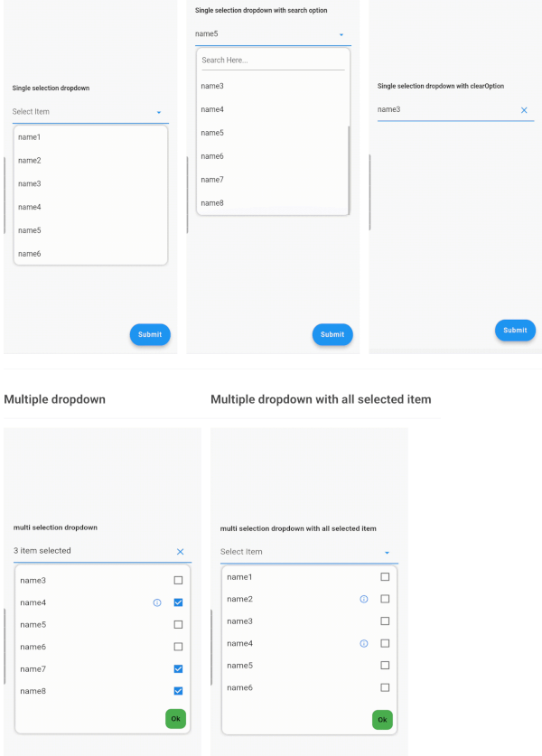
Single Dropdown Single Dropdown with Search Option Single Dropdown with Clear Option
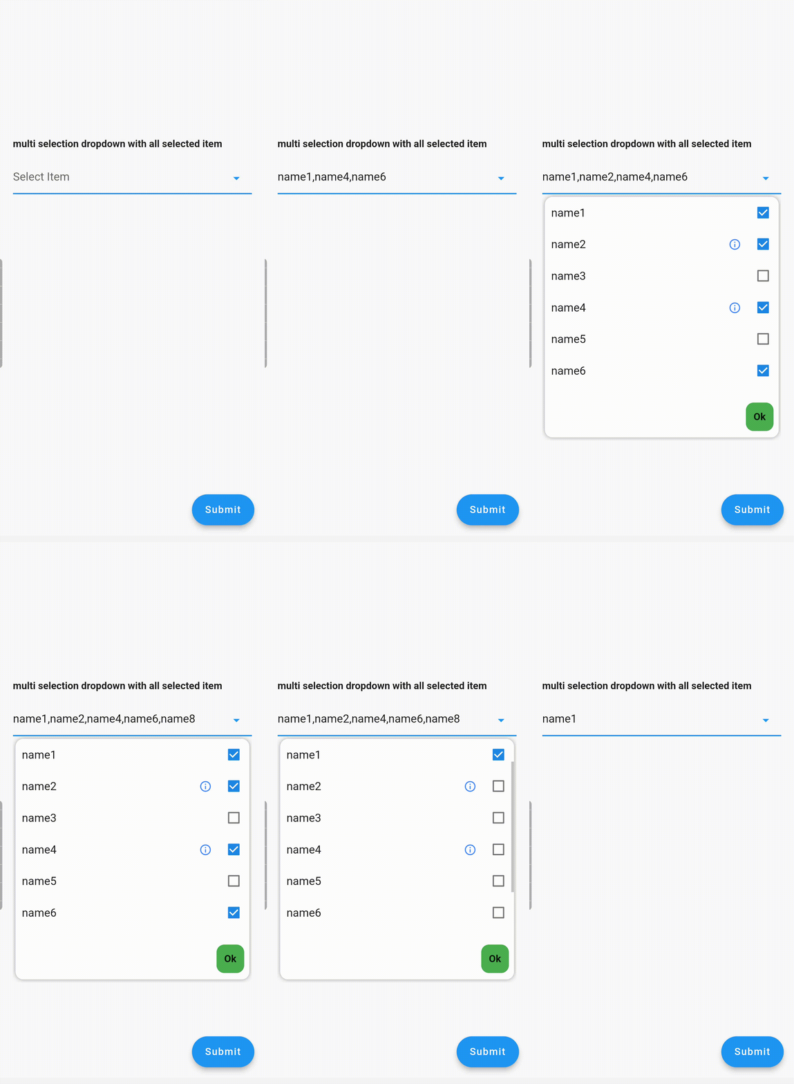
Multiple Dropdown Multiple Dropdown with All Selected Items

Usage

Controllers

You need to use SingleValueDropDownController for single dropdown and MultiValueDropDownController for multiple dropdown.

Properties
  • dropdownRadius: Defines the radius of the dropdown list. Default value is 12.
  • boxDecoration: Add custom BoxDecoration to decorate the dropdown container styling
  • boxMargin: Add custom margins to the dropdown container and override the default vertical: 5, horizontal: 4 margins
  • initialValue: Sets the initial value. If null or not in the dropDownList, it will not display any value.
  • dropDownList: A list of dropdown values of type <DropDownValueModel>.
  • onChanged: Listens for item selection changes. Returns a single DropDownValueModel object for single selection dropdown, and a list of DropDownValueModel objects for multi-selection dropdown.
  • textFieldDecoration: Overrides the default text field decoration.
  • dropDownIconProperty: Customizes the dropdown icon size and color.
  • isEnabled: Set to false to disable the text field. Default value is true.
  • enableSearch: Set to true to enable the search option in the dropdown. Currently available only for single selection dropdown.
  • displayCompleteItem: Set to true to display the complete list of selected items in the text field. Otherwise, it will display as "number_of_items selected".
  • dropDownItemCount: Maximum number of dropdown items to display. Default value is 6.
  • searchKeyboardType: Overrides the default search keyboard type. Applicable only if enableSearch=true.
  • searchTextStyle: Text style for the search text field.
  • searchAutofocus: Set to true to autofocus the search text field. Applicable only if enableSearch=true. Default value is false.
  • searchShowCursor: Set to false to hide the cursor from the search text field. Applicable only if enableSearch=true.
  • clearOption: Set to false to hide the clear suffix icon button from the text field.
  • clearIconProperty: Customizes the clear icon size and color.
  • listSpace: Space between the text field and the list. Default value is 0.
  • listPadding: Padding for dropdown list items.
  • submitButtonText: Text for the multi-dropdown submit button.
  • submitButtonColor: Color of the multi-dropdown submit button.
  • submitButtonTextStyle: Text style for the multi-dropdown submit button.
  • listTextStyle: Text style for dropdown list items.
  • checkBoxProperty: Customizes the properties of multiple checkboxes.

Contributing

Seeking contributions to improve the DropdownTextfield! If you have ideas for new features, optimizations, or bug fixes, please feel free to open a pull request or issue on our GitHub repository. Your contributions are greatly appreciated and will help make this package even better.

所属分类

依赖

依赖清单 2 项

源码仓库

使用此插件的项目

暂无相关数据。