搜索插件、代码仓与 APP 分类

插件详情v2.0.0

floating_snackbar

一个为您的项目提供自定义浮动式消息提示的包。

AndroidiOSWebmacOSWindowsLinux
近 30 天下载
953
喜欢数
28
Pub 分数
150

安装插件

flutter pub add floating_snackbar

插件介绍

基于插件公开信息、社区数据与项目使用情况整理的选型参考。

一个 Flutter 包,可提供可自定义的浮动通知栏,以在多个平台上增强用户反馈。该包旨在提供现代化、动画化的通知体验,支持平滑过渡和动态定位。非常适合显示简短消息、警告或确认信息,而不会中断用户流程。该包轻量级,设置简单,可无缝集成到现有项目中。它可在 Android、iOS、Web、macOS、Windows 和 Linux 上运行,确保设备间的统一行为。

适合场景

  • 显示快速状态更新
  • 操作后显示确认消息
  • 在表单中提供用户反馈
  • 通知用户成功操作
  • 通过动画通知增强用户界面

主要特点

  • 可自定义的外观和动画
  • 浮动的、非阻塞设计
  • 跨平台兼容性
  • 与现有代码的轻松集成
  • 对多种显示位置的支持

适合对象

  • 移动和Web应用
  • 需要轻量级通知的项目
  • 寻求现代 UI 组件的开发者
  • 跨平台保持一致反馈的应用程序
  • 面向用户界面的 Flutter 项目

使用建议

  • 可能需要额外的样式设置以实现复杂设计
  • 仅限基本的snackbar功能
  • 频繁使用时的性能影响
  • 无内置的滑动关闭支持
  • 依赖于平台特定的渲染行为

原始 README

以下为关联源码仓库的 README 原文快照,最新内容请访问源码仓库。

floating_snackbar

pub package CI license

Beautiful, customizable floating snackbars / toasts for Flutter. 🚀

Keep the dead-simple one-liner you already know - or reach for variants, positioning, theming, actions, progress bars, and context-free display when you need them. Pure Dart, zero native code, works on every platform.

Android iOS Linux macOS Web Windows
✅ ✅ ✅ ✅ ✅ ✅

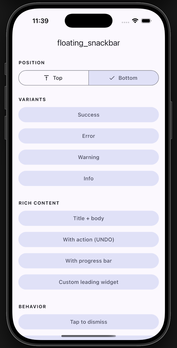
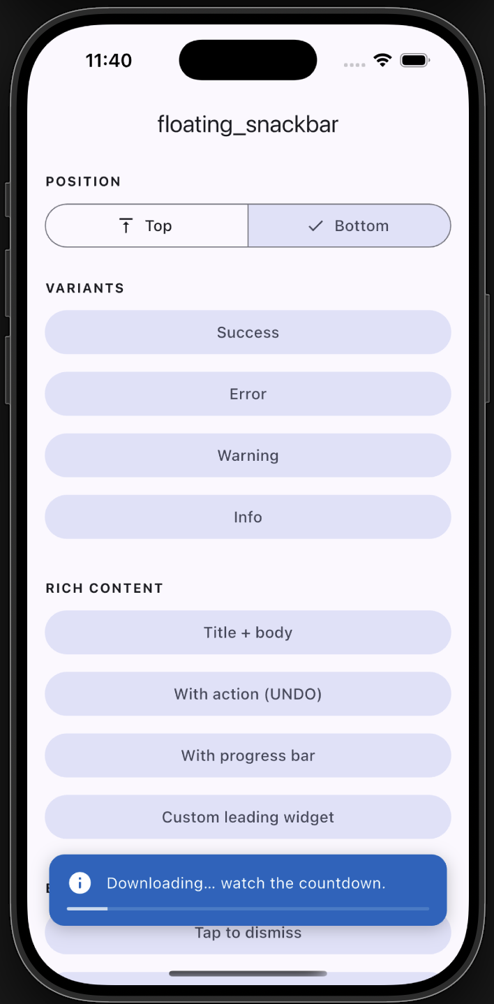
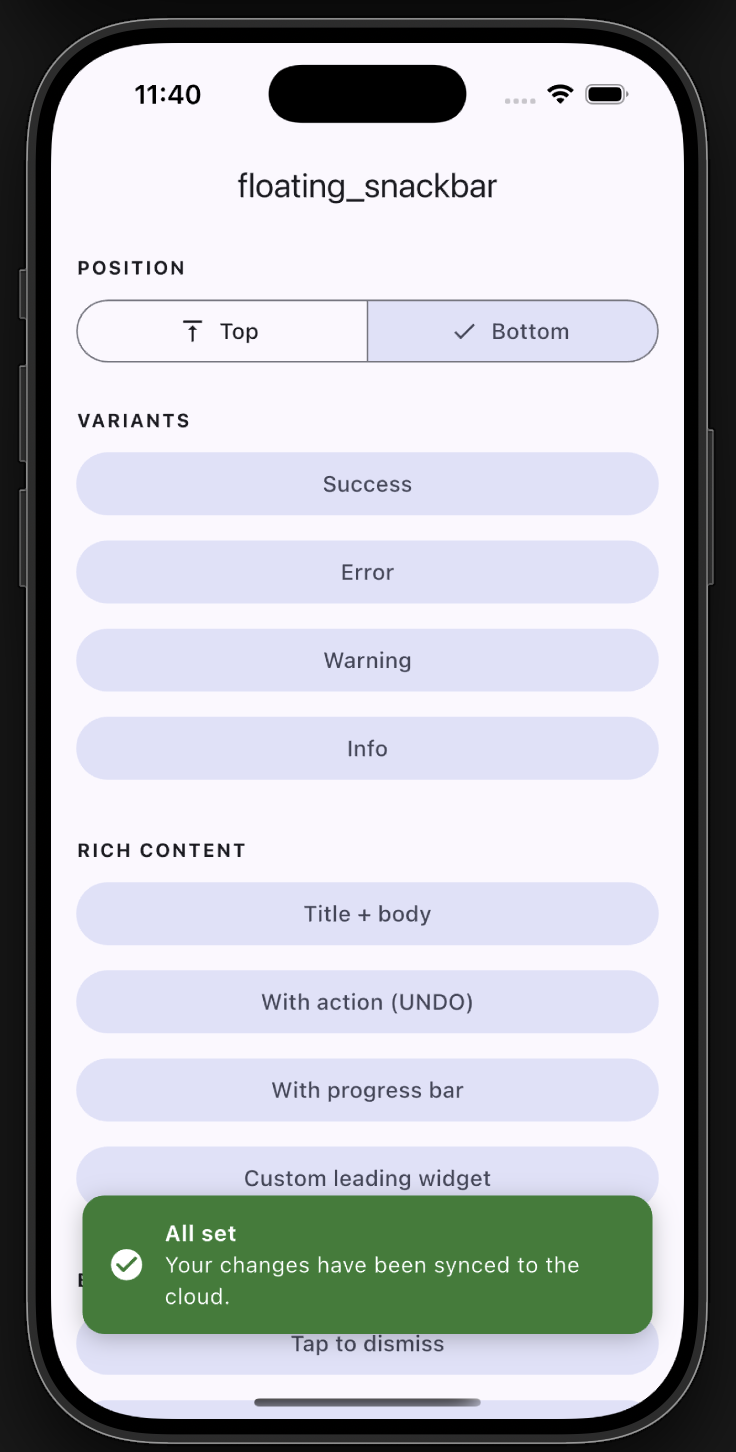
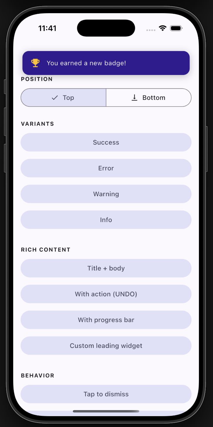
📸 Screenshots

Plain example app screen
Example app
Progress bar
Progress
Bottom snackbar with title
Bottom with title
Top position
Top position

✨ Features

  • ✅ Backward compatible - the original floatingSnackBar() still works.
  • 🎨 Variants - success, error, warning, info, with default colors & icons.
  • 📍 Positioning - show at the top or bottom of the screen.
  • 🧩 Rich content - title + body, leading icon/widget, trailing action button.
  • ⏳ Progress bar - optional countdown indicator.
  • 👆 Dismissal - tap-to-dismiss and swipe-to-dismiss.
  • 🌈 Animations - slide, fade, or scale.
  • 🌍 Global theming - set defaults once via FloatingSnackBar.theme.
  • 🪄 Context-free - show from services/blocs with no BuildContext.

📦 Getting started

Add the dependency:

dependencies:
  floating_snackbar: ^2.0.0

Import it:

import 'package:floating_snackbar/floating_snackbar.dart';

🚀 Usage

The simple one-liner (unchanged)
floatingSnackBar(
  message: 'Hi there! I am a floating SnackBar!',
  context: context,
);
Variants
FloatingSnackBar.success(context, 'Saved successfully!');
FloatingSnackBar.error(context, 'Something went wrong.');
FloatingSnackBar.warning(context, 'Battery is running low.');
FloatingSnackBar.info(context, 'A new update is available.');
Positioning
FloatingSnackBar.success(
  context,
  'Shown at the top!',
  position: FloatingSnackBarPosition.top,
);
Title, action & progress
FloatingSnackBar.show(
  context,
  'Item deleted.',
  title: 'Done',
  position: FloatingSnackBarPosition.bottom,
  showProgress: true,
  duration: const Duration(seconds: 5),
  action: FloatingSnackBarAction(
    label: 'UNDO',
    onPressed: () => restoreItem(),
  ),
);
Custom leading widget & colors
FloatingSnackBar.show(
  context,
  'You earned a new badge!',
  leading: const Icon(Icons.emoji_events, color: Colors.amber),
  backgroundColor: const Color(0xFF311B92),
  animation: FloatingSnackBarAnimation.scale,
);
Context-free (no BuildContext)

Wire the navigator key into your app once:

MaterialApp(
  navigatorKey: FloatingSnackBar.navigatorKey,
  // ...
);

Then call from anywhere - a service, a bloc, an interceptor:

FloatingSnackBar.info(null, 'No BuildContext needed!');

Already have a navigator key? Just assign it: FloatingSnackBar.navigatorKey = myExistingKey;

Global theming

Set your defaults once (e.g. in main) and every snackbar follows them:

FloatingSnackBar.theme = const FloatingSnackBarTheme(
  defaultPosition: FloatingSnackBarPosition.top,
  borderRadius: 16,
  duration: Duration(seconds: 3),
  successColor: Colors.teal,
  animation: FloatingSnackBarAnimation.slide,
);
Dismiss programmatically
FloatingSnackBar.dismiss(context); // or dismiss() with the navigatorKey set

📋 API reference

FloatingSnackBar.show(context, message, { ... })
Parameter Type Description
context BuildContext? Required unless navigatorKey is wired up.
message String The body text.
title String? Optional bold title above the message.
type FloatingSnackBarType normal / success / error / warning / info.
position FloatingSnackBarPosition? top or bottom.
animation FloatingSnackBarAnimation? slide / fade / scale.
duration Duration? Visible time before auto-dismiss.
leading Widget? Custom leading widget (overrides the type icon).
action FloatingSnackBarAction? Trailing action button.
backgroundColor Color? Overrides the type/theme background.
textColor Color? Overrides the text color.
textStyle TextStyle? Overrides the message style.
titleStyle TextStyle? Overrides the title style.
dismissOnTap bool? Tap the card to dismiss.
showProgress bool? Show a countdown bar.
replace bool Replace the current snackbar (default) or queue.

success / error / warning / info are thin wrappers over show with the matching type. Every unset argument falls back to FloatingSnackBar.theme.


🧪 Example

A full demo of every feature lives in example/. Run it with:

cd example
flutter run

🤝 Support

Found a bug or have an idea? Open an issue. 🐛


Enjoy building delightful Flutter apps with floating_snackbar! 🎉

所属分类

源码仓库

使用此插件的项目