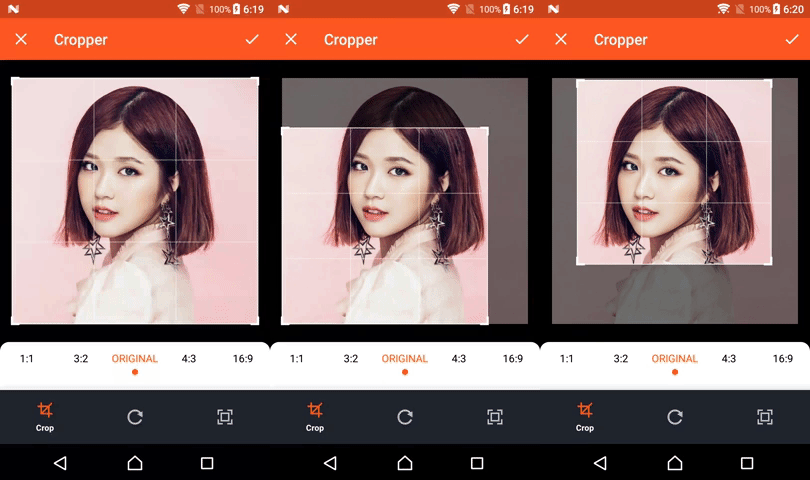
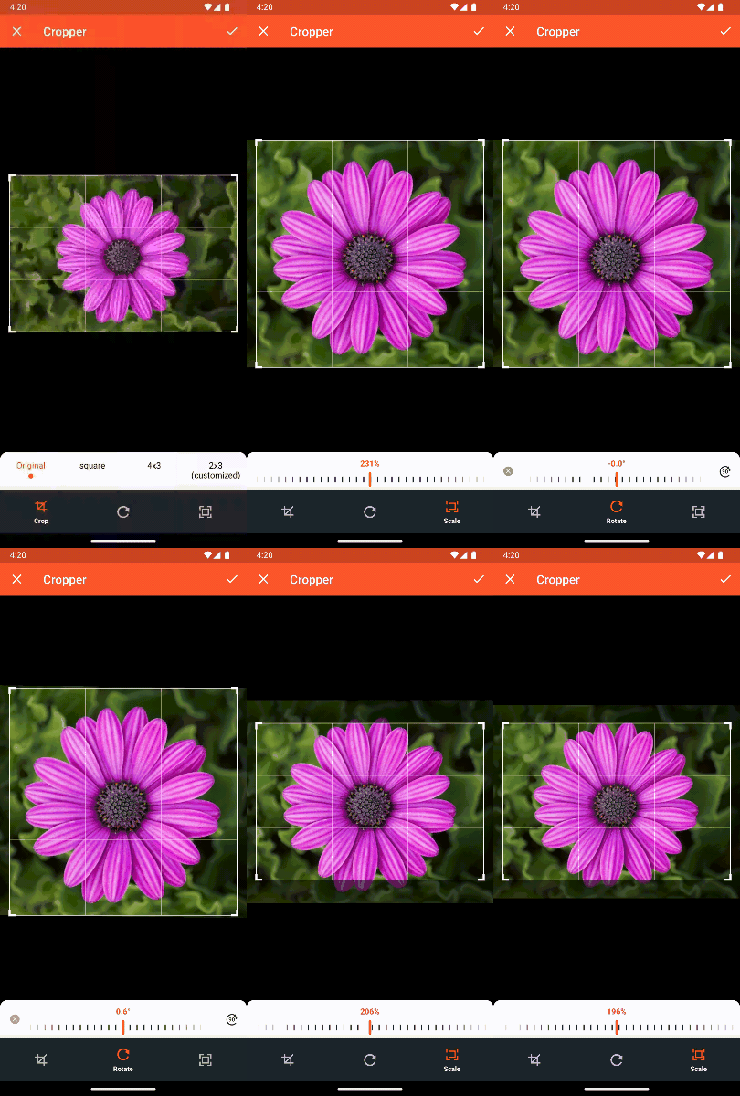
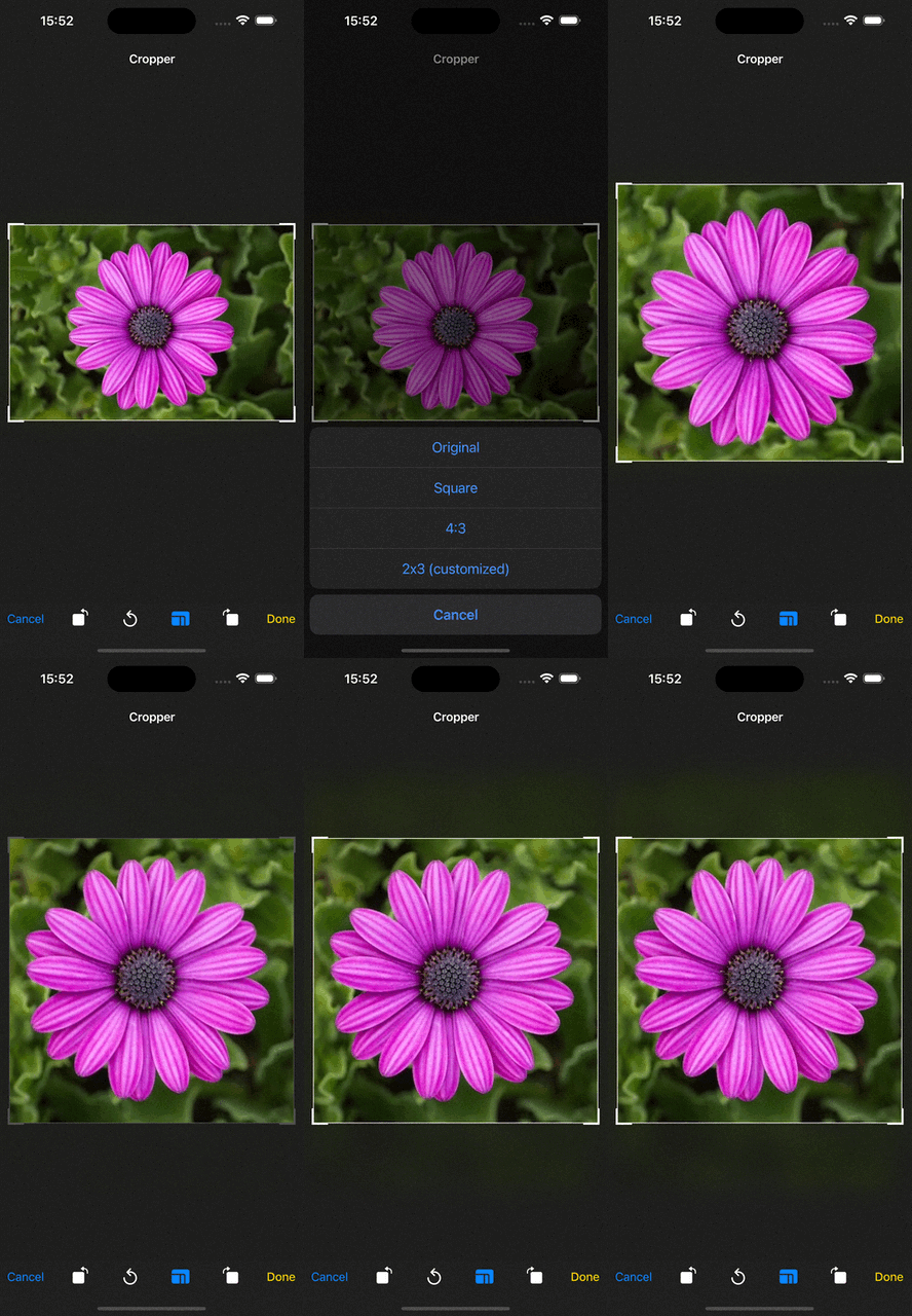
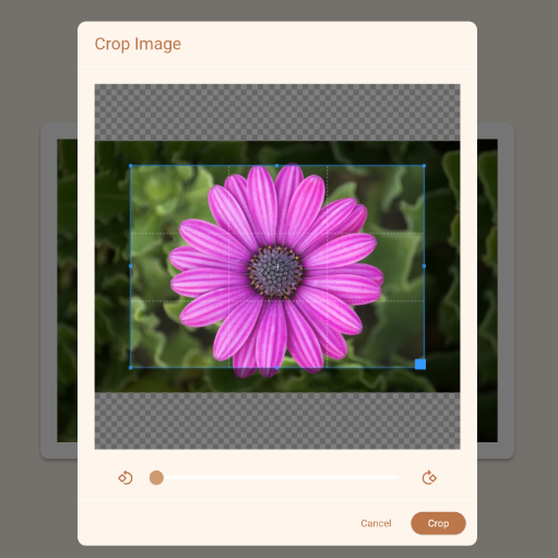
一个 Flutter 插件,可在 Android、iOS 和 Web 平台上实现图像裁剪。它提供了一个用户友好的界面,用于选择和裁剪图像,并支持自定义宽高比、旋转和缩放选项。该插件设计用于无缝集成,支持本地和网络图像,非常适合头像上传、文档扫描和媒体编辑工作流程。该插件利用原生功能以实现最佳性能和视觉质量。
适合场景
个人资料图片裁剪
文档图像处理
社交媒体图片编辑
图像上传预处理
自定义照片编辑器集成
主要特点
跨平台支持(Android、iOS、Web)
可自定义的纵横比
图像旋转和缩放
支持本地和远程图像
简单的集成API
适合对象
需要图像裁剪的应用程序开发者
移动和网页应用中的用户上传图片
需要精确图像编辑的应用程序
开发照片或文档捕获功能的开发者
使用建议
需要 Android 和 iOS 的平台特定权限
Web 支持的功能可能比原生功能有限
大图像文件可能会影响性能
UI 组件的自定义有限
依赖于底层原生实现以获得完整功能
原始 README
以下为关联源码仓库的 README 原文快照,最新内容请访问源码仓库。
Image Cropper
A Flutter plugin for Android, iOS and Web supports cropping images. This plugin is based on three different native libraries so it comes with different UI between these platforms.
Introduction
Image Cropper doesn't manipulate images in Dart codes directly, instead, the plugin uses Platform Channel to expose Dart APIs that Flutter application can use to communicate with three very powerful native libraries (uCrop, TOCropViewController and Cropper.js) to crop and rotate images. Because of that, all credits belong to these libraries.
uCrop - Yalantis
This project aims to provide an ultimate and flexible image cropping experience. Made in Yalantis
TOCropViewController - Tim Oliver
TOCropViewController is an open-source UIViewController subclass to crop out sections of UIImage objects, as well as perform basic rotations. It is excellent for things like editing profile pictures, or sharing parts of a photo online. It has been designed with the iOS Photos app editor in mind, and as such, behaves in a way that should already feel familiar to users of iOS.
aspectRatio: controls the aspect ratio of crop bounds. If this values is set, the cropper is locked and user can't change the aspect ratio of crop bounds.
compressFormat: the format of result image, png or jpg (default is ImageCompressFormat.jpg).
compressQuality: number between 0 and 100 to control the quality of image compression. Note: this field is ignored on Web.
uiSettings: controls UI customization on specific platform (android, ios, web,...)
The result file is saved in NSTemporaryDirectory on iOS and application Cache directory on Android, so it can be lost later, you are responsible for storing it somewhere permanent (if needed).
The implementation on Web is much different compared to the implementation on mobile app. It causes some configuration fields not working (compressQuality) on Web.
WebUiSettings is required for Web.
Customization
Android
Click to view detail
Image Cropper provides a helper class called AndroidUiSettings that wraps all properties can be used to customize UI in uCrop library.
Property
Description
Type
toolbarTitle
desired text for Toolbar title
String
toolbarColor
desired color of the Toolbar
Color
statusBarLight
set to true for light status bar (dark icons), false for dark status bar (light icons)
bool
navBarLight
set to true for light navigation bar (dark icons), false for dark navigation bar (light icons)
bool
toolbarWidgetColor
desired color of Toolbar text and buttons (default is darker orange)
Color
backgroundColor
desired background color that should be applied to the root view
Color
activeControlsWidgetColor
desired resolved color of the active and selected widget and progress wheel middle line (default is white)
Color
dimmedLayerColor
desired color of dimmed area around the crop bounds
Color
cropFrameColor
desired color of crop frame
Color
cropGridColor
desired color of crop grid/guidelines
Color
cropFrameStrokeWidth
desired width of crop frame line in pixels
int
cropGridRowCount
crop grid rows count
int
cropGridColumnCount
crop grid columns count
int
cropGridStrokeWidth
desired width of crop grid lines in pixels
int
showCropGrid
set to true if you want to see a crop grid/guidelines on top of an image
bool
lockAspectRatio
set to true if you want to lock the aspect ratio of crop bounds with a fixed value (locked by default)
bool
freeStyleCropEnabled
set to true to let the user resize the crop frame by dragging its corners. Independent of lockAspectRatio. When null, freestyle is enabled if lockAspectRatio is false.
set to true to let the user resize the crop frame by dragging its corners. Independent of lockAspectRatio — set both to true to match iOS' "locked ratio + draggable corners" behaviour. When null, freestyle is enabled if lockAspectRatio is false (legacy default).
bool
hideBottomControls
set to true to hide the bottom controls (shown by default)
bool
initAspectRatio
desired aspect ratio is applied (from the list of given aspect ratio presets) when starting the cropper
CropAspectRatioPreset
cropStyle
controls the style of crop bounds, it can be rectangle or circle style (default is CropStyle.rectangle).
CropStyle
aspectRatioPresets
controls the list of aspect ratios in the crop menu view.
List
iOS
Click to view detail
Image Cropper provides a helper class called IOUiSettings that wraps all properties can be used to customize UI in TOCropViewController library.
Property
Description
Type
minimumAspectRatio
The minimum croping aspect ratio. If set, user is prevented from setting cropping rectangle to lower aspect ratio than defined by the parameter
double
rectX
The initial rect of cropping: x.
double
rectY
The initial rect of cropping: y.
double
rectWidth
The initial rect of cropping: width.
double
rectHeight
The initial rect of cropping: height.
double
showActivitySheetOnDone
If true, when the user hits 'Done', a UIActivityController will appear before the view controller ends
bool
showCancelConfirmationDialog
Shows a confirmation dialog when the user hits 'Cancel' and there are pending changes (default is false)
bool
rotateClockwiseButtonHidden
When disabled, an additional rotation button that rotates the canvas in 90-degree segments in a clockwise direction is shown in the toolbar (default is false)
bool
embedInNavigationController
Embed the presented TOCropViewController in a UINavigationController. (default is false)
bool
hidesNavigationBar
If this controller is embedded in UINavigationController its navigation bar is hidden by default. Set this property to false to show the navigation bar. This must be set before this controller is presented
bool
rotateButtonsHidden
When enabled, hides the rotation button, as well as the alternative rotation button visible when showClockwiseRotationButton is set to YES (default is false)
bool
resetButtonHidden
When enabled, hides the 'Reset' button on the toolbar (default is false)
bool
aspectRatioPickerButtonHidden
When enabled, hides the 'Aspect Ratio Picker' button on the toolbar (default is false)
bool
resetAspectRatioEnabled
If true, tapping the reset button will also reset the aspect ratio back to the image default ratio. Otherwise, the reset will just zoom out to the current aspect ratio. If this is set to false, and aspectRatioLockEnabled is set to true, then the aspect ratio button will automatically be hidden from the toolbar (default is true)
bool
aspectRatioLockDimensionSwapEnabled
If true, a custom aspect ratio is set, and the aspectRatioLockEnabled is set to true, the crop box will swap it's dimensions depending on portrait or landscape sized images. This value also controls whether the dimensions can swap when the image is rotated (default is false)
bool
aspectRatioLockEnabled
If true, while it can still be resized, the crop box will be locked to its current aspect ratio. If this is set to true, and resetAspectRatioEnabled is set to false, then the aspect ratio button will automatically be hidden from the toolbar (default is false)
bool
title
Title text that appears at the top of the view controller.
String
doneButtonTitle
Title for the 'Done' button. Setting this will override the Default which is a localized string for "Done"
String
cancelButtonTitle
Title for the 'Cancel' button. Setting this will override the Default which is a localized string for "Cancel"
String
cropStyle
controls the style of crop bounds, it can be rectangle or circle style (default is CropStyle.rectangle).
CropStyle
aspectRatioPresets
controls the list of aspect ratios in the crop menu view.
List
Web
Click to view detail
Image Cropper provides a helper class called WebUiSettings that wraps all properties can be used to customize UI in cropperjs library.
Property
Description
Type
size
Display size of the cropper. Default = { width: 500, height: 500 }
CropperSize
viewwMode
Define the view mode of the cropper. Details of available options in View Mode. Default = 0
WebViewMode
dragMode
Define the dragging mode of the cropper. Details of available options in Drag Mode. Default = crop
WebDragMode
initialAspectRatio
Define the initial aspect ratio of the crop box. By default, it is the same as the aspect ratio of the canvas (image wrapper). Note: Only available when the aspectRatio option is set to NaN.
num
checkCrossOrigin
Check if the current image is a cross-origin. Default = true image.
bool
checkOrientation
Check the current image's Exif Orientation information. Note that only a JPEG image may contain Exif Orientation information. Requires to set both the rotatable and scalable options to true at the same time. Default = true
bool
modal
Show the black modal above the image and under the crop box. Default = true
bool
guides
Show the dashed lines above the crop box. Default = true
bool
center
Show the center indicator above the crop box. Default = true
bool
highlight
Show the white modal above the crop box (highlight the crop box). Default = true
bool
background
Show the grid background of the container. Default = true
bool
movable
Enable to move the image. Default = true
bool
rotatable
Enable to rotate the image. Default = true
bool
scalable
Enable to scale the image. Default = true
bool
zoomable
Enable to zoom the image. Default = true
bool
zoomOnTouch
Enable to zoom the image by dragging touch. Default = true
bool
zoomOnWheel
Enable to zoom the image by mouse wheeling. Default = true
bool
wheelZoomRatio
Define zoom ratio when zooming the image by mouse wheeling. Default = 0.1
num
cropBoxMovable
Enable to move the crop box by dragging. Default = true
bool
cropBoxResizable
Enable to resize the crop box by dragging. Default = true
bool
toggleDragModeOnDblclick
Enable to toggle drag mode between "crop" and "move" when clicking twice on the cropper. Default = true
bool
minContainerWidth
The minimum width of the container. Default = 200
num
minContainerHeight
The minimum height of the container. Default = 100
num
minCropBoxWidth
The minimum width of the crop box. Default = 0
num
minCropBoxHeight
The minimum height of the crop box. Default = 0
num
presentStyle
Presentation style of cropper, either a dialog or a page (route). Default = dialog
WebPresentStyle
context
Current BuildContext. The context is required to show cropper dialog or route
BuildContext
customDialogBuilder
Builder to customize the cropper Dialog
WebDialogBuilder
customRouteBuilder
Builder to customize the cropper PageRoute
WebRouteBuilder
barrierColor
Barrier color for displayed Dialog
Color
translations
Translations to display
WebTranslations
themeData
Control UI customization
WebThemeData
View Mode:
0: no restrictions
1: restrict the crop box not to exceed the size of the canvas.
2: restrict the minimum canvas size to fit within the container. If the proportions of the canvas and the container differ, the minimum canvas will be surrounded by extra space in one of the dimensions.
3: restrict the minimum canvas size to fill fit the container. If the proportions of the canvas and the container are different, the container will not be able to fit the whole canvas in one of the dimensions.
If you set viewMode to 0, the crop box can extend outside the canvas, while a value of 1, 2, or 3 will restrict the crop box to the size of the canvas. viewMode of 2 or 3 will additionally restrict the canvas to the container. There is no difference between 2 and 3 when the proportions of the canvas and the container are the same.
Drag Mode:
crop: create a new crop box
move: move the canvas
none: do nothing
Note:
If using WebDialogBuilder and WebRouteBuilder to customize cropper dialog and route, the customization codes must to call following functions:
initCropper() to initialize Cropper object.
crop() to trigger crop feature and then returning the cropped result data to the plugin by using Navigator.of(context).pop(result).
classCropperDialogextendsStatefulWidget{
...
}
class_CropperDialogStateextendsState<CropperDialog> {
@overridevoidinitState() {
super.initState();
/// IMPORTANT: must to call this function
widget.initCropper();
}
@overrideWidgetbuild(BuildContext context) {
Dialog(
child: Column(
children: [
...
cropper,
...
TextButton(
onPressed: () async {
/// IMPORTANT: to call crop() function and return/// result data to plugin, for example:final result = awaitcrop();
Navigator.of(context).pop(result);
},
child: Text('Crop'),
)
]
),
);
}
}
WebUiSettings(
...
customDialogBuilder: (cropper, initCropper, crop, rotate, scale) {
returnCropperDialog(
cropper: cropper,
initCropper: initCropper,
crop: crop,
rotate: rotate,
scale: scale,
);
},
...
)
Example
import'package:image_cropper/image_cropper.dart';
CroppedFile croppedFile = awaitImageCropper().cropImage(
sourcePath: imageFile.path,
uiSettings: [
AndroidUiSettings(
toolbarTitle: 'Cropper',
toolbarColor: Colors.deepOrange,
toolbarWidgetColor: Colors.white,
aspectRatioPresets: [
CropAspectRatioPreset.original,
CropAspectRatioPreset.square,
CropAspectRatioPresetCustom(),
],
),
IOSUiSettings(
title: 'Cropper',
aspectRatioPresets: [
CropAspectRatioPreset.original,
CropAspectRatioPreset.square,
CropAspectRatioPresetCustom(), // IMPORTANT: iOS supports only one custom aspect ratio in preset list
],
),
WebUiSettings(
context: context,
),
],
);
classCropAspectRatioPresetCustomimplementsCropAspectRatioPresetData{
@override
(int, int)? get data => (2, 3);
@overrideStringget name => '2x3 (customized)';
}