搜索插件、代码仓与 APP 分类

introduction_screen 封面
插件详情v5.0.1

introduction_screen

适用于 Flutter 应用的介绍/引导包,支持部分自定义选项

AndroidiOSWebmacOSWindowsLinux
近 30 天下载
6.4万
喜欢数
2970
Pub 分数
160

安装插件

flutter pub add introduction_screen

插件介绍

基于插件公开信息、社区数据与项目使用情况整理的选型参考。

一个用于为移动和Web应用程序创建可自定义介绍或引导屏幕的Flutter包。它提供流畅、交互式的幻灯片体验,支持自定义内容、动画和样式。开发者可以轻松集成带有图片、文本和按钮的欢迎页面,非常适合引导新用户了解应用功能。该包兼容多个平台,包括Android、iOS、Web、macOS、Windows和Linux。

适合场景

  • 引导新用户
  • 应用教程屏幕
  • 欢迎启动体验
  • 功能亮点
  • 首次启动时的用户参与度
  • 可自定义的幻灯片过渡

主要特点

  • 可自定义的幻灯片内容
  • 内置动画
  • 对多个平台的支持
  • 与 Flutter 的轻松集成
  • 可配置的导航按钮
  • 响应式设计

适合对象

  • 新应用开发者
  • 产品入门流程
  • 跨平台应用
  • 交互式教程
  • 以用户界面为重点的项目

使用建议

  • 需要基本的Flutter知识
  • 有限的内置主题
  • 自定义样式可能需要额外的代码
  • 未针对复杂动画进行优化
  • 依赖外部依赖项
  • 可能需要进行平台特定的调整

原始 README

以下为关联源码仓库的 README 原文快照,最新内容请访问源码仓库。

IntroductionScreen pub package

Build Example App Run Project Tests

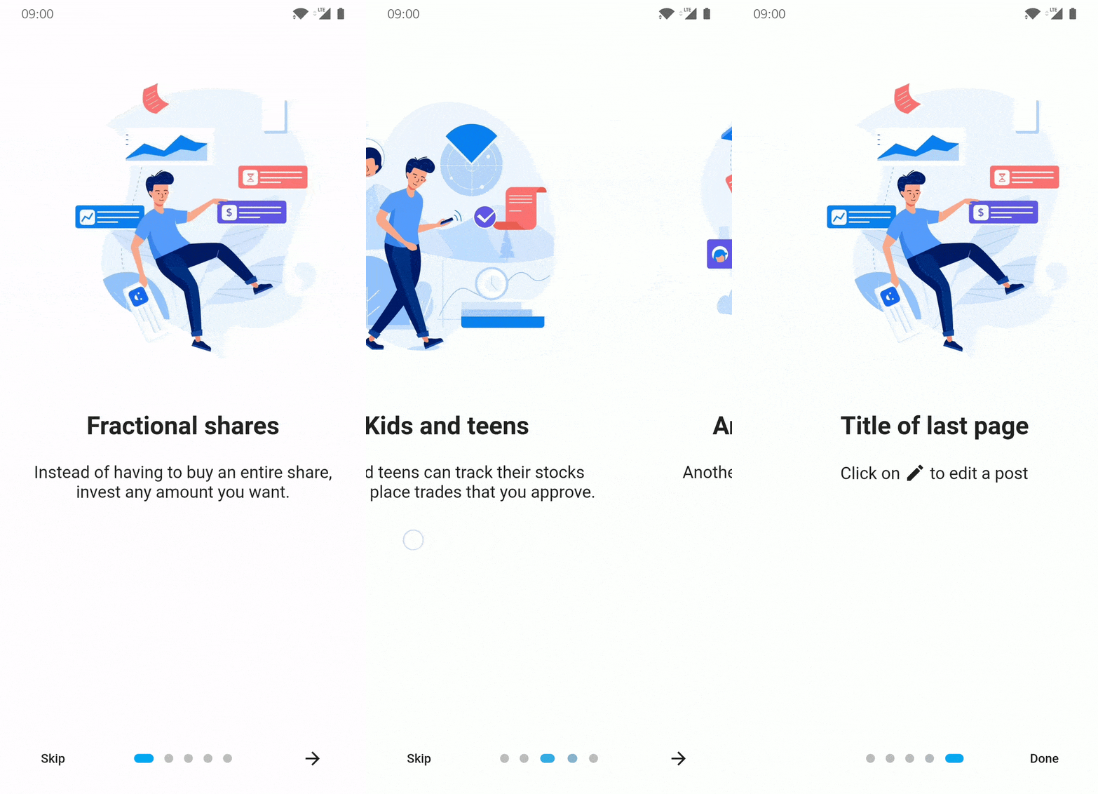
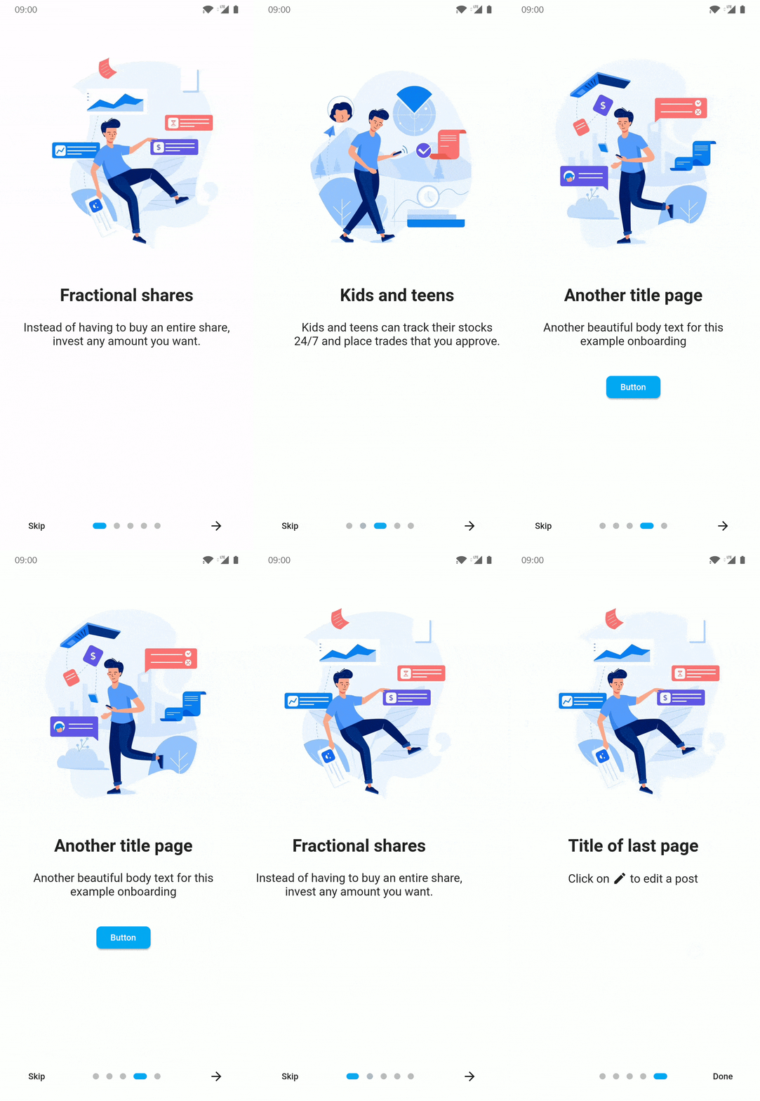
Introduction Screen allows you to have a screen on an app's first launch to, for example, explain your app. This widget is very customizable with a great design.

introduction_screen uses another package, dots_indicator, that I also created.

Installation

You just need to add introduction_screen as a dependency in your pubspec.yaml file.

dependencies:
  introduction_screen: ^5.0.1

Breaking change in 5.0.0: this package now uses the standalone material_ui package instead of package:flutter/material.dart. Your app must also use material_ui (or keep the deprecated MaterialUiCompatibilityBridge). Requires Flutter >=3.44.0 and Dart ^3.12.0. See the CHANGELOG for details.

Examples

Not all of the many parameters in each class are used in these examples. See Parameter Lists for the complete documentation for each class.

Note: if you want to display IntroductionScreen only once, like on the first start of your app, use shared_preferences (or a similar strategy) to save the status of whether it has been already displayed or not. It's not responsibility of this package to handle this.

PageViewModel

A list of PageViewModels is used for IntroductionScreen's pages parameter.

Simple page

This example only defines the title, body, and image parameters. (You can define image as any widget.)

PageViewModel(
  title: "Title of introduction page",
  body: "Welcome to the app! This is a description of how it works.",
  image: const Center(
    child: Icon(Icons.waving_hand, size: 50.0),
  ),
)
Page with custom colors

This example defines the color of the page using the decoration parameter. The image link does not exist and is only for example.

PageViewModel(
  title: "Title of blue page",
  body: "Welcome to the app! This is a description on a page with a blue background.",
  image: Center(
    child: Image.network("https://example.com/image.png", height: 175.0),
  ),
  decoration: const PageDecoration(
    pageColor: Colors.blue,
  ),
)
Page with custom text style

This example defines custom TextStyles in the decoration parameter for the title and body.

PageViewModel(
  title: "Title of orange text and bold page",
  body: "This is a description on a page with an orange title and bold, big body.",
  image: const Center(
    child: Text("👋", style: TextStyle(fontSize: 100.0)),
  ),
  decoration: const PageDecoration(
    titleTextStyle: TextStyle(color: Colors.orange),
    bodyTextStyle: TextStyle(fontWeight: FontWeight.w700, fontSize: 20.0),
  ),
)
Page with a footer (button)

This example defines a footer for the page with a button. The image does not exist and is only for example.

PageViewModel(
  title: "Title of custom button page",
  body: "This is a description on a page with a custom button below.",
  image: Image.asset("res/images/logo.png", height: 175.0),
  footer: ElevatedButton(
    onPressed: () {
      // On button pressed
    },
    child: const Text("Let's Go!"),
  ),
)
Page with widget body

This example defines the page body using bodyWidget and a Widget, rather than with body and a String. Only use body or bodyWidget. The titleWidget parameter does the same thing for the title.

PageViewModel(
  title: "Title of custom body page",
  bodyWidget: Row(
    mainAxisAlignment: MainAxisAlignment.center,
    children: const [
      Text("Click on "),
      Icon(Icons.edit),
      Text(" to edit a post"),
    ],
  ),
  image: const Center(child: Icon(Icons.android)),
)
IntroductionScreen

The IntroductionScreen Widget is the single object that holds all pages and related navigation and settings. In these examples, listPagesViewModel is a list of pages. A page is a PageViewModel object, like the examples in the previous section.

Note:

  • If you not provide the next parameter, the "Next" button will be not displayed. The parameter showNextButton must then be set to false.
  • If you want to display the "Skip" button, you must add a skip parameter and set showSkipButton to true.
  • The done parameter is only required if showDoneButton is true.
Simple intro screen

This example only defines the pages, showNextButton, done, and onDone parameters.

IntroductionScreen(
  pages: listPagesViewModel,
  showNextButton: false,
  done: const Text("Done"),
  onDone: () {
    // On button pressed
  },
)
Intro screen with skip button

This example defines showSkipButton and skip to show the "Skip" button on all pages except the last one.

IntroductionScreen(
  pages: listPagesViewModel,
  showSkipButton: true,
  showNextButton: false,
  skip: const Text("Skip"),
  done: const Text("Done"),
  onDone: () {
    // On button pressed
  },
)
Intro screen with back button

This example defines showBackButton and back to show the "Back" button on all pages except the first one.

IntroductionScreen(
  pages: listPagesViewModel,
  showBackButton: true,
  showNextButton: false,
  back: const Icon(Icons.arrow_back),
  done: const Text("Done"),
  onDone: () {
    // On button pressed
  },
)
Intro screen with custom button text and dots indicators

This example defines dotsDecorator to show a custom implementation of the page progress dots. This example also uses a custom style for the "Done" button, bolding it.

IntroductionScreen(
  pages: listPagesViewModel,
  showSkipButton: true,
  skip: const Icon(Icons.skip_next),
  next: const Text("Next"),
  done: const Text("Done", style: TextStyle(fontWeight: FontWeight.w700)),
  onDone: () {
    // On Done button pressed
  },
  onSkip: () {
    // On Skip button pressed
  },
  dotsDecorator: DotsDecorator(
    size: const Size.square(10.0),
    activeSize: const Size(20.0, 10.0),
    activeColor: Theme.of(context).colorScheme.secondary,
    color: Colors.black26,
    spacing: const EdgeInsets.symmetric(horizontal: 3.0),
    activeShape: RoundedRectangleBorder(
        borderRadius: BorderRadius.circular(25.0)
    ),
  ),
)
Intro screen with custom button style

A custom style will be applied to all buttons using the baseBtnStyle parameter ("Back", "Skip", "Next", "Done"). Specific button style parameters may also be used: backStyle, skipStyle, nextStyle, doneStyle.

If both baseBtnStyle and a specific button style are defined, the baseBtnStyle will be merge with specific style.

The following is the default button style:

TextButton.styleFrom(
  shape: RoundedRectangleBorder(
    borderRadius: BorderRadius.circular(8.0),
  ),
)

This example will override the default in the following ways:

  • All buttons have a light grey background
  • The "Skip" button is red
  • The "Done" button is green
  • The "Next" button is blue
IntroductionScreen(
  pages: listPagesViewModel,
  showSkipButton: true,
  skip: const Text("Skip"),
  next: const Text("Next"),
  done: const Text("Done"),
  onDone: () {
    // When done button is press
  },
  baseBtnStyle: TextButton.styleFrom(
    backgroundColor: Colors.grey.shade200,
  ),  
  skipStyle: TextButton.styleFrom(foregroundColor: Colors.red),  
  doneStyle: TextButton.styleFrom(foregroundColor: Colors.green),  
  nextStyle: TextButton.styleFrom(foregroundColor: Colors.blue),
)
Intro screen with key param to change page manually

To change page manually / programmatically, in response to user input or another event:

  1. Define a GlobalKey as part of the parent widget's state
  2. Pass that key to the IntroductionScreen key param
  3. Use the currentState member to access functions defined in IntroductionScreenState e.g.
    1. next()
    2. previous()
    3. skipToEnd()
    4. animateScroll()

This example moves to the next page after a delay:

class IntroScreenDemo extends StatefulWidget {
  @override
  State<IntroScreenDemo> createState() => _IntroScreenDemoState();
}

class _IntroScreenDemoState extends State<IntroScreenDemo> {
  // 1. Define a `GlobalKey` as part of the parent widget's state
  final _introKey = GlobalKey<IntroductionScreenState>();
  String _status = 'Waiting...';

  @override
  Widget build(BuildContext context) {
    return IntroductionScreen(
      // 2. Pass that key to the `IntroductionScreen` `key` param
      key: _introKey,
      pages: [
        PageViewModel(
            title: 'Page One',
            bodyWidget: Column(
              children: [
                Text(_status),
                ElevatedButton(
                    onPressed: () {
                      setState(() => _status = 'Going to the next page...');

                      // 3. Use the `currentState` member to access functions defined in `IntroductionScreenState`
                      Future.delayed(const Duration(seconds: 3),
                          () => _introKey.currentState?.next());
                    },
                    child: const Text('Start'))
              ],
            )),
        PageViewModel(
            title: 'Page Two', bodyWidget: const Text('That\'s all folks'))
      ],
      showNextButton: false,
      showDoneButton: false,
    );
  }
}

Parameter Lists

IntroductionScreen parameters

Many parameters can be used to customize your app introduction like you want! This is the full list:

Pages
  • Page that will be display (PageViewModel), by adding pages: [..] parameter.
  • Use your own pages (Widget) without using those predefined, by adding rawPages: [..] parameter.
    • If you provide both rawPages and pages parameter, pages will be used.
Callbacks
  • Set a custom callback when done button is pressed, by adding onDone: () {} parameter.
    • This param is required if you define done param, EXCEPT if you set showDoneButton: false
    • If you set overrideDone param, it will be ignored.
  • Set a custom callback when skip button is pressed, by adding onSkip: () {} parameter.
    • By default, it will go to the last page
    • If you set overrideSkip param, it will be ignored.
  • Add callback to listen page changes, by adding onChange: (page) {} parameter.
Use pre-made buttons
  • Define pre-made Done button child (Widget), by adding done: Text('Done')
    • This param or overrideDone are required, EXCEPT if you set showDoneButton: false
    • By providing done, the parameter onDone is also required.
  • Define pre-made Next button child (Widget), by adding next: Text('Next')
    • This param is required, EXCEPT if you set showNextButton: false
  • Define pre-made Skip button child (Widget), by adding skip: Text('Skip')
    • This param is required if you set showSkipButton: true
  • Define pre-made Back button child (Widget), by adding back: Text('Back')
    • This param is required if you set showBackButton: true
Use custom buttons

If you want to control pages, you can use key param. Search this repo's Issues for more detailed information.

  • Define your custom Done button (Widget), by using overrideDone
    • This param or done are required, EXCEPT if you set showDoneButton: false
    • This parameter has priority over the done parameter.
  • Define your custom Next button (Widget), by using overrideNext
    • This param or next are required, EXCEPT if you set showNextButton: false
    • This parameter has priority over the next parameter.
  • Define your custom Skip button (Widget), by using overrideSkip
    • This param or skip are required if you set showSkipButton: true
    • This parameter has priority over the skip parameter.
  • Define your custom Back button (Widget), by using overrideBack
    • This param or back are required if you set showBackButton: true
    • This parameter has priority over the skip parameter.
  • Define your custom dots widget (or the widget that you want on that position), by using customProgress
Manage display of pre-made or custom buttons
  • Hide/show Skip button, by adding showSkipButton: false parameter.
    • Default false
  • Hide/show Next button, by adding showNextButton: false parameter.
    • Default true
  • Hide/show Done button, by adding showDoneButton: false parameter.
    • Default true
  • Hide/show Back button, by adding showBackButton: false parameter.
    • Default false
Controls
  • Display or not the progress dots, by adding isProgress: false parameter.
    • Default true
  • Enable or disable dots progress tap, by adding isProgressTap: false parameter.
    • Default true
Page
  • Freeze the scroll, by adding freeze: true parameter.
    • Default false
  • Duration of scrolling animation, by adding animationDuration: 400 parameter.
    • Default 350
  • Initial page, by adding initialPage: 2 parameter.
    • Default 0
  • You can provide a ScrollController for each page by adding scrollControllers: [..] parameter.
    • If you have 5 pages, you can provide 5 differents ScrollController.
    • If you want to have only one ScrollController for page 1, you can provide: scrollControllers: [controller1]
    • If you want to have only one ScrollController for page 3, you can provide: scrollControllers: [null, null, controller1]
    • Will be ignored for page(s) if useScrollView is set to false in PageViewModel(s)
Pages style
  • Global background color, by adding globalBackgroundColor: Colors.blue parameter.
    • Tips: use Colors.transparent to display an image as background (using Stack with IntroductionScreen inside for example)
  • Customize dots (progression) by adding dotsDecorator: DotsDecorator(...)
    • You can customize dots size, shape, colors, spacing.
  • Customize dots container by adding dotsContainerDecorator: BoxDecorator(...)
    • You can customize container that contain controls.
  • Skip/Back button flex, by adding skipOrBackFlex: 1 parameter.
    • Set 0 to disable Expanded behaviour, default 1
  • Dots indicator flex, by adding dotsFlex: 1 parameter.
    • Set 0 to disable Expanded behaviour, default 1
  • Next/Done button flex, by adding nextFlex: 1 parameter.
    • Set 0 to disable Expanded behaviour, default 1
  • Animation curve between pages, by adding curve: Curves.elasticIn parameter.
    • Default Curves.easeIn
Buttons style
  • Change global style of buttons (for skip, next, done, back), by adding baseBtnStyle parameter.
  • Change skip button style, by adding skipStyle: TextButton.styleFrom(alignment: Alignment.centerLeft) parameter.
  • Change next button style, by adding nextStyle: TextButton.styleFrom(alignment: Alignment.centerRight) parameter.
  • Change done button style, by adding doneStyle: TextButton.styleFrom(splashFactory: NoSplash.splashFactory) parameter.
  • Change back button style, by adding backStyle: TextButton.styleFrom(foregroundColor: Colors.red) parameter.
Semantic
  • Change skip button semantic label, by adding skipSemantic: 'Skip introduction' parameter.
  • Change next button semantic label, by adding nextSemantic: 'Go to next page' parameter.
  • Change done button semantic label, by adding doneSemantic: 'Exit introduction' parameter.
  • Change back button semantic label, by adding backSemantic: 'Go to previous page' parameter.
Layout
  • Show the bottom part of the page, that include skip, next, done buttons by setting showBottomPart: true parameter.
  • Hide the bottom part of the page when the keyboard is open with hideBottomOnKeyboard parameter.
  • Customize controls position on screen, by adding controlsPosition: const Position(left: 0, right: 0, bottom: 100) parameter.
    • Default const Position(left: 0, right: 0, bottom: 0)
  • Customize margin of controls's container, by adding controlsMargin: EdgeInsets.all(16.0) parameter.
    • Default EdgeInsets.zero
  • Customize padding of controls's container, by adding controlsPadding: EdgeInsets.all(8.0) parameter.
    • Default EdgeInsets.all(16.0)
  • Add global header (top), static and displayed above pages, by adding globalHeader: Image.asset(...) parameter.
  • Add global footer below controls/dots, by adding globalFooter: ElevatedButton(...) parameter.
  • Change axis of scroll by adding pagesAxis: Axis.vertical.
    • Default Axis.horizontal
  • Change default scroll physics of PageView by adding scrollPhysics: ClampingScrollPhysics().
    • Default BouncingScrollPhysics()
  • You can also enable right-to-left behavior by adding rtl: true.
    • Default false
  • Change default implicit scrolling behavior by adding allowImplicitScrolling: true
  • Activate the SafeArea by setting safeAreaList: [true,true,true,true] parameter.
PageViewModel parameters

You can provide many parameters to customize each pages:

  • title: "Title of the page" or titleWidget: Text("Custom widget for title")
  • body: "Body of the page" or bodyWidget: Text("Custom widget for body")
  • image: Image.asset(...) image of the page.
    • It's expecting a Widget, so if you want to pass a Video, Text, or anything else, you can.
  • backgroundImage: 'assets/fullscreen.jpg' background image of the page (optional).
    • It's expecting a String with a path to an image asset. Works just like the image parameter under the hood while making an asset span all over the screen.
    • Doesn't affect the image nor fullscreen parameters: can be used together with them to build more complex layouts.
  • footer: ElevatedButton(...), display a widget below body
    • Like image param, it's expecting a Widget, you can pass what you want.
  • decoration: PageDecoration(...), page decoration to customize page
    • See next section for all parameters you can pass
  • reverse: true, reverse order of image and content (title/body). (Default: false)
  • useScrollView: false, by default pages use a Scrollview to handle small screen or long body text. You can remove ScrollView by setting to false.
  • scrollViewKeyboardDismissBehavior: ScrollViewKeyboardDismissBehavior.manual, by default the keyboard dismiss behavious is manual, you can change it.
    • Only used if useScrollView not set to false.
PageDecoration parameters
  • pageColor: Colors.white, background color of the page
    • You cannot use both pageColor and boxDecoration params
  • titleTextStyle: TextStyle(...), TextStyle of the title
  • bodyTextStyle: TextStyle(...), TextStyle of the body
  • boxDecoration: BoxDecoration(...), BoxDecoration of page container
    • You cannot use both pageColor and boxDecoration params
  • imageFlex: 2, flex ratio of the image
  • bodyFlex: 3, flex ratio of the content (title/body)
  • footerFlex: 1, flex ratio of the content (title/body)
  • footerFit: FlexFit.loose, flex ratio of the content (title/body)
  • imagePadding: EdgeInsets.only(bottom: 12.0), padding of the image Widget. (Default EdgeInsets.only(bottom: 24.0))
  • contentPadding: EdgeInsets.only(all: 24.0), padding of the content (title/body/footer) Widget. (Default EdgeInsets.all(16))
  • titlePadding: EdgeInsets.only(bottom: 24.0), padding of the title text/Widget. (Default EdgeInsets.only(top: 16.0, bottom: 24.0))
  • descriptionPadding: EdgeInsets.only(bottom: 24.0), padding of the body text/Widget. (Default EdgeInsets.zero)
  • footerPadding: EdgeInsets.only(top: 24.0), padding of the footer text/Widget. (Default EdgeInsets.symmetric(vertical: 24.0))
  • bodyAlignment: Align.center, content (title, body, footer) alignment. (Default Align.topCenter)
  • imageAlignment: Align.center, image alignment. (Default Align.bottomCenter)
  • fullScreen: true, Set image as fullscreen (background). (Default false)

所属分类

依赖

依赖清单 4 项

源码仓库

使用此插件的项目