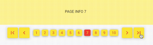
NumberPagination 是一个 Flutter 包,提供传统的基于数字的分页界面,非常适合需要通过离散编号链接进行页面导航的应用程序。它模拟了经典的网页式分页,允许用户直接跳转到特定页面,而不是依赖无限滚动。该包支持 Android、iOS、Web、macOS、Windows 和 Linux 多个平台,适用于跨平台应用。它提供简洁且可自定义的用户界面,内置对页面范围显示、首页/末页按钮以及可配置样式的支持。非常适合需要精确导航的数据密集型界面。
适合场景
以结构化的方式显示大型数据集
在仪表板中创建用户友好的导航
实现搜索结果分页
使用页面控件构建管理面板
在内容列表中启用直接页面跳转
主要特点
编号页按钮
支持首页/末页导航
可自定义的样式选项
跨平台兼容性
可配置的页面范围显示
适用于所有屏幕尺寸的响应式设计
适合对象
开发人员构建类似网页的分页
需要结构化数据导航的应用程序
优先考虑可用性而非无限滚动的项目
面向多平台部署的团队
希望拥有简单直观页面控制的用户
使用建议
可能需要额外的样式设置以支持自定义主题
对于非常大的数据集,若未进行性能优化,则不理想
仅限数值导航(无无限滚动)
需要手动处理页面数据加载
最适合已知总页数的场景
原始 README
以下为关联源码仓库的 README 原文快照,最新内容请访问源码仓库。
number_pagination
Implementing Flutter Number Pagination using a Popular Web Approach.
This package is very simple. Without depending on other packages.
Its usage is also simple and easy.
NumberPagination
A customizable pagination widget for Flutter applications.
Overview
NumberPagination is a Flutter widget that provides an intuitive and flexible way to implement pagination in your applications. It displays page numbers and navigation controls, allowing users to easily navigate through multiple pages of content.
Features
Page number buttons
Navigation controls (first, previous, next, last)
Customizable appearance
Responsive design
Installation
Add this to your package's pubspec.yaml file:
dependencies:number_pagination:^1.1.0
Customization Options for NumberPagination Widget
The NumberPagination widget offers a wide range of customization options to tailor its appearance and behavior to your needs. Below is a comprehensive list of these options:
Page Display
Option
Type
Description
Default
visiblePagesCount
int
Number of page numbers to display at once
10
currentPage
int
Currently displayed page number
Required
totalPages
int
Total number of pages available
Required
Text Styling
Option
Type
Description
Default
fontSize
double
Font size for the page numbers
15
fontFamily
String?
Font family for the page numbers
null
Button Styling
Option
Type
Description
Default
buttonElevation
double
Elevation of the buttons
5
buttonRadius
double
Radius of the buttons
0
controlButtonSize
Size
Size of the control buttons
Size(48, 48)
numberButtonSize
Size
Size of the number buttons
Size(48, 48)
Colors
Option
Type
Description
Default
selectedTextColor
Color
Text color for the selected page button
Colors.white
unSelectedTextColor
Color
Text color for unselected page buttons
Colors.black
selectedButtonColor
Color
Background color of the selected page button
Colors.black
unSelectedButtonColor
Color
Background color of unselected page buttons
Colors.white
controlButtonColor
Color
Background color of control buttons
Colors.white
Icons
Option
Type
Description
Default
firstPageIcon
Widget
Icon for the "first page" button
Icon(Icons.first_page)
previousPageIcon
Widget
Icon for the "previous page" button
Icon(Icons.keyboard_arrow_left)
nextPageIcon
Widget
Icon for the "next page" button
Icon(Icons.keyboard_arrow_right)
lastPageIcon
Widget
Icon for the "last page" button
Icon(Icons.last_page)
Spacing
Option
Type
Description
Default
navigationButtonSpacing
double
Spacing between navigation buttons
4.0
sectionSpacing
double
Spacing between navigation buttons and page number buttons
10.0
betweenNumberButtonSpacing
double
Spacing between individual number buttons
3
Callback
Option
Type
Description
onPageChanged
Function(int)
Callback function triggered when the page changes
These customization options allow you to fine-tune the appearance and behavior of the NumberPagination widget to seamlessly integrate with your app's design and functionality.