搜索插件、代码仓与 APP 分类

step_progress_indicator 封面
插件详情v1.0.2

step_progress_indicator

由一系列选中和未选中步骤组成的条形指示器

AndroidiOSWebmacOSWindowsLinux
近 30 天下载
4.1万
喜欢数
926
Pub 分数
150

安装插件

flutter pub add step_progress_indicator

插件介绍

基于插件公开信息、社区数据与项目使用情况整理的选型参考。

一个 Flutter 包,提供可自定义的步骤进度条,以视觉方式表示用户在一系列步骤中的进展。每个步骤可以标记为选中或未选中,非常适合引导用户完成多阶段流程,如表单、引导流程或结账流程。该指示器支持平滑动画,并且具有高度可配置性,支持颜色、大小和步骤间距等选项。它可在所有主要平台(包括 Android、iOS、Web、macOS、Windows 和 Linux)上正常运行。

适合场景

  • 入门向导
  • 多步骤表单
  • 结账流程跟踪
  • 任务完成工作流
  • 教程进度指示器

主要特点

  • 可自定义步骤外观
  • 步骤之间的动画过渡
  • 对多平台的支持
  • 可配置的颜色和尺寸
  • 响应式设计
  • 与现有 UI 的轻松集成

适合对象

  • 应用开发者构建引导式用户旅程
  • 需要视觉进度反馈的设计人员
  • 需要跨平台一致性的项目
  • 以用户体验为中心的应用程序,具有顺序任务
  • 简单而优雅的进度可视化

使用建议

  • 限制为线性步骤进展
  • 不支持动态步骤添加/删除的内置功能
  • 需要手动管理步骤更新的状态
  • 不适合非线性工作流程
  • 可能需要额外的样式来支持复杂主题

原始 README

以下为关联源码仓库的 README 原文快照,最新内容请访问源码仓库。

Step Progress Indicator

GitHub: SandroMaglione Twitter: SandroMaglione

Open source Flutter package, bar indicator made of a series of selected and unselected steps.

Made by Sandro Maglione, check out his personal official website sandromaglione.com

Check out the full step_progress_indicator tutorial

See the full example here

Check out the official dartdoc for the package here

Screenshots

Install and import the package. Then just customize its parameters.

dependencies:
  flutter:
    sdk: flutter
  step_progress_indicator: ^1.0.2

The last no null-safe version of the package was v0.2.5+8

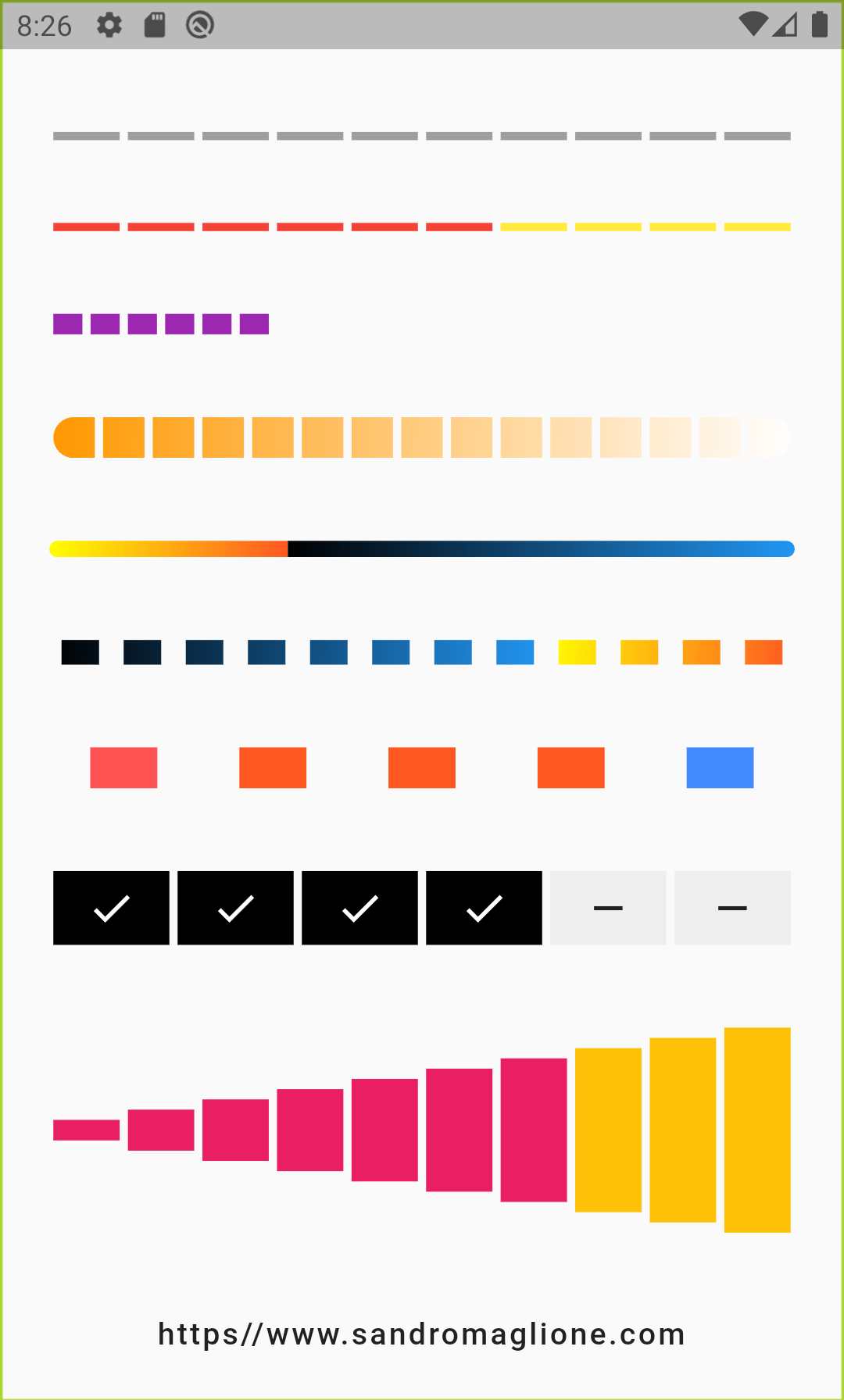
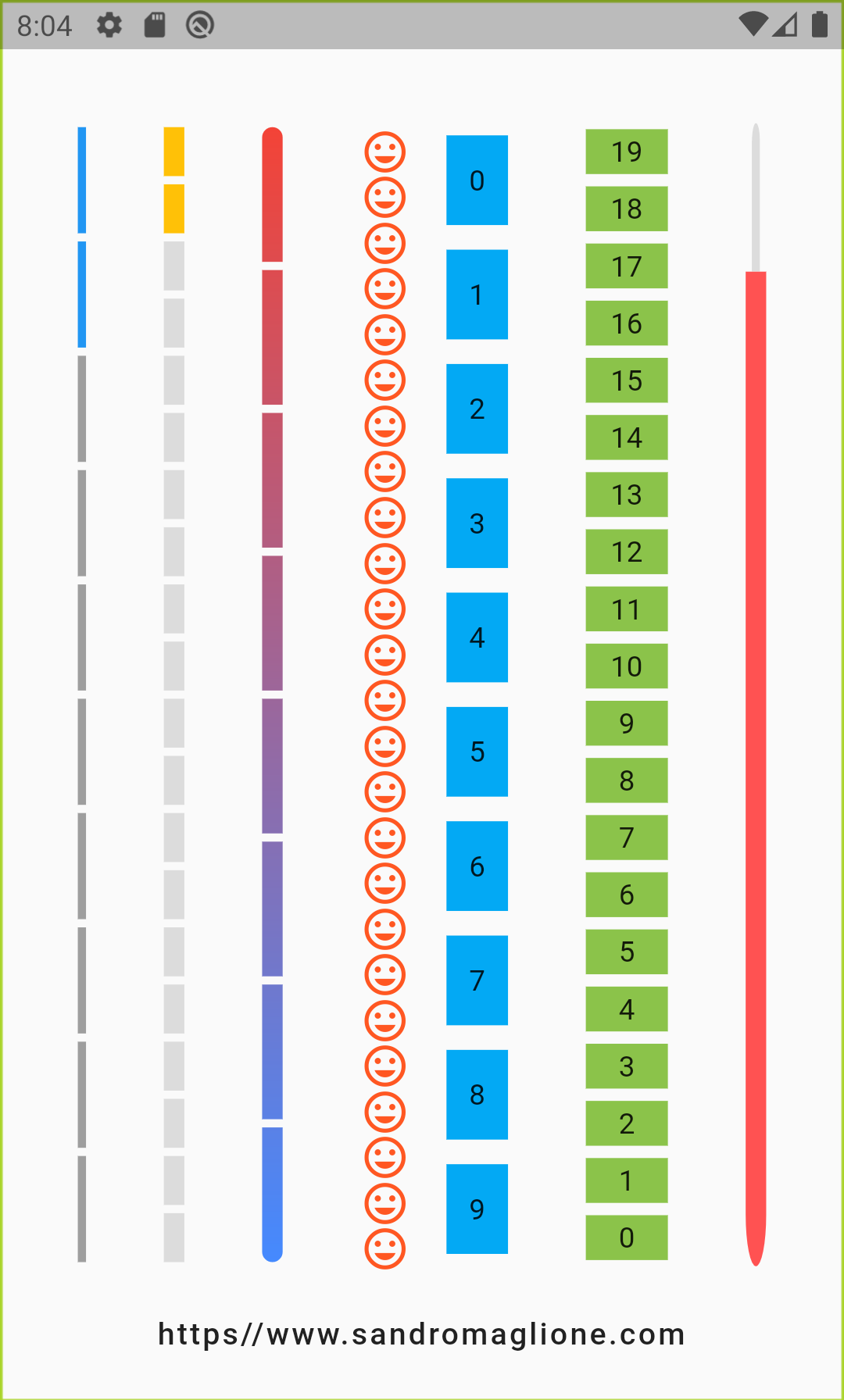
Horizontal Vertical
Horizontal indicator screen Vertical indicator screen
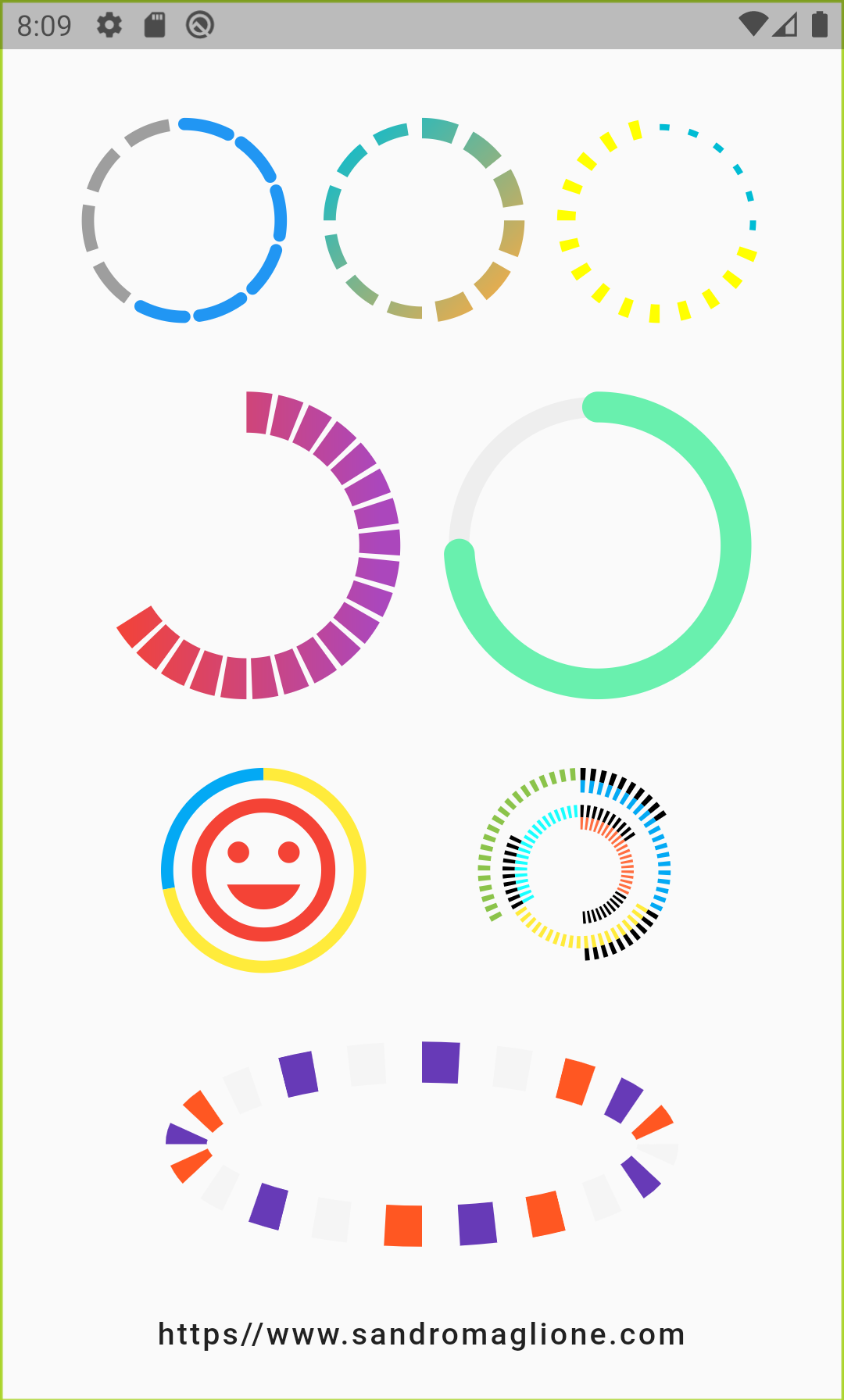
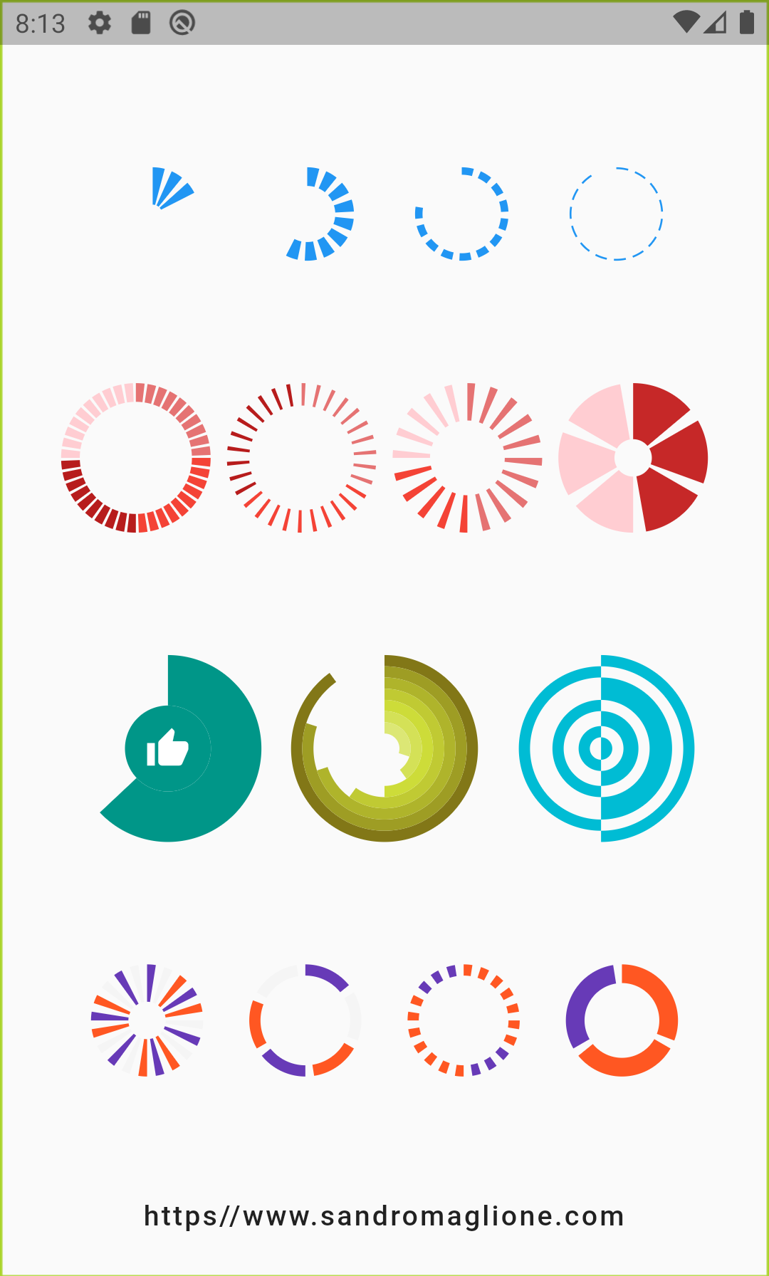
Circular1 Circular2
Circular step progress indicator screen 1 Circular step progress indicator screen 2
Circular step progress indicator screen 1 Circular step progress indicator example 1

Examples

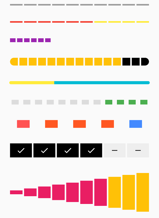
StepProgressIndicator - Example 1

Step Progress Indicator - Example 1

StepProgressIndicator(
    totalSteps: 10,
)
StepProgressIndicator - Example 2

Step Progress Indicator - Example 2

StepProgressIndicator(
    totalSteps: 10,
    currentStep: 6,
    selectedColor: Colors.red,
    unselectedColor: Colors.yellow,
)
StepProgressIndicator - Example 3

Step Progress Indicator - Example 3

StepProgressIndicator(
    totalSteps: 20,
    currentStep: 6,
    size: 10,
    selectedColor: Colors.purple,
    unselectedColor: Colors.transparent,
)
StepProgressIndicator - Example 4

Step Progress Indicator - Example 4

StepProgressIndicator(
    totalSteps: 15,
    currentStep: 12,
    size: 20,
    selectedColor: Colors.amber,
    unselectedColor: Colors.black,
    roundedEdges: Radius.circular(10),
    gradientColor: LinearGradient(
        begin: Alignment.topLeft,
        end: Alignment.bottomRight,
        colors: [Colors.orange, Colors.white],
    ),
),
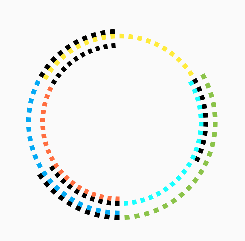
StepProgressIndicator - Example 5

Step Progress Indicator - Example 5

StepProgressIndicator(
    totalSteps: 100,
    currentStep: 32,
    size: 8,
    padding: 0,
    selectedColor: Colors.yellow,
    unselectedColor: Colors.cyan,
    roundedEdges: Radius.circular(10),
    selectedGradientColor: LinearGradient(
        begin: Alignment.topLeft,
        end: Alignment.bottomRight,
        colors: [Colors.yellowAccent, Colors.deepOrange],
    ),
    unselectedGradientColor: LinearGradient(
        begin: Alignment.topLeft,
        end: Alignment.bottomRight,
        colors: [Colors.black, Colors.blue],
    ),
),
StepProgressIndicator - Example 6

Step Progress Indicator - Example 6

StepProgressIndicator(
    totalSteps: 12,
    currentStep: 4,
    padding: 6.0,
    size: 12,
    progressDirection: TextDirection.rtl,
    selectedColor: Colors.green,
    unselectedColor: Colors.black12,
    selectedGradientColor: LinearGradient(
        begin: Alignment.topLeft,
        end: Alignment.bottomRight,
        colors: [Colors.yellowAccent, Colors.deepOrange],
    ),
    unselectedGradientColor: LinearGradient(
        begin: Alignment.topLeft,
        end: Alignment.bottomRight,
        colors: [Colors.black, Colors.blue],
    ),
)
StepProgressIndicator - Example 7

Step Progress Indicator - Example 7

StepProgressIndicator(
    totalSteps: 5,
    padding: 20.0,
    size: 20,
    customColor: (index) => index == 0
        ? Colors.redAccent
        : index == 4 ? Colors.blueAccent : Colors.deepOrange,
)
StepProgressIndicator - Example 8

Step Progress Indicator - Example 8

StepProgressIndicator(
    totalSteps: 6,
    currentStep: 4,
    size: 36,
    selectedColor: Colors.black,
    unselectedColor: Colors.grey[200],
    customStep: (index, color, _) => color == Colors.black
        ? Container(
            color: color,
            child: Icon(
            Icons.check,
            color: Colors.white,
            ),
        )
        : Container(
            color: color,
            child: Icon(
            Icons.remove,
            ),
        ),
)
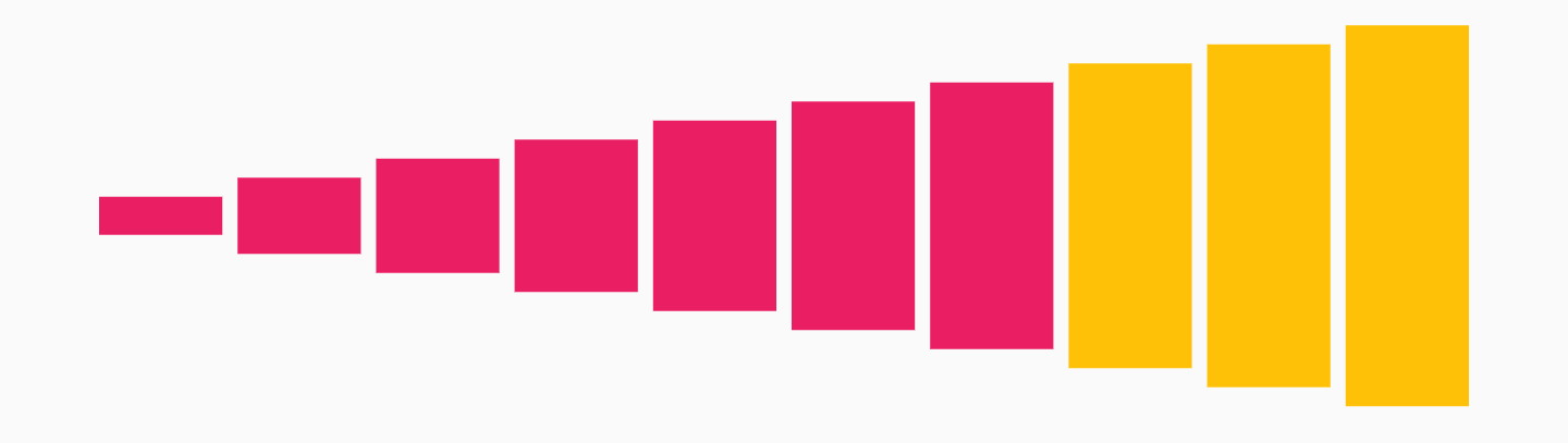
StepProgressIndicator - Example 9

Step Progress Indicator - Example 9

StepProgressIndicator(
    totalSteps: 10,
    currentStep: 7,
    selectedColor: Colors.pink,
    unselectedColor: Colors.amber,
    customSize: (index) => (index + 1) * 10.0,
)

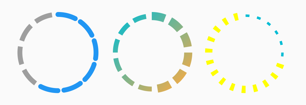
CircularStepProgressIndicator - Example 1

Circular Step Progress Indicator - Example 1

Row(
    mainAxisAlignment: MainAxisAlignment.spaceEvenly,
    children: <Widget>[
        CircularStepProgressIndicator(
            totalSteps: 10,
            currentStep: 6,
            width: 100,
            roundedCap: (_, isSelected) => isSelected,
        ),
        CircularStepProgressIndicator(
            totalSteps: 12,
            currentStep: 6,
            selectedColor: Colors.redAccent,
            unselectedColor: Colors.grey[200],
            selectedStepSize: 10.0,
            width: 100,
            gradientColor: LinearGradient(
                begin: Alignment.topLeft,
                end: Alignment.bottomRight,
                colors: [Colors.cyan, Colors.orangeAccent],
            ),
        ),
        CircularStepProgressIndicator(
            totalSteps: 20,
            currentStep: 6,
            padding: math.pi / 15,
            selectedColor: Colors.cyan,
            unselectedColor: Colors.yellowAccent,
            selectedStepSize: 3.0,
            unselectedStepSize: 9.0,
            width: 100,
        ),
    ],
)
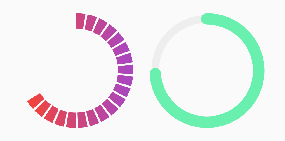
CircularStepProgressIndicator - Example 2

Circular Step Progress Indicator - Example 2

Row(
    mainAxisAlignment: MainAxisAlignment.spaceEvenly,
    children: <Widget>[
    CircularStepProgressIndicator(
        totalSteps: 20,
        currentStep: 12,
        stepSize: 20,
        selectedColor: Colors.red,
        unselectedColor: Colors.purple[400],
        padding: math.pi / 80,
        width: 150,
        height: 150,
        startingAngle: -math.pi * 2 / 3,
        arcSize: math.pi * 2 / 3 * 2,
        gradientColor: LinearGradient(
            colors: [Colors.red, Colors.purple[400]],
        ),
    ),
    CircularStepProgressIndicator(
        totalSteps: 100,
        currentStep: 74,
        stepSize: 10,
        selectedColor: Colors.greenAccent,
        unselectedColor: Colors.grey[200],
        padding: 0,
        width: 150,
        height: 150,
        selectedStepSize: 15,
        roundedCap: (_, __) => true,
    ),
    ],
),
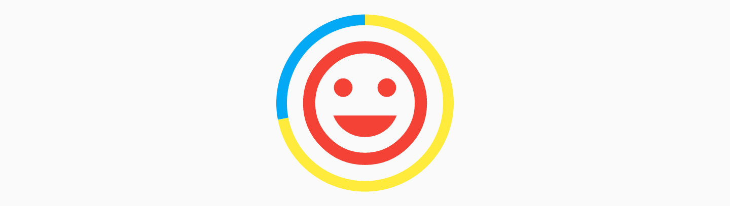
CircularStepProgressIndicator - Example 3

Circular Step Progress Indicator - Example 3

CircularStepProgressIndicator(
    totalSteps: 100,
    currentStep: 72,
    selectedColor: Colors.yellow,
    unselectedColor: Colors.lightBlue,
    padding: 0,
    width: 100,
    child: Icon(
        Icons.tag_faces,
        color: Colors.red,
        size: 84,
    ),
)
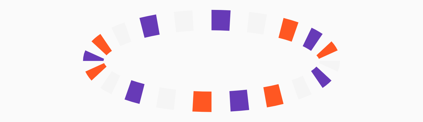
CircularStepProgressIndicator - Example 4

Circular Step Progress Indicator - Example 4

CircularStepProgressIndicator(
    totalSteps: 20,
    stepSize: 20,
    customColor: (index) => index % 3 == 0
        ? Colors.deepPurple
        : index % 2 == 0
            ? Colors.deepOrange
            : Colors.grey[100],
    width: 250,
)

StepProgressIndicator Parameters

Parameter Type Description Default
totalSteps int Total number of step of the complete indicator. @required
currentStep int Number of steps to underline, all the steps with index <= currentStep will have Color equal to selectedColor. 0
customStep(int, Color, double) Widget Defines a custom Widget to display at each step, given the current step index, the Color, which could be defined with selectedColor and unselectedColor or using customColor, and its size, which could be defined using size, selectedSize, unselectedSize, or customSize. -
onTap(int) void Function() Defines onTap function given index of the pressed step. -
customColor(int) Color Assign a custom Color for each step. -
customSize(int) double Assign a custom size for each step. -
selectedColor Color Color of the selected steps. Colors.blue
unselectedColor Color Color of the unselected steps. Colors.grey
gradientColor Gradient Apply gradient color to the indicator. -
selectedGradientColor Gradient Apply gradient color to the selected steps of the indicator. -
unselectedGradientColor Gradient Apply gradient color to the unselected steps of the indicator. -
blendMode BlendMode Apply BlendMode to ShaderMask when gradientColor, selectedGradientColor, or unselectedGradientColor defined. -
direction Axis Defines if indicator is horizontal or vertical. Axis.horizontal
progressDirection TextDirection Defines if steps grow from left-to-right / top-to-bottom TextDirection.ltr or right-to-left / bottom-to-top TextDirection.rtl. TextDirection.ltr
size double Size of the indicator (height if direction is Axis.horizontal, width if Axis.vertical). 4.0
padding double Spacing, left-right if horizontal, top-bottom if vertical, of each step. 2.0
fallbackLength double Length of the progress indicator in case the main axis (based on direction attribute) has no size limit i.e. double.infinity. 100.0
selectedSize double Specify a custom size for selected steps. -
unselectedSize double Specify a custom size for unselected steps. -
roundedEdges Radius Add rounded edge corners to first and last step. -
mainAxisAlignment MainAxisAlignment Assign alignment MainAxisAlignment for indicator's container. MainAxisAlignment.center
crossAxisAlignment CrossAxisAlignment Assign alignment CrossAxisAlignment for indicator's container. CrossAxisAlignment.center
stepMainAxisAlignment MainAxisAlignment Assign alignment MainAxisAlignment for a single step. MainAxisAlignment.center
stepCrossAxisAlignment CrossAxisAlignment Assign alignment CrossAxisAlignment for a single step. CrossAxisAlignment.center

CircularStepProgressIndicator Parameters

Parameter Type Description Default
totalSteps int Total number of step of the complete indicator. @required
currentStep int Number of steps to underline, all the steps with index <= currentStep will have Color equal to selectedColor. 0
child Widget Widget child contained inside the indicator. -
selectedColor Color Color of the selected steps. Colors.blue
unselectedColor Color Color of the unselected steps. Colors.grey
customColor(int) Color Assign a custom Color for each step. -
gradientColor Gradient Apply a gradient color to the indicator. -
customStepSize(int, bool) double Assign a custom size for each step. -
selectedStepSize double Specify a custom size for selected steps. -
unselectedStepSize double Specify a custom size for unselected steps. -
circularDirection CircularDirection Defines if steps grow clockwise (CircularDirection.clockwise) or counterclockwise (CircularDirection.counterclockwise) CircularDirection.clockwise
stepSize double Size of the each step of the indicator. 6.0
height double Height of the indicator's container. -
width double Width of the indicator's container. -
padding double Spacing between each step. math.pi / 20
startingAngle double Angle in which is placed the starting point of the indicator. 0
roundedCap(int, bool) bool Adds rounded edges at the beginning and at the end of the circular indicator given int index of each step and a bool telling if the step is selected. (_, __) => false
removeRoundedCapExtraAngle bool Removes extra angle caused by StrokeCap.butt when roundedCap is applied #20. false
arcSize double Angle in radiants which represents the size of the arc used to display the indicator. math.pi * 2
fallbackHeight double Height of the indicator's container in case the parent height has no size limit i.e. double.infinity. 100.0
fallbackWidth double Width of the indicator's container in case the parent width has no size limit i.e. double.infinity. 100.0

Roadmap

I am always open for suggestions and ideas for possible improvements or fixes.

Feel free to open a Pull Request if you would like to contribute to the project.

If you would like to have a new feature implemented, just write a new issue.

Versioning

  • v1.0.2 - 2 January 2022
  • v1.0.1 - 16 June 2021
  • v1.0.0 - 10 May 2021
  • v0.2.5+8 - 01 December 2020
  • v0.2.4+7 - 25 August 2020
  • v0.2.3+6 - 20 May 2020
  • v0.2.2+5 - 26 April 2020
  • v0.2.1+4 - 25 February 2020
  • v0.2.0+3 - 24 February 2020
  • v0.1.1+2 - 24 January 2020
  • v0.1.0+1 - 23 January 2020

Support

If you would like to support my work, why don't you buy me a coffee?

License

MIT License, see the LICENSE.md file for details.

所属分类

源码仓库

使用此插件的项目