搜索插件、代码仓与 APP 分类

sticky_and_expandable_list 封面
插件详情v1.1.3

sticky_and_expandable_list

构建一个分组列表,支持展开/折叠部分和粘性标题,并支持与滑动条小部件一起使用。

AndroidiOSWebmacOSWindowsLinux
近 30 天下载
7820
喜欢数
175
Pub 分数
140

安装插件

flutter pub add sticky_and_expandable_list

插件介绍

基于插件公开信息、社区数据与项目使用情况整理的选型参考。

一个 Flutter 包,可创建带有可折叠部分和粘性标题的分组列表,非常适合以层次结构组织内容。它与 Sliver 小部件无缝集成,适用于自定义滚动视图(如 CustomScrollView)。该包支持所有主要平台,包括 Android、iOS、Web、macOS、Windows 和 Linux,为不同设备提供一致的体验。它通过最少的样板代码简化了复杂的列表交互。

适合场景

  • 分组数据显示
  • 可折叠部分列表
  • 粘性标题导航
  • 自定义滚动视图
  • 动态内容组织
  • 长列表的增强用户界面

主要特点

  • 可展开/可折叠部分
  • 粘性章节标题
  • Sliver 小部件兼容性
  • 跨平台支持
  • 所需设置最少
  • 平滑动画

适合对象

  • 开发复杂列表的开发者
  • 需要交互式布局的UI设计师
  • 具有层级数据的应用程序
  • 带标题的可滚动界面
  • 移动和Web应用

使用建议

  • 需要了解 Sliver 小部件
  • 在非常大的数据集上可能会影响性能
  • 超出基础样式的定制功能有限
  • 最适合中等规模的分组数据
  • 不建议用于简单的扁平列表

原始 README

以下为关联源码仓库的 README 原文快照,最新内容请访问源码仓库。

sticky_and_expandable_list

Flutter implementation of sticky headers and expandable list.Support use it in a CustomScrollView.

Pub README i18n:中文说明

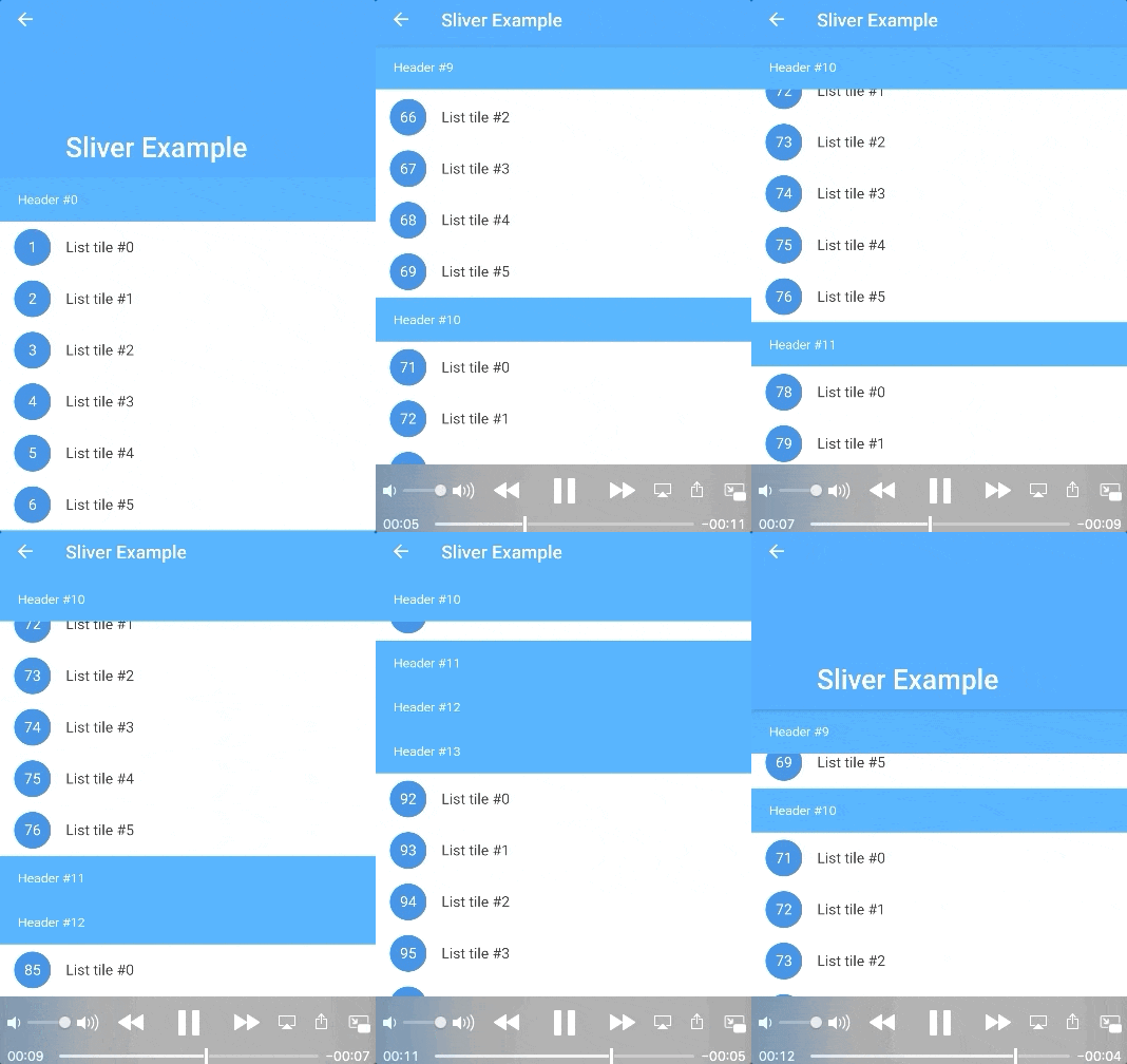
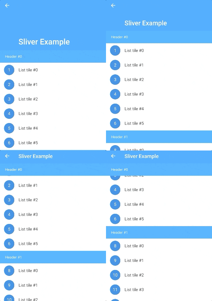
Screenshot

Features

  • Build a grouped list, which support expand/collapse section and sticky header.
  • Use it with CustomScrollView、SliverAppBar.
  • Listen the scroll offset of current sticky header, current sticky header index and switching header index.
  • Only use one list widget, so it supports large data and a normal memory usage.
  • More section customization support, you can return a new section widget by sectionBuilder, to customize background,expand/collapse animation, section layout, and so on.
  • Support add divider.
  • Support overlap content.
  • Support scroll to index like ListView, by scroll-to-index.
  • Pull to refresh and load more, by pull_to_refresh.

Getting Started

In the pubspec.yaml of your flutter project, add the following dependency:

dependencies:
  sticky_and_expandable_list: ^1.1.3

Basic Usage

sectionList is a custom data source for ExpandableListView. We should create a model list to store the information of each section, the model must implement ExpandableListSection.

    //In this example, we create a custom model class(ExampleSection).
    //class ExampleSection implements ExpandableListSection<String> {}
    //so: SliverExpandableChildDelegate<String, ExampleSection>()
    List<ExampleSection> sectionList = List<ExampleSection>();
    return ExpandableListView(
      builder: SliverExpandableChildDelegate<String, ExampleSection>(
          sectionList: sectionList,
          headerBuilder: (context, sectionIndex, index) =>
              Text("Header #$sectionIndex"),
          itemBuilder: (context, sectionIndex, itemIndex, index) {
            String item = sectionList[sectionIndex].items[itemIndex];
            return ListTile(
              leading: CircleAvatar(
                child: Text("$index"),
              ),
              title: Text(item),
            );
          }),
    );

Detail Examples

If you want to use it with sliver widget, use SliverExpandableList instead of ExpandableListView.

FAQ

How to expand/collapse item?
setState(() {
  sectionList[i].setSectionExpanded(true);
});

Example

How to listen current sticky header or the sticky header scroll offset?
  @override
  Widget build(BuildContext context) {
    ExpandableListView(
      builder: SliverExpandableChildDelegate<String, ExampleSection>(
        headerController: _getHeaderController(),
      ),
    )
  }

  _getHeaderController() {
    var controller = ExpandableListController();
    controller.addListener(() {
      print("switchingSectionIndex:${controller.switchingSectionIndex}, stickySectionIndex:" +
          "${controller.stickySectionIndex},scrollPercent:${controller.percent}");
    });
    return controller;
  }
How to set background for each section?

Use sectionBuilder

Customize expand/collapse animation support?

Example

Change Log

CHANGELOG

所属分类

源码仓库

使用此插件的项目