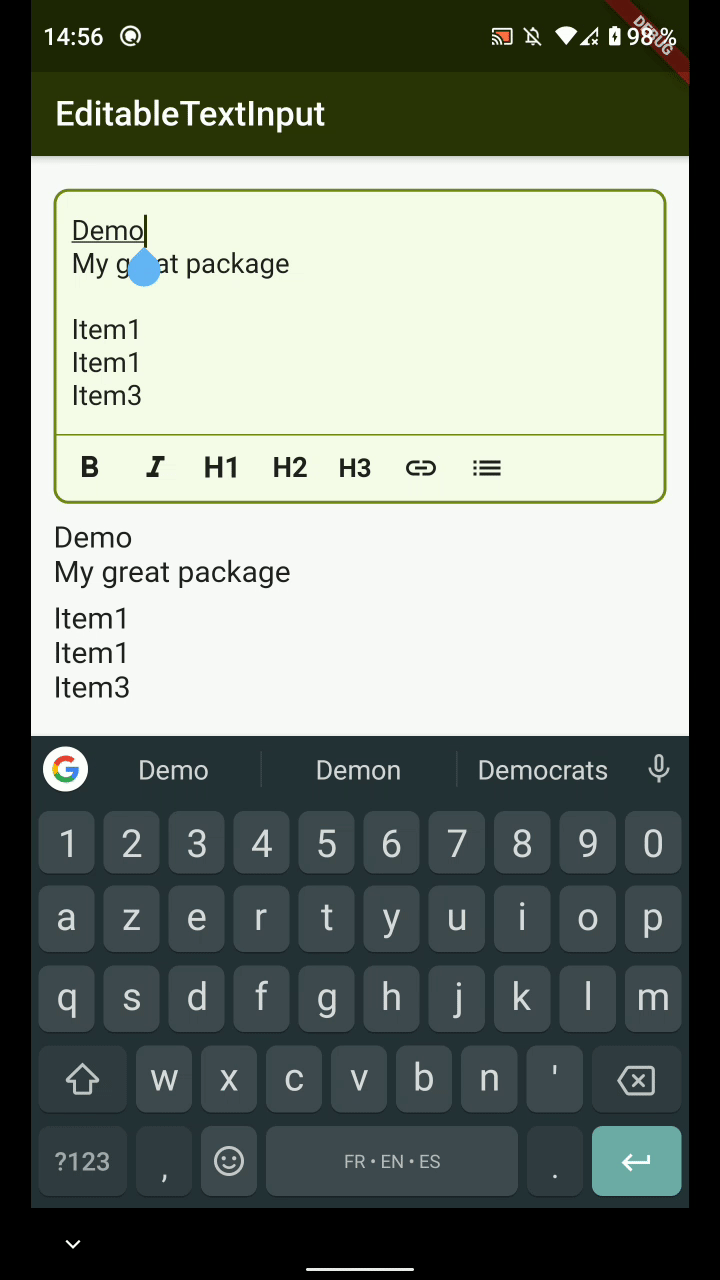
markdown_editable_textinput
MarkdownEditableTextInput is a TextField Widget that allow you to convert easily what's in the TextField to Markdown.
Features
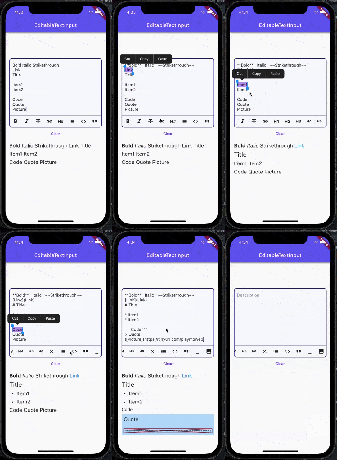
- [x] Convert to Bold, Italic, Strikethrough
- [x] Convert to Code, Quote, Links
- [x] Convert to Heading (H1, H2, H3, H4, H5, H6) and Links
- [x] Support text direction
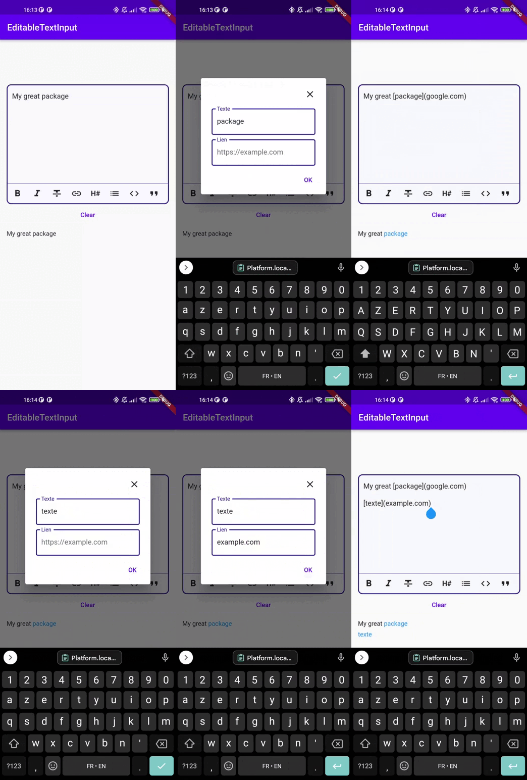
- [x] Dialog mode to enter link and picture
- [x] Possibility to add custom buttons to the action bar
Demo
Link by Dialog demo
Usage
The color of the MarkdownTextInput is defined by the color set in your Theme :
- primaryColor: Cursor's color
- colorScheme.secondary: MarkdownTextInput's borders
- cardColor: Background color of MarkdownTextInput
Attributes
| Attributes |
Example Value |
Description |
| Function onTextChanged |
|
Callback used to retrieve the text in parent's Widget |
| String initialValue |
"Lorem Ipsum" |
Display an initial value in MarkdownTextInput's field |
| Function validators |
|
Add validators to the MarkdownTextInput |
| String label |
"Description" |
Display a label in MarkdownTextInput |
| TextDirection textDirection |
TextDirection.rtl |
Change text direction |
| int maxLines |
3 |
The maximum of lines that can be display in the input |
| List actions |
[MarkdownType.bold, MarkdownType.italic] |
Actions the editor will handle |
| TextEditingController controller |
TextEditingController() |
Pass your own controller. Can be used to clear the input for example |
| TextStyle textStyle |
Theme.of(context).textTheme.bodyText2 |
Overrides input text style |
| bool insertLinksByDialog; |
true |
Choose to use dialog or not to insert link |
| bool insertImageByDialog; |
true |
Choose to use dialog or not to insert an image |
| bool insertImageByDialog; |
true |
Choose to use dialog or not to insert an image |
| bool customCancelDialogText; |
String? |
Text used by dialog for close dialog action |
| bool customSubmitDialogText; |
String? |
Text used by dialog for validate dialog action |
Example
You can see an example of how to use this package here