搜索插件、代码仓与 APP 分类

popover 封面
插件详情v0.5.1

popover

弹出框是在您点击控件或某个区域时,出现在屏幕上其他内容之上的临时视图。

AndroidiOSWebmacOSWindowsLinux
近 30 天下载
3.9万
喜欢数
688
Pub 分数
160

安装插件

flutter pub add popover

插件介绍

基于插件公开信息、社区数据与项目使用情况整理的选型参考。

弹出窗口包提供了一种灵活且平台感知的方式,用于在用户交互触发时显示临时的浮动视图,这些视图会出现在其他内容之上。专为与按钮或图标等控件配合使用而设计,支持在 Android、iOS、Web、macOS、Windows 和 Linux 上实现流畅的动画和自适应定位。该包确保行为一致,同时尊重每个平台的原生设计指南。非常适合用于上下文菜单、工具提示或快速操作面板,而不会中断主 UI 流程。

适合场景

  • 显示上下文菜单
  • 显示快速操作面板
  • 创建工具提示
  • 显示表单验证提示
  • 启用内联编辑选项

主要特点

  • 跨平台兼容性
  • 自适应定位
  • 流畅的动画
  • 可自定义内容
  • 支持触摸和指针事件
  • 响应屏幕边界

适合对象

  • 开发交互式 UI 的开发者
  • 针对多个平台的 Teams
  • 需要上下文叠加的应用程序
  • 需要可重用弹出框的设计系统
  • 使用 Material 或 Cupertino 小部件的项目

使用建议

  • 需要正确处理取消手势
  • 可能需要自定义样式来处理复杂布局
  • 大量并发弹出窗口的性能影响
  • 有限的内置主题选项
  • 不适用于持久内容

原始 README

以下为关联源码仓库的 README 原文快照,最新内容请访问源码仓库。

Popover

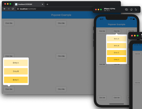
Popover screenshots

Popover for Flutter

Supported platforms Popover is released under the MIT license. Effective Dart PRs welcome!
Current Build Status.

Content

Features

A popover is a transient view that appears above other content onscreen when you tap a control or in an area. Typically, a popover includes an arrow pointing to the location from which it emerged. Popovers can be nonmodal or modal. A nonmodal popover is dismissed by tapping another part of the screen or a button on the popover. A modal popover is dismissed by tapping a Cancel or other button on the popover.

Source: Human Interface Guidelines.

Requirements

  • Dart: 3.9.0+
  • Flutter: 3.35.0+

Install

dependencies:
  popover: ^0.4.0

Example

See example/lib/main.dart.

import 'package:flutter/material.dart';
import 'package:popover/popover.dart';

class PopoverExample extends StatelessWidget {
  @override
  Widget build(BuildContext context) {
    return MaterialApp(
      home: Scaffold(
        appBar: AppBar(title: const Text('Popover Example')),
        body: const SafeArea(
          child: Padding(
            padding: EdgeInsets.all(16),
            child: Button(),
          ),
        ),
      ),
    );
  }
}

class Button extends StatelessWidget {
  const Button({Key? key}) : super(key: key);

  @override
  Widget build(BuildContext context) {
    return Container(
      width: 80,
      height: 40,
      decoration: const BoxDecoration(
        color: Colors.white,
        borderRadius: BorderRadius.all(Radius.circular(5)),
        boxShadow: [BoxShadow(color: Colors.black26, blurRadius: 5)],
      ),
      child: GestureDetector(
        child: const Center(child: Text('Click Me')),
        onTap: () {
          showPopover(
            context: context,
            bodyBuilder: (context) => const ListItems(),
            onPop: () => print('Popover was popped!'),
            direction: PopoverDirection.bottom,
            width: 200,
            height: 400,
            arrowHeight: 15,
            arrowWidth: 30,
          );
        },
      ),
    );
  }
}

class ListItems extends StatelessWidget {
  const ListItems({Key? key}) : super(key: key);

  @override
  Widget build(BuildContext context) {
    return Padding(
        padding: const EdgeInsets.symmetric(vertical: 8),
        child: ListView(
          padding: const EdgeInsets.all(8),
          children: [
            InkWell(
              onTap: () {
                Navigator.of(context)
                  ..pop()
                  ..push(
                    MaterialPageRoute<SecondRoute>(
                      builder: (context) => SecondRoute(),
                    ),
                  );
              },
              child: Container(
                height: 50,
                color: Colors.amber[100],
                child: const Center(child: Text('Entry A')),
              ),
            ),
            const Divider(),
            Container(
              height: 50,
              color: Colors.amber[200],
              child: const Center(child: Text('Entry B')),
            ),
            const Divider(),
            Container(
              height: 50,
              color: Colors.amber[300],
              child: const Center(child: Text('Entry C')),
            ),
          ],
        ),
    );
  }
}

class SecondRoute extends StatelessWidget {
  @override
  Widget build(BuildContext context) {
    return Scaffold(
      appBar: AppBar(
        title: const Text('Second Route'),
        automaticallyImplyLeading: false,
      ),
      body: Center(
        child: ElevatedButton(
          onPressed: () => Navigator.pop(context),
          child: const Text('Go back!'),
        ),
      ),
    );
  }
}

To see examples of the following package on a device or simulator:

cd example && flutter run

Support

This project accepts pull requests only.

If you've encountered a bug or have an improvement in mind, please open a PR with a minimal fix or a reproduction in the example app. See CONTRIBUTING.md for the full contribution process.

License

The source code of the Popover project is available under the MIT license. See the LICENSE file for more info.

所属分类

源码仓库

使用此插件的项目