Note: To inherit the correct ScrollController, please do not set primary to false.
The suggestions box will automatically provide an ambient PrimaryScrollController.
Customizing the TextField
The TypeAheadField will use a simple default TextField builder, if none is provided.
To customize your TextField, you can use the builder property.
You may also use a TextFormField or any other widget that connects to a TextEditingController and FocusNode.
It is crucial that you use the provided controller and focusNode properties,
as they are required for the suggestions box to function.
Customizing the suggestions box
The TypeAheadField will use a simple default decoration builder.
To customize the suggestions box, you can create your own decoration builder.
You may also specify offsets and constraints to position the suggestions box.
By default, the suggestions box will maintain the old suggestions while new
suggestions are being retrieved. To show a circular progress indicator
during retrieval instead, set keepSuggestionsOnLoading to false.
Hiding the suggestions box
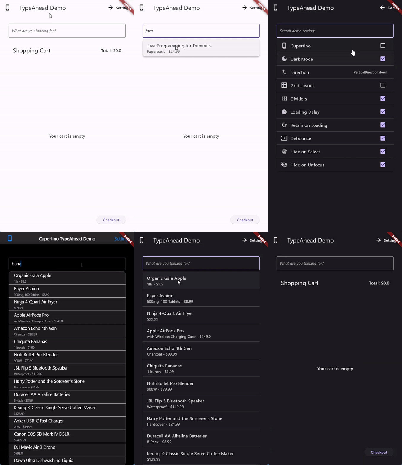
You may want to hide the suggestions box when it is in certain states.
You can do so with the following parameters:
hideOnLoading: Hide the suggestions box while suggestions are being retrieved. This ignores the loadingBuilder.
hideOnEmpty: Hide the suggestions box when there are no suggestions. This ignores the emptyBuilder.
hideOnError: Hide the suggestions box when there is an error retrieving suggestions. This ignores the errorBuilder.
hideOnSelect: Hide the suggestions box when a suggestion is selected. True by default.
hideOnUnfocus: Hide the suggestions box when the TextField loses focus. True by default.
You can also very generally hide the suggestions box by returning null from the suggestionsCallback.
This is different from returning an empty list, which will show the empty widget.
Customizing the animation
Animation duration can be customized using the animationDuration parameter.
You may also specify a custom animation using the transitionBuilder parameter.
The suggestions box does not fire for each character the user types. Instead,
we wait until the user is idle for a duration of time, and then call the
suggestionsCallback. The duration defaults to 300 milliseconds``, but can be configured using the debounceDuration` parameter.
Customizing the direction
By default, the list grows towards the bottom. However, you can use the direction to specify either VerticalDirection.down or VerticalDirection.up.
The suggestions list will automatically reverse in case it is flipped.
To turn off this behavior, set autoFlipDirection to false.
Controlling the suggestions box
You may manually control many aspects of the suggestions box by using the SuggestionsController class.
It grants access to the following:
the current suggestions
the current loading state
the current error
the open/closed state
the desired and effective direction
the stream of selected suggestions
the callback to trigger a resize
When building a widget inside of the suggestions box, you can access the controller via SuggestionsController.of(context).
Controlling the focus
Focus plays an important role in the suggestions box. It is used to determine when to show and hide the suggestions box.
However, in certain situations you may want to control the suggestions box independently of the focus.
Options to do so are as follows:
On the TypeAheadField:
showOnFocus (default: true): Show the suggestions box when the TextField gains focus.
hideOnUnfocus (default: true): Hide the suggestions box when the TextField loses focus.
On the SuggestionsController:
open(gainFocus: false): Show the suggestions box without focusing it.
close(retainFocus: true): Hide the suggestions box without unfocusing it.
Customizing everything
To create your own version of the TypeAhead widget, that is neither Material nor Cupertino, you can use the RawTypeAheadField widget.
You must then specify the following parameters:
builder (to build the TextField)
loadingBuilder (to build the loading widget)
errorBuilder (to build the error widget)
emptyBuilder (to build the empty widget)
itemBuilder (to build the suggestions)
As well as all the usual parameters, such as suggestionsCallback, onSelected, etc.
The decorationBuilder can be used to inject required wrappers like Material or DefaultTextStyle.
For more information, see the source code of the TypeAheadField widget.
FAQ
My suggestions arent changing when I type
You have most likely forgotten to pass the controller and focus node to the TextField in the builder property.
This is required for the suggestions box to function. Here is an example:
TypeAheadField(
// ...
controller: myTextEditingController, // your custom controller, or null
builder: (context, controller, focusNode) {
returnTextField(
controller: controller, // note how the controller is passed
focusNode: focusNode,
// ...
);
},
);
My suggestions are not updating when I click on the TextField
The TypeAhead field caches the suggestions to avoid unnecessary calls to the suggestionsCallback.
If you want to force the suggestions to update, you can use the SuggestionsController to force a refresh.
mySuggestionsController.refresh();
My suggestions box grows while scrolling, then disappears and reappears
The suggestions box uses the overlay to position itself relative to the text field.
Its available size is based on the remaining screen space, which changes as you scroll.
If the scrollable virtualizes its children (removing offscreen widgets from the tree),
the text field gets unmounted and the suggestions box disappears.
To fix this:
Ensure the scrollable keeps the TypeAheadField in the tree while scrolling.
Use a non-virtualizing scrollable like SingleChildScrollView with a Column.
Note that ListView (even with shrinkWrap: true) still culls offscreen children.
Constrain the maximum height of the suggestions box with constraints: BoxConstraints(maxHeight: 200) so it doesn't grow with available space.
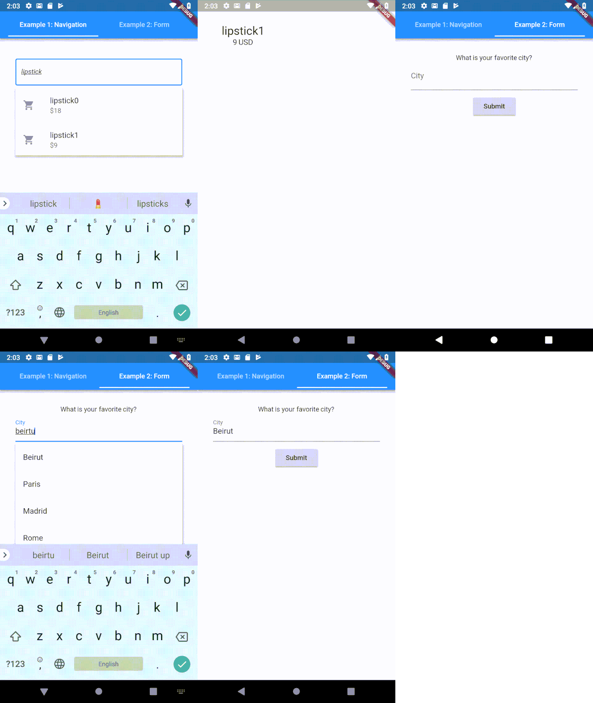
My suggestions box overlaps with other pages in a PageView
When the TypeAheadField is inside a PageView or TabBarView with constrainWidth: false,
the suggestions box extends to the full overlay width, which can overlap adjacent pages.
This scopes the suggestions box to the page's own overlay, so it slides out naturally with the page.
Migrations
From 5.x to 6.x
The package no longer depends on flutter_keyboard_visibility or pointer_interceptor. The following changes have been made:
hideWithKeyboard has been removed. This parameter never worked as intended, since closing the keyboard also loses focus, which is already handled by hideOnUnfocus. If you were using hideWithKeyboard: false, use hideOnUnfocus: false instead.
From 4.x to 5.x
Since version 5.x, the package is based on Dart 3 (null-safety enforced). To use this package, please upgrade your Flutter SDK.
Additionally, various changes have been made to the API surface to make the package more flexible and customizable. The following changes have been made:
SuggestionsBoxDecoration has been removed. You can now directly wrap the SuggestionsBox with any widget you wish via the decorationBuilder property.
TextFieldConfiguration has been removed. You can now directly build your own custom TextField via the builder property.
Note that you must use the provided controller and focusNode properties, as they are required for the suggestions box to function.
SuggestionsBoxController has been renamed to SuggestionsController.
CupertinoSuggestionsBoxController has been merged into SuggestionsController.
SuggestionsController now holds the full state of the suggestions box, meaning suggestions, loading and error state. It will also send notifications when state changes occur.
SuggestionsController now offers streams for when a suggestion is selected.
SuggestionsBox should now automatically resize in all situations. Manual resize calls are no longer required.
TypeAheadFormField has been removed. You can use the builder property to build your own TextFormField.
Various parameters have been renamed to be shorter and more concise. Notable changes include:
suggestionsBoxController -> suggestionsController
layoutArchitecture -> listBuilder
noItemsFoundBuilder-> emptyBuilder
onSuggestionSelected -> onSelected
suggestionsBoxVerticalOffset -> offset (now also includes horizontal offset)
hideSuggestionsOnKeyboardHide -> hideWithKeyboard
Note: In v4, hideSuggestionsOnKeyboardHide also controlled whether the box closed on focus loss.
In v5, this is now two separate flags. If you were using hideSuggestionsOnKeyboardHide: false,
you will also need to set hideOnUnfocus: false to get the same behavior.
intercepting: This is now always true, since it doesnt interfere on mobile platforms and generally has no downsides.
onSuggestionsBoxToggle: You can subscribe to the SuggestionsController to get notified when the suggestions box is toggled.
ignoreAccessibleNavigation: The new Overlay code no longer requires to act differently when accessibility is enabled.
minCharsForSuggestions: You can return null from suggestionsCallback instead.
animationStart: You can use the animation in the builder and map it to customise this.
autoFlipListDirection: This is now always true. You can use the list builder to disable this behavior.
getImmediateSuggestions: You can use the debounceDuration to achieve the same effect.
From 2.x to 3.x
Since version 3.x, the package is based on Dart 2.12 (null-safety).
Flutter now also features the inbuilt Autocomplete widget, which has similar behavior to this package.
This project is the result of the collective effort of contributors who participated effectively by submitting pull requests, reporting issues, and answering questions.
Thank you for your proactiveness, and we hope flutter_typeahead made your lifes at least a little easier!