RFlutter Alert
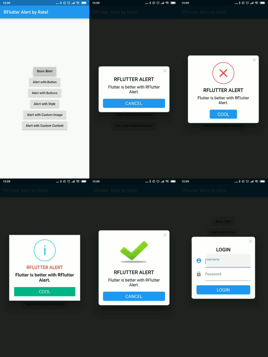
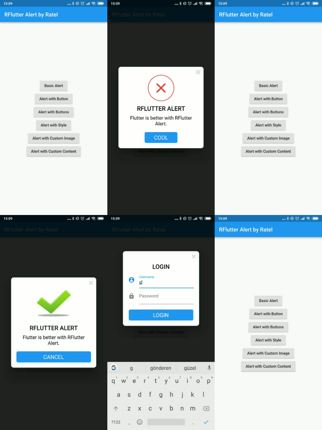
RFlutter Alert is super customizable and easy-to-use alert/popup dialogs for Flutter. You may create reusable alert styles or add buttons as much as you want with ease.
Features
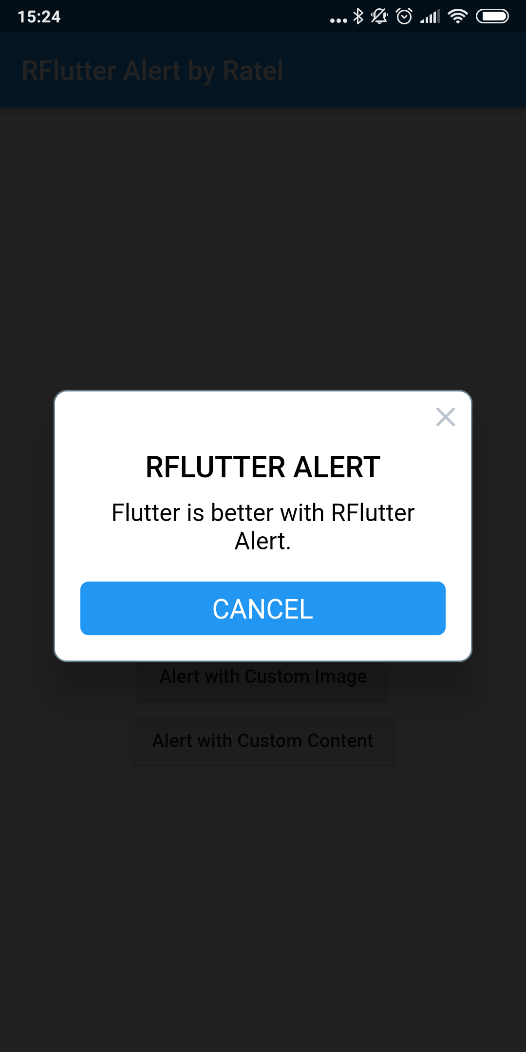
Single line basic alert
Adding buttons dynamically (as much as you want)
Predefined beautiful alert styles (success, error, warning, info)
Reusable alert styles
Super customizable
Change animation (fromTop, fromBottom, fromRight, fromLeft, grow, shrink) & Custom Animation
Set animation duration
Show/hide close button
Set overlay tap to dismiss
Assign Title and desc styles
Change dialog border style
Getting started
You must add the library as a dependency to your project.
dependencies:
 rflutter_alert: ^2.0.7
You can also reference the git repo directly if you want:
dependencies:
 rflutter_alert:
   git: git://github.com/RatelHub/rflutter_alert.git
You should then run flutter packages get
Example Project
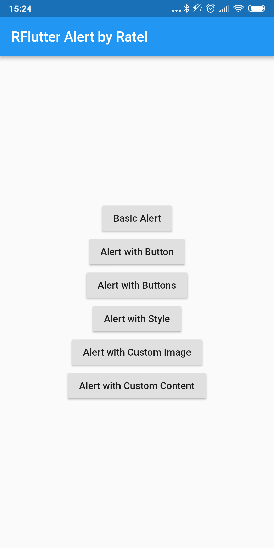
There is a detailed example project in the example folder. You can directly run and play on it. There are code snippets from example project below.
Basic Alert
Alert (context: context, title: "RFLUTTER" , desc: "Flutter is awesome." ).show ();
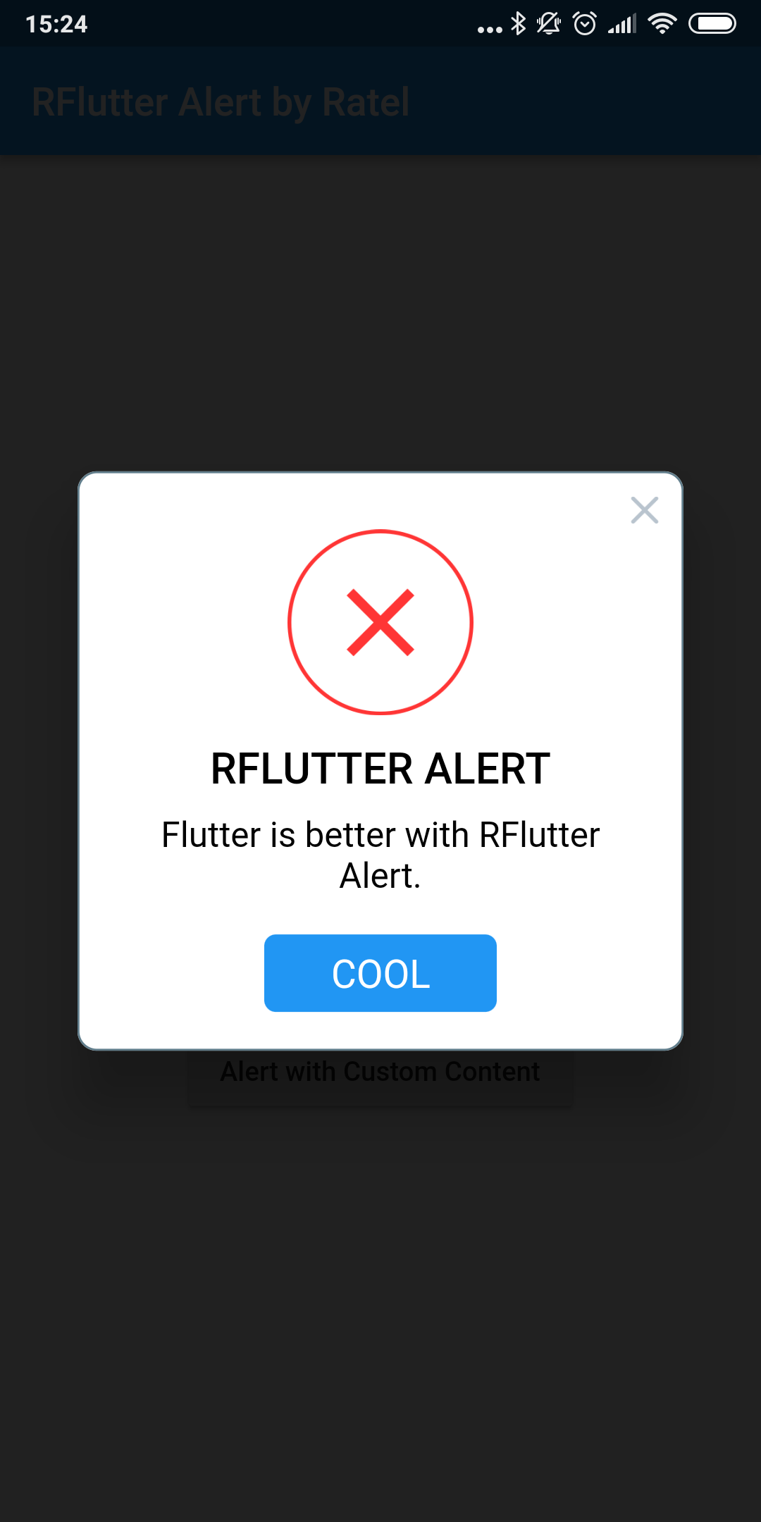
Alert with Button
Alert (
context: context,
type: AlertType .error,
title: "RFLUTTER ALERT" ,
desc: "Flutter is more awesome with RFlutter Alert." ,
buttons: [
DialogButton (
child: Text (
"COOL" ,
style: TextStyle (color: Colors .white, fontSize: 20 ),
),
onPressed: () => Navigator .pop (context),
width: 120 ,
)
],
).show ();
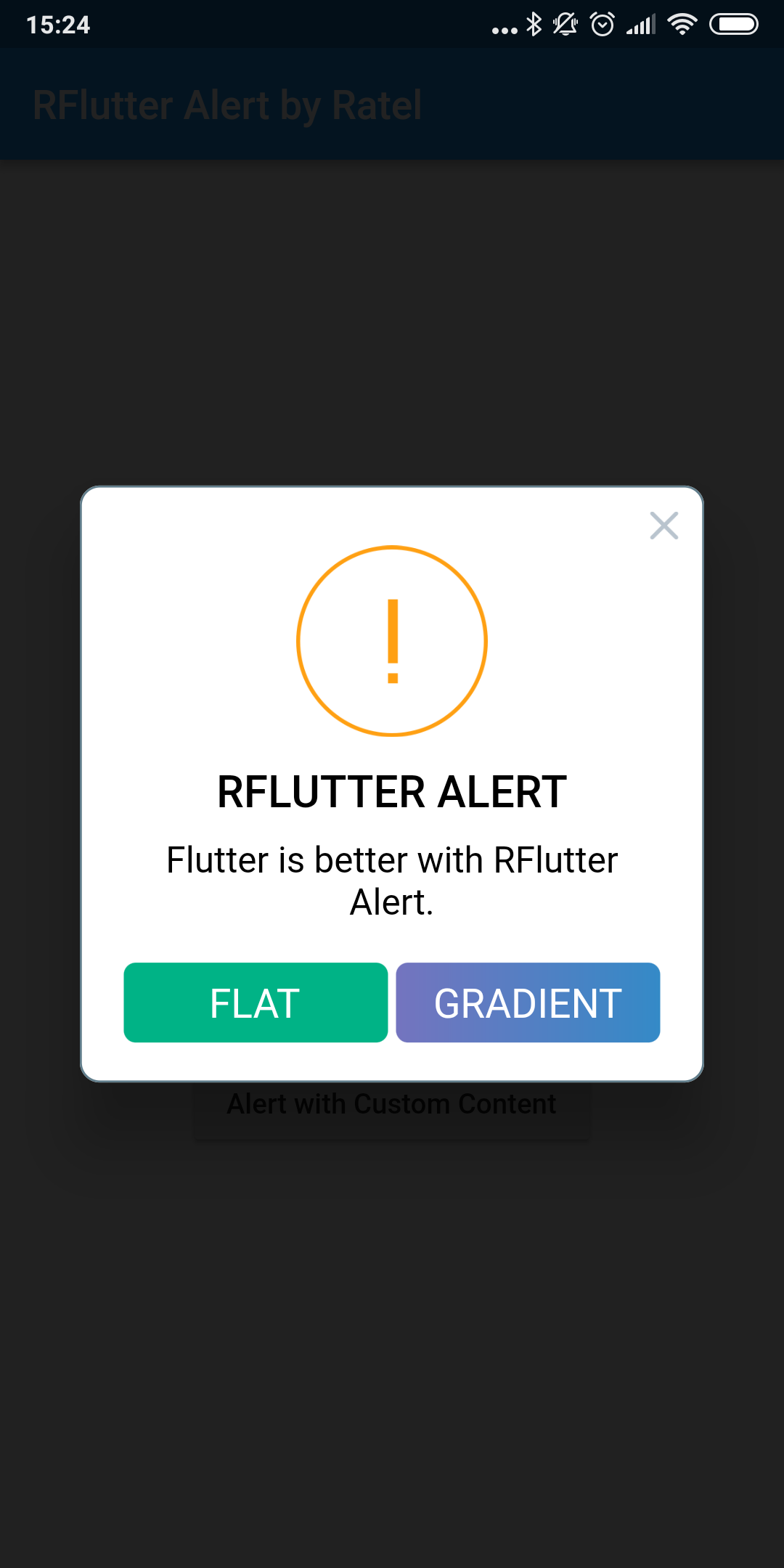
Alert with Buttons
Alert (
context: context,
type: AlertType .warning,
title: "RFLUTTER ALERT" ,
desc: "Flutter is more awesome with RFlutter Alert." ,
buttons: [
DialogButton (
child: Text (
"FLAT" ,
style: TextStyle (color: Colors .white, fontSize: 20 ),
),
onPressed: () => Navigator .pop (context),
color: Color .fromRGBO (0 , 179 , 134 , 1.0 ),
),
DialogButton (
child: Text (
"GRADIENT" ,
style: TextStyle (color: Colors .white, fontSize: 20 ),
),
onPressed: () => Navigator .pop (context),
gradient: LinearGradient (colors: [
Color .fromRGBO (116 , 116 , 191 , 1.0 ),
Color .fromRGBO (52 , 138 , 199 , 1.0 )
]),
)
],
).show ();
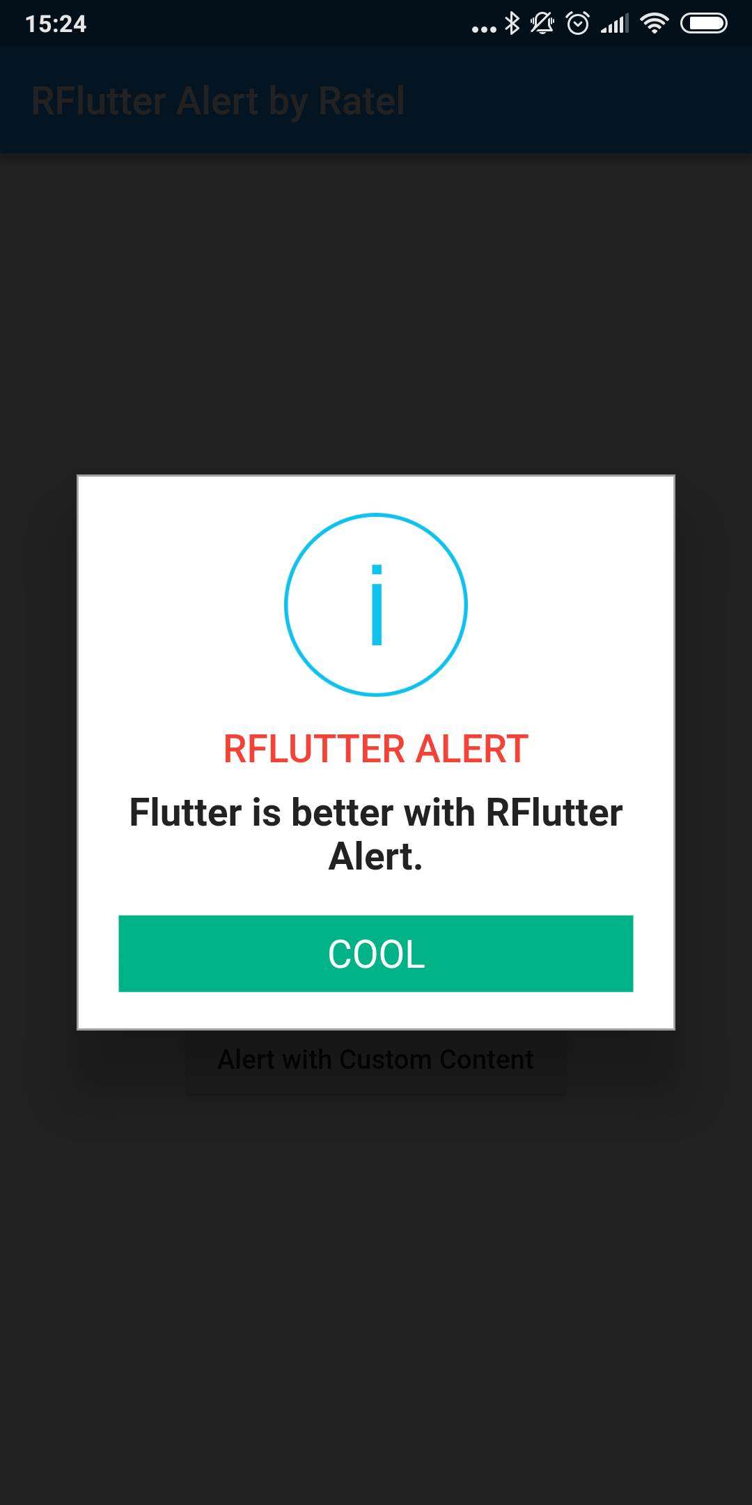
Alert with Style
AlertStyle
Use the AlertStyle class to customize.
var alertStyle = AlertStyle (
animationType: AnimationType .fromTop,
isCloseButton: false ,
isOverlayTapDismiss: false ,
descStyle: TextStyle (fontWeight: FontWeight .bold),
descTextAlign: TextAlign .start,
animationDuration: Duration (milliseconds: 400 ),
alertBorder: RoundedRectangleBorder (
borderRadius: BorderRadius .circular (0.0 ),
side: BorderSide (
color: Colors .grey,
),
),
titleStyle: TextStyle (
color: Colors .red,
),
alertAlignment: Alignment .topCenter,
);
And assign your AlertStyle object to Alert's style field.
Alert (
context: context,
style: alertStyle,
type: AlertType .info,
title: "RFLUTTER ALERT" ,
desc: "Flutter is more awesome with RFlutter Alert." ,
buttons: [
DialogButton (
child: Text (
"COOL" ,
style: TextStyle (color: Colors .white, fontSize: 20 ),
),
onPressed: () => Navigator .pop (context),
color: Color .fromRGBO (0 , 179 , 134 , 1.0 ),
radius: BorderRadius .circular (0.0 ),
),
],
).show ();
Alert with Custom Image
Alert (
context: context,
title: "RFLUTTER ALERT" ,
desc: "Flutter is better with RFlutter Alert." ,
image: Image .asset ("assets/success.png" ),
).show ();
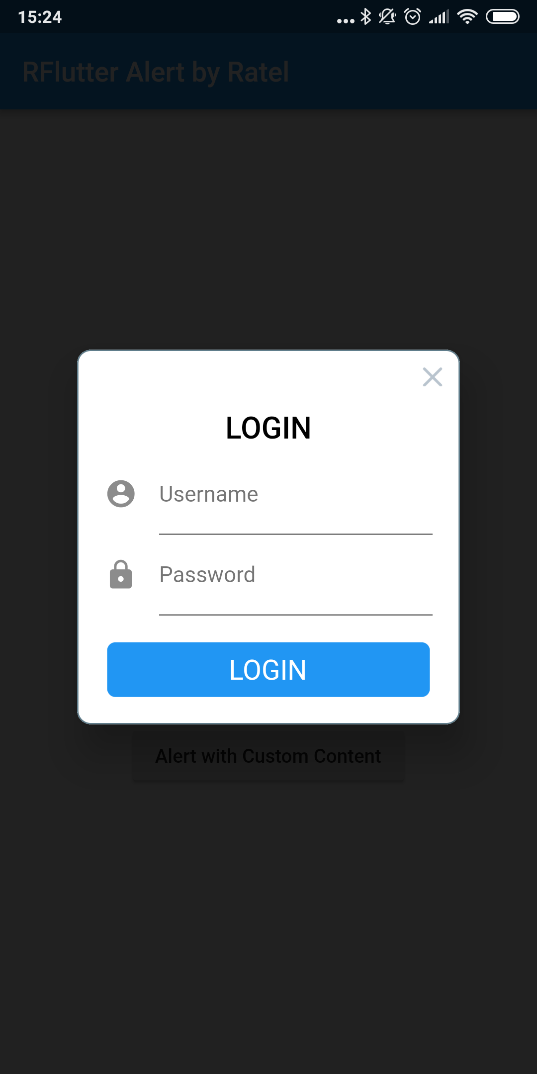
Alert with Custom Content
Alert (
context: context,
title: "LOGIN" ,
content: Column (
children: <Widget >[
TextField (
decoration: InputDecoration (
icon: Icon (Icons .account_circle),
labelText: 'Username' ,
),
),
TextField (
obscureText: true ,
decoration: InputDecoration (
icon: Icon (Icons .lock),
labelText: 'Password' ,
),
),
],
),
buttons: [
DialogButton (
onPressed: () => Navigator .pop (context),
child: Text (
"LOGIN" ,
style: TextStyle (color: Colors .white, fontSize: 20 ),
),
)
]).show ();
Contributions
If you found a bug , open an issue.
If you have a feature request , open an issue.
If you want to contribute , submit a pull request.
Version compatability
See CHANGELOG for all breaking (and non-breaking) changes.
Made with ❤ by
Ratel