一个 Flutter 包,可简化拖动滑动面板的实现,常用于底部表单或可展开的内容区域。它提供跨 Android、iOS、Web、macOS、Windows 和 Linux 多个平台的流畅、可自定义的拖动交互。该控件支持动态高度调整、手势控制,并能无缝集成到现有的 Flutter 布局中。非常适合创建可折叠界面,如地图、聊天面板或详细信息视图。
适合场景
实现可扩展的底部表单
创建交互式地图叠加层
构建聊天或个人资料面板
设计响应式模态框
启用向上滑动导航
在紧凑空间中显示详细内容
主要特点
带有平滑动画的可拖动面板
可自定义高度和吸附点
跨平台兼容性
支持嵌套滚动
可配置的手势和回调
与 Scaffold 及其他小部件的轻松集成
适合对象
开发底部抽屉 UI 的开发者
需要可扩展内容区域的应用程序
需要手势驱动界面的项目
面向多平台部署的团队
实施滑动面板的用户体验设计师
使用建议
可能需要额外的样式来适应复杂布局
使用大量内容时的性能影响
需要仔细处理滚动冲突
内置动画功能有限,仅支持基本的滑动效果
不适合全屏过渡
原始 README
以下为关联源码仓库的 README 原文快照,最新内容请访问源码仓库。
sliding_up_panel
A draggable Flutter widget that makes implementing a SlidingUpPanel much easier! Based on the Material Design bottom sheet component, this widget works on both Android & iOS.
Installing
Add the following to your pubspec.yaml file:
dependencies:sliding_up_panel:^2.0.0+1
Note that v1.0.0 introduced some breaking changes outlined below.
Maintaining sliding_up_panel
Thank you everyone for the support surrounding this project! sliding_up_panel has grown far larger than I could have ever imagined, so parsing through all the feature requests and new issues has taken me more time than I'd like. If you're interested in helping maintain this project, please send me an email at arjain@andrew.cmu.edu. As a sidenote, I'll always try to make sure that this project is compatible with the latest version of Flutter.
Simple Usage
There are two ways which the SlidingUpPanel can easily be added to your project.
Using the SlidingUpPanel as the root widget for the body (recommended).
Nesting the SlidingUpPanel
SlidingUpPanel as the Root (recommended)
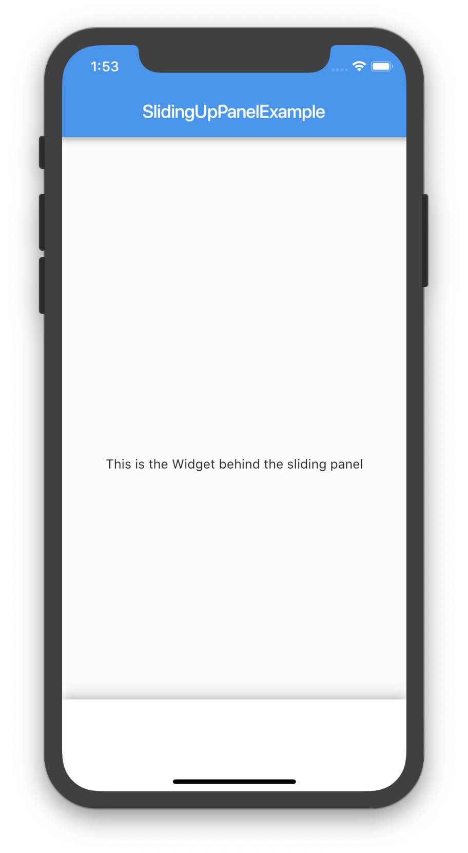
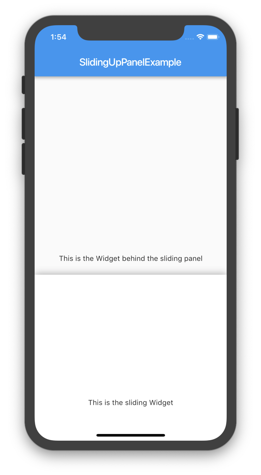
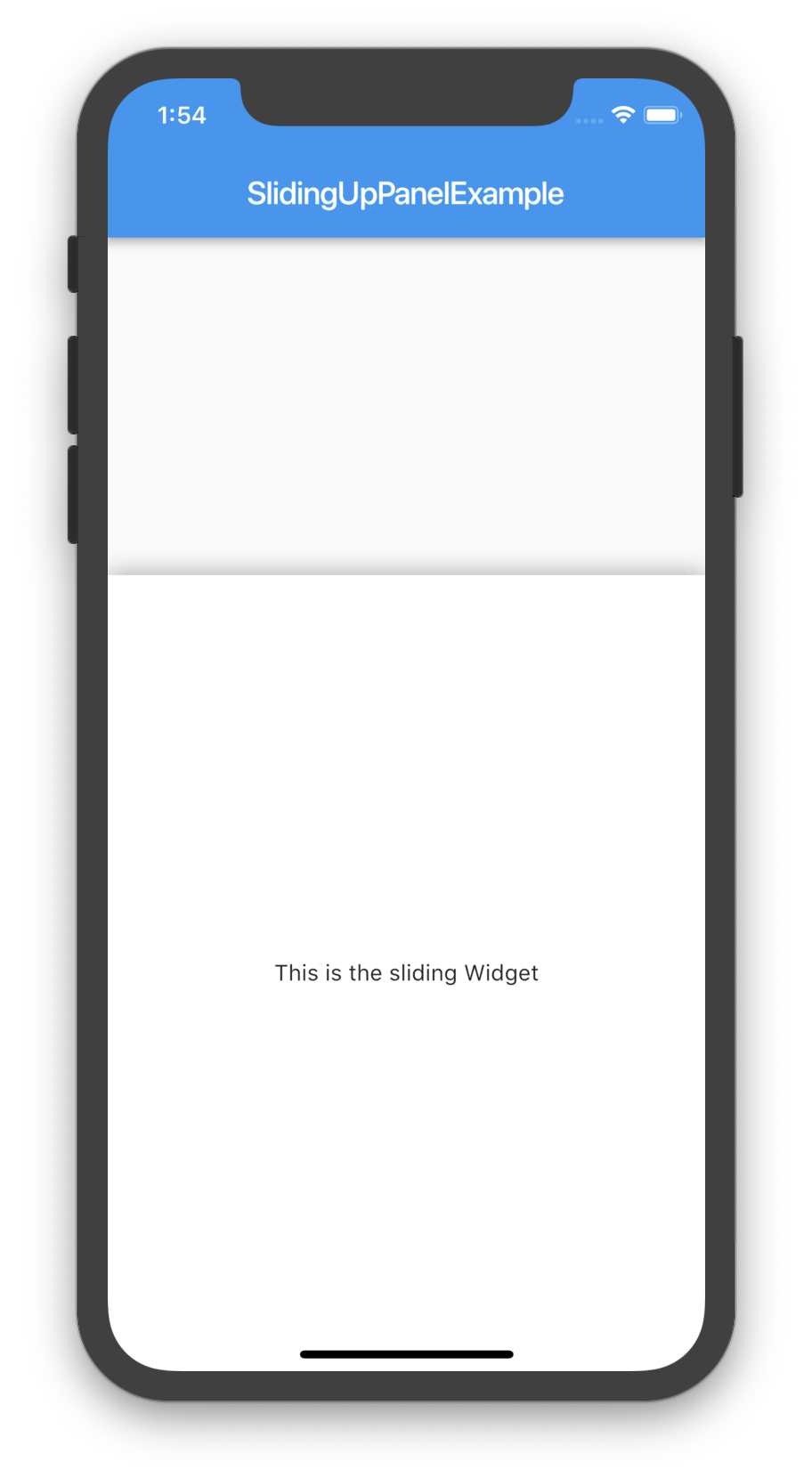
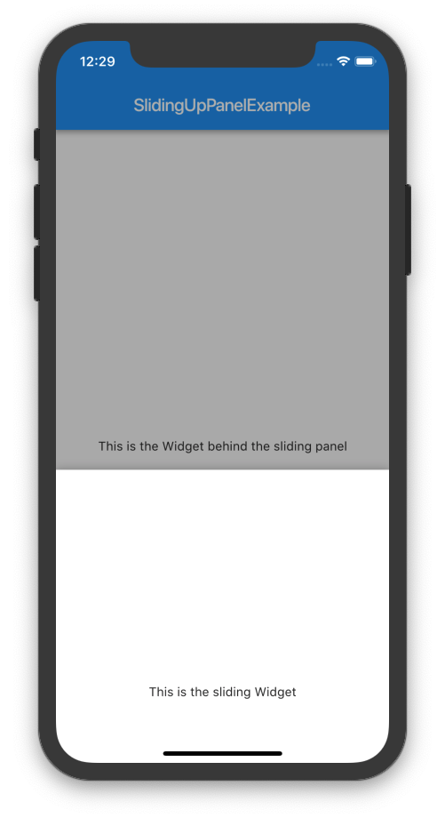
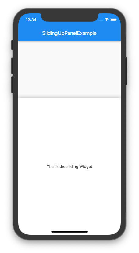
This method is recommended as it allows for the least interference with the behavior of other UI elements. For example:
@overrideWidgetbuild(BuildContext context) {
returnScaffold(
appBar: AppBar(
title: Text("SlidingUpPanelExample"),
),
body: SlidingUpPanel(
panel: Center(
child: Text("This is the sliding Widget"),
),
body: Center(
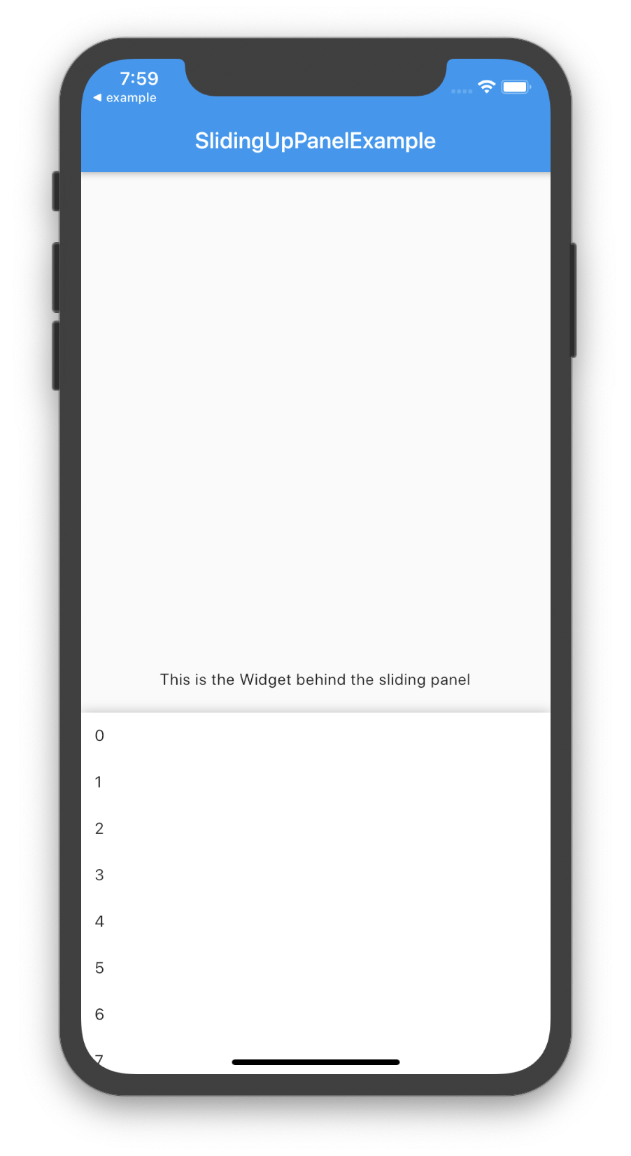
child: Text("This is the Widget behind the sliding panel"),
),
),
);
}
Nesting the SlidingUpPanel
This method isn't recommended but can still be used. Only use this to avoid refactoring large chunks of code or to implement custom scrolling behavior. For example, the SlidingUpPanel can be nested inside of a Stack (note that there are many other possible implementations that vary on a case-by-case basis).
@overrideWidgetbuild(BuildContext context) {
returnScaffold(
appBar: AppBar(
title: Text("SlidingUpPanelExample"),
),
body: Stack(
children: <Widget>[
Center(child: Text("This is the Widget behind the sliding panel"),),
SlidingUpPanel(
panel: Center(child: Text("This is the sliding Widget"),),
)
],
)
);
}
Screenshots
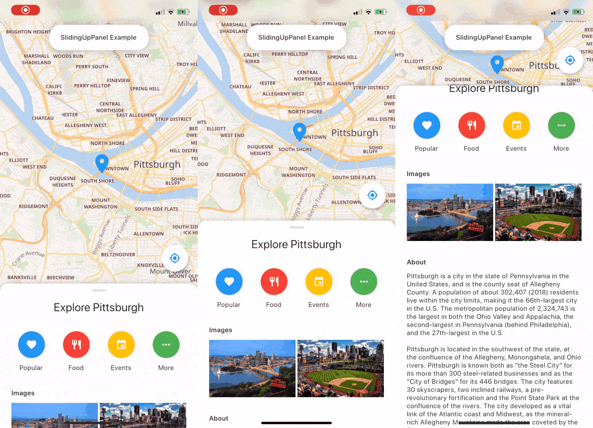
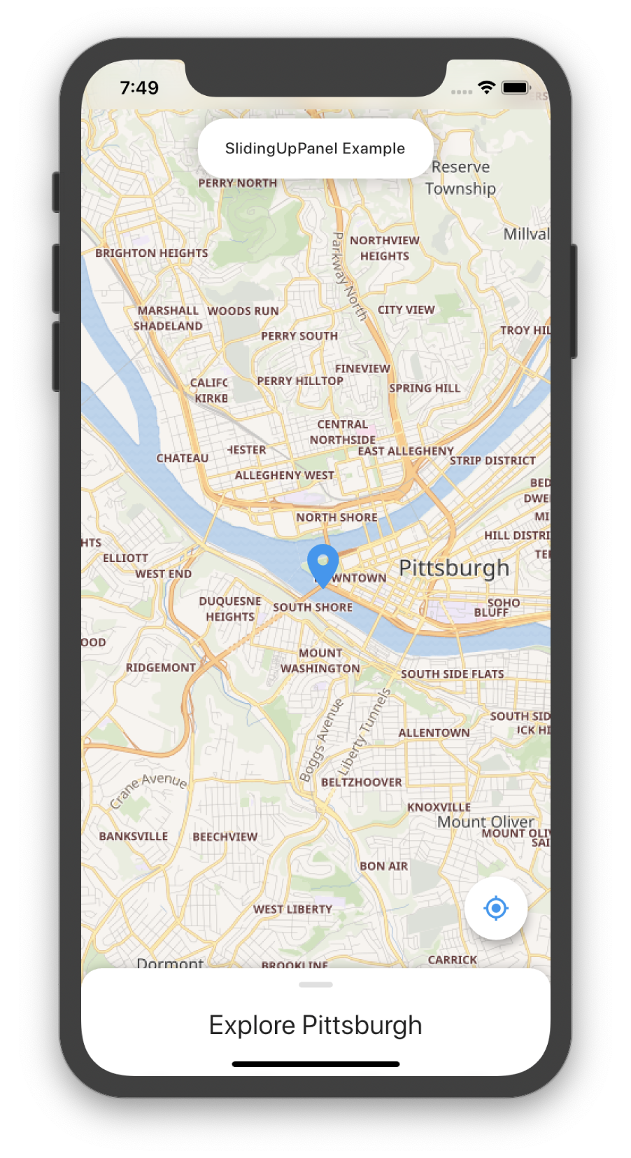
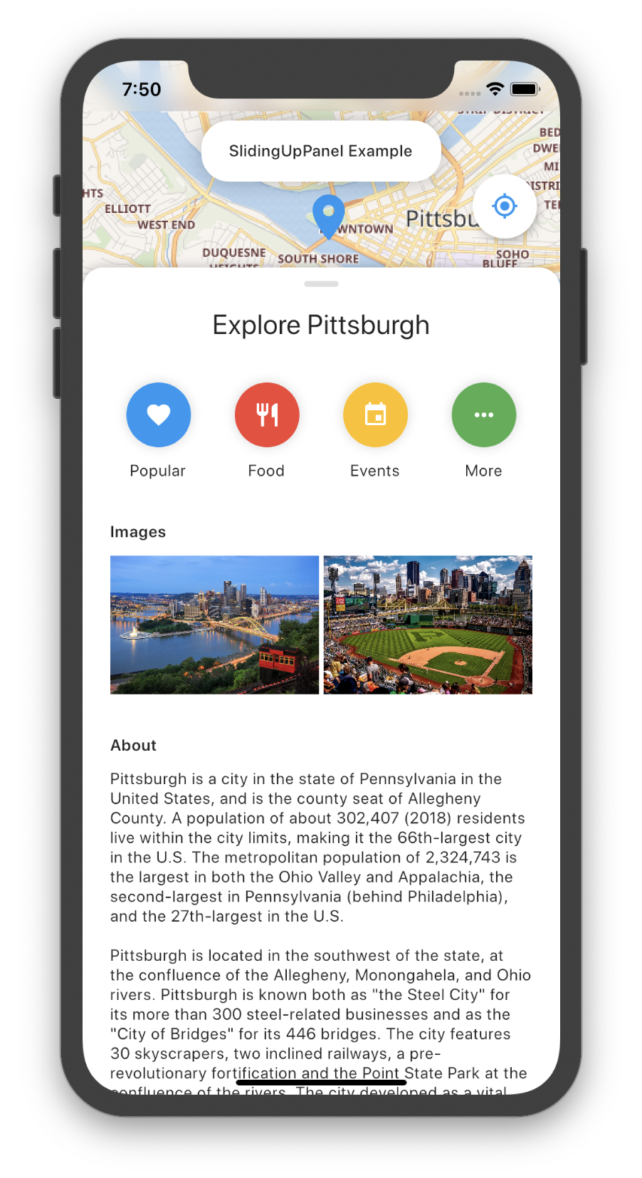
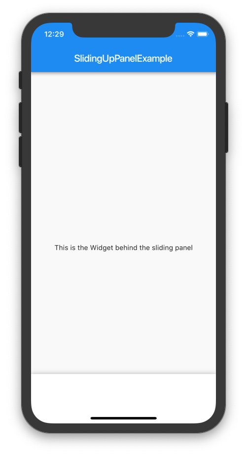
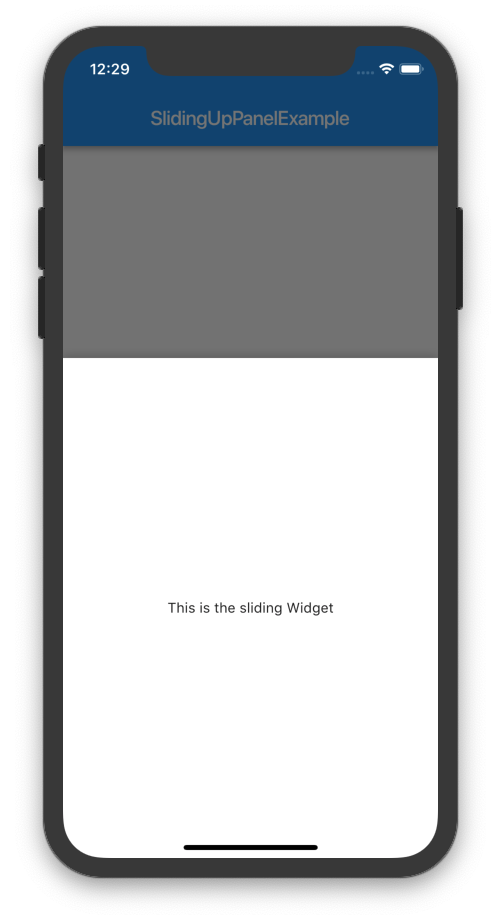
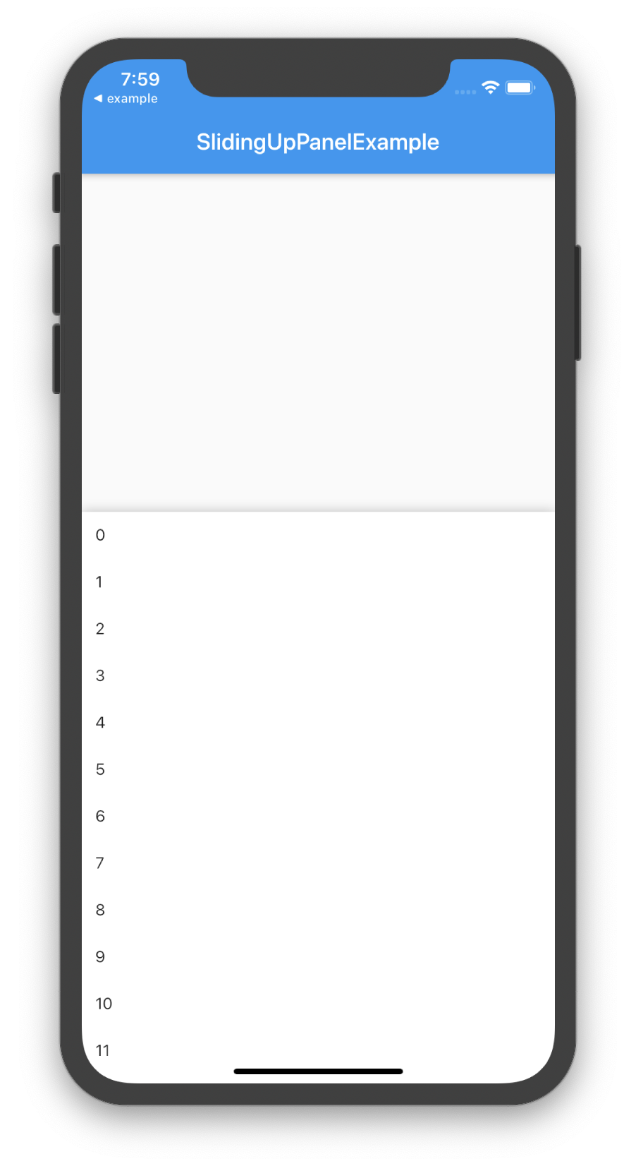
Both methods produce the same result:
Custom Usage
There are several options that allow for more control:
Properties
Description
panel
The Widget that slides into view. When the panel is collapsed and if collapsed is null, then top portion of this Widget will be displayed; otherwise, collapsed will be displayed overtop of this Widget.
panelBuilder [beta]
NOTE: This feature is still in beta and may have some problems. Please open an issue on GitHub if you encounter something unexpected.
Provides a ScrollController to attach to a scrollable object in the panel that links the panel position with the scroll position. Useful for implementing an infinite scroll behavior. If panel and panelBuilder are both non-null, panel will be used.
collapsed
The Widget displayed overtop the panel when collapsed. This fades out as the panel is opened.
body
The Widget that lies underneath the sliding panel. This Widget automatically sizes itself to fill the screen.
header
Optional persistent widget that floats above the panel and attaches to the top of the panel. Content at the top of the panel will be covered by this widget. Add padding to the top of the panel to avoid coverage.
footer
Optional persistent widget that floats above the panel and attaches to the bottom of the panel. Content at the bottom of the panel will be covered by this widget. Add padding to the bottom of the panel to avoid coverage.
minHeight
The height of the sliding panel when fully collapsed.
maxHeight
The height of the sliding panel when fully open.
snapPoint [beta]
NOTE: This feature is still in beta and may have some problems. Please open an issue on GitHub if you encounter something unexpected.
A point between minHeight and maxHeight that the panel snaps to while animating. A fast swipe on the panel will disregard this point and go directly to the open/close position. This value is represented as a percentage of the total animation distance (maxHeight - minHeight), so it must be between 0.0 and 1.0, exclusive.
border
A border to draw around the sliding panel sheet.
borderRadius
If non-null, the corners of the sliding panel sheet are rounded by this.
boxShadow
A list of shadows cast behind the sliding panel sheet.
color
The color to fill the background of the sliding panel sheet.
padding
The amount to inset the children of the sliding panel sheet.
margin
Empty space surrounding the sliding panel sheet.
renderPanelSheet
Set to false to not to render the sheet the panel sits upon. This means that only body, collapsed, and the panel Widgets will be rendered. Set this to false if you want to achieve a floating effect or want more customization over how the sliding panel looks like.
panelSnapping
Set to false to disable the panel from snapping open or closed.
backdropEnabled
If non-null, shows a darkening shadow over the body as the panel slides open.
backdropColor
Shows a darkening shadow of this Color over the body as the panel slides open.
backdropOpacity
The opacity of the backdrop when the panel is fully open. This value can range from 0.0 to 1.0 where 0.0 is completely transparent and 1.0 is completely opaque.
backdropTapClosesPanel
Flag that indicates whether or not tapping the backdrop closes the panel. Defaults to true.
controller
If non-null, this can be used to control the state of the panel.
onPanelSlide
If non-null, this callback is called as the panel slides around with the current position of the panel. The position is a double between 0.0 and 1.0 where 0.0 is fully collapsed and 1.0 is fully open.
onPanelOpened
If non-null, this callback is called when the panel is fully opened.
onPanelClosed
If non-null, this callback is called when the panel is fully collapsed.
parallaxEnabled
If non-null and true, the SlidingUpPanel exhibits a parallax effect as the panel slides up. Essentially, the body slides up as the panel slides up.
parallaxOffset
Allows for specifying the extent of the parallax effect in terms of the percentage the panel has slid up/down. Recommended values are within 0.0 and 1.0 where 0.0 is no parallax and 1.0 mimics a one-to-one scrolling effect. Defaults to a 10% parallax.
isDraggable
Allows toggling of draggability of the SlidingUpPanel. Set this to false to prevent the user from being able to drag the panel up and down. Defaults to true.
slideDirection
Either SlideDirection.UP or SlideDirection.DOWN. Indicates which way the panel should slide. Defaults to UP. If set to DOWN, the panel attaches itself to the top of the screen and is fully opened when the user swipes down on the panel.
defaultPanelState
The default state of the panel; either PanelState.OPEN or PanelState.CLOSED. This value defaults to PanelState.CLOSED which indicates that the panel is in the closed position and must be opened. PanelState.OPEN indicates that by default the Panel is open and must be swiped closed by the user.
Darkening the Body as the Panel Opens
If desired, the body can be darkened as the panel is opened by setting backdropEnabled to true. You can also customize the backdropColor, backdropOpacity, and backdropTapClosesPanel. For example:
@overrideWidgetbuild(BuildContext context){
returnMaterial(
child: SlidingUpPanel(
backdropEnabled: true,
panel: Center(
child: Text("This is the sliding Widget"),
),
body: Scaffold(
appBar: AppBar(
title: Text("SlidingUpPanelExample"),
),
body: Center(
child: Text("This is the Widget behind the sliding panel"),
),
),
),
);
}
Notice how the Scaffold is nested inside of the SlidingUpPanel. This because the backdrop is rendered only over the body of the SlidingUpPanel. As a result, if we want the backdrop to appear over the AppBar, then we must nest the Scaffold this way.
Displaying a Different Child When the Panel is Closed
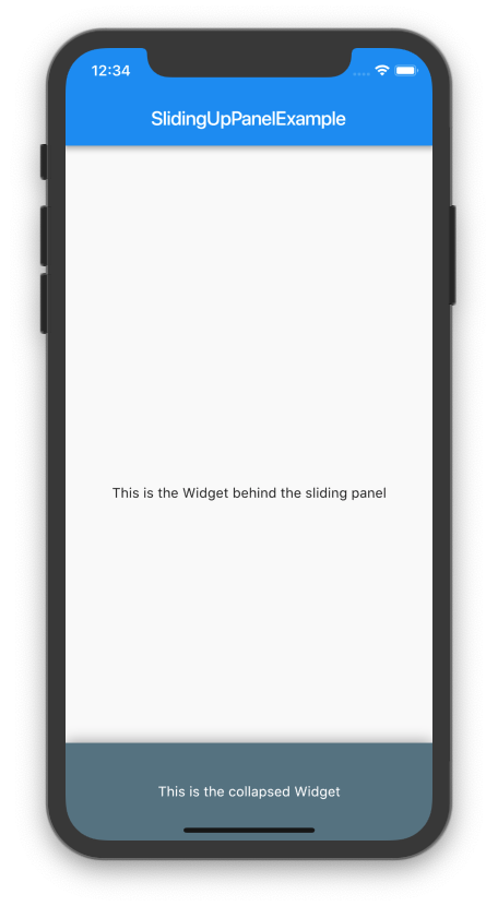
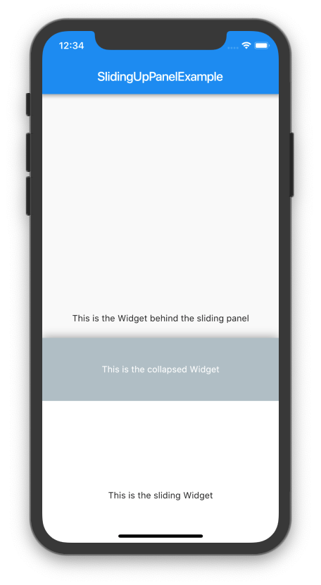
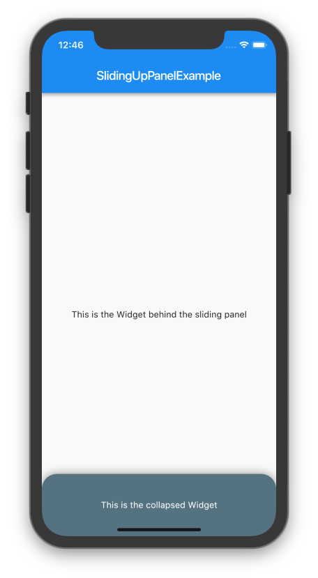
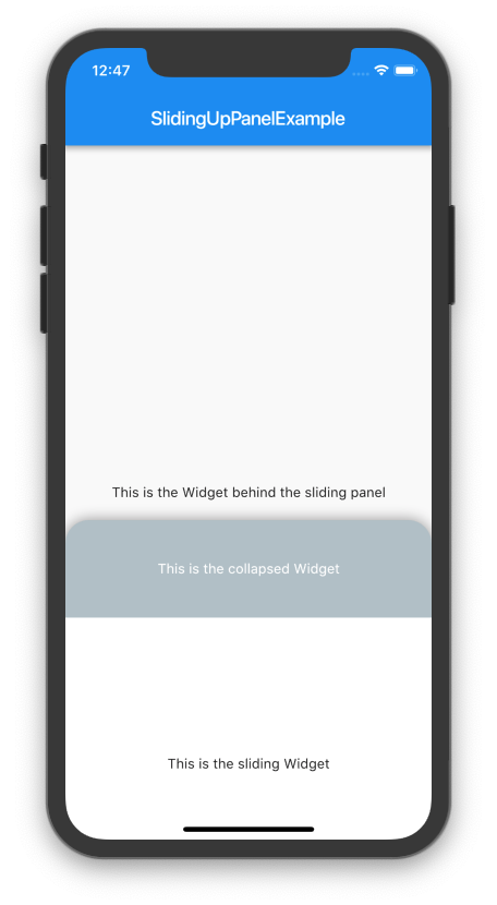
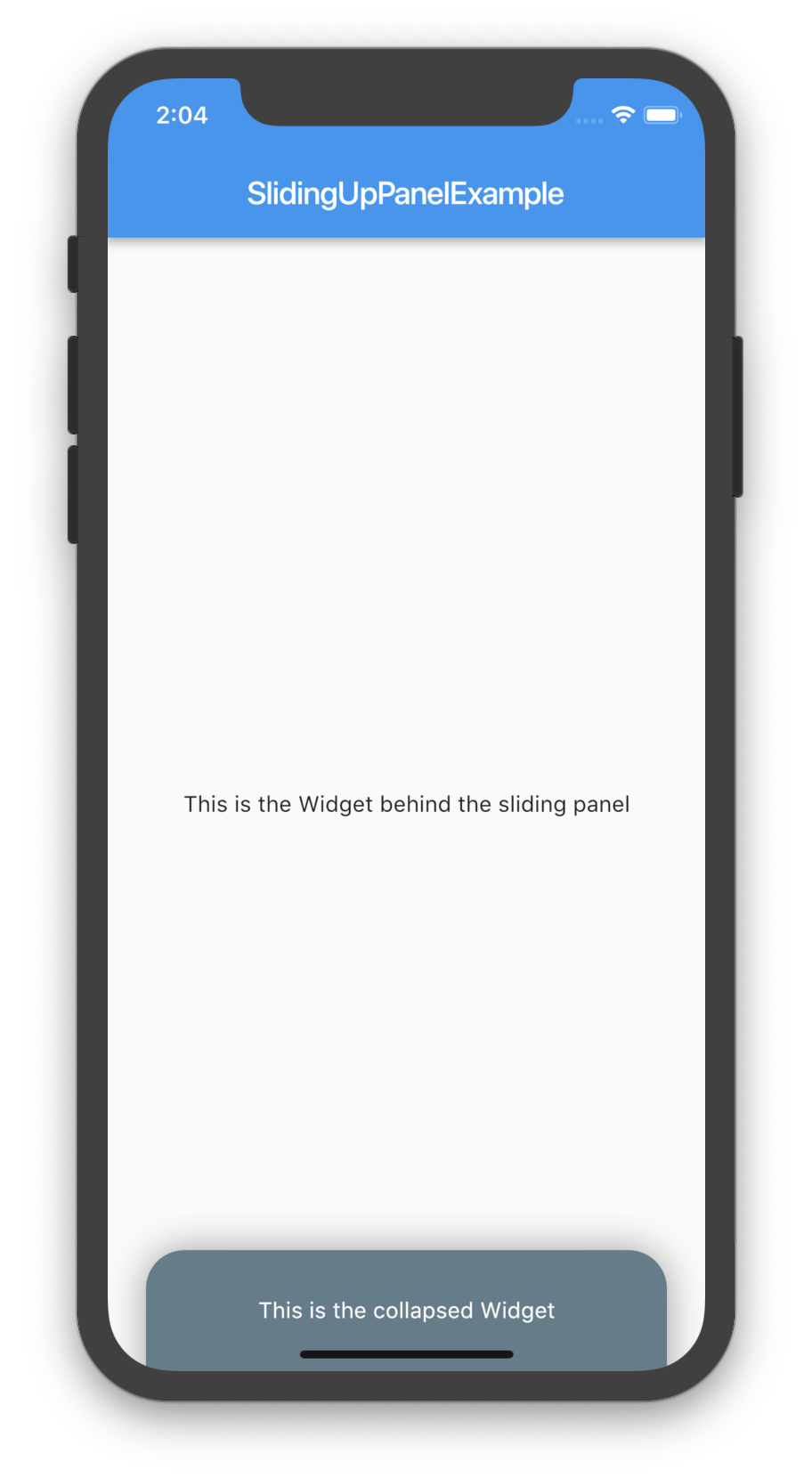
By assigning a non-null Widget to the collapsed property, you can add a Widget that displays overtop the panel when collapsed. As the panel is opened, this Widget will fade out to display the panel underneath. For example:
@overrideWidgetbuild(BuildContext context) {
returnScaffold(
appBar: AppBar(
title: Text("SlidingUpPanelExample"),
),
body: SlidingUpPanel(
panel: Center(
child: Text("This is the sliding Widget"),
),
collapsed: Container(
color: Colors.blueGrey,
child: Center(
child: Text(
"This is the collapsed Widget",
style: TextStyle(color: Colors.white),
),
),
),
body: Center(
child: Text("This is the Widget behind the sliding panel"),
),
),
);
}
Rounding the Borders
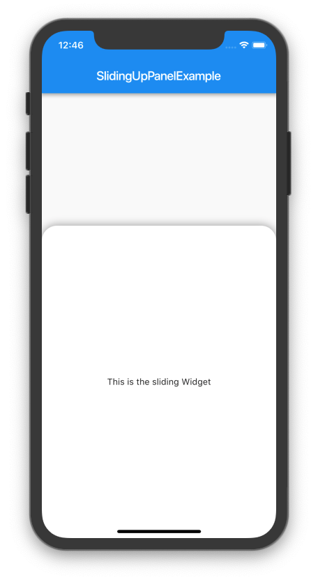
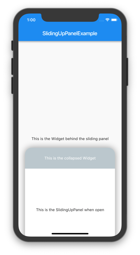
Modern design principles (especially in the Material Design Refresh) emphasize rounded borders. A similar effect can be easily achieved by providing a non-null BorderRadiusGeometry to the borderRadius property. Note that this only curves the border on the underlying panel sheet: any children passed to panel or collapsed must also have their borders curved separately in order to achieve a uniform effect. For example:
@overrideWidgetbuild(BuildContext context) {
BorderRadiusGeometry radius = BorderRadius.only(
topLeft: Radius.circular(24.0),
topRight: Radius.circular(24.0),
);
returnScaffold(
appBar: AppBar(
title: Text("SlidingUpPanelExample"),
),
body: SlidingUpPanel(
panel: Center(
child: Text("This is the sliding Widget"),
),
collapsed: Container(
decoration: BoxDecoration(
color: Colors.blueGrey,
borderRadius: radius
),
child: Center(
child: Text(
"This is the collapsed Widget",
style: TextStyle(color: Colors.white),
),
),
),
body: Center(
child: Text("This is the Widget behind the sliding panel"),
),
borderRadius: radius,
),
);
}
Creating A Floating Effect
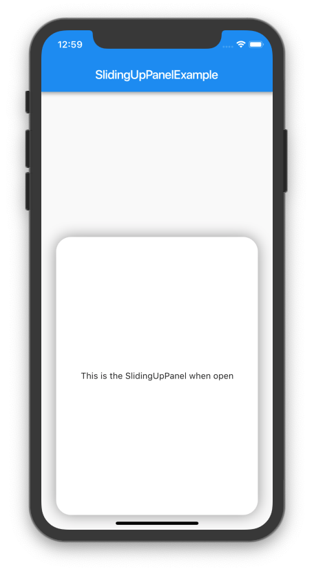
To create a fully custom effect, the default panel sheet can be completely hidden and only the children rendered (i.e. only body, panel, and collapsed are rendered). To do this, set the renderPanelSheet property to false. For example, to create a floating effect:
Note that a similar effect can be created by simply adding a margin to the SlidingUpPanel.
Adding Scrollable Elements to the Sliding Panel
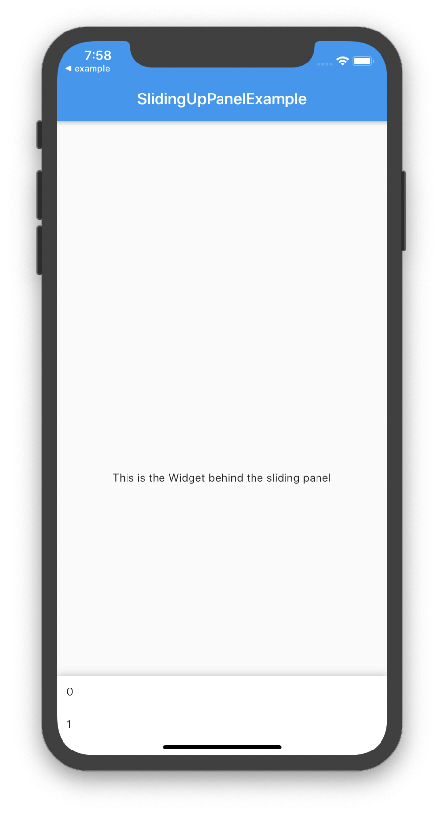
The panel itself can contain Scrollable elements. As of v1.0.0, you can link the scroll position of the Scrollable elements with the position of the sliding up panel by using the panelBuilder. For example:
At times, it can be useful to manually change the state of the SlidingUpPanel. This can be easily achieved by using a PanelController and attaching it to an instance of the SlidingUpPanel. Note that since the PanelController modifies the state of a SlidingUpPanel, these methods can only be called after the SlidingUpPanel has been rendered.
Properties
Data Type
Permissions
Description
panelPosition
double
Read / Write
Evaluates to the current panel position (a value between 0.0 and 1.0) where 0.0 is closed and 1.0 is open. Any value assigned to this property must be between 0.0 and 1.0, inclusive.
isAttached
bool
Read
Determine if the panelController is attached to an instance of the SlidingUpPanel (this property must be true before any other PanelController functions can be used)
isPanelAnimating
bool
Read
Returns whether or not the panel is currently animating.
isPanelOpen
bool
Read
Returns whether or not the panel is open.
isPanelClosed
bool
Read
Returns whether or not the panel is collapsed.
isPanelShown
bool
Read
Returns whether or not the panel is shown/hidden.
Methods
Return Type
Description
open()
Future<void>
Opens the sliding panel fully (i.e. to the maxHeight)
close()
Future<void>
Closes the sliding panel to its collapsed state (i.e. to the minHeight)
hide()
Future<void>
Hides the sliding panel (i.e. is invisible)
show()
Future<void>
Shows the sliding panel in its collapsed state (i.e. "un-hide" the sliding panel)
Animates the panel position to the value. The value must between 0.0 and 1.0 where 0.0 is fully collapsed and 1.0 is completely open. (optional) duration specifies the time for the animation to complete. (optional) curve specifies the easing behavior of the animation.
NOTE: This feature is still in beta and may have some problems. Please open an issue on GitHub if you encounter something unexpected.
Animates the panel position to the snap point. Requires that the SlidingUpPanel snapPoint property is not null. (optional) duration specifies the time for the animation to complete. (optional) curve specifies the easing behavior of the animation.
v1.0.0 introduced some breaking changes to the PanelController to better adhere to Dart language conventions. The changes are outlined below.
The following PanelController methods now return Future<void> instead of void:
close()
open()
hide()
show()
animatePanelToPosition(double value)
The following PanelController methods have changed to Dart properties to better reflect Dart language conventions:
setPanelPosition() -> panelPosition [as a setter]
getPanelPosition() -> panelPosition [as a getter]
isPanelAnimating() -> isPanelAnimating
isPanelOpen() -> isPanelOpen
isPanelClosed() -> isPanelClosed
isPanelShown() -> isPanelShown
For example, here's how you would have previously used setPanelPosition() and getPanelPosition() vs. how you would now use the panelPosition property:
// OLD, no longer supportedprint(pc.getPanelPosition()); // print a value between 0.0 and 1.0
pc.setPanelPosition(0.5); // sets the panelPosition to 0.5
// NEWprint(pc.panelPosition); // print a value between 0.0 and 1.0
pc.panelPosition = 0.5; // sets the panelPosition to 0.5
And here's how you would have previously called isPanelAnimating() vs. how you would now call isPanelAnimating.
panelController.isPanelAnimating(); // OLD, no longer supported