Package selection guidance compiled from public package information, community data, and project usage.
Adaptive Chameleon Theme is a Flutter package that simplifies theme management by supporting light, dark, and system theme modes. It enables dynamic color switching based on user preferences or system settings, ensuring a consistent and adaptive UI across devices. The package integrates seamlessly with Flutter's ThemeData and provides easy-to-use utilities for theme mode detection and color customization. Ideal for apps requiring responsive design and accessibility, it enhances user experience through automatic theme adaptation.
Use cases
Dynamic theme switching in mobile apps
Supporting dark mode and system themes
Customizing app colors per theme
Building accessible UIs
Cross-platform theme consistency
Key features
Light, dark, and system theme mode support
Easy color theme switching
Automatic system theme detection
Cross-platform compatibility
Simple integration with ThemeData
Configurable theme variables
Suitable for
Developers building responsive Flutter apps
Apps targeting multiple platforms
Projects requiring accessibility features
Teams focused on user experience
Design systems with multiple themes
Considerations
Requires manual configuration of theme colors
Limited to basic theme mode handling
No built-in persistence for user preferences
Depends on proper implementation of ThemeData
May need additional packages for advanced theming
Original README
Original README snapshot from the linked source repository. Visit the repository for the latest content.
Adaptive Chameleon Theme
A Flutter package that will automatically retrieve your OS defined Theme (Dynamic), force your
prefered one (Light / Dark), allow you to present the user with a set of color themes to choose
from and of course, persist this choice in your device.
Features
Set default theme
Override system theme mode and set yours (light/dark)
Change theme colors
Customize color palettes for different theme modes
This package allows for an arbitrary number of themes to be defined. Each theme has a unique ID
of type int. To create the themes and map them to IDs, first you have to create an instance of
ThemeCollection, like so:
final themeCollection = ThemeCollection(
    themes: {
        0: ThemeData(primarySwatch: Colors.blue),
        1: ThemeData(primarySwatch: Colors.red),
    },
    fallbackTheme: ThemeData.light(), // optional fallback theme, default value is ThemeData.light()
);
I would however recommend you introduce a class with static const int values to
associate a name to each ID value for easier reference:
You can utilise the changeThemeMode function from anywhere in your app. It provides a simple
and
straight forward way of altering the theme modes: light to dark, dark to light or to system
default.
This function has two optional parameters: dynamic and dark.
If the value of dynamic is true, it takes precedence over dark.
// sets theme mode to darkAdaptiveChameleonTheme.of(context).changeThemeMode(dark: true);
// sets theme mode to lightAdaptiveChameleonTheme.of(context).changeThemeMode(dark: false);
// sets theme mode to system defaultAdaptiveChameleonTheme.of(context).changeThemeMode(dynamic: true);
Changing Theme Color
The theme can be set anywhere in the app, provided you have a BuildContext, e.g.:
By setting the theme, its ID is automatically saved via the shared_preferences package, so the next time the
app starts, the theme can be restored automatically.
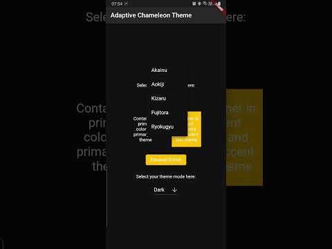
The example app can be found in the example folder. It implements a dropdown menu to select
between 5 themes. The app is the source for the video demo above.
Showcase
Using this package in a live app? Let me know and I will add it here.