Adaptive platform-specific widgets for Flutter. Auto renders native iOS 26+ liquid glass designs, traditional Cupertino widgets for older iOS versions, Material Design for Android.
Package selection guidance compiled from public package information, community data, and project usage.
Adaptive Platform UI is a Flutter widget library that delivers platform-specific designs automatically. It renders modern iOS 26+ liquid glass effects, traditional Cupertino widgets for older iOS versions, and Material Design components for Android. The package ensures native-like aesthetics across platforms without manual configuration, enhancing visual consistency and user experience. It simplifies cross-platform development by adapting UI elements based on the target operating system and version.
Use cases
Cross-platform apps needing native iOS and Android styling
Apps targeting iOS 26+ with dynamic glass effects
Developers seeking automatic platform adaptation
UI consistency across different OS versions
Reducing boilerplate for platform-specific widgets
Key features
Auto-detects OS and version
Supports iOS 26+ liquid glass design
Fallback to traditional Cupertino widgets
Material Design for Android
Minimal setup required
Suitable for
Flutter developers prioritizing native look and feel
Projects requiring adaptive UI without complex logic
Teams building apps for both iOS and Android
Apps aiming for modern iOS visual trends
Developers wanting to reduce platform-specific code
Considerations
Requires iOS 13+ for full functionality
Limited customization for advanced styling
Depends on underlying platform APIs
May increase bundle size slightly
Not suitable for non-native UI requirements
Original README
Original README snapshot from the linked source repository. Visit the repository for the latest content.
Adaptive Platform UI
A Flutter package that provides adaptive platform-specific widgets with native iOS 26+ designs, traditional Cupertino widgets for older iOS versions, and Material Design for Android.
Upgrading from 0.1.x? Read Migrating to 1.0.0 first: the iOS deployment target is now 15.0, and on iOS 26+ the toolbar is fixed above the navigator.
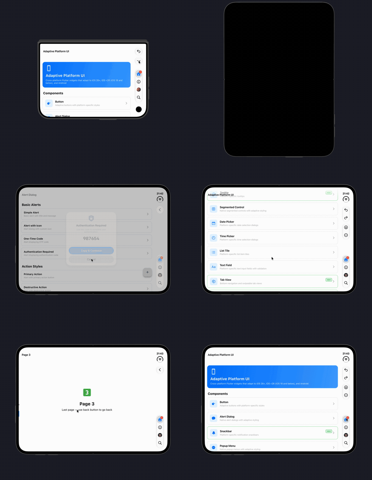
One toolbar stays in place while pages slide underneath it, and only its items change, in step with the page transition and with a back swipe. On iPhone Duo the toolbar and the tab bar move to the vertical bar on the side, as native Liquid Glass capsules, in every rotation; items that do not fit move into the system overflow menu. Works with any router, with nothing to set up.
iOS 26+ Native Toolbar & Tab Bar
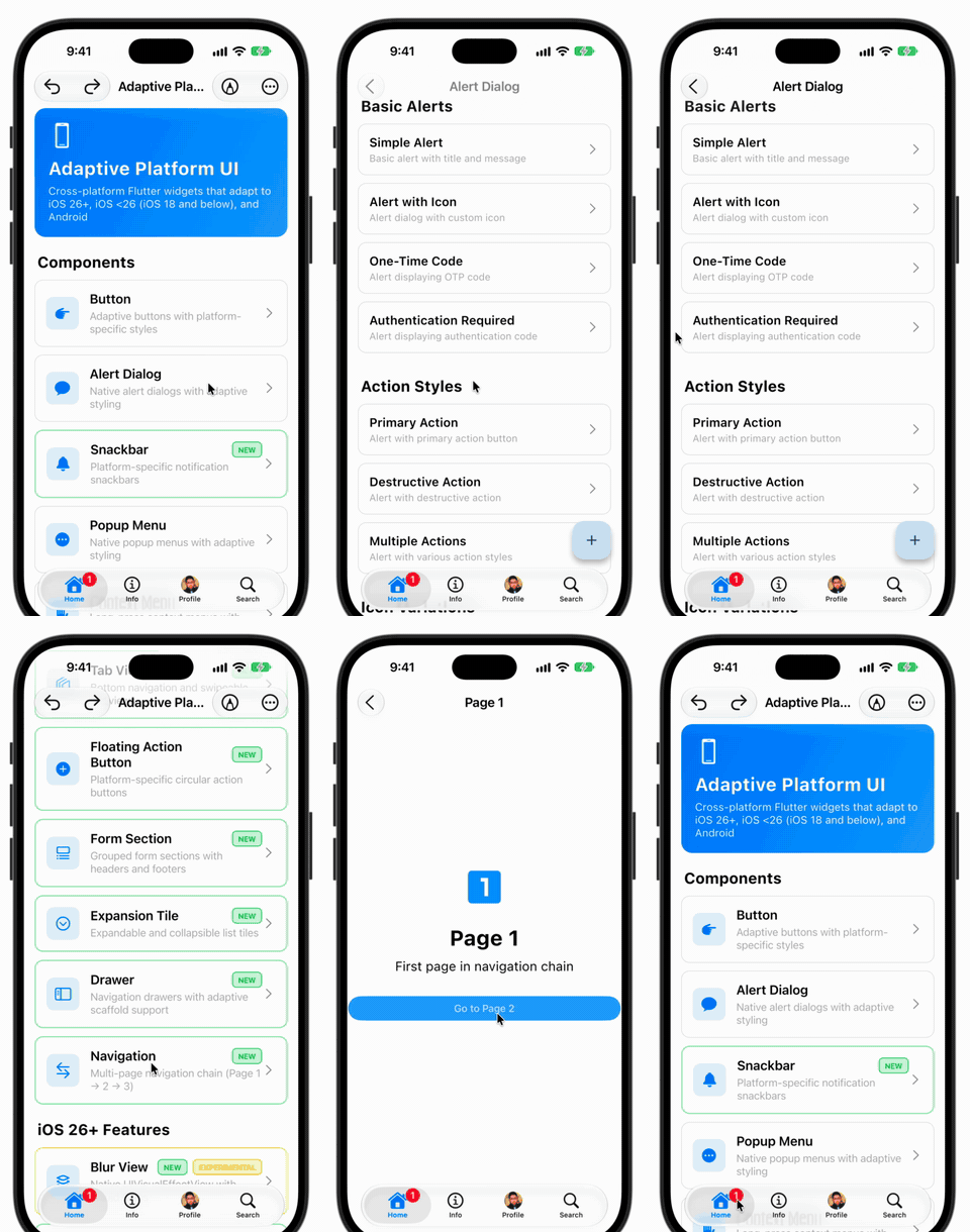
Native iOS 26 UIToolbar and UITabBar with Liquid Glass blur effects, minimize behavior, and native gesture handling.
Features
AdaptiveApp - Unified app configuration for all platforms:
Separate themes for Material (Android) and Cupertino (iOS)
Full theme mode support (light, dark, system)
Router support via AdaptiveApp.router()
Zero configuration required
iOS 26+ Native Designs - Modern iOS 26 components with:
Native UITabBar - Tab bar with minimize behavior and smooth animations
Native UIButton - Button styles with spring animations and haptic feedback
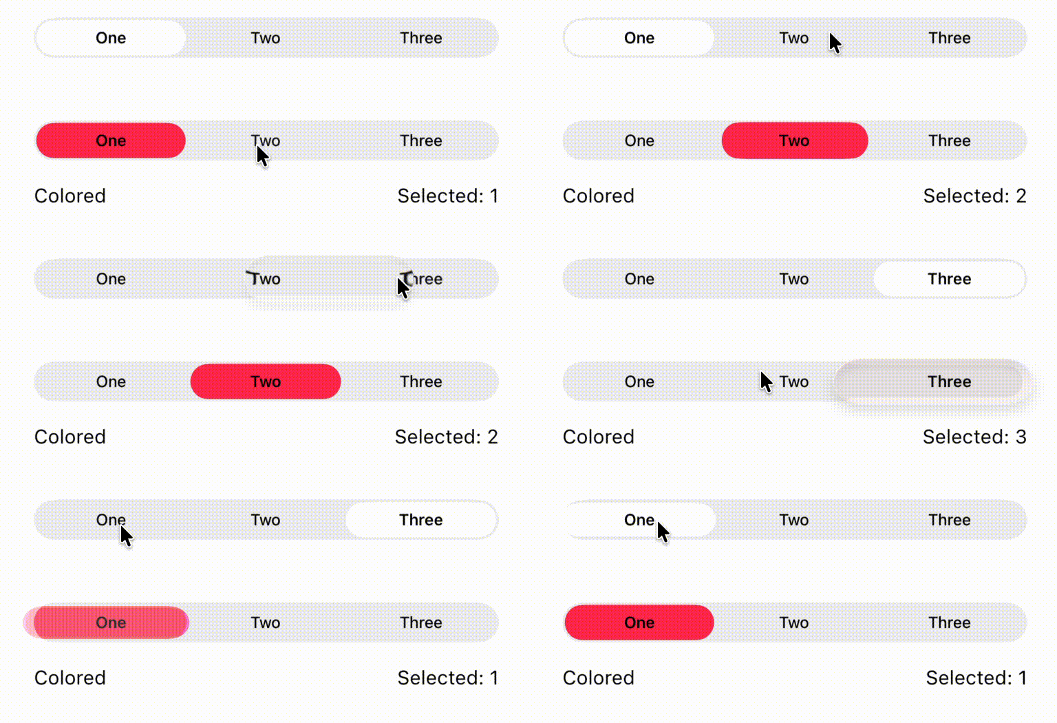
Native UISegmentedControl - Segmented controls with SF Symbol support
Native UISwitch & UISlider - Switches and sliders with native animations
Native corner radius and shadows
Smooth spring animations
Dynamic color system (light/dark mode)
Multiple component styles
iOS Legacy Support - Traditional Cupertino widgets for iOS 18 and below
Material Design - Full Material 3 support for Android
Automatic Platform Detection - Zero configuration required
Version-Aware Rendering - Automatically selects appropriate widget based on iOS version
Widget Showcase
Important: Localization Setup
⚠️ For proper localization support (automatic translations for date/time pickers, buttons, etc.), you must add localization delegates to your AdaptiveApp:
import'package:flutter_localizations/flutter_localizations.dart';
AdaptiveApp(
localizationsDelegates: [
GlobalMaterialLocalizations.delegate,
GlobalCupertinoLocalizations.delegate, // Important!GlobalWidgetsLocalizations.delegate,
],
supportedLocales: [
Locale('en', ''), // EnglishLocale('de', ''), // GermanLocale('tr', ''), // Turkish// Add more locales as needed
],
// ... rest of your app configuration
)
Without these delegates, date/time pickers and other widgets will show English text regardless of system language.
🎯 Priority System: Custom bars take priority over auto-generated ones
🔄 Flexible: Null parameters hide components
Adaptive Bottom Navigation Bar (Destinations):
Fixed Liquid Glass toolbar and iPhone Duo
On iOS 26+ the native toolbar is not part of a page. AdaptiveApp keeps one
toolbar above the navigator, the way a UINavigationController does: pages
slide underneath it, the bar stays where it is, and only its items change.
Nothing to set up. Use AdaptiveApp (or AdaptiveApp.router) and give
your pages an AdaptiveAppBar(useNativeToolbar: true). Each
AdaptiveScaffold publishes its app bar when it appears and withdraws it
when it leaves.
Any router. It relies on the widget tree only, not on a
NavigatorObserver, so it works with Navigator, GoRouter (including
StatefulShellRoute), auto_route, nested navigators and tabs.
Items follow the page transition. The outgoing page's items fade out
and the incoming page's fade in, driven by the route's own animation, so it lasts exactly as
long as the page transition, follows a back swipe under the finger and
reverses when the swipe is cancelled. Switching tabs crossfades. The back
button appears when the page can go back and pops that page's own
navigator.
Dialogs and sheets leave the bar in place, dimmed and not tappable.
iPhone Duo. On the cover display, and on the inner display in
landscape, iOS reserves a strip along one side for vertical controls. The
package lays that strip out the way the system does, from the top: the
status cluster, the back button, the toolbar items (each group in one
Liquid Glass capsule), and at the bottom the tab bar as a capsule of icons.
The title moves to the leading edge and the page body stays clear of the
strip. It follows the hardware through every rotation, including the one
that puts the strip on the left, and keeps clear of the camera wherever
the rotation puts it. On the inner display in portrait the bars stay
horizontal, as they do in UIKit.
Overflow. When the strip runs out of room, toolbar items move, from the
bottom up, into the system overflow menu, and the tab bar stays whole.
Give every icon action a label so it has a name there:
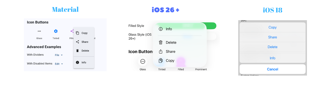
iOS: Banner-style notification at the top with slide/fade animations, tap to dismiss, and icon indicators.
Android: Material SnackBar at the bottom with standard Material Design appearance.
AdaptiveDatePicker
// Basic date pickerfinal selectedDate = awaitAdaptiveDatePicker.show(
context: context,
initialDate: DateTime.now(),
);
// Date picker with rangefinal selectedDate = awaitAdaptiveDatePicker.show(
context: context,
initialDate: DateTime.now(),
firstDate: DateTime(2020),
lastDate: DateTime(2025),
);
// Date and time picker (iOS)final selectedDateTime = awaitAdaptiveDatePicker.show(
context: context,
initialDate: DateTime.now(),
mode: CupertinoDatePickerMode.dateAndTime,
);
if (selectedDate != null) {
print('Selected: ${selectedDate.toString()}');
}
iOS: Uses CupertinoDatePicker in a modal bottom sheet with Cancel/Done buttons.
Android: Uses Material DatePickerDialog.
iOS: Modern custom design with rounded corners, smooth shadows, animated chevron, and gradient separator.
Android: Material ExpansionTile with InkWell effects.
AdaptiveTabBarView
Horizontal swipeable tab view with tabs at the top.
// Tab bar view at the topAdaptiveTabBarView(
tabs: ['Latest', 'Popular', 'Trending'],
children: [
LatestPage(),
PopularPage(),
TrendingPage(),
],
onTabChanged: (index) {
print('Tab changed to: $index');
},
)
iOS: Uses CupertinoSlidingSegmentedControl for tab selection.
Android: Uses Material TabBar + TabBarView.
Use the PlatformInfo utility class to check platform and iOS version:
import'package:adaptive_platform_ui/adaptive_platform_ui.dart';
// Check platformif (PlatformInfo.isIOS) {
print('Running on iOS');
}
if (PlatformInfo.isAndroid) {
print('Running on Android');
}
// Check iOS versionif (PlatformInfo.isIOS26OrHigher()) {
print('Using iOS 26+ features');
}
if (PlatformInfo.isIOS18OrLower()) {
print('Using legacy iOS widgets');
}
// Get iOS version numberint version = PlatformInfo.iOSVersion; // e.g., 26// Check version rangeif (PlatformInfo.isIOSVersionInRange(24, 26)) {
print('iOS version is between 24 and 26');
}
// Get platform descriptionString description = PlatformInfo.platformDescription; // e.g., "iOS 26"
Installation
Add this to your package's pubspec.yaml file:
dependencies:adaptive_platform_ui:^1.0.0
Then run:
flutter pub get
iOS needs a deployment target of 15.0 or higher. In ios/Podfile:
platform :ios, '15.0'
Migrating to 1.0.0
Most apps need two small steps, or none.
1. Raise the iOS deployment target to 15.0. Set platform :ios, '15.0' in
ios/Podfile, set the Runner target's iOS Deployment Target to 15.0 in Xcode,
then run pod install. Xcode 27 does not build below 15.0.
2. Let the fixed toolbar in. On iOS 26+ the native toolbar now lives above
the navigator instead of inside each page.
If you use AdaptiveApp or AdaptiveApp.router, there is nothing to do.
If you use MaterialApp or CupertinoApp directly, add the host once:
Without the host every page keeps drawing its own toolbar, exactly as before
1.0.0, so nothing breaks; you just do not get the fixed toolbar, and on iPhone
Duo the tab bar of a tab layout stays at the bottom instead of moving into
the vertical bar.
Check these if they apply to you:
Custom leading, titleWidget or iconWidget. They are now built above
the navigator. A widget that calls Navigator.of(context) with its own
context no longer finds the page's navigator. Use the page's context:
// Before: a widget that looks the navigator up from its own context.
leading: constMyCloseButton(),
// After: capture the page's context in the callback.
leading: CupertinoButton(
onPressed: () => Navigator.of(context).pop(), // the page's context
child: constIcon(CupertinoIcons.xmark),
),
A scaffold that does not start at the top of the screen, such as one
pane of a side by side layout, should keep its own toolbar:
When UITabBarController becomes root, Flutter engine still believes it owns the screen, creating a parent-child relationship neither framework was designed to handle.
Recommendation:
✅ Use for prototyping and concept validation
✅ Use for demos and presentations
❌ Do NOT use in production apps
❌ Do NOT rely on Flutter navigation when active
❌ Do NOT expect hot reload to work
For production apps, use Flutter's built-in TabBar or implement search within the existing navigation structure.
See the example app's Native Search Tab demo page for detailed technical explanation.
Widget Catalog
Currently available adaptive widgets:
✅ AdaptiveApp - Platform-specific app configuration with theme support and router
✅ AdaptiveAppBar - Centralized app bar configuration with custom navigation bar support
✅ AdaptiveBottomNavigationBar - Centralized bottom navigation configuration with custom tab bar support
✅ AdaptiveScaffold - Scaffold with optional native iOS 26 toolbar and tab bar
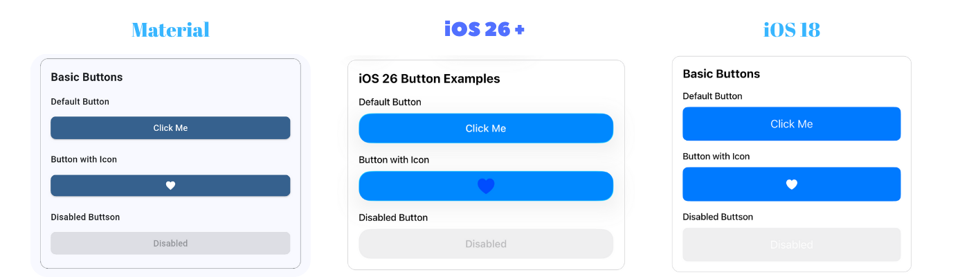
✅ AdaptiveButton - Buttons with iOS 26+ native designs