Package selection guidance compiled from public package information, community data, and project usage.
adv_fab is a Flutter package that enhances the standard floating action button by enabling it to expand and reveal hidden widgets, offering dynamic interaction. It supports use as a customizable NavigationBar or a floating space bar, ideal for modern UI designs requiring intuitive navigation and visual hierarchy. The package is lightweight and integrates seamlessly into existing Flutter projects with minimal setup. Its expandable behavior improves accessibility and user engagement in mobile applications.
Use cases
Bottom navigation with expandable actions
Enhanced floating action buttons in dashboards
Interactive app toolbars
Customizable navigation bars
Floating space bars in scrollable layouts
Key features
Expandable FAB with smooth animations
Supports multiple child widgets
Reusable as NavigationBar or floatingSpaceBar
Lightweight and easy integration
Configurable expansion direction and timing
Suitable for
Developers building interactive Flutter apps
Designers seeking modern UI patterns
Apps requiring accessible floating controls
Projects with complex bottom navigation needs
UI-heavy applications with dynamic layouts
Considerations
May require careful layout management
Animation performance depends on device
Limited platform-specific customization
Not suitable for simple static FABs
Best used with clear visual hierarchy
Original README
Original README snapshot from the linked source repository. Visit the repository for the latest content.
AdvFAB (More Than Just A Floating Action Button)
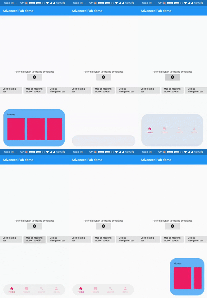
AdvFAB is An Advanced floating action button that expands itself to reveal its hidden widget. It can also be used as an AnimatedbottomNavigationbar or just an AnimatedFloatingActionBar with the same expansion capabilities.
Have a look at the gif below
Image 1
Image 2
NOTE: This package has lots of functionalities and parameters to customize your AdvFab please refer to the example floder and the full documentation in order to take advantage of this package to the fullest. Use this quick guide to setup your work environment and understand the basics :)
Create an Advanced FLoating Action Button (AdvFab)
First import the package inside your project
import'package:adv_fab/adv_fab.dart';
In your project, create a AdvFabController
AdvFabController controller;
//now inside the inti function@overridevoidinitState() {
super.initState();
controller = AdvFabController();
}
This controller will allow you to expand, collapse and more importantly "setExpandedWidgetConfiguration". It will also give you the state of the AdvFab( true or false depending on whether the widget is expanded or not)
IMPORTANT : The "setExpandedWidgetConfiguration" shall be called at least once in the life time of your widget, to configure what has to be displayed once the AdvFab is expanded else you will get an error.
Create an AdvFab widget inside the floatingActionButton of the scaffold
Scaffold(
	floatingActionButton: AdvFab(
		//controller shall not be null (actually it can but still....)
		controller: controller
	),
)
Use flags
AdvFab allows you to create a navigation bar, an empty bar (where you can add a ny widget you want) or just a normal floating action button. To enable these functionalities, here are the flags to toggle
useAsFloatingSpaceBar: false (by default )
useAsFloatingActionButton: true ( by default )
useAsNavigationBar: false (by default )
IMPORTANT : There can be only one value as "true", if you set more than one value as true, then a priority rule will be applied and will set the flag with higher priority to true and you will get a configuration error warning
Important Note
In order to maintain the screen adaptability of this widget (to make it look even on all screens), I opted for a formula based on percentages of the screen.
This means that every width and height shall be given by you in the range [0 - 100],100 inclusive.
Example:
To help you debug your code easily, I included a log facility, You just have to set the ShowLogs property to true and you will get all of them.
When you use AdvFab as a floating Action Button, the default Icon displayed will be a warning icon in red, just use the floatingActionButtonIconColor and floatingActionButtonIcon properties to change them; The floating action button also has its idenpendent ontap property called onFloatingActionButtonTapped
To use the AnimatedBottomNavigationBar, the body of the scaffold shall be a AdvBottomBarBody
Conclusion
Thank you for using my package, if you have any question feel free to contact me on instagram or directly on my mail emile@emilecode.com