Search packages, repositories and app categories

animated_button_bar cover
Package detailsv1.0.0

animated_button_bar

A highly customizable button bar with animation on selected item.

AndroidiOSWebmacOSWindowsLinux
30-day downloads
604
Likes
82
Pub points
150

Install package

flutter pub add animated_button_bar

Package Overview

Package selection guidance compiled from public package information, community data, and project usage.

A customizable button bar in Flutter that features smooth animations when an item is selected. It allows developers to create interactive, visually engaging navigation bars with animated transitions between buttons. The package supports multiple platforms and offers extensive styling options for colors, shapes, and animation duration. Ideal for apps requiring intuitive tab-like navigation with dynamic feedback.

Use cases

  • Interactive navigation bars
  • Tabbed interfaces
  • Animated UI transitions
  • Customizable bottom navigation
  • User feedback on selection
  • Mobile and web app dashboards

Key features

  • Smooth selection animations
  • Highly customizable appearance
  • Cross-platform support
  • Configurable animation duration
  • Flexible layout options
  • Supports tap gestures

Suitable for

  • Flutter developers building modern UIs
  • Apps needing animated navigation
  • Designers focused on user experience
  • Projects targeting multiple platforms
  • Developers wanting reusable components

Considerations

  • May impact performance with many items
  • Requires careful tuning of animation speed
  • Limited built-in themes
  • Not suitable for simple static buttons
  • Depends on correct state management
  • Best used with responsive design patterns
Original README

Original README snapshot from the linked source repository. Visit the repository for the latest content.

animated_button_bar

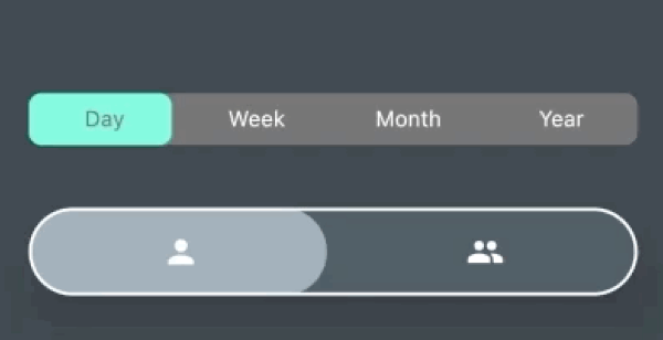
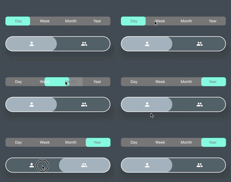
AnimatedButtonBar is a flutter library that allows you to create a row of buttons with an animation on selection.

Getting started

Add this to your app's pubspec.yaml file:

dependencies:  
  animated_button_bar: ^0.0.2

Usage

Then you have to import the package with:

import 'package:animated_button_bar/animated_button_bar.dart';  

And use an AnimatedBarButton like this:

  Column(  
          mainAxisAlignment: MainAxisAlignment.center,  
          children: [  
            //inverted selection button bar  
            AnimatedButtonBar(  
              radius: 8.0,  
              padding: const EdgeInsets.all(16.0),  
              invertedSelection: true,  
              children: [  
                ButtonBarEntry(onTap: () => print('First item tapped'), child: Text('Day')),  
                ButtonBarEntry(onTap: () => print('Second item tapped'), child: Text('Week')),  
                ButtonBarEntry(onTap: () => print('Third item tapped'), child: Text('Month')),  
                ButtonBarEntry(onTap: () => print('Fourth item tapped'), child: Text('Year'))  
              ],  
            ),  
            //You can populate it with different types of widgets like Icon  
            AnimatedButtonBar(  
              radius: 32.0,  
              padding: const EdgeInsets.all(16.0),  
              backgroundColor: Colors.blueGrey.shade800,  
              foregroundColor: Colors.blueGrey.shade300,  
              elevation: 24,  
              borderColor: Colors.white,  
              borderWidth: 2,  
              innerVerticalPadding: 16,  
              children: [  
                ButtonBarEntry(onTap: () => print('First item tapped'), child: Icon(Icons.person)),  
                ButtonBarEntry(onTap: () => print('Second item tapped'), child: Icon(Icons.people)),  
              ],  
            ),  
          ],  
        ),  

Result

parameters

parameter description default
animationDuration animation duration when tap const Duration(milliseconds: 200)
backgroundColor main color of the widget Theme.of(context).backgroundColor
borderColor color of the border null
borderWidth width of the border borderColor != null ? 1.0 : 0.0;
children A list of ButtonBarEntry to display required
curve the curve for the animation Curves.fastOutSlowIn
elevation double 0
foregroundColor color for the selection Theme.of(context).accentColor
invertedSelection bool false
radius double 0.0
verticalPadding double 8.0

Categories

Dependencies

Dependency list 1 items

Source repository

Projects using this package