Package selection guidance compiled from public package information, community data, and project usage.
AnimatedDigit is a Flutter widget that provides smooth scroll animation effects for numbers, ideal for displaying dynamic numeric values with a visually engaging transition. It simplifies the implementation of animated counters or score displays by automatically handling digit scrolling, making it easy to integrate into apps requiring real-time number updates. The package supports multiple platforms including Android, iOS, Web, macOS, Windows, and Linux, ensuring consistent behavior across devices.
Use cases
Displaying live scores in games
Animating countdown timers
Showing dynamic statistics
Updating progress indicators
Creating digital clocks
Visualizing changing metrics
Key features
Smooth scroll animation for digits
Easy-to-use API
Supports any integer value
Cross-platform compatibility
Customizable speed and duration
Minimal setup required
Suitable for
Game developers
Dashboard builders
Real-time data display apps
Educational apps
Interactive UI components
Considerations
Best suited for integers, not decimals
Limited customization for individual digit styling
Performance may vary with very high update rates
Not designed for large number ranges without optimization
Requires manual handling of value changes
Original README
Original README snapshot from the linked source repository. Visit the repository for the latest content.
Scroll animation numbers widget, any number that need animation effects and easy to use.
Usage
🚴🏻 Easy Show
// only showAnimatedDigitWidget(
value: 9999
),
🚄 Easy Show & State
// simple state control
int value = 9999;
AnimatedDigitWidget(
  value: value
  textStyle: TextStyle(color: Colors.pink),
),
setState((){
  value = 191919;
});
🎡 Controller
Built-in accuracy calculation
AnimatedDigitController _controller = AnimatedDigitController(10240.987);
AnimatedDigitWidget(
controller: _controller,
textStyle: TextStyle(color: Colors.pink),
fractionDigits: 2, // number of decimal places reserved, not rounded
enableSeparator: true, // like this 10,240.98
),
// UI Result => 10,240.98// increment
_controller.addValue(1314);
// minus
_controller.minusValue(1314); // from v3.1.0 added// times
_controller.timesValue(1314); // from v3.1.0 added// divide
_controller.divideValue(1314); // from v3.1.0 added// reset
_controller.resetValue(1314);
// last
_controller.dispose();
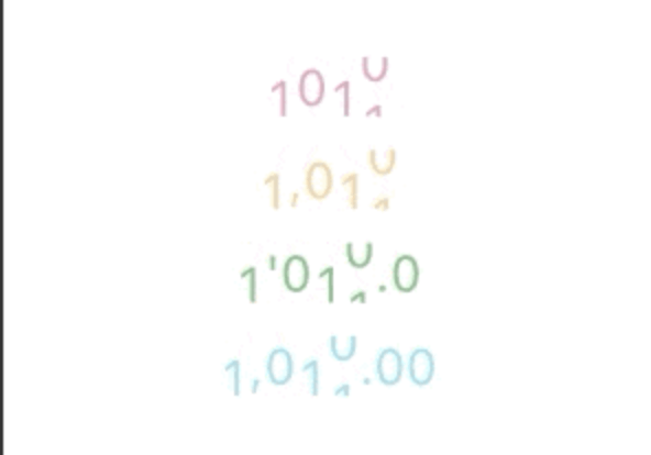
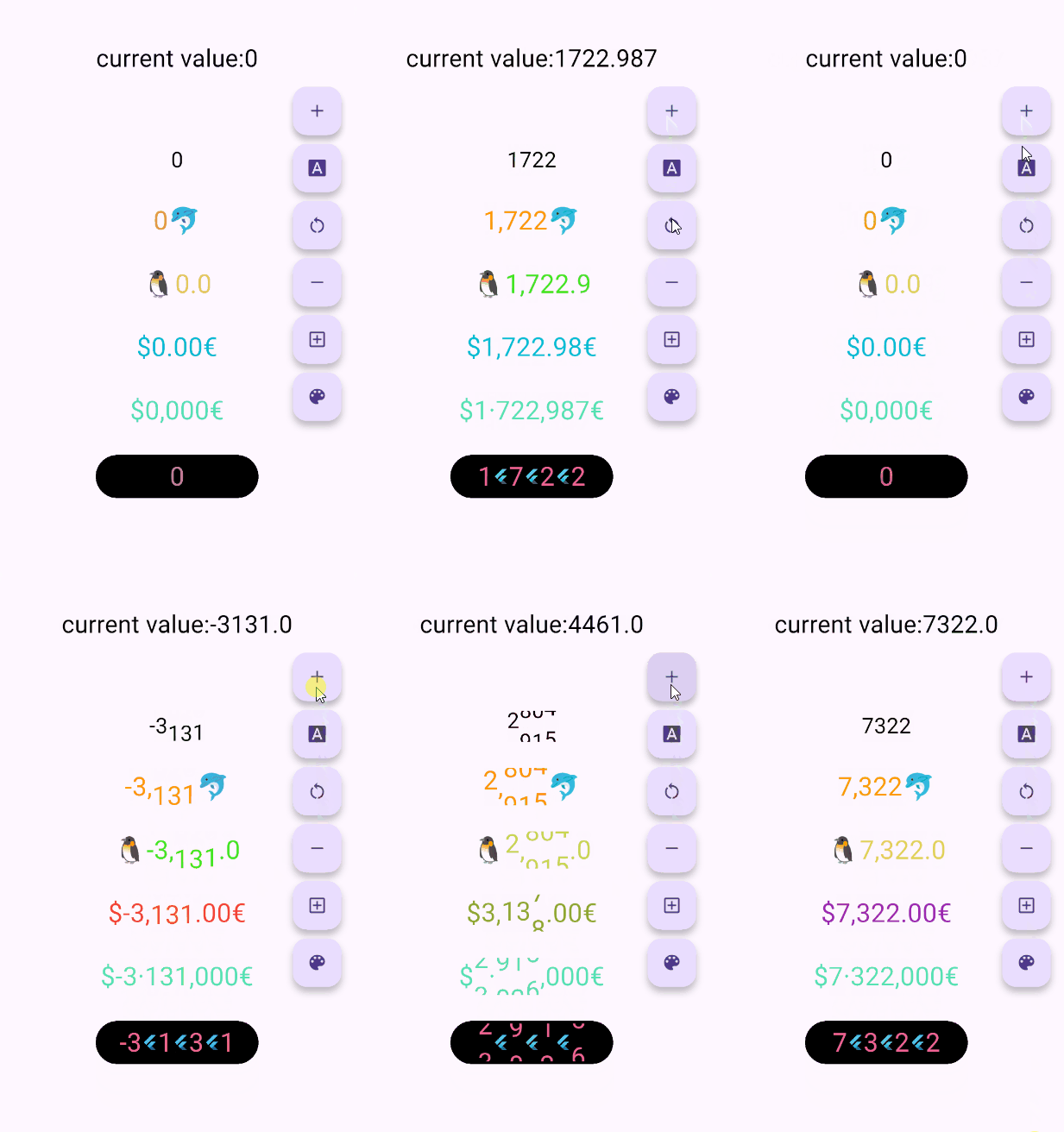
🖼 UI Effect Image & 💻 Code Example
AnimatedDigitWidget(
  value: 12531.98, // or use controller
),
AnimatedDigitWidget(
  value: 12531.98, // or use controller
  enableSeparator: true,
),
AnimatedDigitWidget(
  value: 12531.98, // or use controller
  fractionDigits: 2,
  enableSeparator: true,
),
The add a ValueColor object to valueColors, which is an array, you can add more ...,but always take the last eligible
Since version v3.3.1+1, colors have supported animated transitions instead of abrupt direct color switching, eliminating harsh transitions.
int value = 9999; // or use Controller.valueAnimatedDigitWidget(
value: value,
textStyle: TextStyle(
color: Colors.orange[200],
fontSize: 30,
),
valueColors: [
ValueColor(
//When value <= 0 , the color changes to red
condition: () => value <= 0,
color: Colors.red,
),
// you can add more ...,but always take the last eligible.
],
),
🍓Disable the initial scroll animation.
AnimatedDigitWidget(
...,
firstScrollAnimate: false// set false | >= v3.3.1+1
),
🍋Support for padding the integer part with leading zeros when the number of digits is less than the specified minimum
range: [0, 9], 🐧0 ➡️ 00、1 ➡️ 01、2 ➡️ 02 ...
AnimatedDigitWidget(
...,
fractionDigits: 0, // It must be set to 0; if there are decimal places, it's really unnecessary (wry smile)~~
enableMinIntegerDigits: true// set true, | >= v3.3.1+2
),
⚠️ value and controller cannot be both null.
⚠️ controller has higher priority.
controller - digit controller, The displayed number can be controlled via addValue and resetValue.
value - the display number.
🍑 TextStyle And BoxStyle Setting
textStyle - the numbers text style.
boxDecoration - Use with decoration of Container.
🍇 Int Type(default) Or Decimal Type Setting
fractionDigits - the fraction digits, int, default0.
🖌 Example ( 1000520.98765 ):
0 => 1000520;
1 => 1000520.9;
2 => 1000520.98;
3 => 1000520.987;
N => 1000520.[N];
The default 0 means an integer, when it is a decimal, if the value is less than the fractionDigits, it will be filled with 0 to the right, and the truncation method is used, so there is no rounding.
🍓 Numbers Free Style Setting
decimalSeparator - the decimal separator,can be replaced by other symbols in place of decimal separators, default..
enableSeparator - enable digit separator. defaultfalse not enable, only true, separateLength and separateSymbol valid.
🖌 Example (true): 1000520 => 1,000,520 (seealso separateLength or separateSymbol)
separateSymbol - the numbers separator symbol (only enableSeparator is true), make numbers much easier to read, default,.
🖌 Example ( 1000520 ):
, => 1,000,520
' => 1'000'520
- => 1-000-520
separateLength - the numbers separator length (only enableSeparator is true), separateSymbol by separator length insert, default3.
🖌 Example ( 1000520 ):
1 => 1,0,0,0,5,2,0
2 => 1,00,05,20
3 => 1,000,520
🥝 Scroll Animation Setting
duration - the animate duration, default Duration(milliseconds: 300).
curve - the animate curve, default Curves.easeInOut. look animate curve.
loop - enable loop scroll animate. default true, always scroll down, not scroll up from 9 -> 0; false, scroll up and down.
🍎 Digital Size Scheme Setting
autoSize - the default true is to automatically expand and contract according to the size of the ( number / symbol ) itself, false, the text size of the number 0 is used as the container size of each number, which can ensure the same width, but it seems that there is a slight interval between 1 and other numbers 😊 .
animateAutoSize - the animation resizing. default true, false will change directly to the size of the number/symbol.
🍒 Number prefix and suffix Setting
prefix - the text to display in front of the counter.