Package selection guidance compiled from public package information, community data, and project usage.
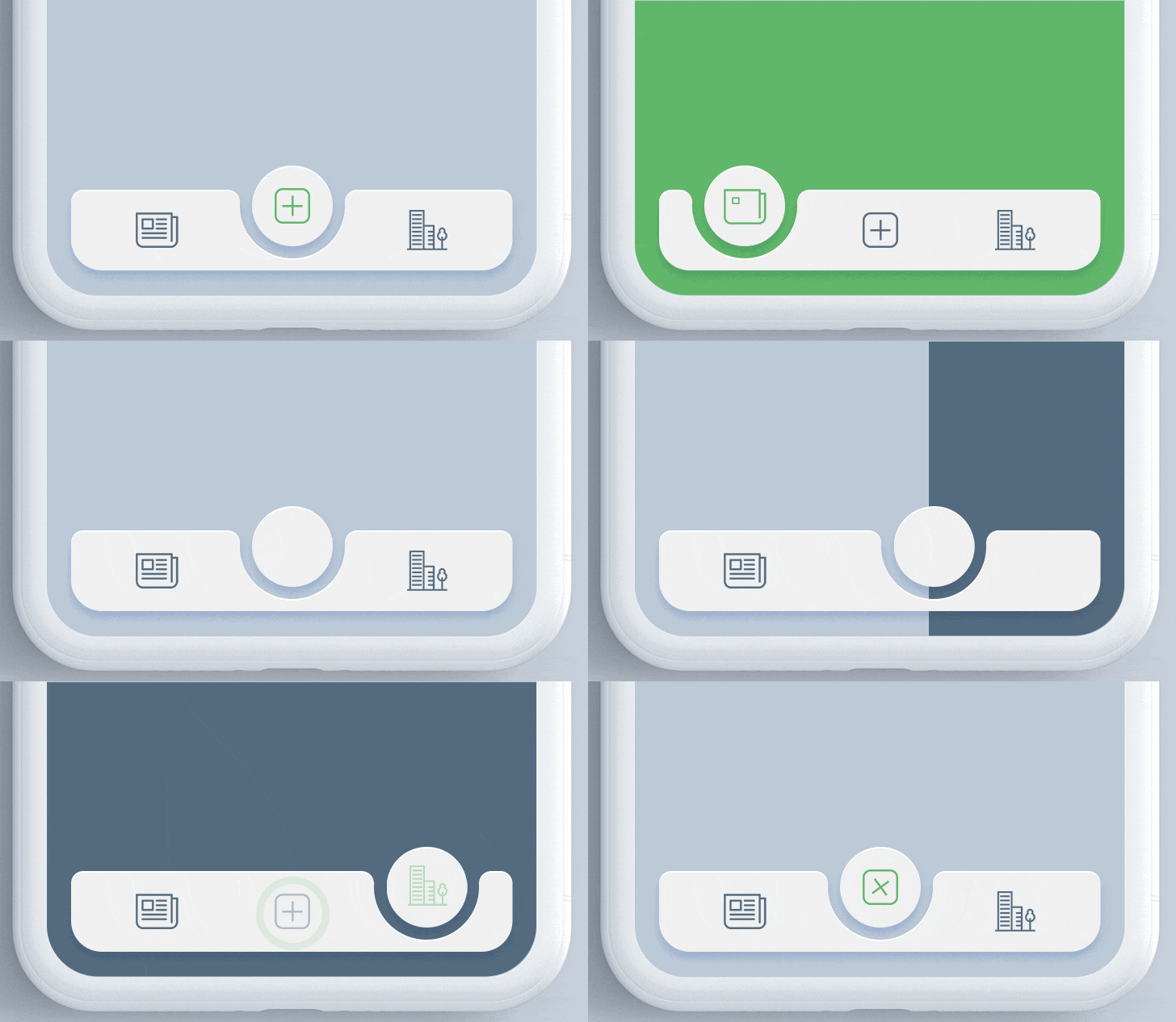
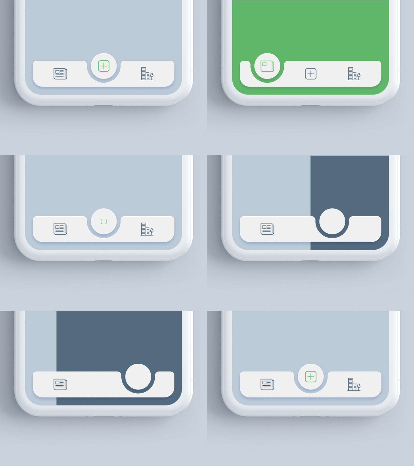
The animated_notch_bottom_bar package enables developers to create visually appealing bottom navigation bars with a dynamic notch effect, supporting any custom widget as children. It enhances user experience with smooth animations and modern design aesthetics. Compatible across multiple platforms including Android, iOS, Web, macOS, Windows, and Linux, it offers flexibility for cross-platform applications. The package is easy to integrate and customize, making it ideal for apps that prioritize engaging UI interactions.
Use cases
Creating modern app interfaces
Enhancing navigation UX
Designing custom bottom bars
Building cross-platform apps
Adding animated transitions
Implementing notch-based layouts
Key features
Animated notch effect
Customizable child widgets
Cross-platform support
Smooth animations
Easy integration
Responsive design
Suitable for
Mobile and web app developers
UI/UX designers
Apps requiring modern navigation
Developers seeking animated components
Projects with custom bottom navigation
Cross-platform Flutter projects
Considerations
May require performance optimization on older devices
Limited customization for notch shape
Depends on parent container constraints
Not suitable for simple navigation needs
Animation may distract in minimalistic designs
Requires careful alignment with overall UI theme
Original README
Original README snapshot from the linked source repository. Visit the repository for the latest content.
Animated Notch Bottom Bar
A Flutter package for animating the position of selected item in bottomNavigationBar with notch like design. Inspired by react-native-tabbar-interaction plugin.
Features :
Supports any widget as as a bottom bar children.
Animates the notch toward selected item.
Create an optimized bottom navigation bar with beautiful animation.
Supports blur effect like iOS Tab View.
Getting Started
Add the dependency in pubspec.yaml:
dependencies:...animated_notch_bottom_bar:^1.0.0
Basic Usage
Place AnimatedNotchBottomBar in the bottomNavigationBar parameter of a Scaffold widget and provide NotchBottomBarController to AnimatedNotchBottomBar.
Starting with version 1.0.0 of the package, NotchBottomBarController have been added for control the animation instead of PageController. The pageController field has been removed and notchBottomBarController is required now.
AnimatedNotchBottomBar
notchBottomBarController - The controller which allows you to control the page.
bottomBarItems - Navigation items, required more than one item and less than six.
onTap - Required to listen when an item is tapped it provides the selected item's index.
color - The bottom bar's background color.
removeMargins - To remove side and bottom margins by default it's false.
bottomBarWidth - To provide width for web and desktop app.
durationInMilliSeconds - To set duration time in MilliSeconds.
showLabel: To show or hide the label under bottom bar item.
itemLabelStyle - The bottom bar's item text style.
showShadow - If false the bottom bar's elevation will be removed.
showBlurBottomBar - If true the bottom bar will look blur.
blurOpacity - To set opacity of blur effect.
blurFilterX - Creates an image filter that applies a Gaussian blur at x axis.
blurFilterY - Creates an image filter that applies a Gaussian blur at y axis.
notchColor - Customizable notch's color.
notchGradient - Add Gradient to notch.
showTopRadius - If set false the top corner radius will be removed.
showBottomRadius - If set false the top corner radius will be removed.
elevation - Set elevation of bottom bar.
bottomBarHeight - To set height of bottom bar.
BottomBarItems
title - the bottom bar item label
activeItem - the selected item.
inActiveItem - the inactive item.
Guideline for contributors
Contribution towards our repository is always welcome, we request contributors to create a pull request to the main branch only.
We’d be really happy if you send us links to your projects where you use our component. Just send an email to sales@mindinventory.com and do let us know if you have any questions or suggestion regarding our work.