Package selection guidance compiled from public package information, community data, and project usage.
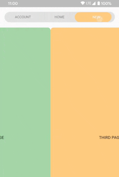
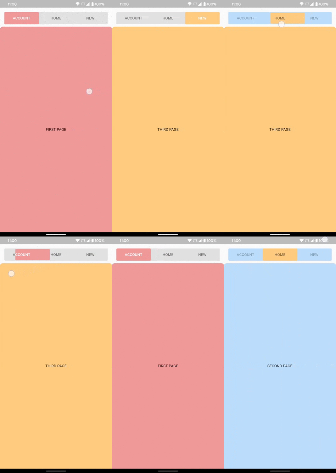
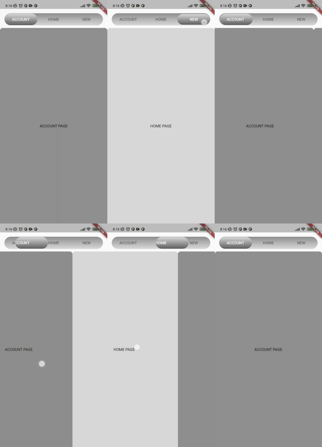
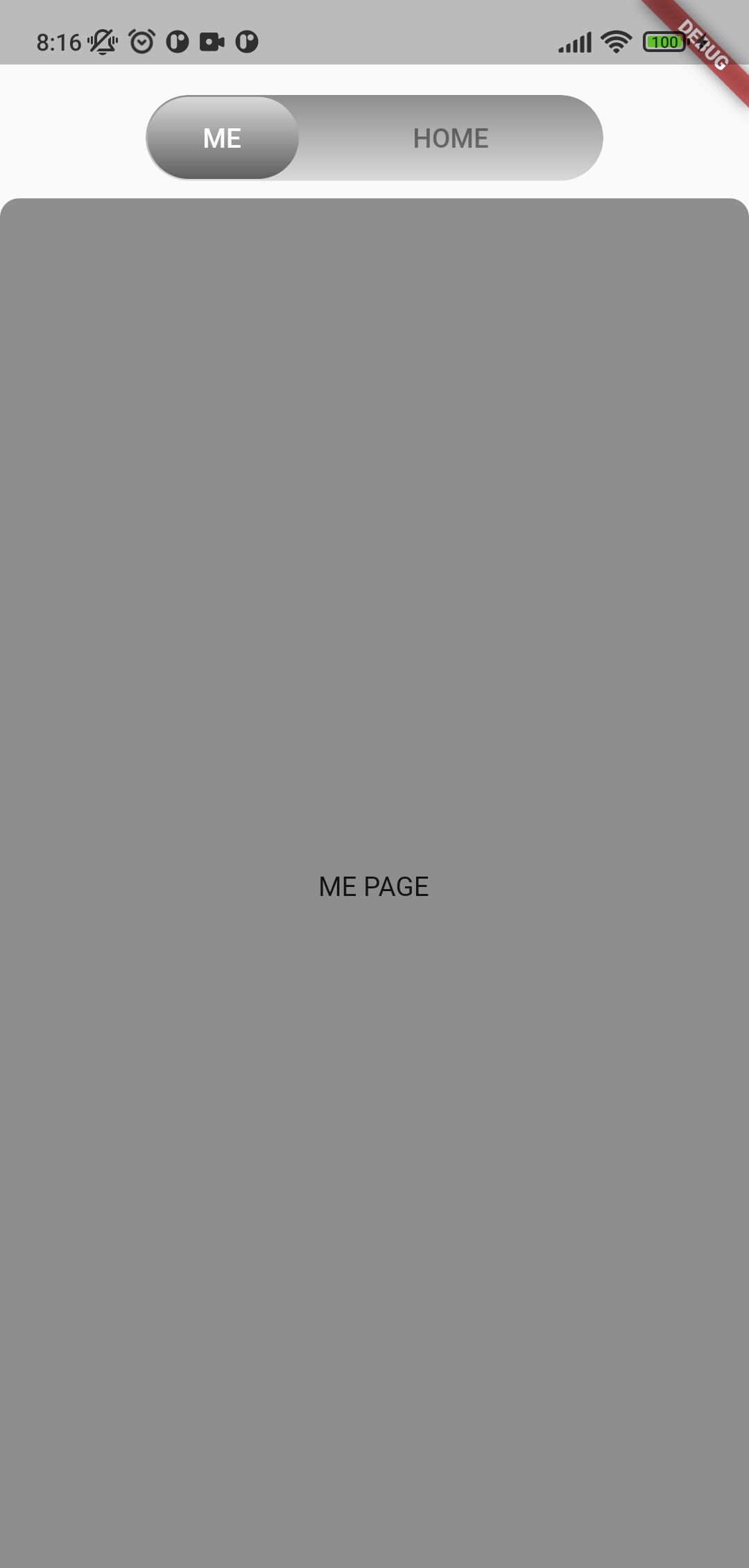
A customizable animated segmented control designed to work seamlessly with TabView in Flutter applications. It provides smooth transitions between segments, supports various styling options, and enhances user interaction with dynamic visual feedback. Ideal for apps requiring intuitive tab navigation with a modern aesthetic. The package is compatible across all major platforms including Android, iOS, Web, macOS, Windows, and Linux.
Use cases
Interactive tab navigation
Dynamic UI transitions
Customizable tab interfaces
Cross-platform tab controls
Enhanced user experience in dashboards
Form section switching
Key features
Smooth animated transitions
Highly customizable appearance
Built-in support for TabView
Responsive design across platforms
Easy integration with existing Flutter projects
Supports both horizontal and vertical layouts
Suitable for
Developers building cross-platform apps
Designers seeking modern UI components
Apps with multiple content sections
Projects requiring interactive tab experiences
Teams prioritizing consistent UX across devices
Considerations
May require additional styling for complex themes
Performance impact with large numbers of segments
Limited built-in accessibility features
Dependent on external TabView implementation
Not optimized for extremely high-frequency updates
Original README
Original README snapshot from the linked source repository. Visit the repository for the latest content.
A customizable segment tab control. Can be used with or without TabView.
You can style the whole widget, an individual tab, or both. A value on the currently selected SegmentTab
overrides the corresponding value on SegmentedTabControl.
Note that the text colors are read from the selected tab and applied to the whole bar, so
textColor and selectedTextColor set the bar's label colors while that tab is selected rather than
coloring only that one tab.
Change tracking logic is identical to TabBar logic.
DefaultTabController.of(context).index
or
_controller.index
Сustom tab content
Use SegmentTab.labelBuilder to show any widget like an icon.
The selected-tab highlight is produced by painting the tab row twice and clipping the upper copy to the
indicator, so the builder is called once per layer and receives the color of the layer it is painting.
Plain Icon and Text children inherit that color. Use color for anything that does not inherit it, such as a
border or an SVG:
If you have any ideas or are running into a bug, please submit an issue on github page: https://github.com/LanarsInc/animated-segmented-tab-control/issues