Search packages, repositories and app categories

animated_sidebar cover
Package detailsv1.0.1

animated_sidebar

A collapsable sidebar plugin for Flutter, optimized for web and desktop applications.

AndroidiOSWebmacOSWindowsLinux
30-day downloads
244
Likes
42
Pub points
150

Install package

flutter pub add animated_sidebar

Package Overview

Package selection guidance compiled from public package information, community data, and project usage.

Animated Sidebar is a Flutter plugin that provides a collapsible sidebar designed for web and desktop applications. It offers smooth animations and responsive behavior, enhancing navigation in larger interfaces. The sidebar can expand or collapse with fluid transitions, improving user experience across platforms. Built with performance in mind, it integrates seamlessly into apps targeting multiple environments, including mobile, web, and desktop. Ideal for dashboards, admin panels, and complex UIs requiring efficient space management.

Use cases

  • Dashboard navigation
  • Admin panel interfaces
  • Desktop application layouts
  • Web app sidebars
  • Multi-platform apps

Key features

  • Smooth collapsible animations
  • Responsive design for web and desktop
  • Cross-platform compatibility
  • Customizable appearance
  • Easy integration with existing Flutter projects

Suitable for

  • Developers building web/desktop apps
  • UI designers focusing on navigation efficiency
  • Projects needing dynamic sidebar behavior
  • Apps with complex navigation structures
  • Teams targeting multiple platforms

Considerations

  • Best suited for web and desktop use cases
  • May require additional styling for mobile-specific needs
  • Performance depends on animation complexity
  • Limited customization options beyond basic styling
  • Not optimized for mobile-only applications

Original README

Original README snapshot from the linked source repository. Visit the repository for the latest content.

Animated Sidebar

pub package Libraries.io for GitHub License

A highly customizable and styleable collapsable sidebar plugin for Flutter, optimized for web and desktop applications.

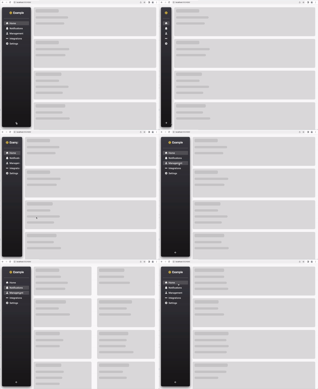
Example

example-ui

Installation

Add the following to your pubspec.yaml file:

dependencies:  
 animated_sidebar: ^1.0.0   

or use the following command:

flutter pub add animated_sidebar  

Add the following import to your dart file:

import 'package:animated_sidebar/animated_sidebar.dart';  

Usage

Sidebar Items

define a list of SidebarItem objects:

import 'package:animated_sidebar/animated_sidebar.dart';  
  
final List<SidebarItem> items = [  
  SidebarItem(icon: Icons.home, text: 'Home'),  
  SidebarItem(icon: Icons.notifications, text: 'Notifications'),  
  SidebarItem(icon: Icons.person, text: 'Management'),  
];  
Child Items

it is also possible to define multiple SidebarChildItem for every SidebarItem.

import 'package:animated_sidebar/animated_sidebar.dart';  
  
final List<SidebarItem> items = [  
  SidebarItem(icon: Icons.home, text: 'Home'),  
  SidebarItem(  
    icon: Icons.person,  
    text: 'Management',  
    children: [  
	  SidebarChildItem(icon: Icons.person, text: 'Users'),  
	  SidebarChildItem(icon: Icons.verified_user, text: 'Roles'),  
    ],  
  ),
];  

The Item Containing the Children is Collapsed and expand only on tap. If the Current selected item is a SidebarChildItem the overlying Item keeps expanded

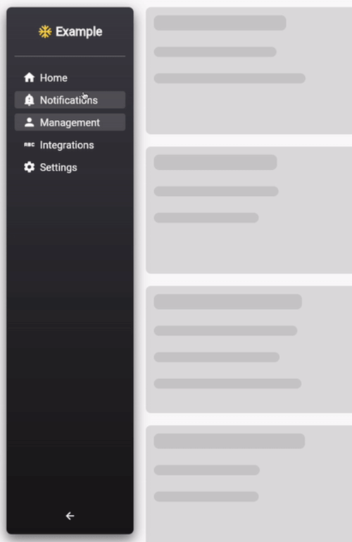
Default usage of AnimatedSidebar
import 'package:animated_sidebar/animated_sidebar.dart';

@override
Widget build(BuildContext context) {
  return Scaffold(
    backgroundColor: Theme.of(context).scaffoldBackgroundColor,
    body: Row(
      children: [
        AnimatedSidebar(
          expanded: MediaQuery.of(context).size.width > 600,
          items: items,
          selectedIndex: 0,
          onItemSelected: (index) => print(index),
          headerIcon: Icons.ac_unit_sharp,
          headerIconColor: Colors.amberAccent,
          headerText: 'Example',
        ),
        Center(
          child: Text(
            'Page: $activeTab',
            style: Theme.of(context).textTheme.headline3,
          ),
        ),
      ],
    ),
  );
}
Use the AnimatedSidebar widget and handle state external :
import 'package:animated_sidebar/animated_sidebar.dart';

int activeTab = 0;

@override
Widget build(BuildContext context) {
  return Scaffold(
    backgroundColor: Theme.of(context).scaffoldBackgroundColor,
    body: Row(
      children: [
        AnimatedSidebar(
          expanded: MediaQuery.of(context).size.width > 600,
          items: items,
          selectedIndex: activeTab,
          autoSelectedIndex: false, // must be false if you want to handle state external
          onItemSelected: (index) =>
              setState(() => activeTab = index),
          headerIcon: Icons.ac_unit_sharp,
          headerIconColor: Colors.amberAccent,
          headerText: 'Example',
        ),
        Center(
          child: Text(
            'Page: $activeTab',
            style: Theme.of(context).textTheme.headline3,
          ),
        ),
      ],
    ),
  );
}

Categories

Source repository

Projects using this package

No data available yet.