
Overview
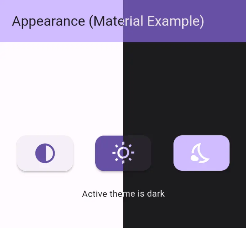
The appearance package simplifies implementing light, dark, and system theme modes in Flutter applications. It provides a seamless way to switch between themes and persist the selected mode across app restarts. Built with ease of integration in mind, it handles theme state management and ensures consistent user experience across Android, iOS, and web platforms. The package supports dynamic theme switching and automatically adapts to system-level theme preferences.
Use cases
- Implementing theme toggles in mobile and web apps
- Persisting user's theme preference after app restart
- Supporting system theme awareness
- Creating accessible UI with light and dark modes
- Enabling smooth theme transitions
Key features
- Light, dark, and system theme support
- Persistent theme state storage
- Automatic system theme detection
- Cross-platform compatibility (Android, iOS, Web)
- Simple API for theme switching
Suitable for
- Flutter developers building cross-platform apps
- Apps requiring user-customizable themes
- Projects focused on accessibility and UX
- Developers wanting minimal boilerplate for theming
- Applications targeting both mobile and web
Considerations
- Requires manual handling of theme-specific widget styling
- Does not include built-in theme design components
- Limited to theme mode persistence, not full theme customization
- May require additional setup for complex theme logic
- Depends on external state management if used beyond basic functionality