Search packages, repositories and app categories

auth_buttons cover
Package detailsv3.0.3

auth_buttons

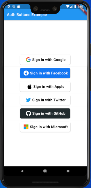
Auth Buttons is a flutter widget library, include buttons for authenticating with the most popular social networks like Google, Facebook, Apple and Twitter.

AndroidiOSWebmacOSWindowsLinux
30-day downloads
5K
Likes
199
Pub points
140

Install package

flutter pub add auth_buttons

Package Overview

Package selection guidance compiled from public package information, community data, and project usage.

Auth Buttons is a Flutter widget library providing ready-to-use authentication buttons for popular social networks including Google, Facebook, Apple, and Twitter. Designed to simplify the integration of social login features, it offers consistent, visually appealing buttons across platforms. The package supports Android, iOS, Web, macOS, Windows, and Linux, ensuring cross-platform compatibility. It enhances user experience by reducing boilerplate code and streamlining the implementation of third-party authentication flows.

Use cases

  • Social login integration
  • User onboarding with social accounts
  • Cross-platform authentication UI
  • Simplified OAuth button implementation
  • Streamlined sign-in workflows

Key features

  • Pre-built social login buttons
  • Support for Google, Facebook, Apple, and Twitter
  • Cross-platform compatibility
  • Consistent UI across devices
  • Easy integration with minimal setup
  • Customizable button styles

Suitable for

  • Developers building apps with social logins
  • Projects requiring quick authentication UI components
  • Apps targeting multiple platforms
  • Teams prioritizing development speed
  • Frontend-focused authentication implementations

Considerations

  • Requires additional configuration for OAuth setup
  • Depends on underlying platform SDKs
  • May need custom handling for error states
  • Limited to predefined social providers
  • Not suitable for custom authentication methods

Original README

Original README snapshot from the linked source repository. Visit the repository for the latest content.

auth_buttons

Github stars Pub Version

Auth Buttons is a flutter widget library, include buttons for authenticating with the most popular social networks like: Google, Facebook, Apple and too other.

Installation

  1. Add this to your packages pubspec.yaml file:
dependencies:
  auth_buttons: <^last>
  1. Install it You can install it from the command line:
$ flutter pub get
  1. Import it Now in Dart code, you can use:
import 'package:auth_buttons/auth_buttons.dart';

Recommendation

We recommend you to using show special when you want use some button. show help you importing part of library.

import 'package:auth_buttons/auth_buttons.dart'
    show GoogleAuthButton, AuthButtonStyle, AuthButtonType, AuthIconType;

We also recommend you to using the latest version.

Overview

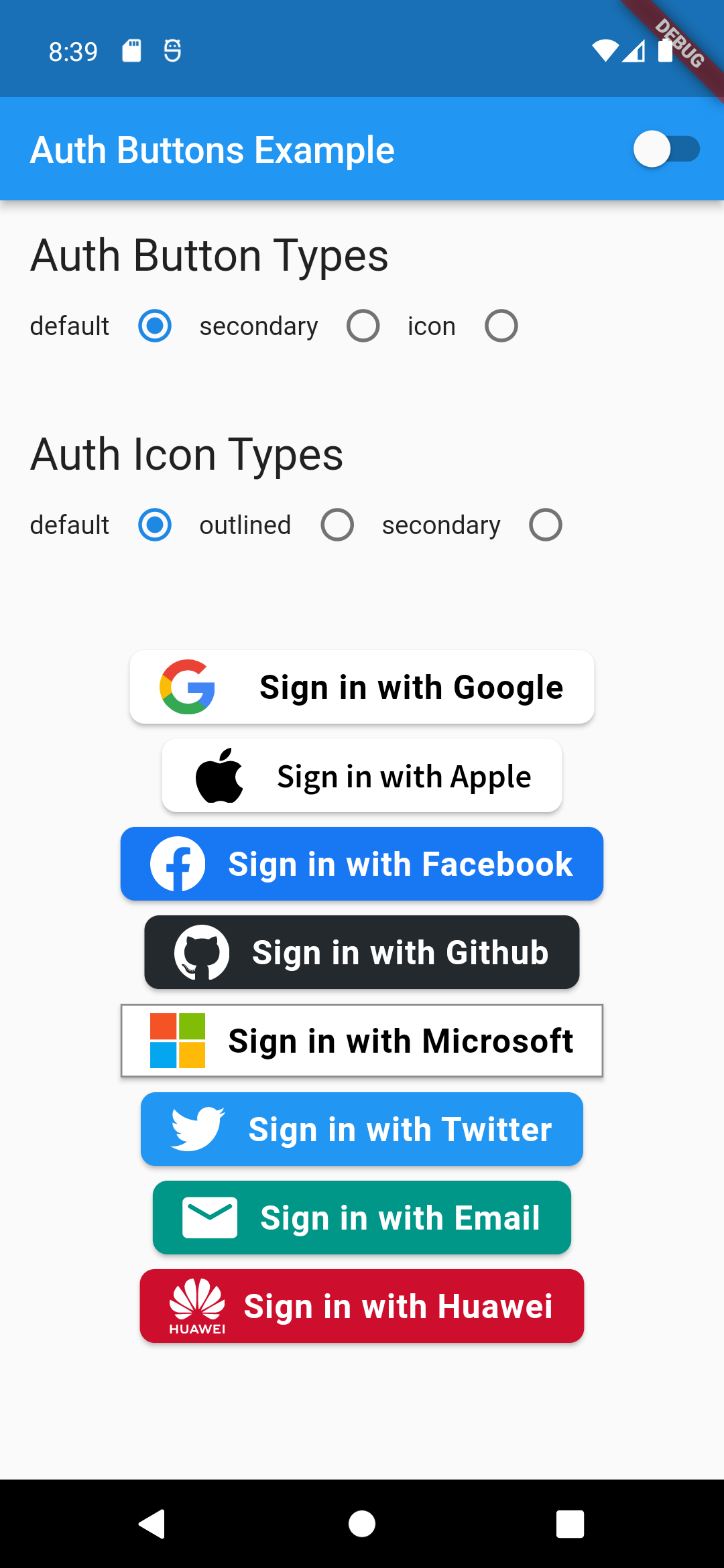
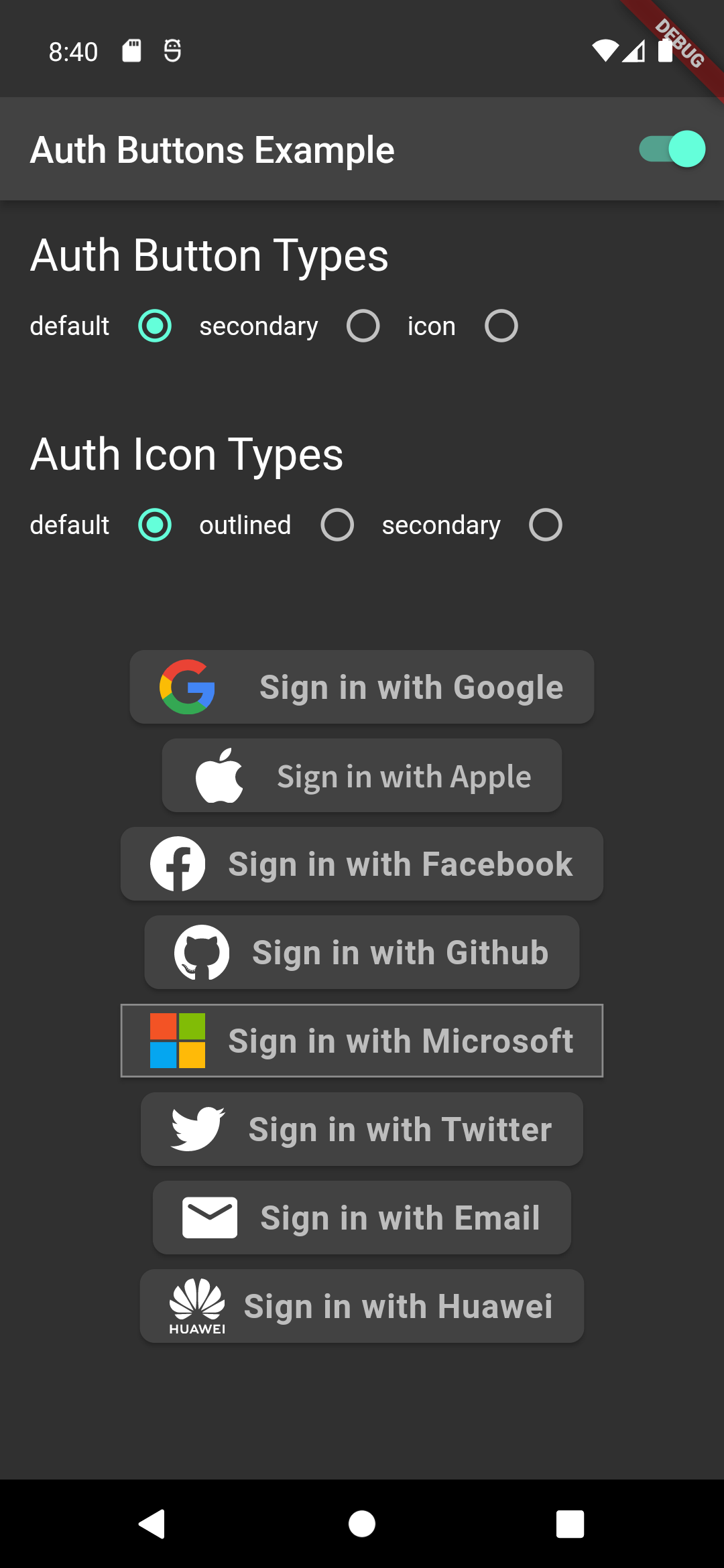
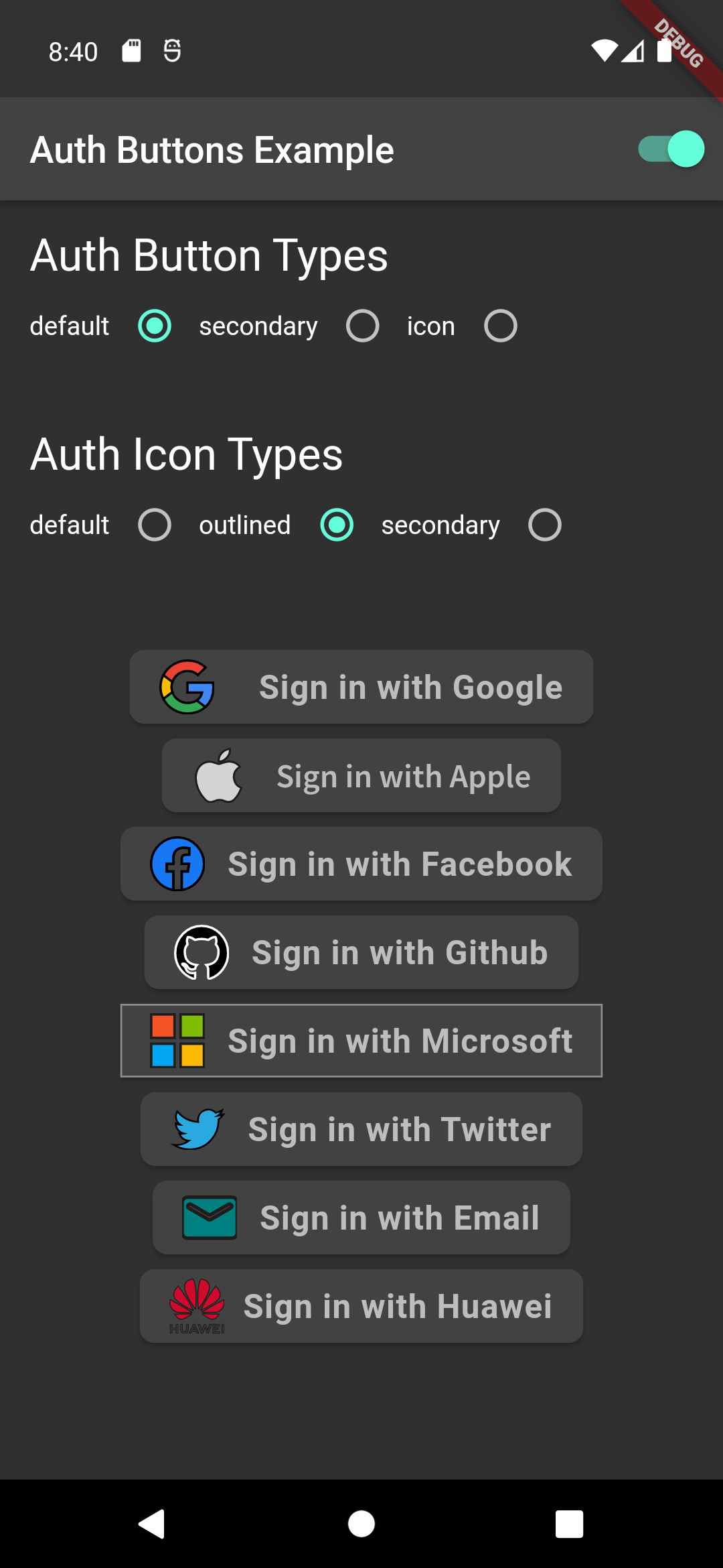
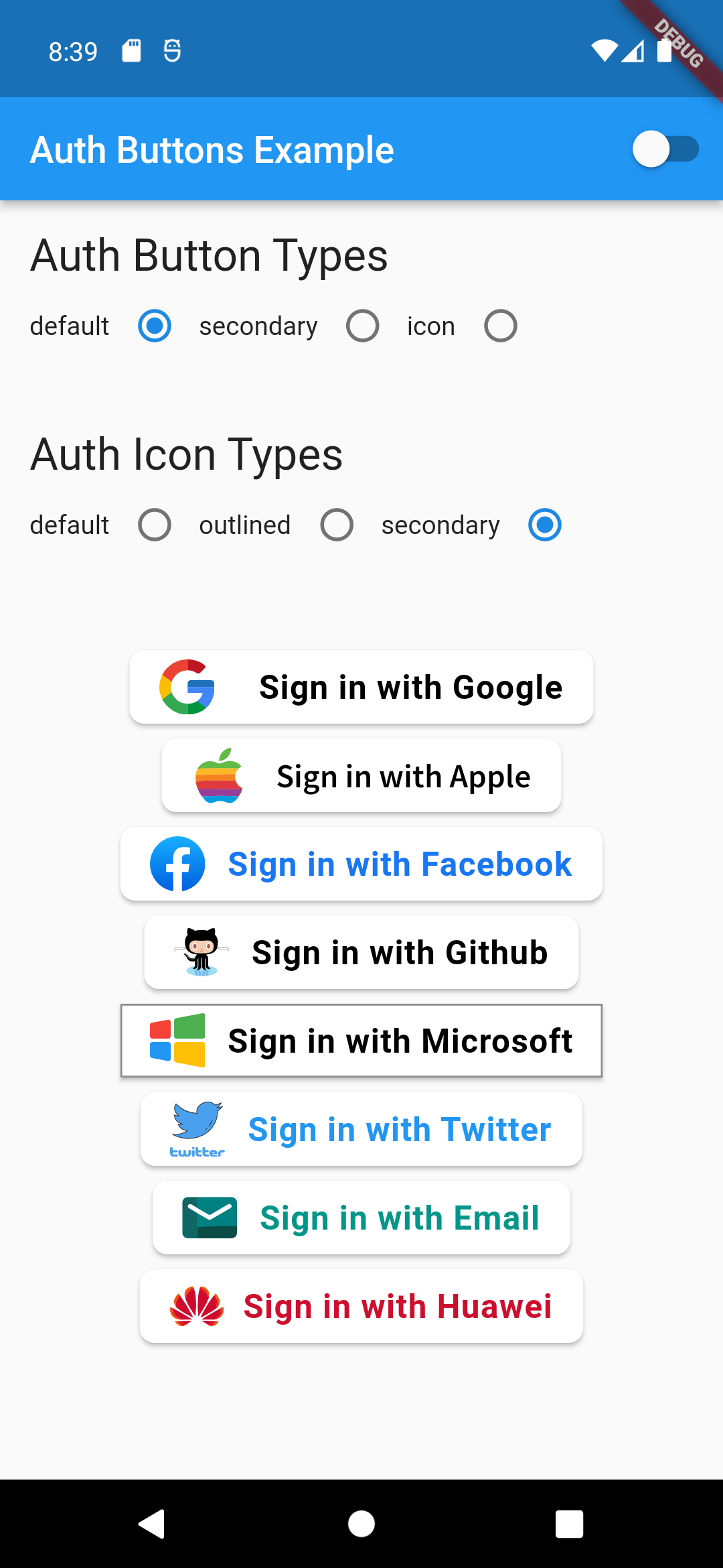
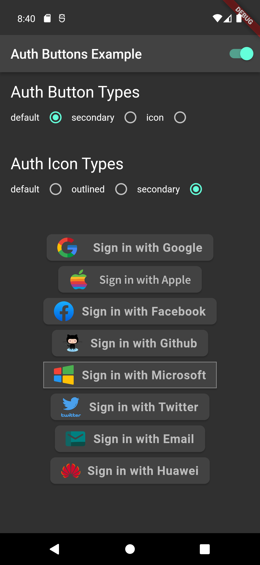
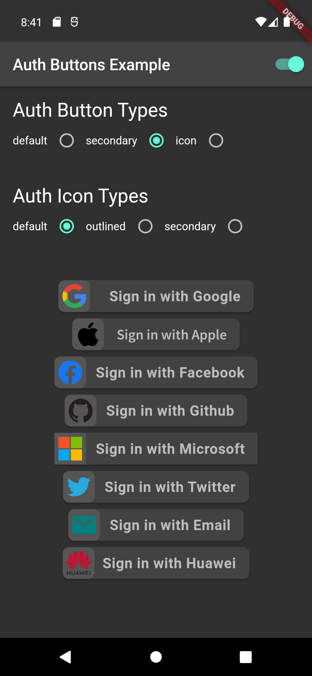
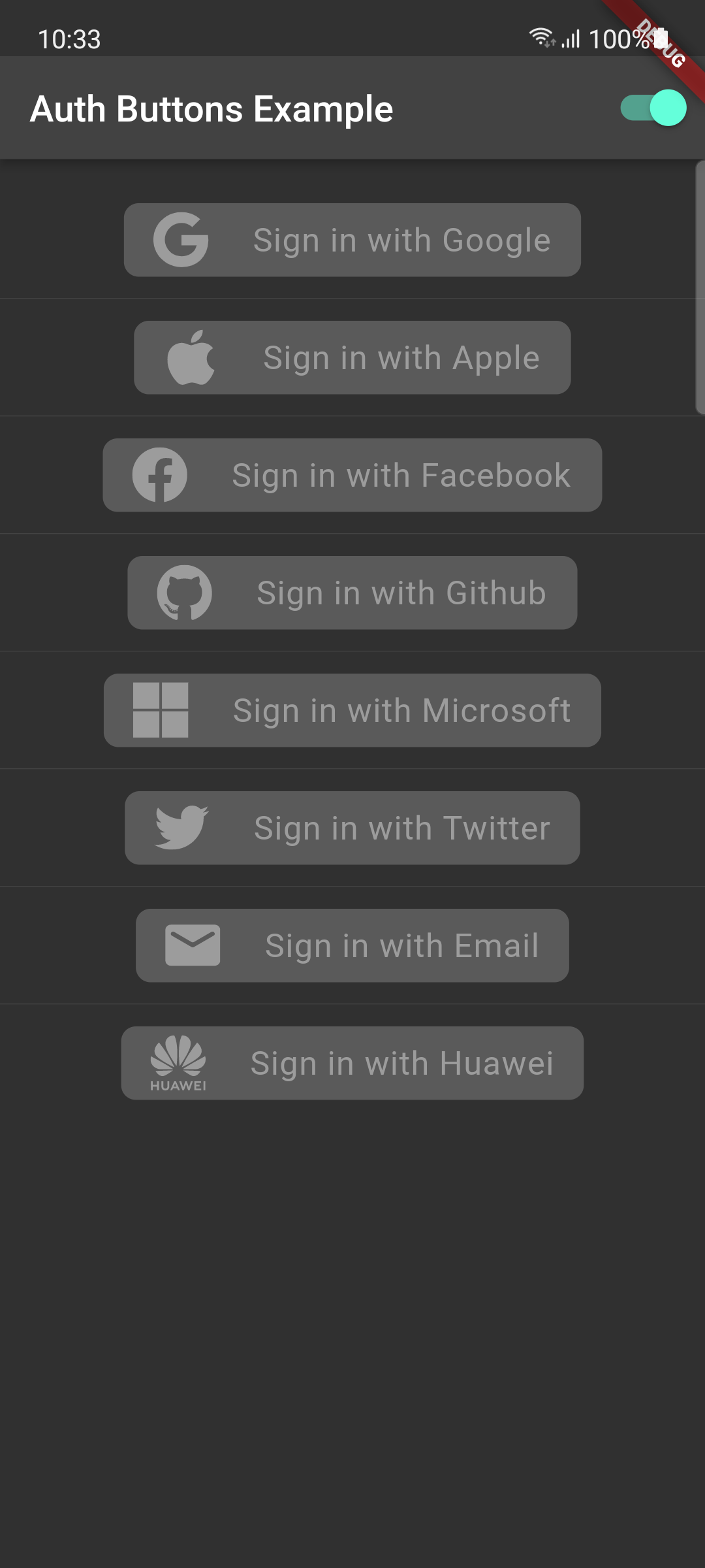
From the version 3.0.0 all AuthButtons are following the system mode. see ThemeMode for more info.

From the version 3.0.0 you're able to regroup AuthButton s for sharing style properties, to do this use the already existing AuthButtonGroup.

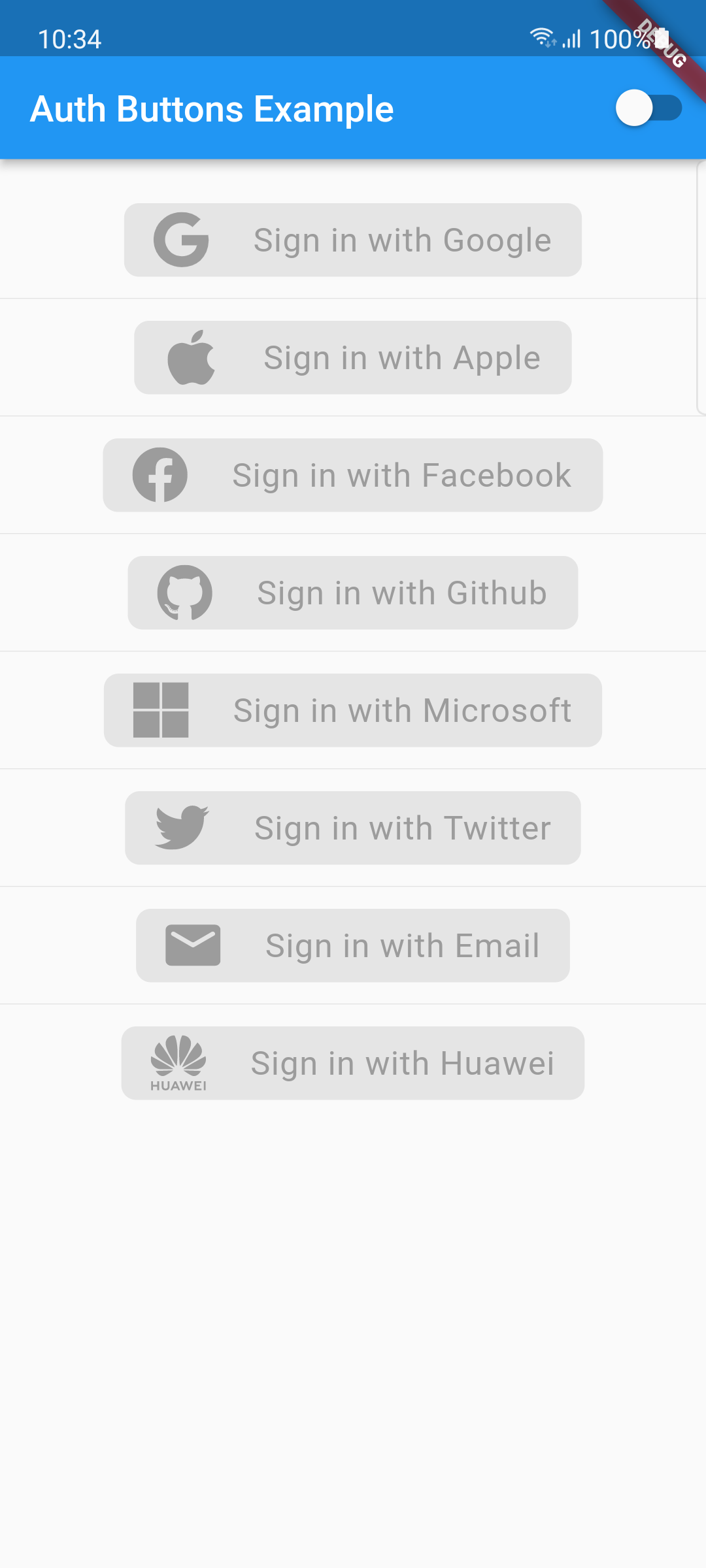
From the version 2.0.0 disabled state is supported.

  1. Enabled
  2. Disabled

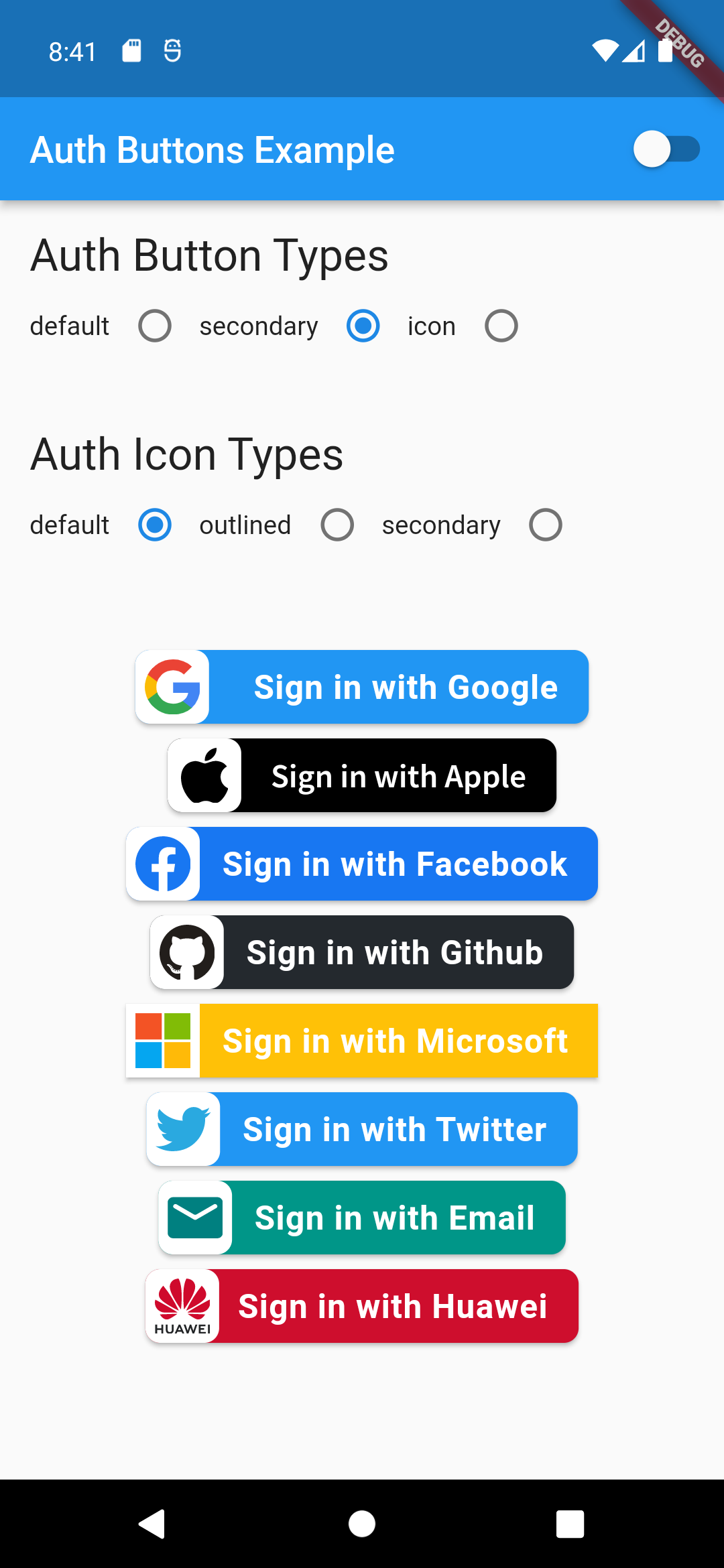
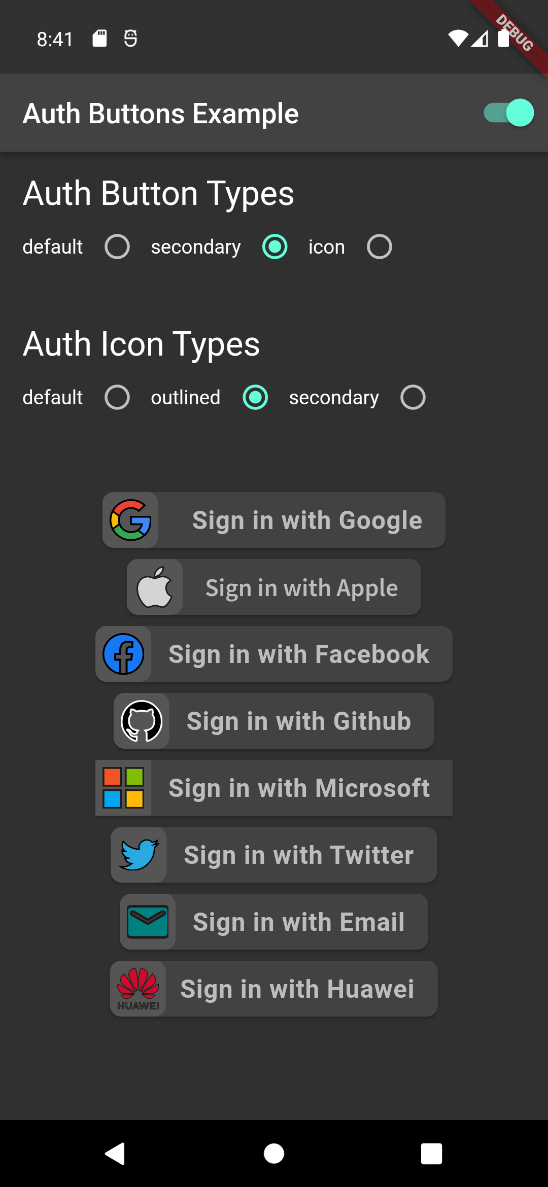
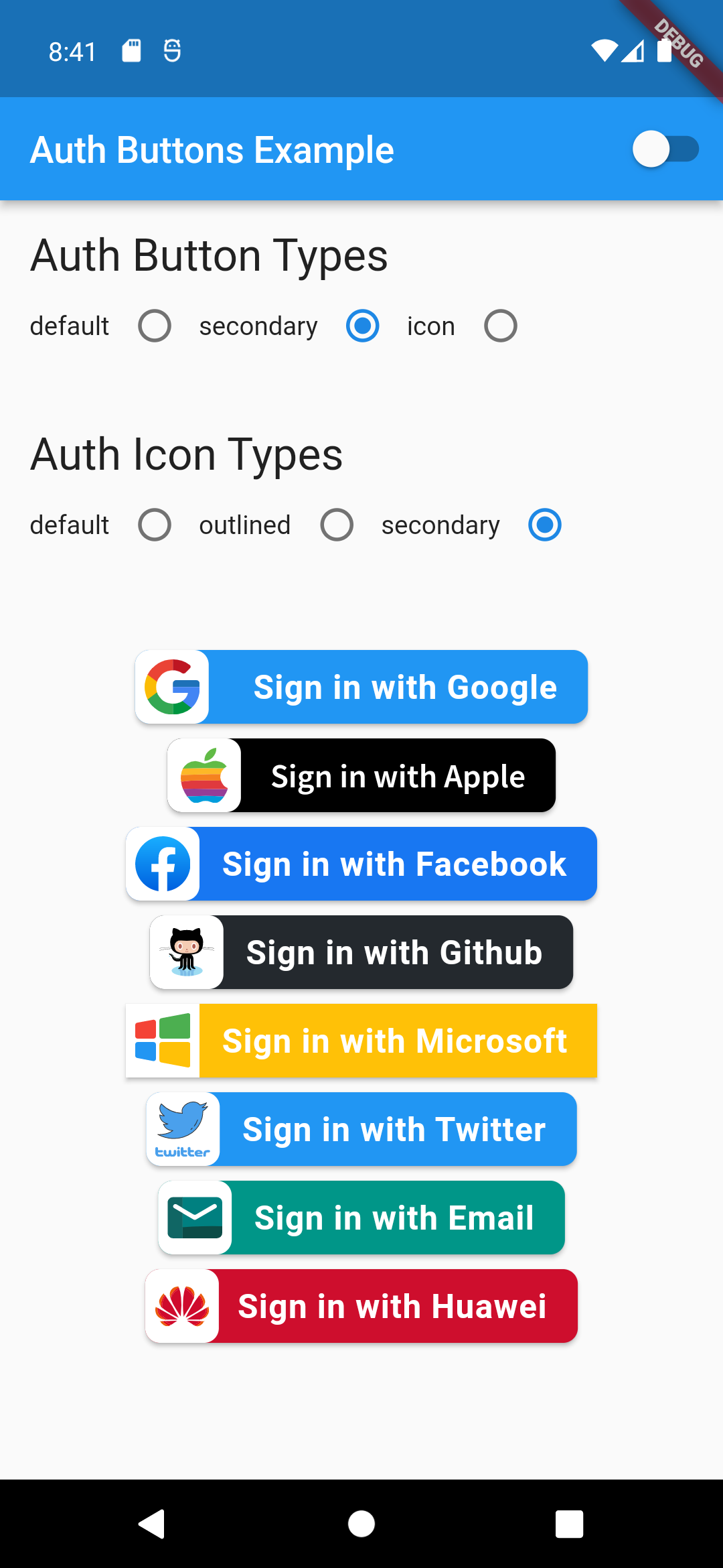
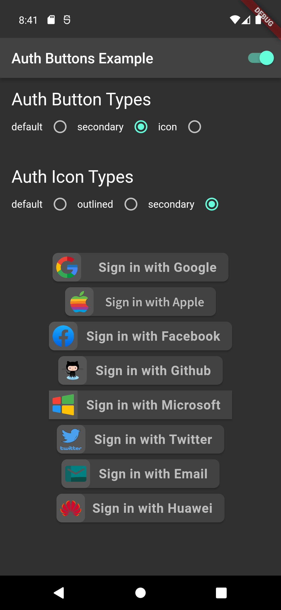
There are three Types you can choose between them:

  1. Default
  2. Icon
  3. Secondary

Suggestion

If you plain to use a non existing AuthButton like: Linkedin or any others along with the existing one, than make your custom one just use CustomAuthButton this provide you with a fast way to do so.

Using

Enabled State.

You need to use just the following code:

Default Type
GoogleAuthButton(
  onPressed: () {},
),
Light Dark
default-button-default-icon dark-default-button-default-icon
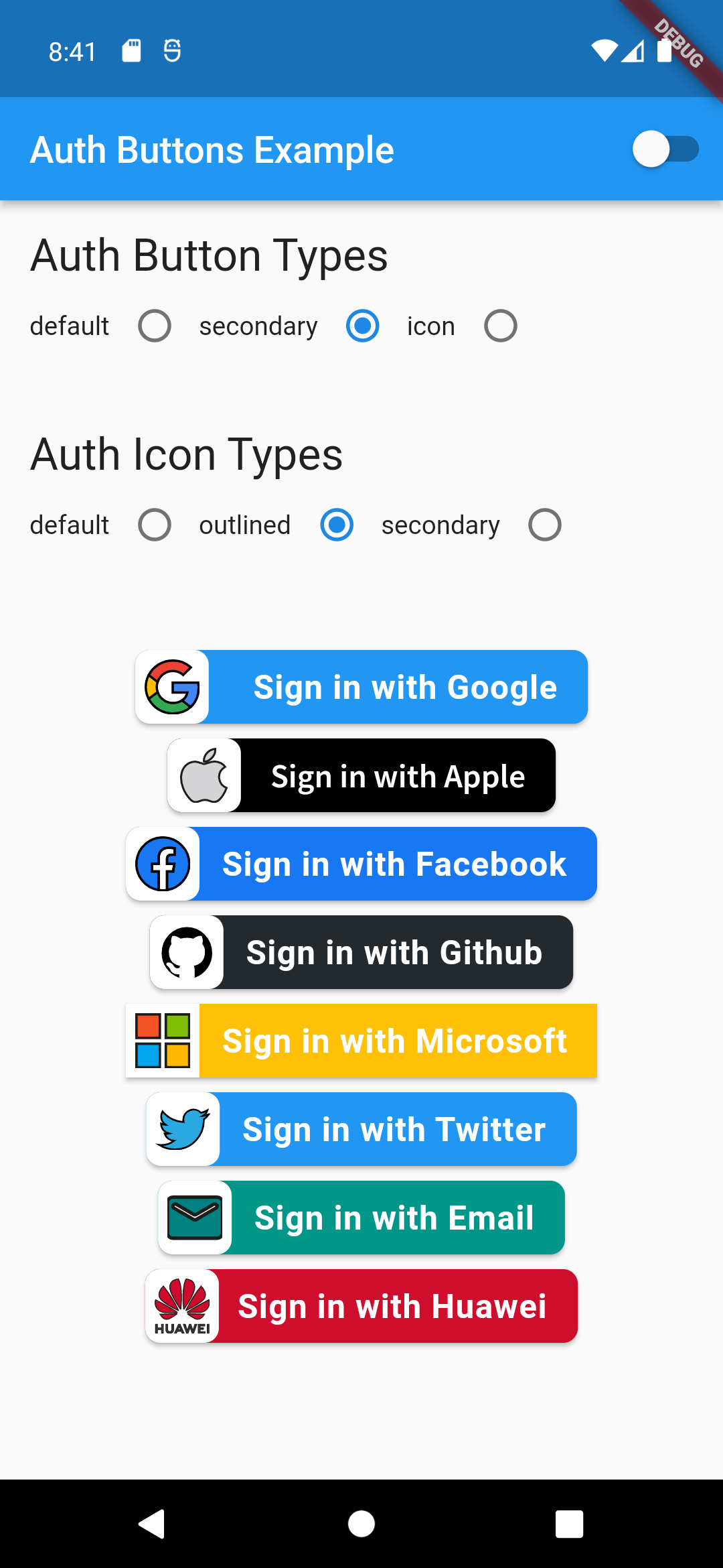
GoogleAuthButton(
  onPressed: () {},
  style: AuthButtonStyle(
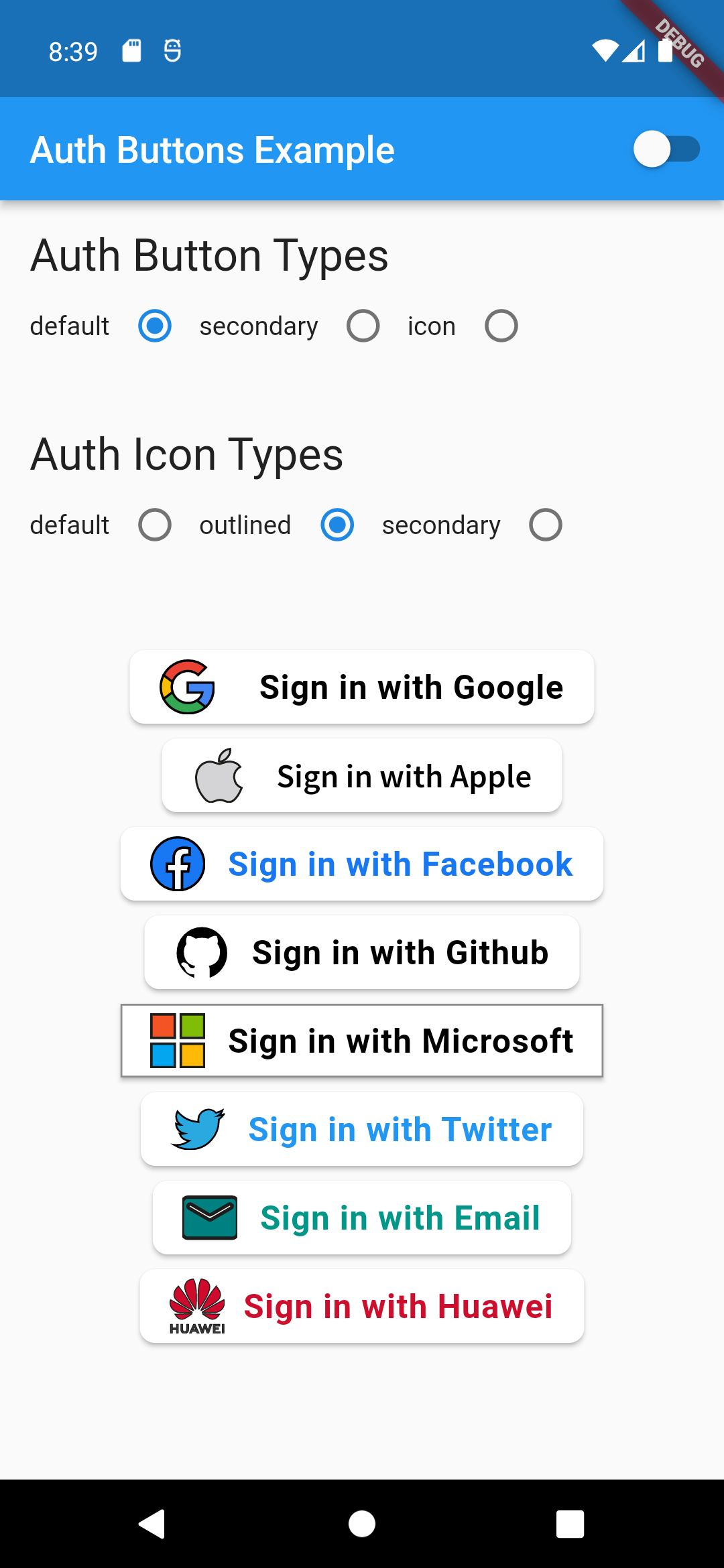
    iconType: AuthIconType.outlined,
  ),
),
Light Dark
default-button-outlined-icon dark-default-button-outlined-icon
GoogleAuthButton(
  onPressed: () {},
  style: AuthButtonStyle(
    iconType: AuthIconType.secondary,
  ),
),
Light Dark
default-button-secondary-icon dark-default-button-secondary-icon
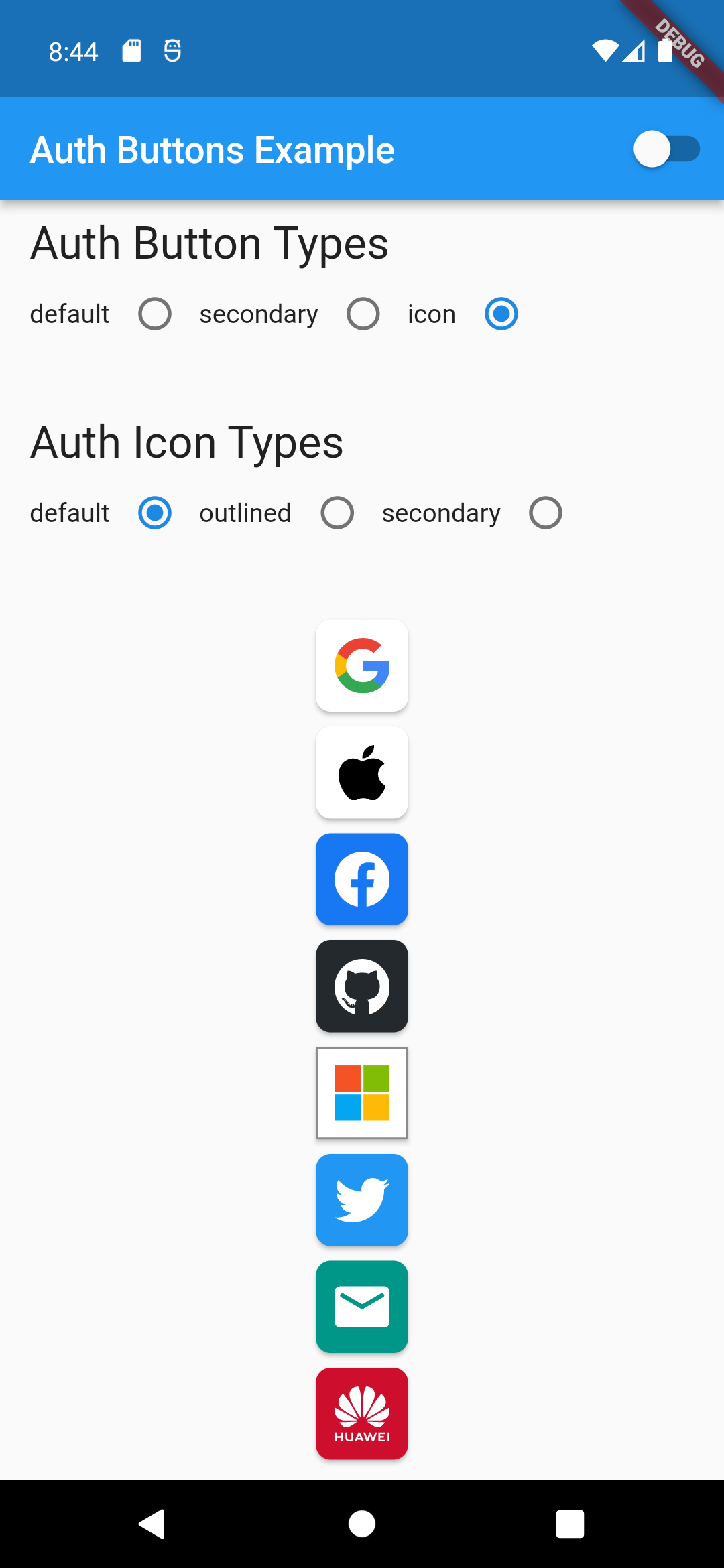
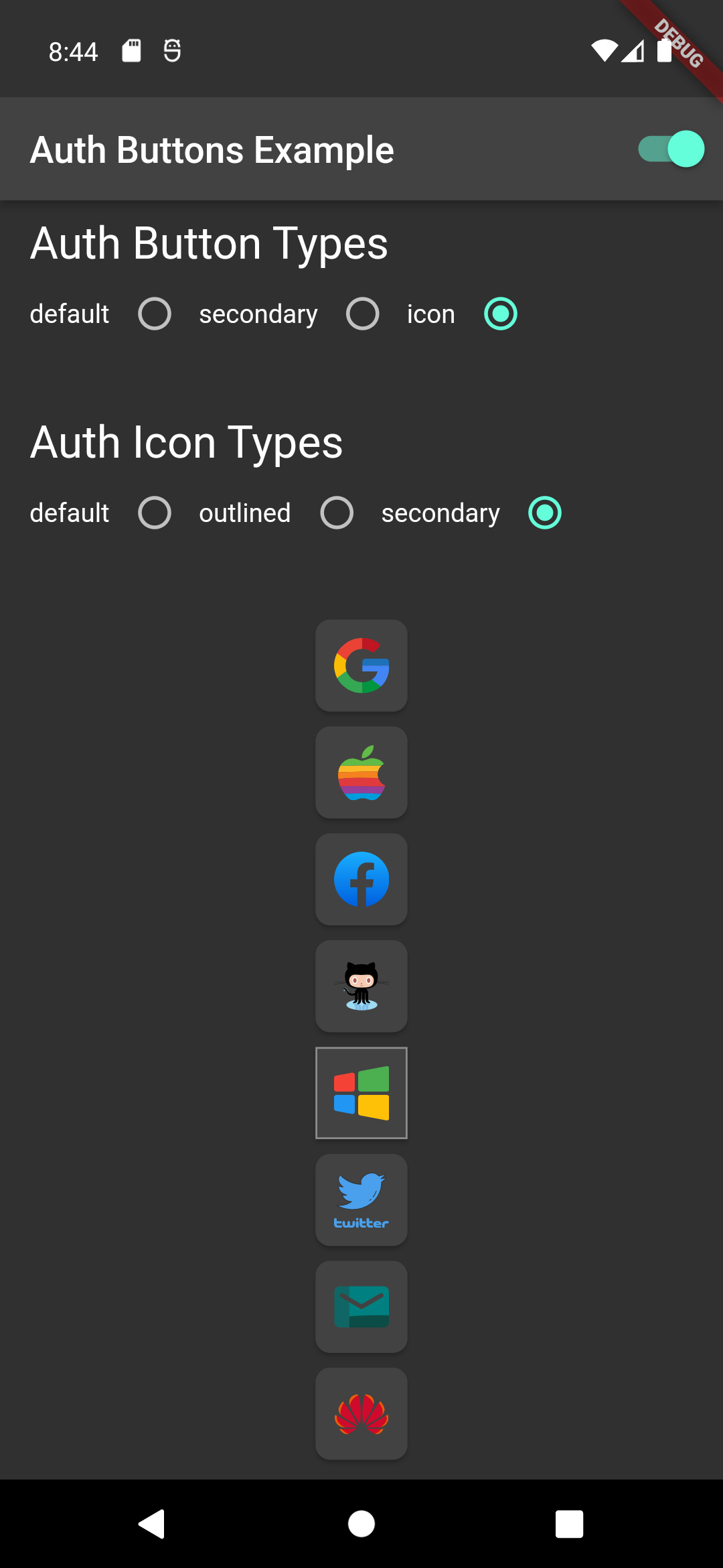
Icon Type
GoogleAuthButton(
  onPressed: () {},
  style: AuthButtonStyle(
    buttonType: AuthButtonType.icon,
  ),
),
Light Dark
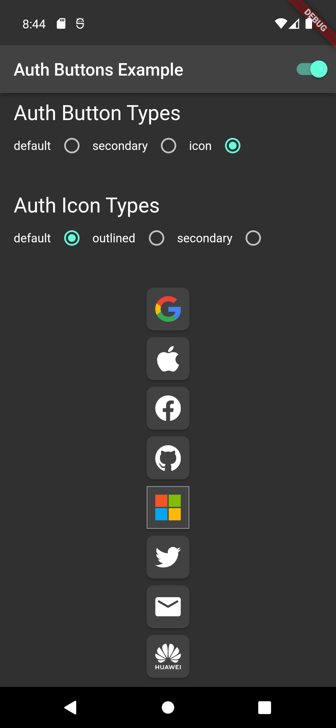
icon-button-default-icon dark-icon-button-default-icon
GoogleAuthButton(
  onPressed: () {},
  style: AuthButtonStyle(
    buttonType: AuthButtonType.icon,
    iconType: AuthIconType.outlined,
  ),
),
Light Dark
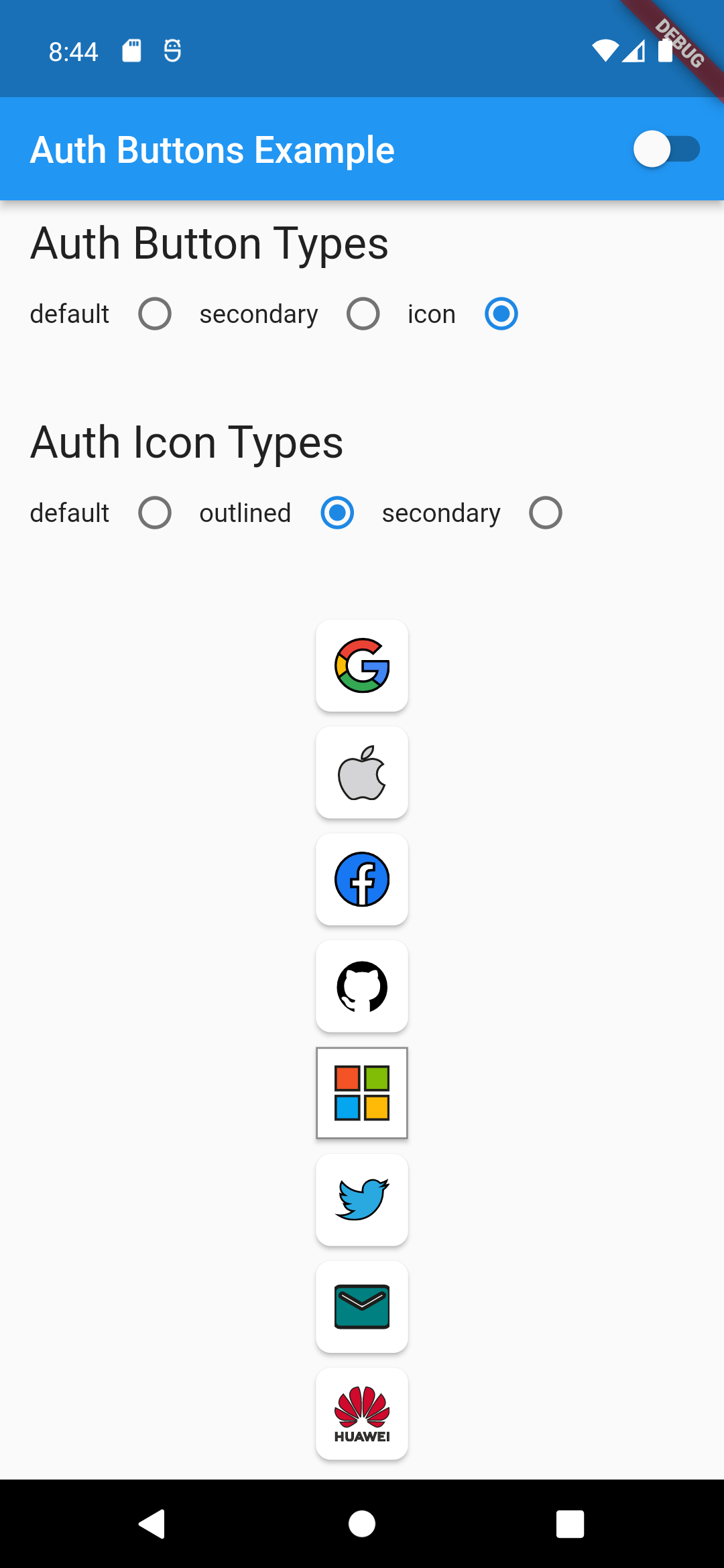
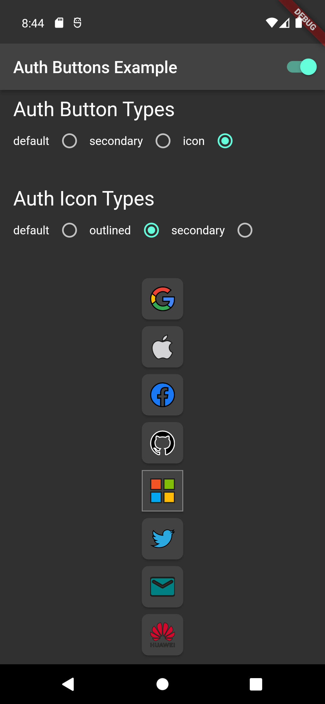
icon-button-outlined-icon dark-icon-button-outlined-icon
GoogleAuthButton(
  onPressed: () {},
  style: AuthButtonStyle(
    buttonType: AuthButtonType.icon,
    iconType: AuthIconType.secondary,
  ),
),
Light Dark
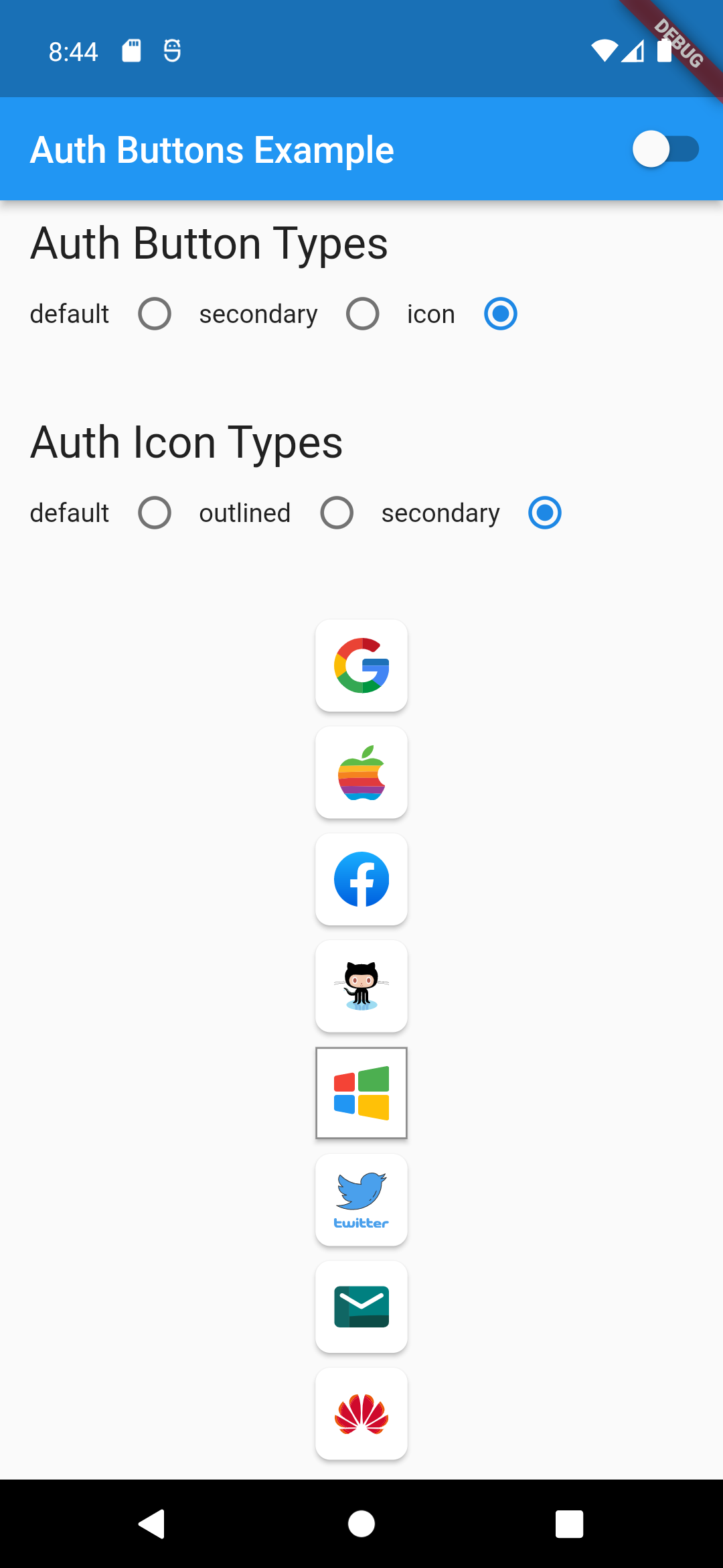
icon-button-secondary-icon dark-icon-button-secondary-icon
Secondary Type
GoogleAuthButton(
  onPressed: () {},
  style: AuthButtonStyle(
    buttonType: AuthButtonType.secondary,
  ),
),
Light Dark
secondary-button-default-icon dark-secondary-button-default-icon
GoogleAuthButton(
  onPressed: () {},
  style: AuthButtonStyle(
    buttonType: AuthButtonType.secondary,
    iconType: AuthIconType.outlined,
  ),
),
Light Dark
secondary-button-outlined-icon dark-secondary-button-outlined-icon
GoogleAuthButton(
  onPressed: () {},
  style: AuthButtonStyle(
    buttonType: AuthButtonType.secondary,
    iconType: AuthIconType.secondary,
  ),
),
Light Dark
secondary-button-secondary-icon dark-secondary-button-secondary-icon
Disabled State
Light Dark
disabled-buttons dark-disabled-buttons

Do same think with the other buttons, when you want to customize any button you can do it just passing a property which you want.

Grouped buttons

Example

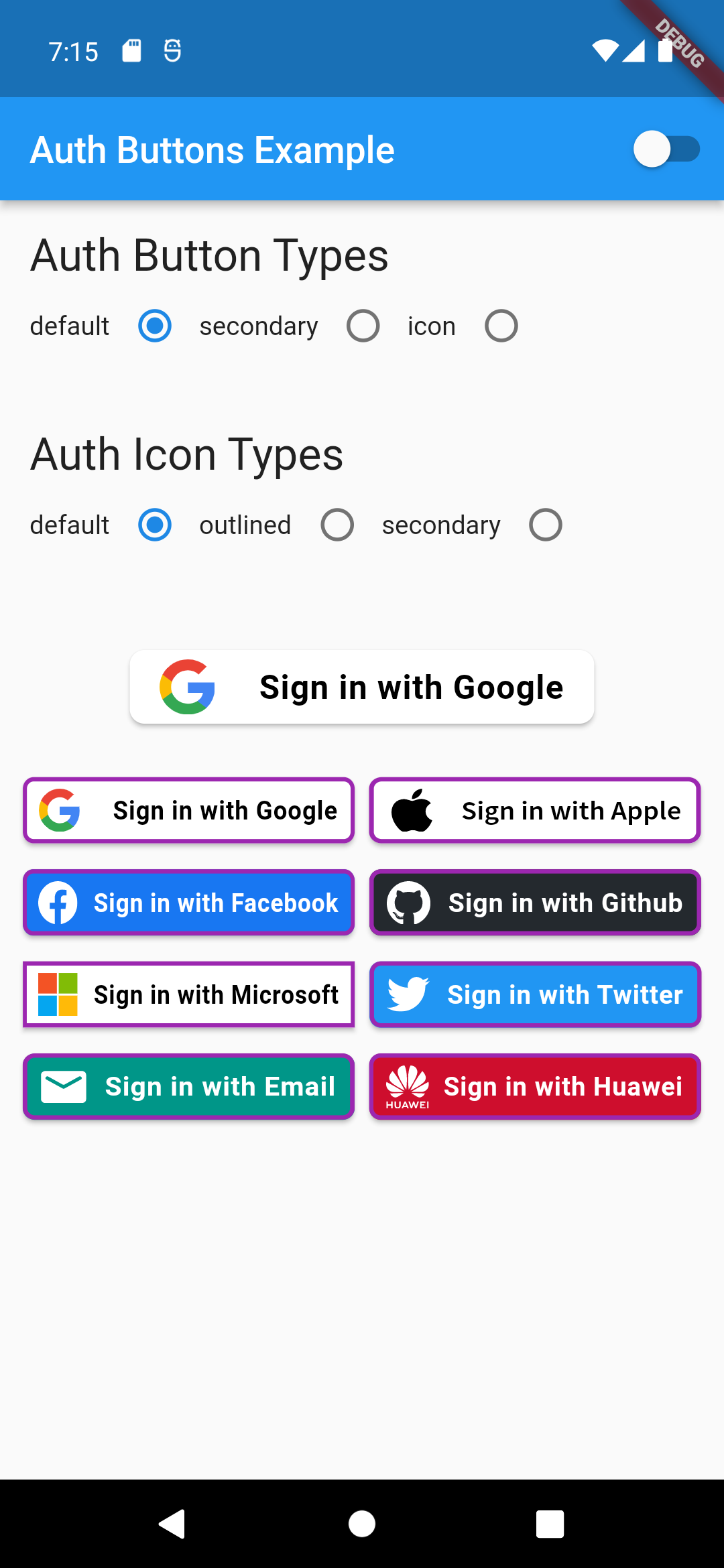
auth button group usecase
AuthButtonGroup(
  style: const AuthButtonStyle(
    width: 180,
    height: 50,
    borderColor: Colors.purple,
    borderWidth: 3.0,
    margin: EdgeInsets.only(bottom: 8.0),
  ),
  buttons: [
    GoogleAuthButton(),
    AppleAuthButton(),
    //....
  ]
),
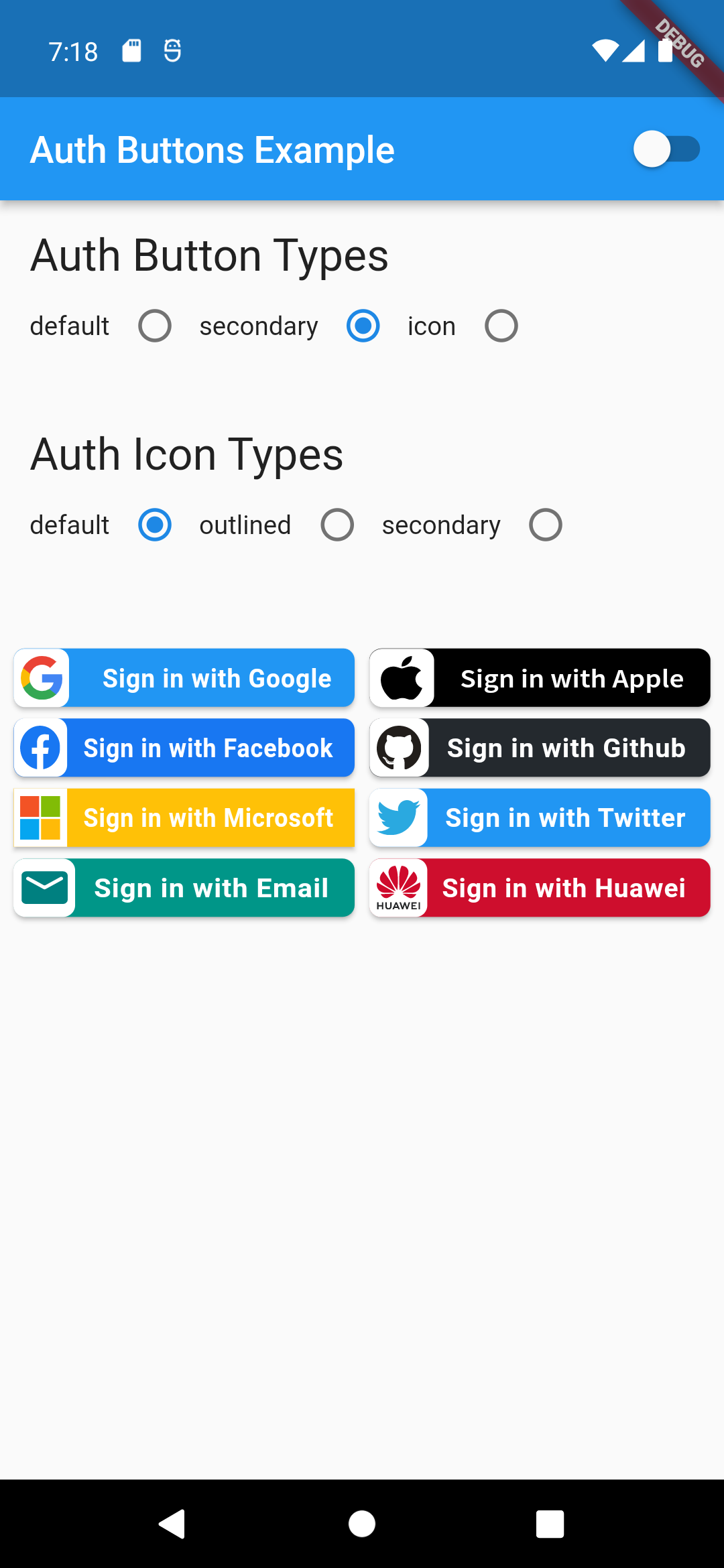
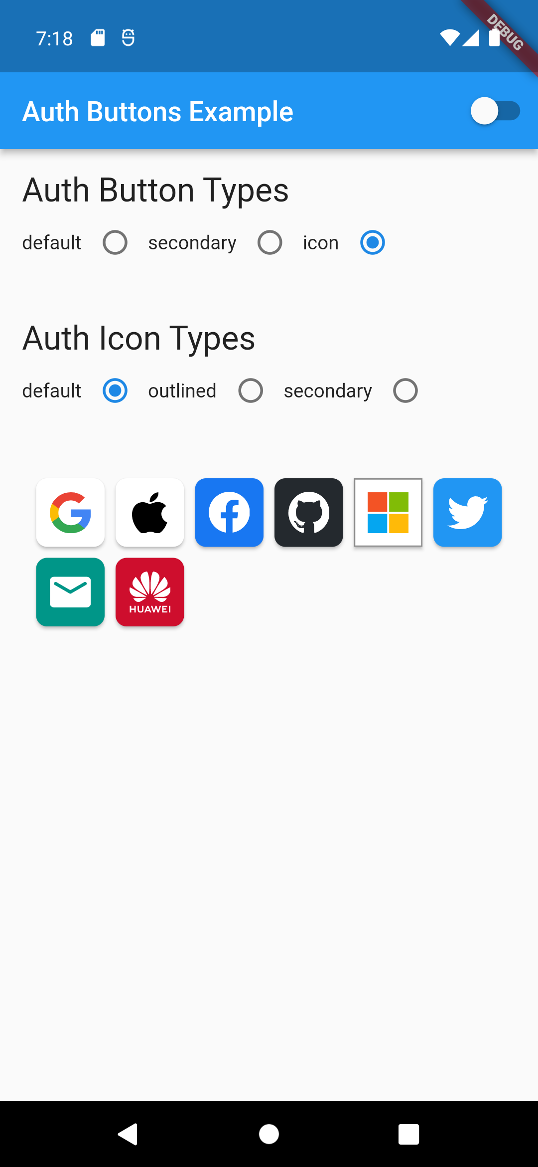
                                                                                           Secondary                                                                                               |  Icon

:-----------------------------------------------------------------------------------------------------------------------------------------------------------------------------------------------------:|:-------------------------: auth button group secondary buttons | auth-button-group-icon-buttons

Full property you can pass:

GoogleAuthButton(
  key: const ValueKey<String>(''),
  onPressed: () {},
  onLongPress: () {},
  onHover: (bool value) {},
  onFocusChange: (bool value) {},
  focusNode: FocusNode(),
  autofocus: false,
  text: 'Sign in with Google',
  isLoading: false,
  themeMode: ThemeMode.system,
  textDirection: TextDirection.ltr,
  materialStyle: ButtonStyle(),
  style: AuthButtonStyle(
    buttonColor: Colors.blue,
    splashColor: Colors.red,
    elevation: 2.0,
    borderRadius: 99.0,
    textStyle: TextStyle(),
    padding: const EdgeInsets.all(8.0),
    margin: const EdgeInsets.all(8.0),
    borderColor: Colors.amber,
    borderWidth: 3.0,
    buttonType: AuthButtonType.secondary,
    width: 300.0,
    height: 50.0,
    iconSize: 40.0,
    separator: 20.0,
    iconBackground: Colors.white,
    iconType: AuthIconType.outlined,
    shadowColor: Colors.pink,
    progressIndicatorColor: Colors.blue,
    progressIndicatorValueColor: Colors.grey[300],
    progressIndicatorStrokeWidth: 2.0,
    progressIndicatorValue: 1.0,
    iconColor: Colors.purple,
    progressIndicatorType: AuthIndicatorType.circular,
    visualDensity: VisualDensity.standard,
    tapTargetSize: MaterialTapTargetSize.shrinkWrap,
),

return up

Categories

Dependencies

Dependency list 2 items

Source repository

Projects using this package

No data available yet.