Search packages, repositories and app categories

awesome_card cover
Package detailsv1.2.0

awesome_card

Flutter package to create a Credit Card Widget in your application.

AndroidiOSWebmacOSWindowsLinux
30-day downloads
4K
Likes
287
Pub points
145

Install package

flutter pub add awesome_card

Package Overview

Package selection guidance compiled from public package information, community data, and project usage.

Awesome Card is a Flutter package that enables developers to easily create visually appealing credit card widgets within their applications. It provides a customizable and responsive card UI, ideal for payment forms, checkout screens, or financial apps. The package supports multiple platforms including Android, iOS, Web, macOS, Windows, and Linux, ensuring consistent design across devices. With intuitive configuration options, it simplifies the integration of card input fields and styling. Perfect for apps requiring secure and attractive card display components.

Use cases

  • Payment form interfaces
  • Checkout screens
  • Financial application dashboards
  • Card management features
  • User profile card displays

Key features

  • Customizable card design
  • Responsive layout across platforms
  • Easy integration with form inputs
  • Supports multiple operating systems
  • Built-in card number formatting

Suitable for

  • Flutter developers building payment apps
  • UI designers needing card components
  • Apps requiring cross-platform card UIs
  • Developers focused on clean payment experiences

Considerations

  • Does not include full payment processing
  • Requires manual handling of sensitive data
  • Not intended for production payment gateways
  • Best used alongside security best practices
  • Limited to UI rendering, not transaction logic

Original README

Original README snapshot from the linked source repository. Visit the repository for the latest content.

Awesome Card

A Flutter package to create a beautiful, animated Credit Card widget in your application.


Stay tuned for the latest updates:


Pub Twitter

✨ Features

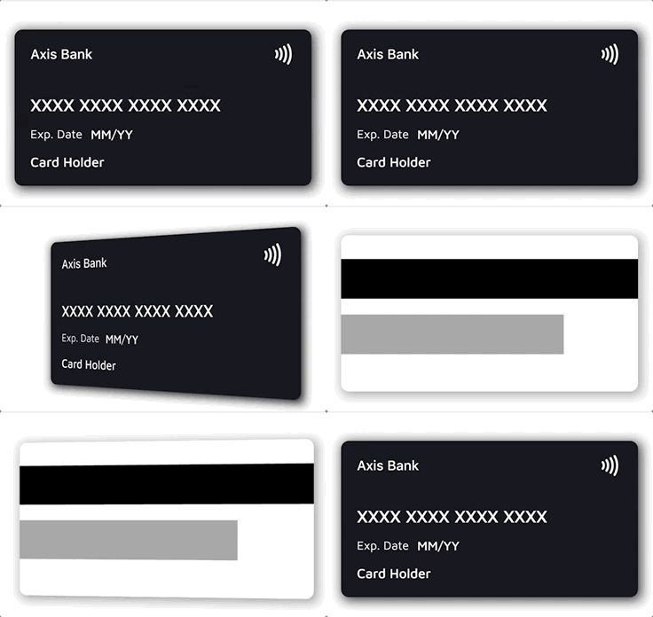
  • 💳 Realistic credit card widget with front and back sides
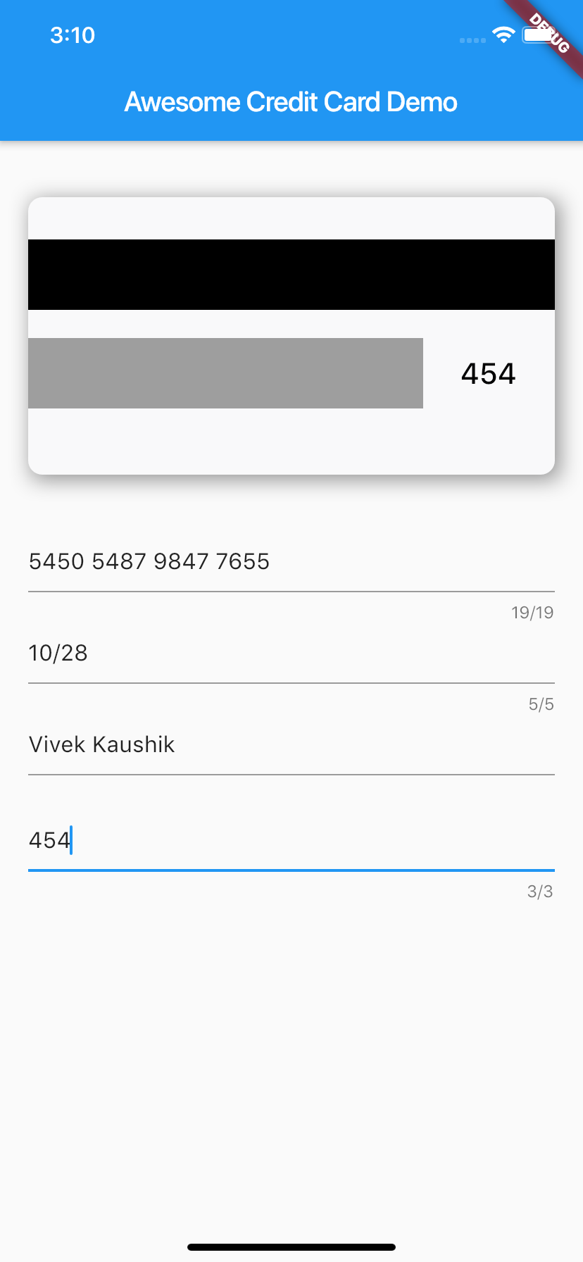
  • 🔄 Smooth 3D flip animation between front and back
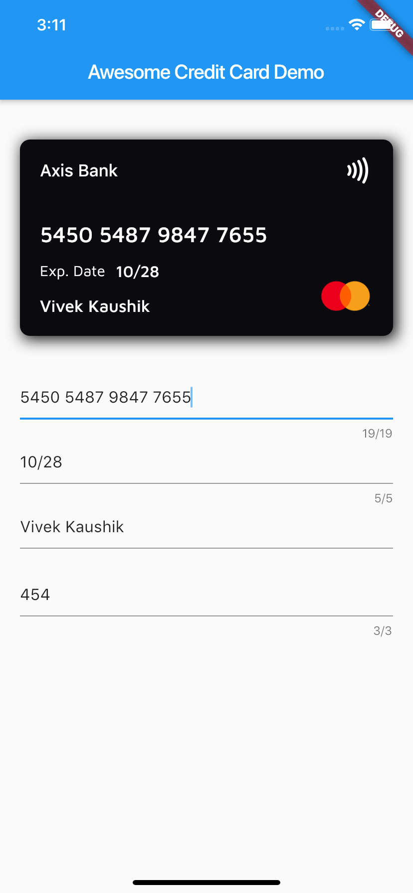
  • 🔍 Automatic card brand detection from the number (Visa, Mastercard, Amex, RuPay, Elo, Discover, Diners Club, JCB, Maestro)
  • 🎭 Automatic number masking per brand (e.g. Amex XXXX XXXXXX XXXXX)
  • 🎨 Customizable backgrounds, text styles, labels, and fully custom layouts
  • 📏 Responsive — content scales down gracefully on narrow cards instead of overflowing
  • 📳 Optional contactless indicator and card shadow

📱 Screenshots


⚙️ Installation

Add the dependency to your pubspec.yaml:

dependencies:
  awesome_card: ^1.2.0

Requires Dart 3 / Flutter 3.10 or newer.

Then import it in your Dart file:

import 'package:awesome_card/awesome_card.dart';

🚀 Quick start

The only required parameters are the two backgrounds — everything else has sensible defaults:

CreditCard(
  frontBackground: CardBackgrounds.black,
  backBackground: CardBackgrounds.white,
)

A fully configured card:

CreditCard(
  cardNumber: "5450 7879 4864 7854",
  cardExpiry: "10/25",
  cardHolderName: "Card Holder",
  cvv: "456",
  bankName: "Axis Bank",
  cardType: CardType.masterCard, // optional — auto-detected from cardNumber
  showBackSide: false,
  frontBackground: CardBackgrounds.black,
  backBackground: CardBackgrounds.white,
  showShadow: true,
  isContactless: true,
  textExpDate: 'Exp. Date',
  textName: 'Name',
  textExpiry: 'MM/YY',
)

🔄 Flipping the card

The card flips whenever showBackSide changes across a rebuild. A common pattern is to flip it while the CVV field has focus:

class _MyPageState extends State<MyPage> {
  bool showBack = false;
  late final FocusNode _cvvFocus;

  @override
  void initState() {
    super.initState();
    _cvvFocus = FocusNode()
      ..addListener(() => setState(() => showBack = _cvvFocus.hasFocus));
  }

  @override
  void dispose() {
    _cvvFocus.dispose();
    super.dispose();
  }

  @override
  Widget build(BuildContext context) {
    return Column(
      children: [
        CreditCard(
          cardNumber: cardNumber,
          cvv: cvv,
          showBackSide: showBack,
          frontBackground: CardBackgrounds.black,
          backBackground: CardBackgrounds.white,
        ),
        TextField(focusNode: _cvvFocus, /* CVV input */),
      ],
    );
  }
}

🎨 Customization

Text styles

Every text field's style can be overridden. Each style is merged over the default, so a partial override (e.g. only fontSize) keeps the default font, weight, and color for everything else:

CreditCard(
  // ...
  bankNameTextStyle: TextStyle(fontSize: 20),
  cardNumberTextStyle: TextStyle(fontSize: 24, letterSpacing: 2),
  cardExpiryTextStyle: TextStyle(fontStyle: FontStyle.italic),
  cardHolderNameTextStyle: TextStyle(fontWeight: FontWeight.bold),
  cvvTextStyle: TextStyle(color: Colors.red),
)

Text colors default to frontTextColor (white) on the front and backTextColor (black) on the back.

Backgrounds

Any widget works as a card background — a Container, gradient, or image:

// Built-in solid backgrounds
frontBackground: CardBackgrounds.black,
backBackground: CardBackgrounds.white,

// Solid color from a hex value
frontBackground: CardBackgrounds.custom(0xff1b447b),

// Anything else — e.g. a gradient
frontBackground: Container(
  decoration: BoxDecoration(
    gradient: LinearGradient(colors: [Colors.indigo, Colors.blueAccent]),
  ),
),
Fully custom layouts

To replace the entire front or back content (e.g. to center the card number or add extra elements), pass your own widget — it is stacked on top of the background and receives the full card area:

CreditCard(
  frontBackground: CardBackgrounds.black,
  backBackground: CardBackgrounds.white,
  frontLayout: MyCustomFront(),
  backLayout: MyCustomBack(),
)

🔍 Card type detection

When cardType is not provided, the brand is detected from cardNumber and the matching icon and number mask are applied automatically. Supported brands:

Brand Example prefixes
Visa 4
Mastercard 51–55, 2221–2720
American Express 34, 37
RuPay 60, 6521, 6522
Elo 401178, 431274, 6362, 6516, 6550, …
Discover 6011, 65, 644–649
Diners Club 300–305, 36, 38
JCB 35, 2131, 1800
Maestro 50, 56–69

The detection helpers are exported and can be used standalone:

CardType type = getCardType('4111111111111111');        // CardType.visa
String mask  = getCardTypeMask(cardNumber: '378282246310005'); // XXXX XXXXXX XXXXX
Widget icon  = getCardTypeIcon(cardNumber: '5555555555554444'); // Mastercard logo

To force a specific brand regardless of the number, pass cardType. To force a specific mask, pass mask.

Custom brands

Brands the package doesn't ship (regional or store cards) can be registered via customBrands. They are checked before the built-in detection and support their own icon and optional number mask:

CreditCard(
  cardNumber: cardNumber,
  customBrands: [
    CardBrand(
      name: 'troy',
      icon: Image.asset('assets/troy.png', width: 55, height: 40),
      pattern: RegExp(r'^9792'),
      mask: 'XXXX XXXX XXXX XXXX', // optional
    ),
  ],
  frontBackground: CardBackgrounds.black,
  backBackground: CardBackgrounds.white,
)

Precedence: explicit cardType → customBrands (first match wins) → built-in detection.

📖 Parameter reference

Parameter Type Default Description
frontBackground Widget required Background widget of the front side
backBackground Widget required Background widget of the back side
cardNumber String? — Card number; shown masked-style as typed. Empty shows the brand mask
cardExpiry String? — Expiry string, e.g. 10/25
cardHolderName String? — Cardholder name (ellipsized when too long)
cvv String? — CVV shown on the back side
bankName String '' Bank name shown at the top of the front
cardType CardType? auto Override the auto-detected brand
customBrands List<CardBrand>? — Custom brands checked before built-in detection
mask String? auto Override the auto-selected number mask
showBackSide bool false Which side is visible; changing it animates the flip
showShadow bool false Drop shadow behind the card
isContactless bool? true Show the contactless (NFC) icon
width double? screen width − margins Card width
height double? width / 2 + 24 Card height
horizontalMargin double 20 Horizontal margin used when width is not set
frontTextColor Color Colors.white Default text color on the front
backTextColor Color Colors.black Default text color on the back
textExpDate String? 'Exp. Date' Label above/next to the expiry
textExpiry String? 'MM/YY' Placeholder when cardExpiry is empty
textName String? 'Card Holder' Placeholder when cardHolderName is empty
bankNameTextStyle TextStyle? — Merged over the bank name style
cardNumberTextStyle TextStyle? — Merged over the card number style
cardExpiryTextStyle TextStyle? — Merged over the expiry style
cardHolderNameTextStyle TextStyle? — Merged over the holder name style
cvvTextStyle TextStyle? — Merged over the CVV style
frontLayout Widget? built-in Replaces the entire front content
backLayout Widget? built-in Replaces the entire back content

🧪 Example & tests

A complete demo app lives in example/ — card preview wired to text fields with live brand detection and the CVV-focus flip. Run it with:

cd example
flutter run

The package ships with a regression test suite (flutter test) covering brand detection, null-safety, text-style merging, and narrow-card layouts.

🤝 Contributing

Issues and pull requests are welcome! Please run flutter analyze and flutter test before submitting a PR.

🙍🏻‍♂️ Author

📄 License

Awesome Card is released under the MIT license. See LICENSE for details.

Categories

Source repository

Projects using this package

No data available yet.