Package selection guidance compiled from public package information, community data, and project usage.
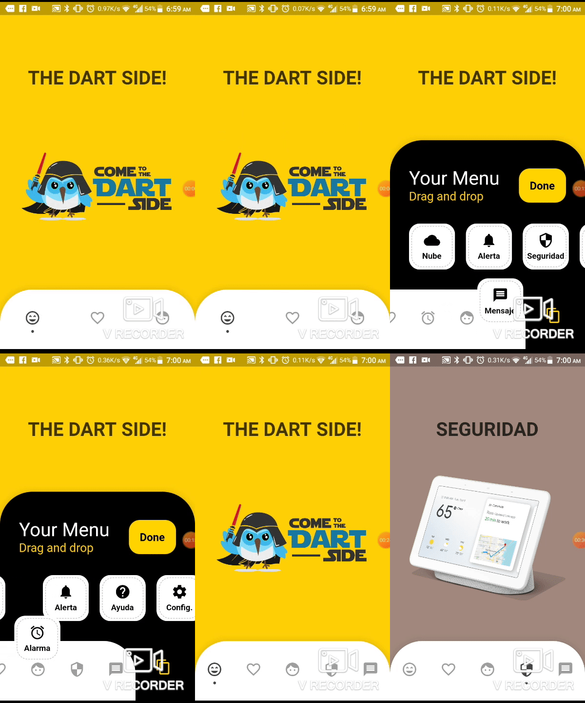
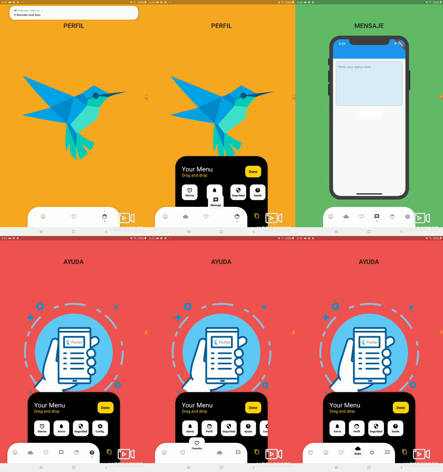
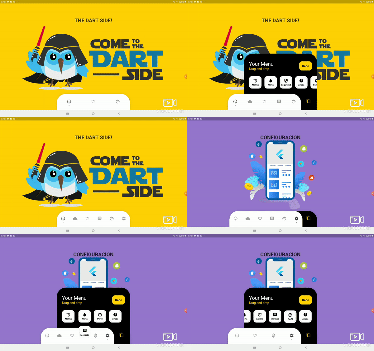
A customizable bottom navigation bar in Flutter that allows users to drag and drop items to personalize their layout. It offers a dynamic, interactive experience for arranging navigation icons with full control over appearance and behavior. Ideal for apps requiring flexible navigation patterns, this package enhances user engagement through intuitive customization. The bar supports smooth transitions and responsive design, making it suitable for modern mobile applications.
Use cases
Customizable app navigation
User-driven interface layouts
Interactive bottom bars
Mobile app personalization
Dynamic UI rearrangement
Key features
Drag-and-drop item reordering
Fully customizable dot indicators
Responsive design support
Easy integration with Flutter
Supports custom styling
Suitable for
Developers seeking interactive navigation
Apps with user-centric design
Customizable mobile interfaces
Flutter projects needing dynamic bottom bars
Design-focused application development
Considerations
Limited platform-specific documentation
No built-in animations beyond basic transitions
Requires manual handling of state management
Not optimized for large numbers of items
May need additional styling for complex themes
Original README
Original README snapshot from the linked source repository. Visit the repository for the latest content.
Bottom Personalized Dot Bar
A bottom navigation bar that you can customize with the options you need, without any limits. You can also customize the appearance of the navigation bar.
List of items to be displayed in the navigation bar
hiddenItems
List of items that will be hidden
keyItemSelected
Item key that is selected
width
Navigation bar width
height
Navigation bar height
borderRadius
Navigation bar radius
selectedColorIcon
Selected Icon color
unSelectedColorIcon
Unselected Icon color
navigatorBackground
Navigator Container Background color
settingBackground
Setting Container Background color (Hidden items)
iconSetting
Settings button icon
iconSettingColor
Settings button icon color
settingTitleText
Setting Title Text
settingTitleColor
Setting Title color
settingSubTitleText
Setting Sub-Title Text
settingSubTitleColor
Setting Sub-Title color
doneText
Done button Text
textDoneColor
Text Done Color
buttonDoneColor
Button done color
hiddenItemBackground
Background of hidden item
iconHiddenColor
Icon Hidden Color
textHiddenColor
Text Hidden Color
dotColor
Selection Indicator Color (Dot
boxShadow
Shadow of container
onOrderHideItems
Event when you sort the hidden options, this has as parameter the list of hidden options with the new order. onOrderHideItems: (List<BottomPersonalizedDotBarItem> hiddenItems) { /* Your action */ }
onOrderItems
Event when ordering browser options, this has as parameter the list of options with the new order onOrderItems: (List<BottomPersonalizedDotBarItem> items) { /* Your action */ }
onAddItem
Event when you add a new option to the navigation bar, this has as parameters the item you add and the list of options. onAddItem: (BottomPersonalizedDotBarItem itemAdd, List<BottomPersonalizedDotBarItem> items) { /* Your action */ }
onRemoveItem
Event when you delete an option from the navigation bar, this has as parameters the element to delete and the list of hidden options. onRemoveItem: (BottomPersonalizedDotBarItem itemRemove, List<BottomPersonalizedDotBarItem> hiddenItems) { /* Your action */ }
BottomPersonalizedDotBarItem
Attribute
Description
keyItem
Unique key
icon
Item icon
name
Item name
onTap
Event with you press the item. onTap: (String keyItem) { /* Your action */ }