Package selection guidance compiled from public package information, community data, and project usage.
Bubble Box is a Flutter package that enables developers to create visually appealing bubble-shaped containers with customizable features such as borders, dotted lines, gradients, angles, adaptive sizing, and directional offsets. It supports multiple platforms including Android, iOS, Web, macOS, Windows, and Linux. The package simplifies the implementation of dynamic, stylish UI elements ideal for tooltips, badges, or interactive design components. With intuitive configuration options, it enhances user interface aesthetics without requiring complex custom painting.
Use cases
Creating animated tooltips
Designing chat bubbles
Building interactive badges
Enhancing UI with gradient effects
Implementing responsive bubble layouts
Key features
Customizable bubble direction
Adaptive width and height
Gradient color support
Dotted line borders
Angle and offset adjustments
Platform cross-compatibility
Suitable for
UI designers seeking visual flair
Developers building chat interfaces
Apps needing dynamic badge components
Projects with emphasis on visual effects
Cross-platform mobile and web apps
Considerations
May impact performance with excessive use
Requires careful layout management
Limited documentation beyond basic examples
Not ideal for simple rectangular shapes
Original README
Original README snapshot from the linked source repository. Visit the repository for the latest content.
A powerful bubble box, which implements basic bubble, border, dotted line, gradient color, angle, adaptive width and height, bubble direction, offset, etc.
This project was wrote with pure dart code,which means it's support both iOS As well as Android, web, windows, linux, etc.
Modified a lot of APIs, please pay attention to upgrade
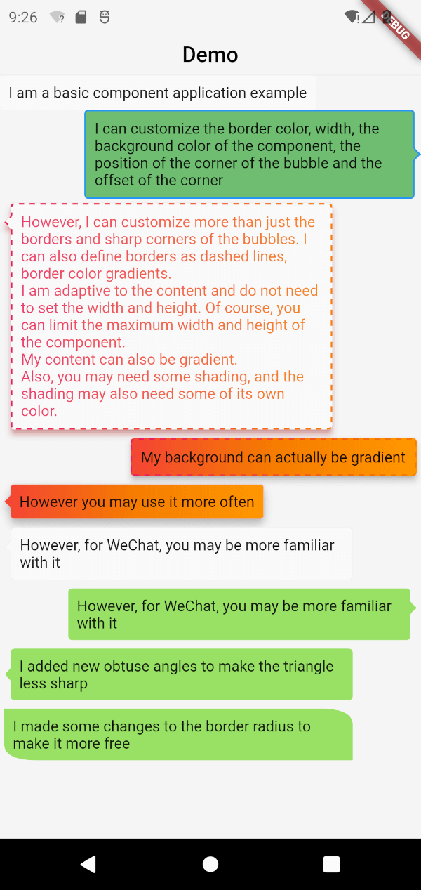
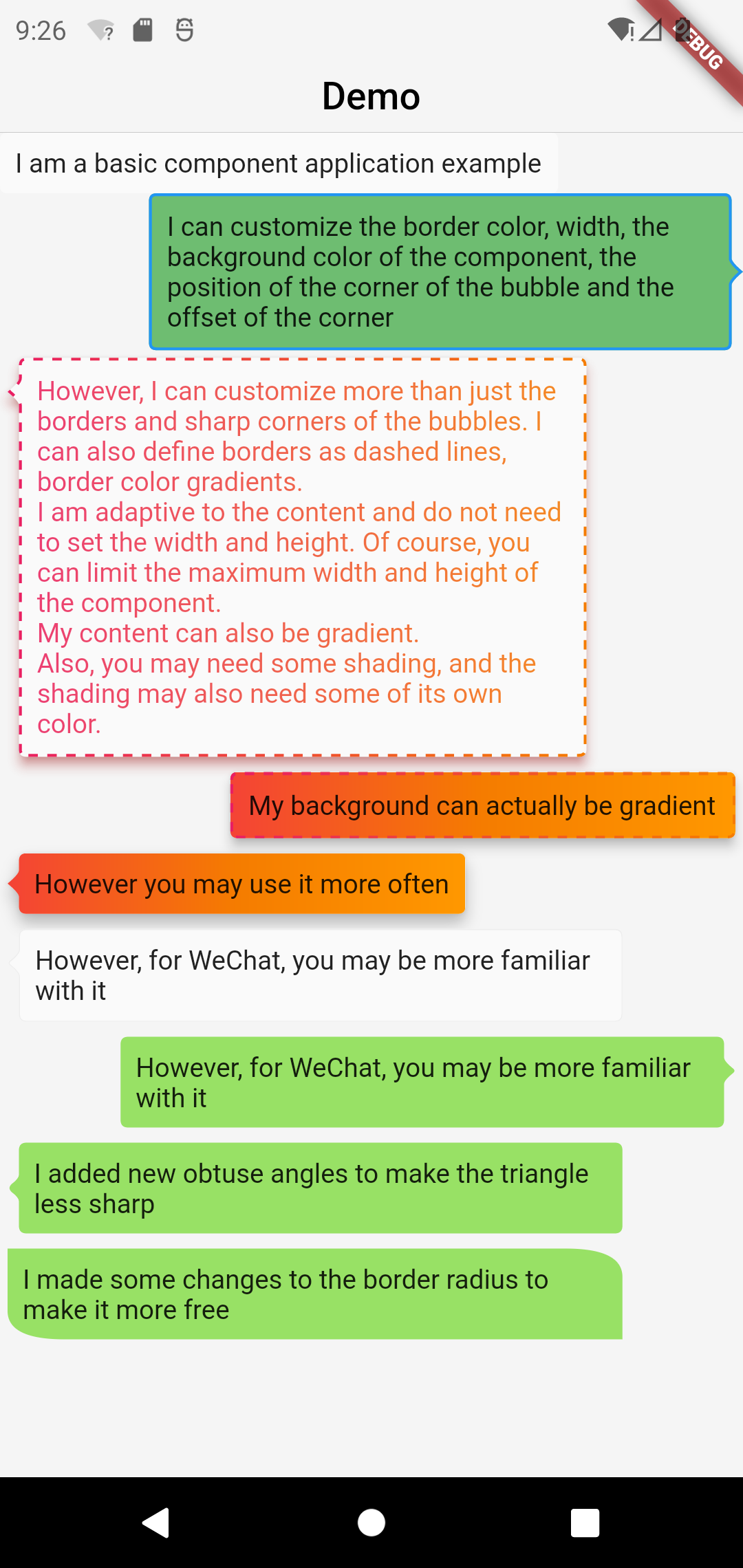
Screenshot
Basic Components
BubbleBox(
    maxWidth: MediaQuery.of(context).size.width * 0.8,
    child: Text('I am a basic component application example'),
)
Customize the border color, width, and component background color
BubbleBox(
maxWidth: MediaQuery.of(context).size.width * 0.8,
shape: BubbleShapeBorder(
border: BubbleBoxBorder(
color: Colors.blue,
width: 3,
),
position: constBubblePosition.center(0),
direction: BubbleDirection.right,
),
backgroundColor: Colors.green.withOpacity(0.8),
child: Text('I can customize the color and width of the border, the background color of the component, the position of the sharp corner of the bubble and the offset of the sharp corner'),
)
Define the border as a dashed line and the border color gradient
BubbleBox(
maxWidth: MediaQuery.of(context).size.width * 0.8,
gradient: LinearGradient(
colors: [
Colors.pink,
Colors.orange[700],
],
),
blendMode: BlendMode.srcATop,
shape: BubbleShapeBorder(
border: BubbleBoxBorder(
gradient: LinearGradient(
colors: [
Colors.pink,
Colors.orange[700],
],
),
width: 3,
style: BubbleBoxBorderStyle.dashed,
),
direction: BubbleDirection.left,
position: constBubblePosition.start(12),
),
margin: EdgeInsets.all(4),
elevation: 5,
shadowColor: Colors.redAccent,
child: Text(
'However, I can not only customize the border and sharp corners of the bubble. I can also define the border as a dashed line and a gradient of border color. \nI am adaptive to the content, there is no need to set the width and height. Of course, you can limit the maximum width and height of the component. \nMy content can also be faded. \nIn addition, you may need some shadows, and the shadows may also need some of their own colors.'),
)
BubbleBox(
maxWidth: MediaQuery.of(context).size.width * 0.85,
shape: BubbleShapeBorder(
direction: BubbleDirection.left,
position: constBubblePosition.start(12),
arrowQuadraticBezierLength: 2,
),
backgroundColor: Color(0xff98E165),
margin: EdgeInsets.all(4),
child: Text(
'We added new obtuse angles so that the triangles are no longer so sharp',
),
),
enhanced radius
BubbleBox(
    maxWidth: MediaQuery.of(context).size.width * 0.85,
    backgroundColor: Color(0xff98E165),
    margin: EdgeInsets.all(4),
    shape: BubbleShapeBorder(
      radius: BorderRadius.only(
          topRight: Radius.elliptical(30, 15),
          bottomLeft: Radius.elliptical(30, 15)),
    ),
    child: Text(
      'We have made some modifications to the border radius to make it more free',
    ),
  ),