Search packages, repositories and app categories

Package detailsv0.0.4

bubbled_navigation_bar

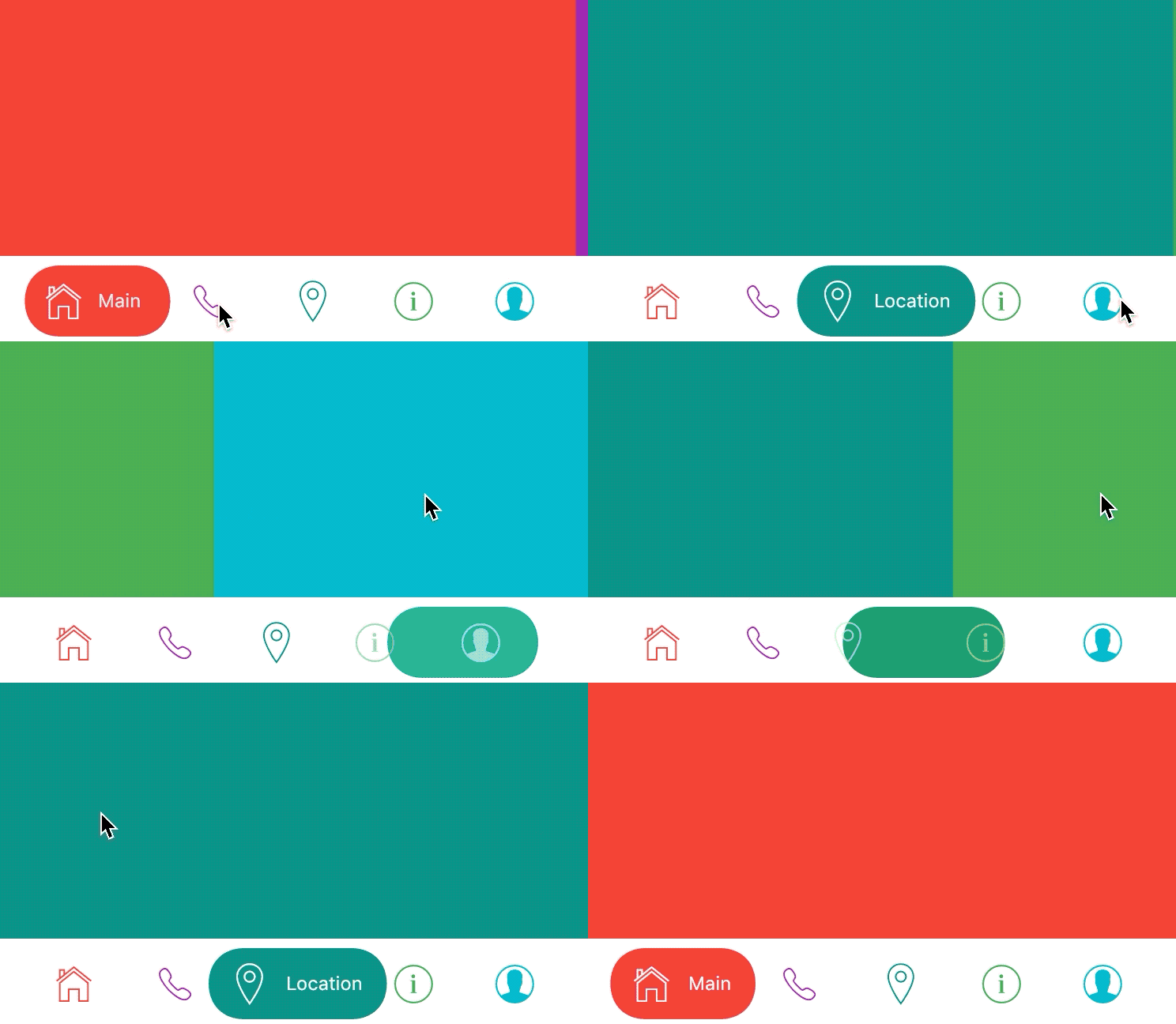
Stunning Animating Bubbled Shape Navigation Bar. Adjustable color, background color, animation curve, animation duration. Working with PageView via controller param.

30-day downloads
80
Likes
71
Pub points
35

Install package

flutter pub add bubbled_navigation_bar

Package Overview

Package selection guidance compiled from public package information, community data, and project usage.

A visually appealing Flutter package that implements an animating bubbled shape navigation bar. It offers customizable colors, background color, animation curve, and duration for a dynamic user experience. The navigation bar integrates seamlessly with PageView using a controller parameter, enabling smooth transitions between pages. Ideal for modern app interfaces where visual feedback and interactive elements enhance usability. Designed with performance and flexibility in mind, it supports responsive design across different screen sizes.

Use cases

  • Creating animated bottom navigation bars
  • Enhancing app UI with fluid transitions
  • Integrating with PageView for swipeable content
  • Designing modern mobile app interfaces
  • Adding visual feedback to navigation actions

Key features

  • Animatable bubbled shape
  • Customizable colors and animation settings
  • PageView integration via controller
  • Smooth transition effects
  • Responsive design support
  • Easy setup with pub add command

Suitable for

  • Flutter developers seeking modern UI components
  • Apps requiring engaging navigation experiences
  • Design-focused applications with interactive elements
  • Developers using PageView for horizontal scrolling
  • Projects emphasizing visual polish and animations

Considerations

  • Requires careful tuning of animation parameters
  • May impact performance on low-end devices
  • Limited platform-specific customization
  • Best suited for apps with minimal navigation items
  • Not ideal for complex tabbed layouts with many screens
Original README

Original README snapshot from the linked source repository. Visit the repository for the latest content.

bubbled_navigation_bar

pub package

A Flutter package for easy implementation of bubbled navigation bar.

Gif

Add dependency
dependencies:
  bubbled_navigation_bar: ^0.0.3 #latest version
Easy to use
home: Scaffold(
bottomNavigationBar: BubbledNavigationBar(
  defaultBubbleColor: Colors.blue,
  onTap: (index) {
    // handle tap
  },
  items: <BubbledNavigationBarItem>[
    BubbledNavigationBarItem(
      icon:       Icon(CupertinoIcons.home, size: 30, color: Colors.red),
      activeIcon: Icon(CupertinoIcons.home, size: 30, color: Colors.white),
      title: Text('Home', style: TextStyle(color: Colors.white, fontSize: 12),),
    ),
    BubbledNavigationBarItem(
      icon:       Icon(CupertinoIcons.phone, size: 30, color: Colors.purple),
      activeIcon: Icon(CupertinoIcons.phone, size: 30, color: Colors.white),
      title: Text('Phone', style: TextStyle(color: Colors.white, fontSize: 12),),
    ),
    BubbledNavigationBarItem(
      icon:       Icon(CupertinoIcons.info, size: 30, color: Colors.teal),
      activeIcon: Icon(CupertinoIcons.info, size: 30, color: Colors.white),
      title: Text('Info', style: TextStyle(color: Colors.white, fontSize: 12),),
    ),
    BubbledNavigationBarItem(
      icon:       Icon(CupertinoIcons.profile_circled, size: 30, color: Colors.cyan),
      activeIcon: Icon(CupertinoIcons.profile_circled, size: 30, color: Colors.white),
      title: Text('Profile', style: TextStyle(color: Colors.white, fontSize: 12),),
    ),
  ],
),
body: Container(color: Colors.blue,),
)
Advanced use

Way of use with PageView and sliding animation from example.gif you can see in example folder.

Attributes

items: List of Widgets
initialIndex: Initial index of Curve
color: Color of NavigationBar, default Colors.white
defaultBubbleColor: background color of floating bubble onTap: Function handling taps on items
animationCurve: Curves interpolating button change animation, default Curves.easeInOutQuad
animationDuration: Duration of button change animation, default Duration(milliseconds: 500)

Categories

Source repository

Projects using this package

No data available yet.