Package selection guidance compiled from public package information, community data, and project usage.
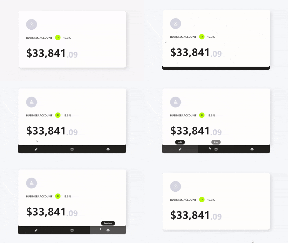
Card Actions is a Flutter package that enhances card widgets with customizable actions and interactive features. It enables developers to add swipe gestures, tap interactions, and dynamic content changes to cards, improving user engagement. Designed for use in lists, dashboards, or card-based UIs, it supports multiple platforms including Android, iOS, Web, macOS, Windows, and Linux. The package integrates seamlessly with existing Flutter projects via a simple pub add command. Its lightweight design focuses on performance and ease of use, making it ideal for modern, responsive card interfaces.
Use cases
Interactive card swipes
Dynamic card content updates
Gesture-driven card interactions
Card-based dashboards
User feedback via card actions
Cross-platform card enhancements
Key features
Swipe-to-action support
Customizable tap and gesture responses
Lightweight and performant
Multi-platform compatibility
Easy integration with Flutter
Extensible action handlers
Suitable for
Developers building card-heavy UIs
Apps requiring interactive card elements
Cross-platform mobile and web apps
Design systems with reusable card components
Prototyping interactive layouts
Considerations
Requires understanding of Flutter gesture system
May need additional styling for complex interactions
Best suited for simple to moderately complex card behaviors
Not intended for full-screen navigation
Limited to card-level interactions
Original README
Original README snapshot from the linked source repository. Visit the repository for the latest content.
Features
✨ Simple Use
⚙️ Great Customization
🌍 Expand the functionality of your cards
🛑 Not use for mobile devices, will soon be available for use on those platforms.
Getting Started
To use this card actions package, you need to add the dependencies in pubspec.yaml file.
dependencies:card_actions:^0.0.1
Use
To use card actions is very simple, just wrap your card with our CardActions widget,
CardActions(
    ...
    child: YourCard() // here would be your card
)
Basic Setup
CardActions needs the parameters width, height and actions
width is the width of the widget
height is the height of the widget
actions is a list of CardActionButton.
CardActions(
    width: //your card width
    height: // your card height
    actions: <CardActionButton>[
        CardActionButton(
            icon: Icon(
                Icons.edit,
                color: Colors.white,
            ), // Icon
            label: 'edit',
            onPress: () {},
        ), // CardActionButton
    ]
    child: yourCard(), // here would be your card
)
If you want to change the direction of the hover, you can use the axisDirection property of the CardAction to change it.
the axisDirection property receives a enum of type CardActionAxis at the moment we only have bottom and right.
CardActionAxis.bottom
CardActionAxis.right
Example
To make this example, we will need to configure more things, but it will be very simple, the first thing is that we change the background color for it we have to use the property backgroundColor then an important part is that we change the design of the cursor when it is on top of the buttons and this we can do it in two ways:
In the CardAction we have the buttonsCursor property that serves to change the cursor to ALL the buttons.
In the CardActionButton we have the cursor property to change the cursor to that specific button.
Important.
If you use both options at the same time the button will prioritize its own cursor setting over the global setting with buttonsCursor.
and finally we add the necessary functions to the buttons by means of its onPress method.