
Overview
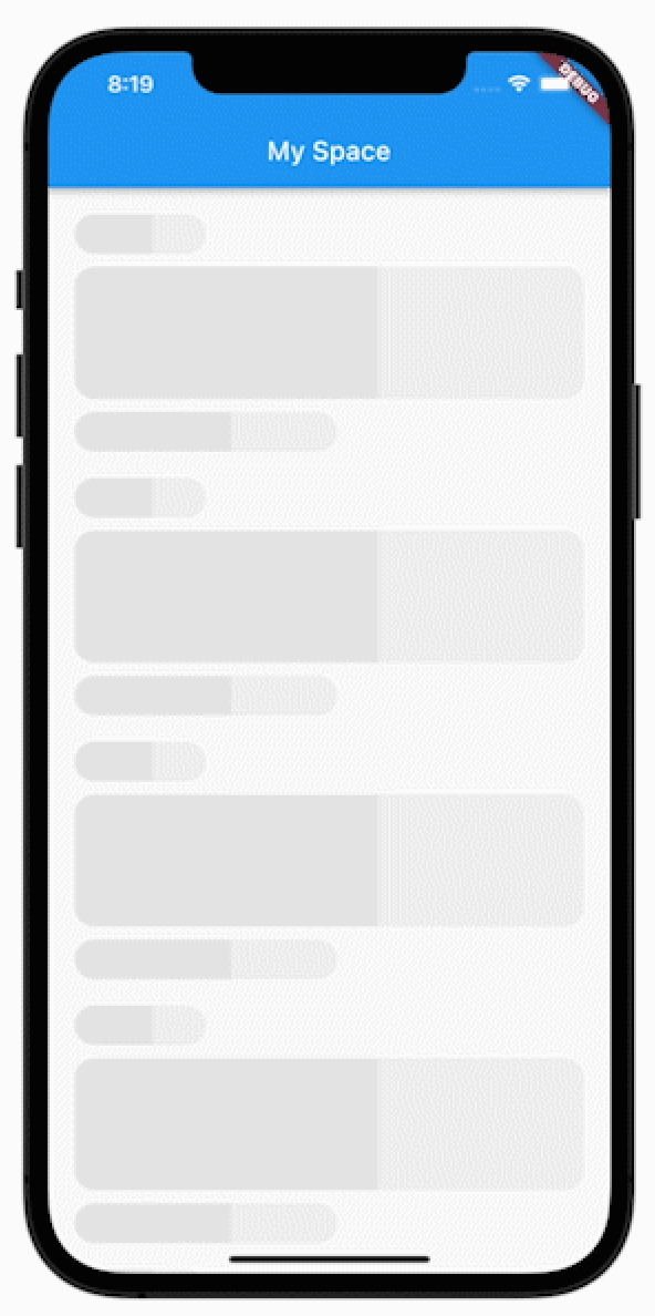
A Flutter package that simplifies the creation of animated loading cards with smooth transitions between two colors. Designed for developers seeking a lightweight solution to display placeholder content during data loading, it enhances user experience with subtle visual feedback. The package supports multiple platforms including Android, iOS, Web, macOS, Windows, and Linux, ensuring consistent behavior across devices. It integrates easily into existing UIs with minimal configuration.
Use cases
- Displaying loading states in lists
- Creating placeholder cards in dashboards
- Enhancing UX during data fetching
- Replacing static placeholders
- Adding visual feedback in forms
- Improving app perceived performance
Key features
- Smooth color transition animation
- Customizable start and end colors
- Minimal setup required
- Cross-platform compatibility
- Lightweight and fast
- Supports all major Flutter platforms
Suitable for
- UI/UX designers seeking dynamic placeholders
- Developers building data-heavy apps
- Teams prioritizing user experience
- Frontend-focused Flutter projects
- Apps with frequent data loading
- Prototyping interactive interfaces
Considerations
- Limited to card-style loading indicators
- No support for custom shapes or gradients
- Requires manual integration with state management
- Not suitable for complex animations
- Depends on Flutter's rendering pipeline
- May impact performance if overused in large lists