Package selection guidance compiled from public package information, community data, and project usage.
Card Slider is a Flutter package that provides a draggable image carousel allowing users to swipe or drag through cards. It's ideal for showcasing images, products, or content in a visually engaging way. The slider supports smooth transitions and intuitive gestures across multiple platforms. Built with performance and ease of use in mind, it integrates seamlessly into apps requiring interactive card-based navigation. Perfect for galleries, product displays, or onboarding screens.
Use cases
Image galleries
Product showcases
Onboarding screens
Interactive sliders
Content carousels
Key features
Draggable gesture support
Smooth slide transitions
Cross-platform compatibility
Customizable card appearance
Built-in swipe animations
Suitable for
Mobile app developers
UI/UX designers
E-commerce applications
Portfolio websites
Interactive prototypes
Considerations
Requires gesture handling setup
May need optimization for large datasets
Limited built-in styling options
Not suitable for non-image content
Performance depends on card count
Original README
Original README snapshot from the linked source repository. Visit the repository for the latest content.
card_slider
A draggable Flutter image carousel slider on swipe or drag! Card slider for carousel images and widgets. This widget works on both Android & iOS.
Installing
Add the following to your pubspec.yaml file:
dependencies:card_slider:^1.0.5
Maintaining card_slider
Thank you everyone for the support surrounding this project! card_slider has grown far larger than I could have ever imagined, so parsing through all the feature requests and new issues has taken me more time than I'd like. If you're interested in helping maintain this project, please send me an email at asylzatwww@gmail.com. As a sidenote, I'll always try to make sure that this project is compatible with the latest version of Flutter.
Simple Usage
There are two ways which the CardSlider can easily be added to your project.
Using the CardSlider slides as widgets.
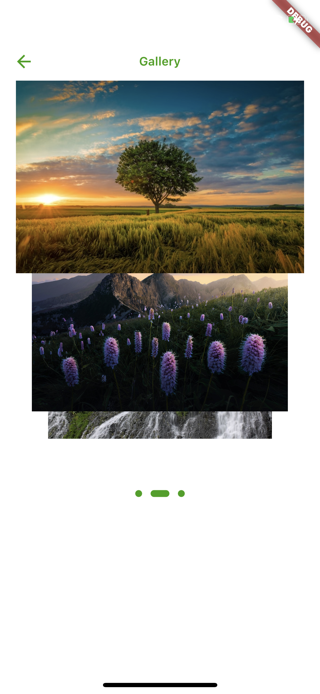
Using the CardSlider slides as images
Using the CardSlider slides as widgets inside scrollable Column.
CardSlider slides as widgets
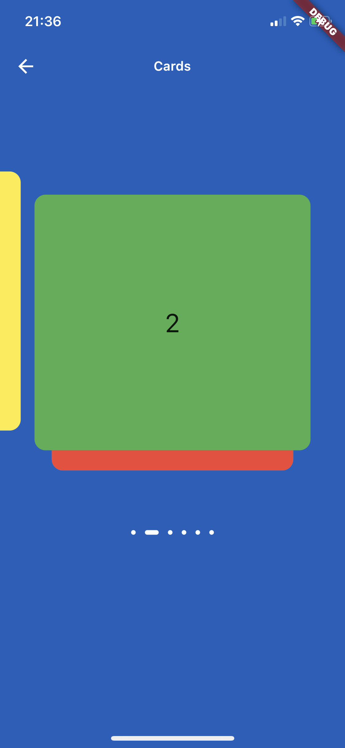
This method uses widgets as a slide cards. For example:
CardSlider slides as widgets inside scrollable Column widget
This method uses widget as a slide cards inside scrollable column, instead of using SingleChildScrollView use the code below which uses ListView, otherwise GestureDetector won't work. For example:
bool _dragOverMap = false;
finalGlobalKey _pointerKey = GlobalKey();
_checkDrag(Offset position, bool up) {
if (!up) {
// find your widgetRenderBox box = _pointerKey.currentContext!.findRenderObject() asRenderBox;
//get offsetOffset boxOffset = box.localToGlobal(Offset.zero);
// check if your pointerdown event is inside the widget (you could do the same for the width, in this case I just used the height)if (position.dy > boxOffset.dy &&
position.dy < boxOffset.dy + box.size.height) {
setState(() {
_dragOverMap = true;
});
}
} else {
setState(() {
_dragOverMap = false;
});
}
}
@overrideWidgetbuild(BuildContext context) {
List<Color> valuesDataColors = [
Colors.purple,
Colors.yellow,
Colors.green,
Colors.red,
Colors.grey,
Colors.blue,
];
List<Widget> valuesWidget = [];
for (int i = 0; i < valuesDataColors.length; i++) {
valuesWidget.add(Container(
decoration: BoxDecoration(
borderRadius: BorderRadius.circular(12.0),
color: valuesDataColors[i],
),
child: Align(
alignment: Alignment.center,
child: Text(
i.toString(),
style: constTextStyle(
fontSize: 28,
),
),
)));
}
returnScaffold(
appBar: AppBar(
title: constText("Slide inside column widget"),
),
body: Listener(
onPointerUp: (ev) {
_checkDrag(ev.position, true);
},
onPointerDown: (ev) {
_checkDrag(ev.position, false);
},
child: ListView(
// if dragging over your widget, disable scroll, otherwise allow scrolling
physics:
_dragOverMap ? constNeverScrollableScrollPhysics() : constScrollPhysics(),
children: [
Column(
children: [
for (int i = 0; i < 3; i++)
constListTile(title: Text("Tile to scroll")),
constDivider(),
],
),
// Your widget that you want to prevent to scroll the ListviewContainer(
color: Colors.amberAccent,
key: _pointerKey, // key for finding the widget
height: 350,
width: double.infinity,
child:
CardSlider(
cards: valuesWidget,
bottomOffset: .0008,
cardHeight: 0.75,
containerHeight: MediaQuery.of(context).size.height - 100,
itemDotOffset: 0.55,
)
,
),
Column(
children: [
for (int i = 0; i < 3; i++)
constListTile(title: Text("Tile to scroll")),
constDivider(),
],
),
],
),
),
);
}
Screenshots
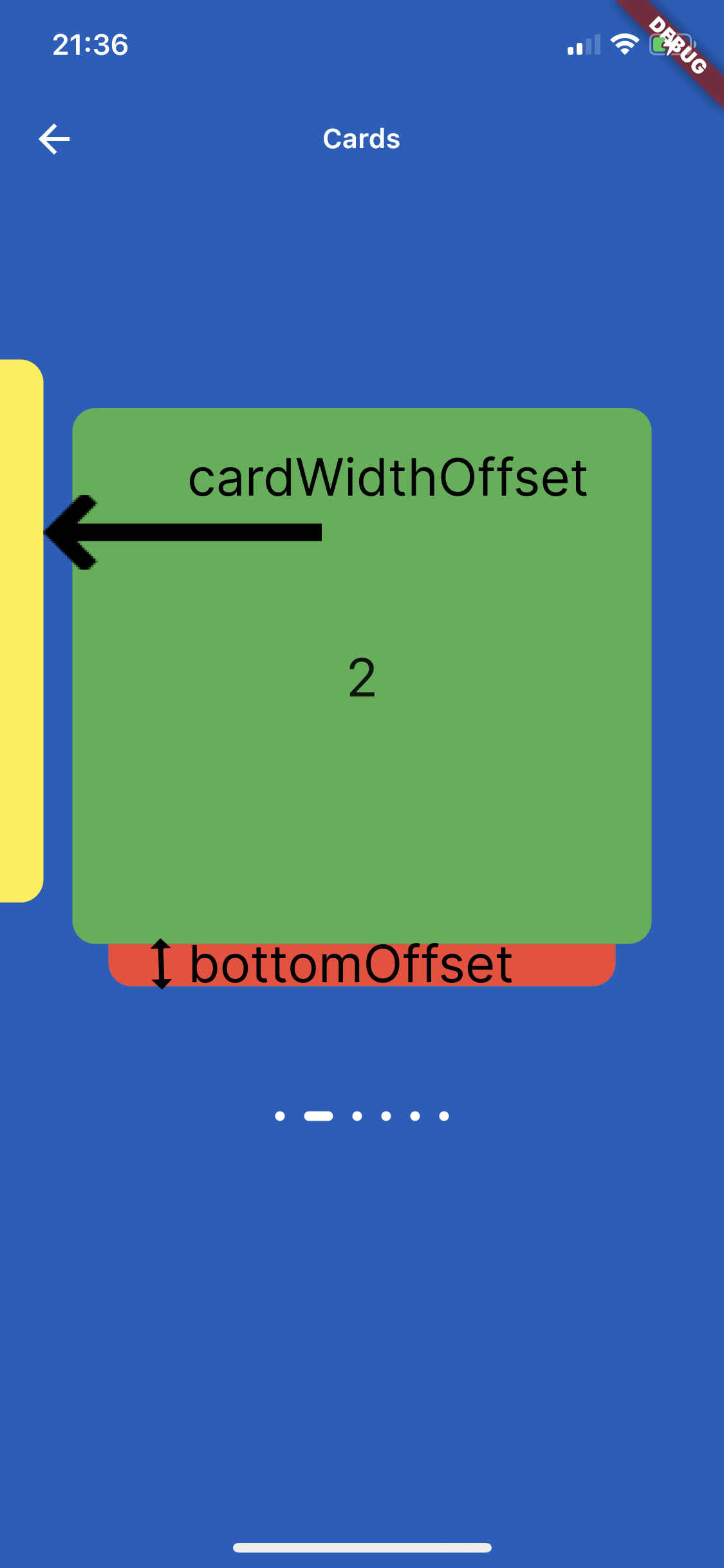
On the image below is shown how to use parameters cardWidthOffset, cardHeightOffset, bottomOffset :
Custom Usage
There are several options that allow for more control:
Properties
Description
cards
The List of Widgets for slider
slideChanged
Optional Event fired when ever slide is changed, (sliderIndex){ } sliderIndex has a value of a current slide.
blurValue
Optional blurValue used for blurring the slider
blurOnClick
Optional blurOnClick is method which listens if users clicks over blurred slider to be able to remove blurry
sliderBackGroundWidget
Optional widget which placed on the background of slider, can be placed logo or any other image or widget .
itemDotWidth
Optional is a width of dots under slider showing current location.
bottomOffset
Optional is a double value, the height of a bottom of previous slide
cardWidth
Optional is a width of a slides
cardHeight
Optional is a height of a slides
cardWidthOffset
Optional is a width which is used for how far slide must go on in horizontal distance when swiping or dragging
cardHeightOffset
Optional is a height which is used for how far slide must go on in vertical distance when swiping or dragging
itemDot
Optional is a widget by which can be changed the dots of th slider position
containerWidth
Optional is a width of main Container
containerHeight
Optional is a height of main Container
containerColor
Optional is a color of main Container
itemDotOffset
Optional is a distance to position itemDot under slides
🔢 Get Current Slide Index
You can listen to slide changes and get the current slide index using the slideChanged callback.