Search packages, repositories and app categories

card_stack_widget cover
Package detailsv0.1.6

card_stack_widget

A vertical dismissible and customizable stack of cards for Flutter applications

AndroidiOSWebmacOSWindowsLinux
30-day downloads
286
Likes
88
Pub points
160

Install package

flutter pub add card_stack_widget

Package Overview

Package selection guidance compiled from public package information, community data, and project usage.

A Flutter package that provides a vertical stack of dismissible cards, allowing users to swipe up or down to navigate through content. Each card can be customized with unique layouts, animations, and behaviors. Ideal for interactive interfaces like quizzes, product showcases, or task lists. The widget supports multiple platforms including Android, iOS, Web, macOS, Windows, and Linux, ensuring consistent performance across devices.

Use cases

  • Interactive card-based navigation
  • Product or item discovery interfaces
  • Quiz or survey applications
  • Task management with swipe actions
  • Content browsing with smooth transitions

Key features

  • Vertical card stacking
  • Swipe-to-dismiss gestures
  • Customizable card appearance
  • Cross-platform compatibility
  • Built-in animation support
  • Extensible event handling

Suitable for

  • Developers building card-based UIs
  • Apps requiring swipe interactions
  • Multi-platform Flutter projects
  • Interactive onboarding flows
  • Dynamic content presentation

Considerations

  • Requires careful handling of gesture conflicts
  • May impact performance with large card counts
  • Customization requires familiarity with Flutter layout
  • Limited built-in themes
  • Not optimized for horizontal stacks
  • Depends on external dependencies for advanced features

Original README

Original README snapshot from the linked source repository. Visit the repository for the latest content.

📦 card_stack_widget

A vertical dismissible and customizable stack of cards for a Flutter application.

Usage

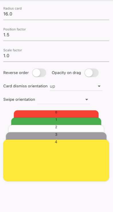
CardStackWidget requires a list of CardModel, in order to create a stack of cards. You can customize their swipe or dismiss orientation, change the scale or the position factor. You can also apply an opacity, that change on drag movement.

Below, you can find an example of the usage of CardStackWidget and CardModel:

CardStackWidget _buildCardStackWidget(BuildContext context) {
  final mockList = _buildMockList(context, size: 4);

  return CardStackWidget(
    opacityChangeOnDrag: true,
    swipeOrientation: CardOrientation.both,
    cardDismissOrientation: CardOrientation.both,
    positionFactor: 3,
    scaleFactor: 1.5,
    alignment: Alignment.center,
    reverseOrder: true,
    animateCardScale: true,
    dismissedCardDuration: const Duration(milliseconds: 150),
    cardList: mockList,
  );
}

/// Create a mock list of `CardModel` to use inside `CardStackWidget`
_buildMockList(BuildContext context, {int size = 0}) {
  final double containerWidth = MediaQuery
      .of(context)
      .size
      .width - 16;

  var list = <CardModel>[];
  for (int i = 0; i < size; i++) {
    var color = Color((Random().nextDouble() * 0xFFFFFF).toInt() << 0)
        .withOpacity(1.0);

    list.add(
      CardModel(
        backgroundColor: color,
        radius: 8,
        shadowColor: Colors.black.withOpacity(0.2),
        child: SizedBox(
          height: 310,
          width: containerWidth,
          child: Container(), // Whatever you want
        ),
      ),
    );
  }

  return list;
}

Preview

GIF example card widget 1 GIF example card widget 2

🚀 Supported properties

CardStackWidget:

  • cardList: List
  • scaleFactor: double
  • positionFactor: double
  • alignment: Alignment?
  • reverseOrder: bool
  • cardDismissOrientation: CardOrientation
  • swipeOrientation: CardOrientation
  • onCardTap: Function(CardModel)?
  • animateCardScale: Duration
  • dismissedCardDuration: bool
  • opacityChangeOnDrag: bool

CardModel:

  • key: Key?
  • shadowColor: Color
  • backgroundColor: Color
  • radius: Radius
  • border: BoxBorder?
  • child: Widget?
  • padding: EdgeInsets?
  • margin: EdgeInsets?
  • gradient: Gradient?
  • imageDecoration: DecorationImage?

Categories

Source repository

Projects using this package

No data available yet.