Search packages, repositories and app categories

circle_nav_bar cover
Package detailsv2.2.0

circle_nav_bar

A package provides an easy way to make circle button nav bar in Flutter project

AndroidiOSWebmacOSWindowsLinux
30-day downloads
3.5K
Likes
164
Pub points
160

Install package

flutter pub add circle_nav_bar

Package Overview

Package selection guidance compiled from public package information, community data, and project usage.

A Flutter package that simplifies the creation of circular navigation bars, offering a modern and visually appealing alternative to traditional bottom navigation bars. It enables developers to easily implement animated, circular buttons with customizable icons and colors. The package supports multiple platforms including Android, iOS, Web, macOS, Windows, and Linux, making it versatile for cross-platform applications. With minimal setup via pub add, it integrates seamlessly into existing Flutter projects.

Use cases

  • Creating modern app interfaces
  • Enhancing user experience with circular navigation
  • Building mobile and web apps with unique UI elements
  • Designing intuitive navigation in creative apps
  • Implementing animated tab switches

Key features

  • Circular button design
  • Customizable icons and colors
  • Smooth animations
  • Cross-platform support
  • Easy integration with Flutter
  • Minimal configuration required

Suitable for

  • UI designers seeking innovative navigation
  • Developers building creative or artistic apps
  • Projects requiring modern interface elements
  • Cross-platform Flutter applications
  • Apps focused on user engagement and visual appeal

Considerations

  • May require additional styling for complex layouts
  • Limited customization compared to full custom widgets
  • Potential performance impact with many animated elements
  • Not ideal for simple navigation needs
  • Best suited for apps with fewer navigation items
Original README

Original README snapshot from the linked source repository. Visit the repository for the latest content.

Circle Nav Bar

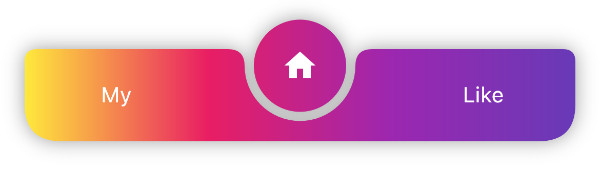
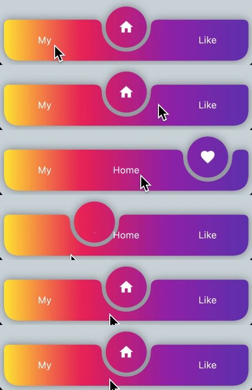
Example style:

  • ./example
no padding black padding with gradient
  • ./example_two
Level and Icons only Icons padding with Levels and icons

How to use

dependencies:
  circle_nav_bar: ^latest_version
import 'package:circle_nav_bar/circle_nav_bar.dart';

Scaffold(
      bottomNavigationBar: CircleNavBar(
        activeIcons: const [
          Icon(Icons.person, color: Colors.deepPurple),
          Icon(Icons.home, color: Colors.deepPurple),
          Icon(Icons.favorite, color: Colors.deepPurple),
        ],
        inactiveIcons: const [
          Text("My"),
          Text("Home"),
          Text("Like"),
        ],
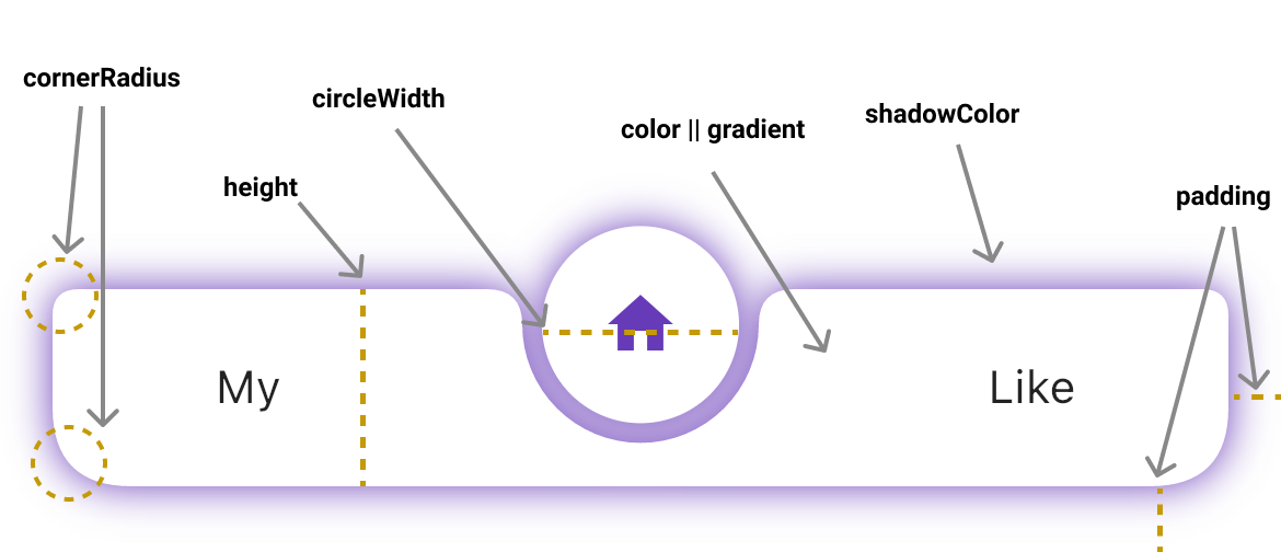
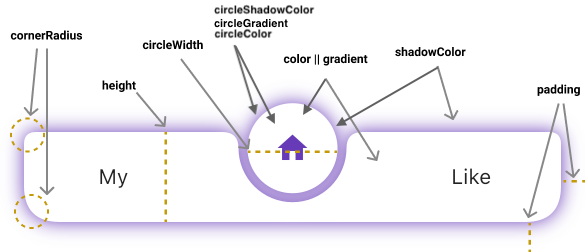
        color: Colors.white,
        circleColor: Colors.white,
        height: 60,
        circleWidth: 60,
        initIndex: 1,
        onChanged: (v) {
          // TODO
        },
        // tabCurve: ,
        padding: const EdgeInsets.only(left: 16, right: 16, bottom: 20),
        cornerRadius: const BorderRadius.only(
          topLeft: Radius.circular(8),
          topRight: Radius.circular(8),
          bottomRight: Radius.circular(24),
          bottomLeft: Radius.circular(24),
        ),
        shadowColor: Colors.deepPurple,
        circleShadowColor: Colors.deepPurple,
        elevation: 10,
        gradient: LinearGradient(
            begin: Alignment.topRight,
            end: Alignment.bottomLeft,
            colors: [ Colors.blue, Colors.red ],
        ),
        circleGradient: LinearGradient(
            begin: Alignment.topRight,
            end: Alignment.bottomLeft,
            colors: [ Colors.blue, Colors.red ],
        ),
      ),
      ...

Contributors

Jiwon Lee
Jiwon Lee
Rupinderjeet Singh Hans
Md Ashraf Ullah
Md Ashraf Ullah
mark-kkk
mark-kkk
kzrnm
kzrnm

Categories

Source repository

Projects using this package

No data available yet.