
Overview
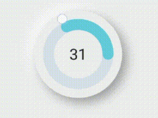
The circular package is a Flutter library designed to create and manage circular sliders for intuitive value selection within a defined range. It enables developers to display and pick data in a visually engaging circular format, ideal for settings like volume controls, angle selectors, or percentage inputs. The package supports multiple platforms including Android, iOS, Web, macOS, Windows, and Linux, ensuring consistent behavior across devices. With customizable appearance and smooth interactions, it simplifies the integration of circular input mechanisms into Flutter applications.
Use cases
- Adjusting values in a 360-degree range
- Creating intuitive UIs for settings like brightness or volume
- Designing interactive dashboards
- Implementing angle or percentage selectors
- Building custom form inputs with visual feedback
Key features
- Circular slider with smooth rotation
- Configurable range and step values
- Cross-platform compatibility
- Customizable styling and colors
- Built-in value change callbacks
- Responsive touch and drag support
Suitable for
- UI designers seeking visual input components
- Developers building control panels or settings interfaces
- Apps requiring non-linear value selection
- Projects targeting multiple platforms with consistent UX
- Educational or interactive applications
Considerations
- May require additional logic for precise value mapping
- Performance may vary on low-end devices with complex animations
- Limited built-in validation beyond range constraints
- Not optimized for high-frequency updates without throttling