Search packages, repositories and app categories

control_style cover
Package detailsv0.1.2

control_style

Applies additional decoration to Flutter-based text fields, buttons and other controls. This allows for better interface customisation.

AndroidiOSWebmacOSWindowsLinux
30-day downloads
17.4K
Likes
25
Pub points
160

Install package

flutter pub add control_style

Package Overview

Package selection guidance compiled from public package information, community data, and project usage.

ControlStyle is a Flutter package that enhances the visual appearance of UI controls such as text fields and buttons by applying customizable decorations. It enables developers to easily tailor the look and feel of standard widgets without writing repetitive styling code. With support across all major platforms, it streamlines interface customization for consistent, polished designs. The package integrates seamlessly into existing Flutter projects via a simple pub add command.

Use cases

  • Customizing text field borders
  • Enhancing button aesthetics
  • Creating unified UI themes
  • Improving form input visuals
  • Streamlining design consistency
  • Adding decorative effects to controls

Key features

  • Easy integration with Flutter widgets
  • Cross-platform compatibility
  • Extensible decoration system
  • Minimal boilerplate required
  • Supports responsive design
  • Theme-aware styling

Suitable for

  • UI designers seeking visual polish
  • Developers building forms
  • Teams maintaining consistent design systems
  • Apps requiring custom control appearances
  • Projects with tight UI deadlines
  • Flutter beginners exploring widget styling

Considerations

  • May require additional configuration for complex layouts
  • Limited to visual enhancements (no functional changes)
  • Depends on Flutter's rendering pipeline
  • Potential performance impact with many decorated controls
  • Not suitable for non-visual customization needs
  • Requires understanding of Flutter's widget tree

Original README

Original README snapshot from the linked source repository. Visit the repository for the latest content.

Applies additional appearance settings to Flutter text fields, buttons and other controls. Currently supports: outer shadow, inner shadow, border, inner gradient.

Try it out: example

Intro

The Flutter library provides limited opportunities to set up the appearance of controls. You usually make this customisation by wrapping the components into a Container widget and configuring it using the decoration parameter. Such an approach has limitations as it leads to increasing the volume of work and complicating the code. Especially time consuming in this case is creating animations for switching between different appearances depending on a state of a control.

In addition, this approach works incorrectly when you are adding shadows to text fields in combination with errorText and helperText:

Container issue

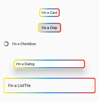
This package helps to solve the aforementioned problem. It provides the most common customisation features for control elements which have shape field such as buttons, text fields, Card, Chip, Checkbox, Dialog, Drawer, inks, ListTile, Material, NavigationBar.

The package provides the same customisation parameters to all controls, which allows for identically decorating any of the controls.

final outlinedShape = DecoratedOutlinedBorder(
  borderGradient: const GradientBorderSide(
    gradient: LinearGradient(colors: [Colors.yellow, Colors.blue, Colors.red]),
    width: 2,
  ),
  child: RoundedRectangleBorder(borderRadius: BorderRadius.circular(8)),
);

...
  Column(children: [
    const SizedBox(height: 16),
    Card(child: const Padding(padding: EdgeInsets.all(8.0), child: Text("I'm a Card")), shape: outlinedShape),
    const SizedBox(height: 16),
    Chip(label: const Text("I'm a Chip"), shape: outlinedShape),
    const SizedBox(height: 16),
    Row(children: [Checkbox(value: false, onChanged: (value) {}, shape: outlinedShape), const Text("I'm a Checkbox")]),
    const SizedBox(height: 16),
    Dialog(child: const Padding(padding: EdgeInsets.all(8.0), child: Text("I'm a Dialog")), shape: outlinedShape),
    const SizedBox(height: 16),
    ListTile(title: const Text("I'm a ListTile"), shape: outlinedShape),
    const SizedBox(height: 16),
  ]);
...

Control examples

Features

Demo

The package enables outer shadow, inner shadow, border and inner gradient styles for Flutter’s standard controls. These can be applied without using external control widgets.

Usage

You can customize all your controls at once via the theme setting of MaterialApp, or separate controls through changing their own styles.

To use the plugin with inputs, you need to wrap InputBorder with DecoratedInputBorder and configure its parameters.

For example, the code:

    MaterialApp(
      theme: ThemeData(
        inputDecorationTheme: InputDecorationTheme(
          border: OutlineInputBorder(
            borderRadius: BorderRadius.circular(8),
          ),
        ),
      ),
    );

should be updated to:

    MaterialApp(
      theme: ThemeData(
        inputDecorationTheme: InputDecorationTheme(
          border: DecoratedInputBorder(
            shadow: const [
              BoxShadow(
                color: Colors.blue,
                blurRadius: 12,
              )
            ],
            child: OutlineInputBorder(
              borderRadius: BorderRadius.circular(8),
            ),
          ),
        ),
      ),
    );

For buttons, you need to wrap OutlinedBorder with DecoratedOutlinedBorder and configure its parameters.

Hence, this code:

    MaterialApp(
      theme: ThemeData(
        primarySwatch: Colors.blue,
        outlinedButtonTheme: OutlinedButtonThemeData(
            style: ElevatedButton.styleFrom(
          shape: RoundedRectangleBorder(
            borderRadius: BorderRadius.circular(8),
          ),
        )),
      ),
    );

should be updated to:

    MaterialApp(
      theme: ThemeData(
        primarySwatch: Colors.blue,
        outlinedButtonTheme: OutlinedButtonThemeData(
            style: ElevatedButton.styleFrom(
          shape: DecoratedOutlinedBorder(
            shadow: const [
              BoxShadow(
                color: Colors.blue,
                blurRadius: 12,
              )
            ],
            child: RoundedRectangleBorder(
              borderRadius: BorderRadius.circular(8),
            ),
          ),
        )),
      ),
    );

The examples above show how to decorate all the controls at once.

In case you need to decorate separate element, you need to configure its styles:

    TextField(
      decoration: InputDecoration(
          border: DecoratedInputBorder(
        shadow: const [
          BoxShadow(
            color: Colors.blue,
            blurRadius: 12,
          )
        ],
        child: OutlineInputBorder(
          borderRadius: BorderRadius.circular(8),
        ),

      )),
    );

    ...

    ElevatedButton(
      onPressed: () {},
      child: const Text("Button"),
      style: ElevatedButton.styleFrom(
          shape: DecoratedOutlinedBorder(
        shadow: const [
          BoxShadow(
            color: Colors.blue,
            blurRadius: 12,
          )
        ],
        child: RoundedRectangleBorder(
          borderRadius: BorderRadius.circular(8),
        ),
      )),
    );
Animation

To configure element state change animations, use the usual Flutter’s approach.

TextButton(
  onPressed: () {},
  child: const Text("Text button"),
  style: ButtonStyle(
    shape: MaterialStateProperty.resolveWith((states) {
      return DecoratedOutlinedBorder(
        shadow: [
          GradientShadow(
            gradient: states.contains(MaterialState.pressed)
                ? const LinearGradient(colors: [Colors.red, Colors.green, Colors.cyan])
                : const LinearGradient(colors: [Colors.blue, Colors.blue]),
            blurRadius: 12,
          )
        ],
        child: RoundedRectangleBorder(borderRadius: BorderRadius.circular(8)),
      );
    }),
  ),
)

Animation

Outer shadow

Add the shadow parameter to DecoratedInputBorder or DecoratedOutlinedBorder.

For adding a single-colour shadow, use BoxShadow.

TextButton(
  onPressed: () {},
  child: const Text("Text button"),
  style: TextButton.styleFrom(
      shape: DecoratedOutlinedBorder(
    shadow: const [
      BoxShadow(
        color: Colors.blue,
        blurRadius: 12,
      )
    ],
    child: RoundedRectangleBorder(borderRadius: BorderRadius.circular(8)),
  )),
);

Color shadow

For applying a gradient-shadow, use GradientShadow. It is different from BoxShadow only in that instead of color it uses the gradient parameter.

TextButton(
  onPressed: () {},
  child: const Text("Text button"),
  style: TextButton.styleFrom(
      shape: DecoratedOutlinedBorder(
    shadow: const [
      GradientShadow(
        gradient: LinearGradient(colors: [Colors.red, Colors.green, Colors.cyan]),
        blurRadius: 12,
      )
    ],
    child: RoundedRectangleBorder(borderRadius: BorderRadius.circular(8)),
  )),
)

Gradient shadow

Inner shadow

Add innerShadow for DecoratedInputBorder or DecoratedOutlinedBorder.

For adding a single-colour shadow, use BoxShadow.

TextButton(
  onPressed: () {},
  child: const Text("Text button"),
  style: TextButton.styleFrom(
      shape: DecoratedOutlinedBorder(
    innerShadow: const [
      BoxShadow(
        color: Colors.blue,
        blurRadius: 12,
      )
    ],
    child: RoundedRectangleBorder(borderRadius: BorderRadius.circular(8)),
  )),
)

Inner shadow

For applying a gradient-shadow, use GradientShadow. It is different from BoxShadow only in that instead of color it uses the gradient parameter.

TextButton(
  onPressed: () {},
  child: const Text("Text button"),
  style: TextButton.styleFrom(
      shape: DecoratedOutlinedBorder(
    innerShadow: const [
      GradientShadow(
        gradient: LinearGradient(colors: [Colors.red, Colors.green, Colors.cyan]),
        blurRadius: 12,
      )
    ],
    child: RoundedRectangleBorder(borderRadius: BorderRadius.circular(8)),
  )),
)

Inner gradient shadow

Background

Add the backgroundGradient parameter of the Gradient type to DecoratedInputBorder or DecoratedOutlinedBorder.

TextButton(
  onPressed: () {},
  child: const Text("Text button"),
  style: ButtonStyle(
    shape: MaterialStateProperty.resolveWith((states) {
      return DecoratedOutlinedBorder(
        backgroundGradient: LinearGradient(colors: [Colors.blue.withOpacity(0.5), Colors.blue.withOpacity(0.2)]),
        child: RoundedRectangleBorder(borderRadius: BorderRadius.circular(8)),
      );
    }),
  ),
)

Background gradient

Border

Add the borderGradient or GradientBorderSide parameter to DecoratedInputBorder or DecoratedOutlinedBorder. This parameters differ from the Flutter’ BorderSide in that they use gradient parameter instead of color.

TextButton(
  onPressed: () {},
  child: const Text("Text button"),
  style: ButtonStyle(
    shape: MaterialStateProperty.resolveWith((states) {
      return DecoratedOutlinedBorder(
        borderGradient: const GradientBorderSide(
          gradient: LinearGradient(colors: [Colors.red, Colors.green, Colors.blue]),
          width: 3,
        ),
        child: RoundedRectangleBorder(borderRadius: BorderRadius.circular(8)),
      );
    }),
  ),
)

Gradient border

BorderShadow in Detail

The wrappers DecoratedInputBorder and DecoratedOutlinedBorder reach an element’s border through the child parameter and apply stylization above the default border of this element. In case of an outer shadow, the shadow’s part above the control then gets cut off in order to create an illusion of the shadow being located behind the control.

how it works

Decorative styles are applied above the layer that contains an element’s border. Hence, when it comes to buttons, such stylisation overlaps the inner area of an element. Using transparent colours hence used to address this issue. This limitation is due to Flutter itself.

Background overlap issue

Compatibility

The following borders have been tested.

Inputs:

  • UnderlineInputBorder
  • OutlineInputBorder

Buttons:

  • BeveledRectangleBorder
  • CircleBorder
  • ContinuousRectangleBorder
  • RoundedRectangleBorder
  • StadiumBorder

Issues

  • Shadows may overlap nearby elements.

Shadow overlap issue

  • The decoration of the inner area of the button overlaps the button itself.

Background overlap issue

Categories

Source repository

Projects using this package

No data available yet.