
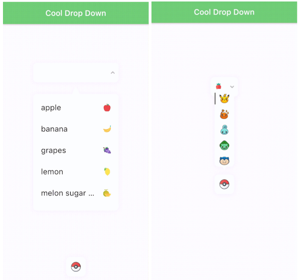
Overview
A customizable dropdown UI component for Flutter that allows developers to tailor the appearance of the selected item, the dropdown box's BoxDecoration, and the input field. It supports multiple platforms including Android, iOS, Web, macOS, Windows, and Linux. The package enhances user experience with smooth animations and flexible styling options, making it ideal for forms and selection interfaces. Built with simplicity and customization in mind, it integrates seamlessly into existing Flutter projects.
Use cases
- Form inputs with custom dropdowns
- User preference selectors
- Dynamic option pickers
- Mobile and web interface enhancements
- Customizable UI components
Key features
- Customizable selected item style
- Configurable BoxDecoration for dropdown
- Extensible input field design
- Cross-platform compatibility
- Smooth animation transitions
- Easy integration with Flutter forms
Suitable for
- Developers seeking styled dropdowns
- Projects requiring consistent UI across platforms
- Apps with complex form interactions
- Design-focused Flutter applications
- Teams prioritizing customization and flexibility
Considerations
- Requires understanding of BoxDecoration and Flutter layout
- May need additional styling for edge cases
- Limited built-in validation
- Best suited for simple to moderately complex dropdown needs