Package selection guidance compiled from public package information, community data, and project usage.
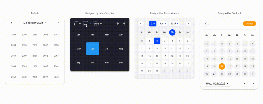
A highly customizable date picker for Flutter applications, offering extensive styling and configuration options. Built for developers who need full control over the appearance and behavior of date selection interfaces across multiple platforms. The package supports Android, iOS, Web, macOS, Windows, and Linux, ensuring consistent user experiences regardless of device. With a focus on flexibility and ease of integration, it enables developers to tailor the picker’s look and feel to match app designs precisely.
Use cases
Custom date selection in forms
Tailored UI for mobile and web apps
Cross-platform date pickers
Enhanced user experience with unique styling
Integration into complex input workflows
Key features
99% customizable design
Supports all major platforms
Extensive styling options
Easy integration with Flutter
Configurable date ranges and formats
Responsive layout adaptation
Suitable for
Developers needing full UI control
Apps requiring unique date picker aesthetics
Multi-platform Flutter projects
Design-focused applications
Teams prioritizing consistency across devices
Considerations
Requires manual styling for advanced customization
May have learning curve for beginners
Limited built-in themes compared to standard pickers
Performance impact with heavy customizations
Dependent on external GitHub repository for updates
Original README
Original README snapshot from the linked source repository. Visit the repository for the latest content.
CreateDatePicker Package
The CreateDatePicker package enables you to create a fully customizable date picker. You can create your own component without worrying about the functionality and place it anywhere to match your design
To integrate the package into your Flutter application is very easy, you just need to add the Widget and customize every component and place it anywhere with the builder property: