Search packages, repositories and app categories

crystal_navigation_bar cover
Package detailsv2.0.0

crystal_navigation_bar

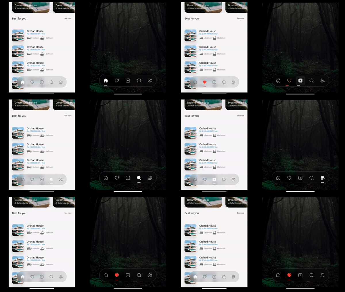
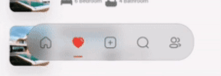
Sleek, crystal-clear blur bottom navigation bar with dynamic indicator for seamless app navigation.

AndroidiOSWebmacOSWindowsLinux
30-day downloads
2.5K
Likes
137
Pub points
160

Install package

flutter pub add crystal_navigation_bar

Package Overview

Package selection guidance compiled from public package information, community data, and project usage.

Crystal Navigation Bar is a visually striking bottom navigation bar for Flutter apps, featuring a sleek, crystal-clear blur effect and a dynamic indicator that enhances user experience. Designed for seamless app navigation across multiple platforms, it offers smooth animations and modern aesthetics. The package supports Android, iOS, Web, macOS, Windows, and Linux, making it ideal for cross-platform development. With minimal setup via `flutter pub add`, it integrates effortlessly into existing projects. Its focus on visual clarity and fluid transitions makes it perfect for apps prioritizing design and usability.

Use cases

  • Cross-platform mobile and web apps
  • Modern UI designs with blur effects
  • Apps requiring intuitive bottom navigation
  • High-end user interfaces
  • Dynamic indicator-based navigation

Key features

  • Crystal-clear blur effect
  • Dynamic indicator animation
  • Cross-platform compatibility
  • Minimal setup with pub add
  • Smooth transition animations
  • Customizable appearance

Suitable for

  • Design-focused Flutter developers
  • Apps with premium UI/UX requirements
  • Developers targeting multiple platforms
  • Projects emphasizing visual polish
  • Users seeking modern navigation patterns

Considerations

  • May impact performance on low-end devices
  • Blur effect requires GPU acceleration
  • Limited customization beyond core features
  • Best suited for light-themed interfaces
  • Potential rendering inconsistencies on older OS versions

Original README

Original README snapshot from the linked source repository. Visit the repository for the latest content.

Crystal Bottom Navigation Bar


undefined undefined
undefined undefined undefined undefined undefined
undefined undefined

A highly flexible bottom navigation bar that allows you to tailor it to your specific needs without any constraints. Elevate your UI/UX with seamless animations, customizable appearance—including the option to incorporate blur effects—and the ability to fully personalize the interface.

Styles

Screenshot 1

Simple BottomBar

With Border

Screenshot 2

Simple BottomBar

With Badge


CRYSTAL BOTTOM NAVIGATION BAR


  • Blur navigation bar
  • Frosted navigation bar
  • Floating navigation bar
  • Rounded navigation bar
  • Modern navigation bar

Getting Started

To install, add it to your pubspec.yaml file:

dependencies:
    crystal_navigation_bar:

import 'package:crystal_navigation_bar/crystal_navigation_bar.dart';

How to use it

Use CrystalNavigationBar constructor in Your app with in Scaffold's bottomNavigationBar:

Make sure extendBody in Scaffold should be true to use Floating behavior

      extendBody: true,

if you do not want to make round navigation bar with show body behind the navbar you have to make that

      extendBody: false,
Widget build(BuildContext context) {
  return Scaffold(
    body: Center(),
    extendBody: true,//<------like this 
    bottomNavigationBar:  CrystalNavigationBar(
          currentIndex: _SelectedTab.values.indexOf(_selectedTab),
          onTap: _handleIndexChanged,
          indicatorColor: Colors.white,
          // enableFloatingNavBar: false
          items: [
            
            
          ],
        ),
  );
}

basic implementation

Widget build(BuildContext context) {
    return Scaffold(
      extendBody: true,
      body: SizedBox(
        height: MediaQuery.of(context).size.height,
        child: Image.network(
          "https://images.pexels.com/photos/1671325/pexels-photo-1671325.jpeg?auto=compress&cs=tinysrgb&w=1260&h=750&dpr=2",
          fit: BoxFit.fitHeight,
        ),
      ),
      bottomNavigationBar: Padding(
        padding: const EdgeInsets.only(bottom: 10),
        child: CrystalNavigationBar(
          currentIndex: _SelectedTab.values.indexOf(_selectedTab),
          // indicatorColor: Colors.white,
          unselectedItemColor: Colors.white70,
          backgroundColor: Colors.black.withOpacity(0.1),
          // outlineBorderColor: Colors.black.withOpacity(0.1),
          borderWidth: 2,
          outlineBorderColor: Colors.white,
          onTap: _handleIndexChanged,
          items: [
            /// Home
            CrystalNavigationBarItem(
              icon: IconlyBold.home,
              unselectedIcon: IconlyLight.home,
              selectedColor: Colors.white,
              badge: Badge(
                label: Text(
                  "9+",
                  style: TextStyle(color: Colors.white),
                ),
              ),
            ),

            /// Favourite
            CrystalNavigationBarItem(
              icon: IconlyBold.heart,
              unselectedIcon: IconlyLight.heart,
              selectedColor: Colors.red,
            ),

            /// Add
            CrystalNavigationBarItem(
              icon: IconlyBold.plus,
              unselectedIcon: IconlyLight.plus,
              selectedColor: Colors.white,
            ),

            /// Search
            CrystalNavigationBarItem(
                icon: IconlyBold.search,
                unselectedIcon: IconlyLight.search,
                selectedColor: Colors.white),

            /// Profile
            CrystalNavigationBarItem(
              icon: IconlyBold.user_2,
              unselectedIcon: IconlyLight.user,
              selectedColor: Colors.white,
            ),
          ],
        ),
      ),
    );
  }

The constructor has 19 attributes related to the Widget:

  • items: A list of tabs to display, example Home, Profile,Search, etc
  • height: The height of CrystalNavigationBar, [Default] & [Minimum] height is 105,
  • currentIndex: The tab to display.
  • onTap:Returns the index of the tab that was tapped.
  • outlineBorderColor : Border Color of the Bottom bar.
  • borderWidth : Border Width of the Bottom bar.
  • badge : Badge to display. (to display notification count etc).
  • selectedItemColor:The color of the icon and text when the item is selected.
  • unselectedItemColor: The color of the icon and text when the item is not selected.
  • margin:A convenience field for the margin surrounding the entire widget.
  • itemPadding:The padding of each item.
  • duration: The transition duration.
  • curve: The transition curve.
  • indicatorColor:The color of the tab indicator.
  • marginR:margin for the bar to give some radius .
  • paddingR:padding for the bar to give some radius.
  • borderRadius:border radius for nav bar.
  • backgroundColor:background colors for the nav bar.
  • boxShadow: floating nav bar shadow ,it takes List of BoxShadow
  • enableFloatingNavBar: make Floating nav bar enabled.
  • enablePaddingAnimation: enable the animation on item during item change.
  • splashColor: Color of the item's Splash Color. To disable, use Colors.transparent.

iconly package is used for Icons in the demo/example

Adjust Colors of background, unselectedItemColor, selectedItemColor according to your UI for better Design.

Example Usage

See Example Code for more info.

Contributing

Every pull request is welcome.

Contributors

Imtiaz Ahmad

  • Twitter
  • GitHub
  • LinkedIn

Categories

Dependencies

Dependency list 1 items

Source repository

Projects using this package