Search packages, repositories and app categories

curved_labeled_navigation_bar cover
Package detailsv2.0.6

curved_labeled_navigation_bar

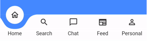
Stunning Animating Curved Shape Navigation Bar. Adjustable color, background color, animation curve, animation duration.

AndroidiOSmacOSWindowsLinux
30-day downloads
2.3K
Likes
145
Pub points
160

Install package

flutter pub add curved_labeled_navigation_bar

Package Overview

Package selection guidance compiled from public package information, community data, and project usage.

A visually striking, animating curved navigation bar for Flutter apps. It features smooth transitions with customizable colors, background hues, animation curves, and duration settings. Ideal for modern UIs that prioritize aesthetic appeal and user engagement. The package supports multiple platforms including Android, iOS, macOS, Windows, and Linux, ensuring consistent design across devices. Its dynamic animations enhance the user experience while maintaining simplicity in implementation.

Use cases

  • Modern app interfaces
  • Mobile and desktop applications
  • Interactive UI components
  • Custom bottom navigation bars
  • Enhanced user experience

Key features

  • Animatable curved shape
  • Customizable colors
  • Adjustable animation curve
  • Configurable animation duration
  • Cross-platform support
  • Labeled navigation items

Suitable for

  • Design-focused developers
  • Apps requiring visual flair
  • UI/UX designers
  • Flutter beginners seeking advanced widgets
  • Projects with custom navigation needs

Considerations

  • May impact performance on low-end devices
  • Requires careful color contrast for accessibility
  • Animation settings need testing across devices
  • Limited to bottom navigation use case
  • Not suitable for minimalistic designs

Original README

Original README snapshot from the linked source repository. Visit the repository for the latest content.

curved_labeled_navigation_bar

pub package

A Flutter package for easy implementation of curved navigation bar. This package is a fork of the original curved_navigation_bar from https://github.com/rafalbednarczuk/curved_navigation_bar with label for CurvedNavigationBarItem.

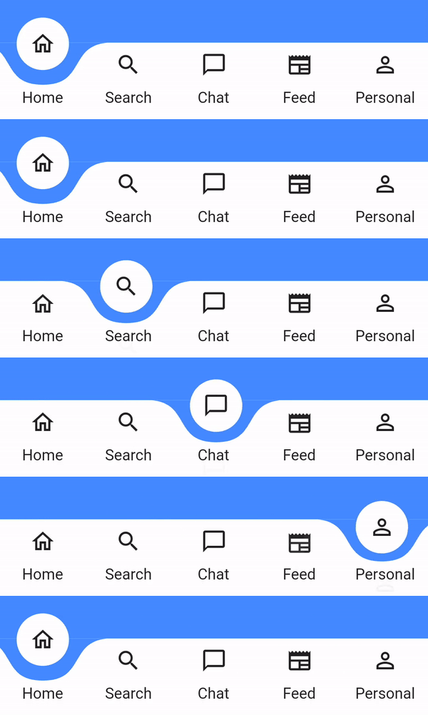
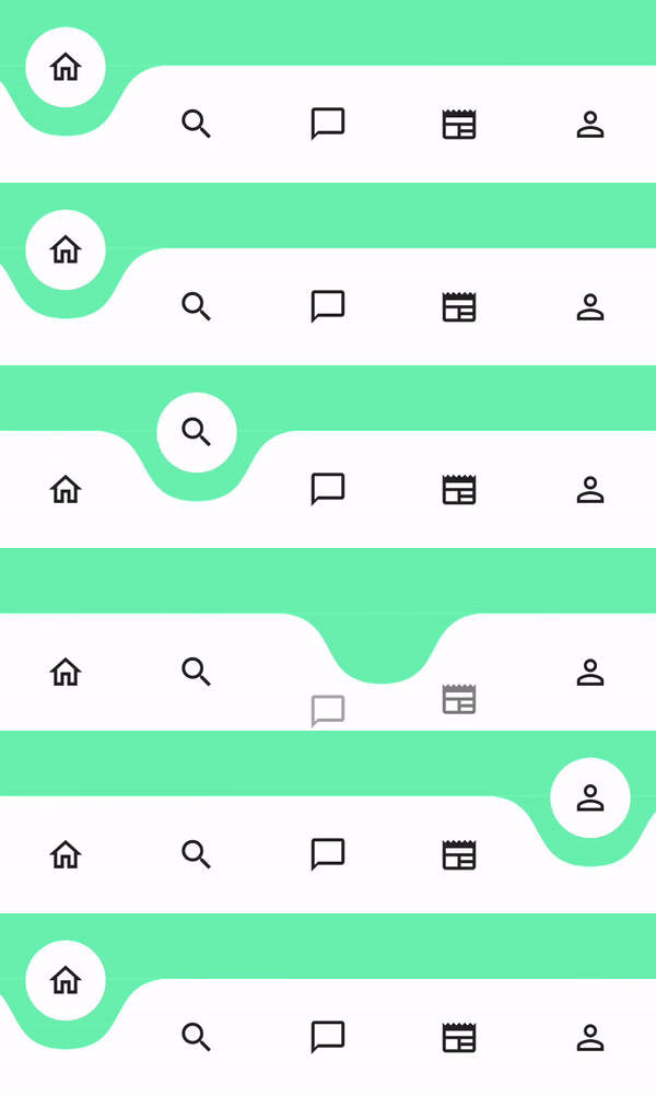
Label No Label
Gif Gif
Add dependency
dependencies:
  curved_labeled_navigation_bar: ^2.0.6 #latest version
Easy to use
Scaffold(
  bottomNavigationBar: CurvedNavigationBar(
    backgroundColor: Colors.blueAccent,
    items: [
      CurvedNavigationBarItem(
        child: Icon(Icons.home_outlined),
        label: 'Home',
      ),
      CurvedNavigationBarItem(
        child: Icon(Icons.search),
        label: 'Search',
      ),
      CurvedNavigationBarItem(
        child: Icon(Icons.chat_bubble_outline),
        label: 'Chat',
      ),
      CurvedNavigationBarItem(
        child: Icon(Icons.newspaper),
        label: 'Feed',
      ),
      CurvedNavigationBarItem(
        child: Icon(Icons.perm_identity),
        label: 'Personal',
      ),
    ],
    onTap: (index) {
      // Handle button tap
    },
  ),
  body: Container(color: Colors.blueAccent),
)
Attributes
CurvedNavigationBar
Attribute Description
items List of CurvedNavigationBarItem
index Index of NavigationBar, can be used to change current index or to set initial index
color Color of NavigationBar, default Colors.white
buttonBackgroundColor Background color of floating button, default same as color attribute
backgroundColor Color of NavigationBar's background, default Colors.blueAccent
onTap Function handling taps on items
letIndexChange Function which takes page index as argument and returns bool. If function returns false then page is not changed on button tap. It returns true by default
animationCurve Curves interpolating button change animation, default Curves.easeOut
animationDuration Duration of button change animation, default Duration(milliseconds: 600)
height Height of NavigationBar
maxWidth Allows to set the width of the navigation bar lower than the entire screen width by default
iconPadding Padding of icon in floating button
CurvedNavigationBarItem
Attribute Description
child Icon of CurvedNavigationBarItem
label Text of CurvedNavigationBarItem
labelStyle TextStyle for label
Change page programmatically
 // State class
  int _page = 0;
  GlobalKey<CurvedNavigationBarState> _bottomNavigationKey = GlobalKey();

  @override
  Widget build(BuildContext context) {
    return Scaffold(
        bottomNavigationBar: CurvedNavigationBar(
          key: _bottomNavigationKey,
          items: [
            CurvedNavigationBarItem(
              child: Icon(Icons.home_outlined),
              label: 'Home',
            ),
            CurvedNavigationBarItem(
              child: Icon(Icons.search),
              label: 'Search',
            ),
            CurvedNavigationBarItem(
              child: Icon(Icons.chat_bubble_outline),
              label: 'Chat',
            ),
            CurvedNavigationBarItem(
              child: Icon(Icons.newspaper),
              label: 'Feed',
            ),
            CurvedNavigationBarItem(
              child: Icon(Icons.perm_identity),
              label: 'Personal',
            ),
          ],
          onTap: (index) {
            setState(() {
              _page = index;
            });
          },
        ),
        body: Container(
          color: Colors.blueAccent,
          child: Center(
            child: Column(
              children: <Widget>[
                Text(_page.toString(), textScaler: TextScaler.linear(10.0)),
                ElevatedButton(
                  child: Text('Go To Page of index 1'),
                  onPressed: () {
                    // Page change using state does the same as clicking index 1 navigation button
                    final CurvedNavigationBarState? navBarState =
                        _bottomNavigationKey.currentState;
                    navBarState?.setPage(1);
                  },
                )
              ],
            ),
          ),
        ),
    );
  }

Categories

Dependencies

Dependency list 2 items

Source repository

Projects using this package

No data available yet.