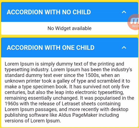
The Custom Accordion package allows to create Expandable Flutter widget where each item or list of items can be expanded or collapsed simply by clicking on the header.
Package selection guidance compiled from public package information, community data, and project usage.
The Custom Accordion package provides a flexible and customizable expandable widget for Flutter, enabling users to create collapsible sections with simple header clicks. Each item or group of items can be expanded or collapsed dynamically, ideal for organizing content in a clean, interactive way. It supports multiple platforms including Android, iOS, Web, macOS, Windows, and Linux, making it suitable for cross-platform applications. The package is lightweight and easy to integrate, offering developers full control over styling and behavior through customizable properties.
Use cases
Collapsible FAQ sections
Interactive form wizards
Dynamic content navigation
Nested expandable lists
Mobile-friendly data organization
Key features
Header-triggered expansion
Support for multiple items
Customizable animation
Cross-platform compatibility
Easy integration with existing widgets
Suitable for
Developers building interactive UIs
Apps needing collapsible content
Projects requiring responsive design
Teams using Flutter for multi-platform apps
UI designers seeking reusable components
Considerations
Requires manual handling of state management
Limited built-in theming options
May need additional styling for complex layouts
Not optimized for very large datasets
Depends on external dependencies for advanced features
Original README
Original README snapshot from the linked source repository. Visit the repository for the latest content.
Custom Accordion
Create dynamic, interactive, and visually appealing accordions in your Flutter app with ease using the "Custom Accordion" package. This powerful library simplifies the process of adding collapsible sections to your UI, making it a breeze to manage and customize accordions to suit your design and functionality needs.
CustomAccordion(
title: 'Accordion with one child',
subTitle: 'Accordion Sub Title',
headerBackgroundColor: Colors.blue,
titleStyle: constTextStyle(
fontSize: 18,
fontWeight: FontWeight.bold,
color: Colors.white,
),
subTitleStyle: constTextStyle(
fontSize: 16,
fontWeight: FontWeight.normal,
color: Colors.white,
),
toggleIconOpen: Icons.keyboard_arrow_down_sharp,
toggleIconClose: Icons.keyboard_arrow_up_sharp,
headerIconColor: Colors.white,
accordionElevation: 0,
widgetItems: constText(
'Lorem Ipsum is simply dummy text of the printing and typesetting industry. Lorem Ipsum has been the industry\'s standard dummy text ever since the 1500s, when an unknown printer took a galley of type and scrambled it to make a type specimen book. It has survived not only five centuries, but also the leap into electronic typesetting, remaining essentially unchanged. It was popularised in the 1960s with the release of Letraset sheets containing Lorem Ipsum passages, and more recently with desktop publishing software like Aldus PageMaker including versions of Lorem Ipsum.',
),
),
The following properties can be set for the widget.
Property
Description
Type
Required
Default value
title
Title of Accordion
String
Yes
subTitle
Sub Title of Accordion
String
No
headerBackgroundColor
Header background color
Color
No
Theme.of(context).splashColor
titleStyle
Header text style
TextStyle
No
Theme.of(context).textTheme.titleLarge
subTitleStyle
Sub Title text style
TextStyle
No
Theme.of(context).textTheme.titleSmall
toggleIconOpen
Toggle icon to expand/open widgets
IconData
No
Icons.arrow_drop_down
toggleIconClose
Toggle icon to collapse/close widgets
IconData
No
Icons.arrow_drop_up
headerIconColor
Icon Color
Color
No
Theme.of(context).iconTheme.color
backgroundColor
Background color of widget
Color
No
Theme.of(context).cardColor
accordionElevation
Elevation of accordion widget
double
No
Theme.of(context).cardTheme.elevation
widgetItems
Child Widget(s) of accordion
Widget
No
Text()
widgetItemsPadding
Padding arround children of accordion
EdgeInsetsGeometry
No
EdgeInsets.all(10)
showContent
Make default behaviour of accordion children visible or hidden
bool
No
false
disableToggle
Make default behaviour of accordion toggle
bool
No
false
Contribution
🚀 We believe in the power of collaboration and welcome contributions from our amazing community to make Custom Accordion even more awesome!
Whether you're a developer, designer, or just an enthusiast, you can contribute in various ways:
💡 Feature Ideas: Have a cool feature in mind? Share your ideas with us. We love fresh perspectives!
🐛 Bug Reports: Spotted a bug? Let us know! Help us squash those pesky little critters.
📖 Documentation: Improve our documentation. Clear and concise docs make a world of difference.
🛠 Code Contributions: If you're a developer, dive into the codebase. Tackle open issues or implement new features.
💬 Community Support: Share your knowledge! Help others by answering questions and engaging in discussions.
✏️ Design: If you have design skills, contribute by enhancing our UI/UX.
Dig into CONTRIBUTING.MD, which covers submitting bugs, requesting new features, preparing your code for a pull request, etc.
Please don't forget to like, follow, and star our repo!.
Support the package (optional)
If you find this package useful, you can support it for free by giving it a thumbs up at the top of this page.
Bugs or Requests
If you encounter any problems feel free to open an issue. If you feel the library is missing a feature, please raise a ticket. Pull request are also welcome.