
Overview
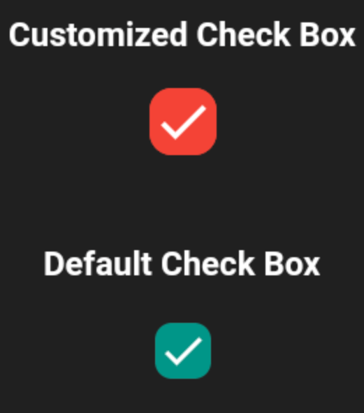
A customizable Flutter checkbox that allows users to define active and inactive colors, custom icons, and corner radius. It provides a flexible way to style checkboxes beyond the default Material design, making it ideal for apps requiring unique visual themes. The package supports all major platforms including Android, iOS, Web, macOS, Windows, and Linux, ensuring consistent appearance across devices. It is lightweight and easy to integrate with minimal configuration.
Use cases
- Custom UI designs
- Themed applications
- Cross-platform consistency
- Form customization
- Branding integration
Key features
- Custom active color
- Custom inactive color
- Custom icon support
- Adjustable corner radius
- Platform agnostic
- Simple API
Suitable for
- Designers seeking visual control
- Developers building branded forms
- Apps needing unique checkbox styles
- Cross-platform projects
- UI-heavy applications
Considerations
- Requires manual icon asset management
- Limited to checkbox-specific customization
- No built-in accessibility labels
- Not suitable for complex form logic
- Depends on correct asset path configuration